

Imagine standing in front of investors, pitching your heart out to make them say YES. Instead, they cringe at you — or at your pitch deck design rather. This is the worst scenario when pitching a business idea.
And if you don’t have time to create a pitch deck design to present to investors or clients, subscribe to Penji today and get started requesting your graphic designs. But for now, let’s take a look at pitch deck designs from 15 well-known brands.
1. Buffer
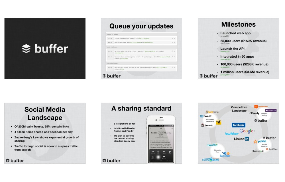
Images credit to Buffer
Buffer used gray slides with a transparent background image to act as the visual representation of the slide’s content. Plus, they also limited the font colors to black and green, making it easy on the eyes. Not only that, but the Buffer logo is also present in every slide. As simple as this pitch deck looks, Buffer eventually raised $500,000 after convincing investors. Finally, the data presented are also easy to digest in a bulleted format.
2. Airbnb
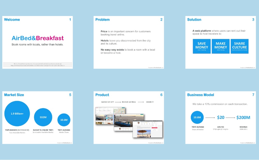
Images credit to PitchDeckCoach
As outdated as Airbnb’s pitch deck design might be, it’s one you can look to for inspiration. This one’s a recreated version of the original one. Still, for one, it’s a no-fuss pitch deck design that emphasizes numbers. Overall, Airbnb’s pitch deck takes a minimalist approach with a clean layout and clear message. It’s one pitch deck you can use if you want to present numbers without overwhelming your investors.
3. Facebook
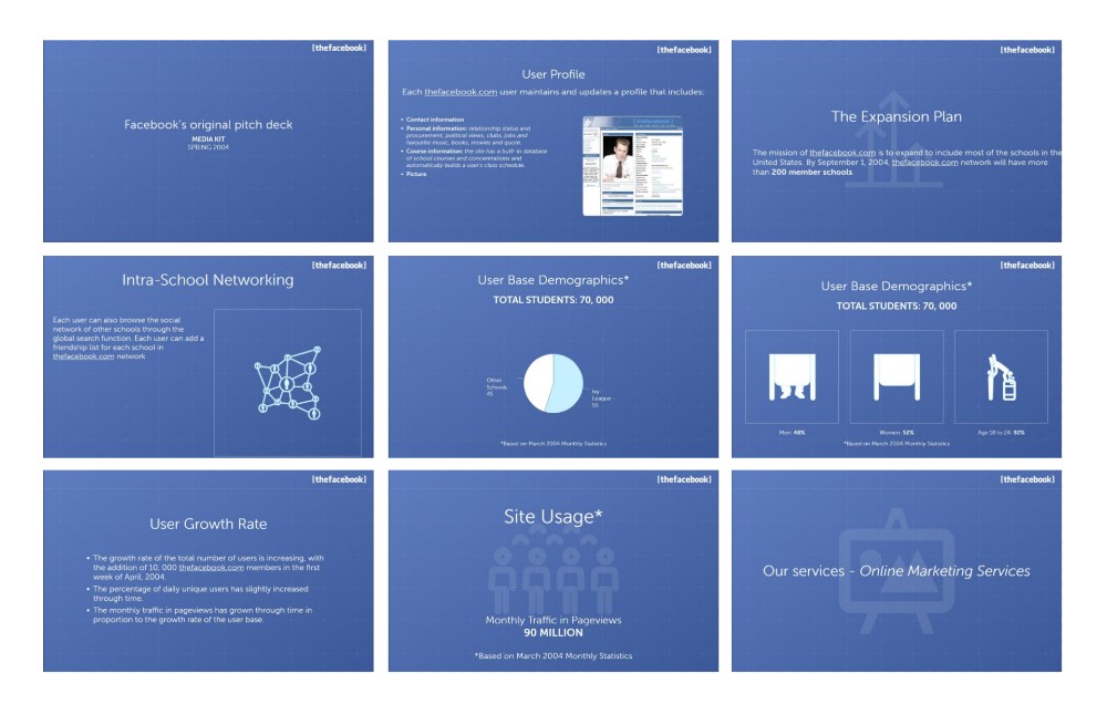
Images credit to startuphome
Facebook’s original pitch deck uses the all-too-familiar Facebook blue for the slides. The white text on blue is a beautiful contrast as well. Moreover, it uses icons and transparent background images making for an interesting visual. While their slides act as a template, it contains the necessary information that any pitch deck should have. You could use the Facebook pitch deck if you don’t want to miss any company detail.
4. LinkedIn
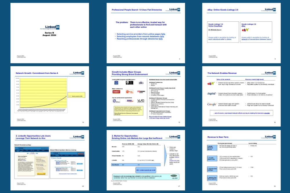
Images credit to Joseph Hsieh
LinkedIn’s pitch deck may be longer than the other examples shown here, but it tries to squeeze in all the necessary information to get funding. The structure looks clean, and it’s well-organized. In addition, their pitch deck looks professional, which you could copy if you need one such as this. But if you’re aiming for a more modern look, adding more photos and following graphic design trends will do the trick.
5. WeWork
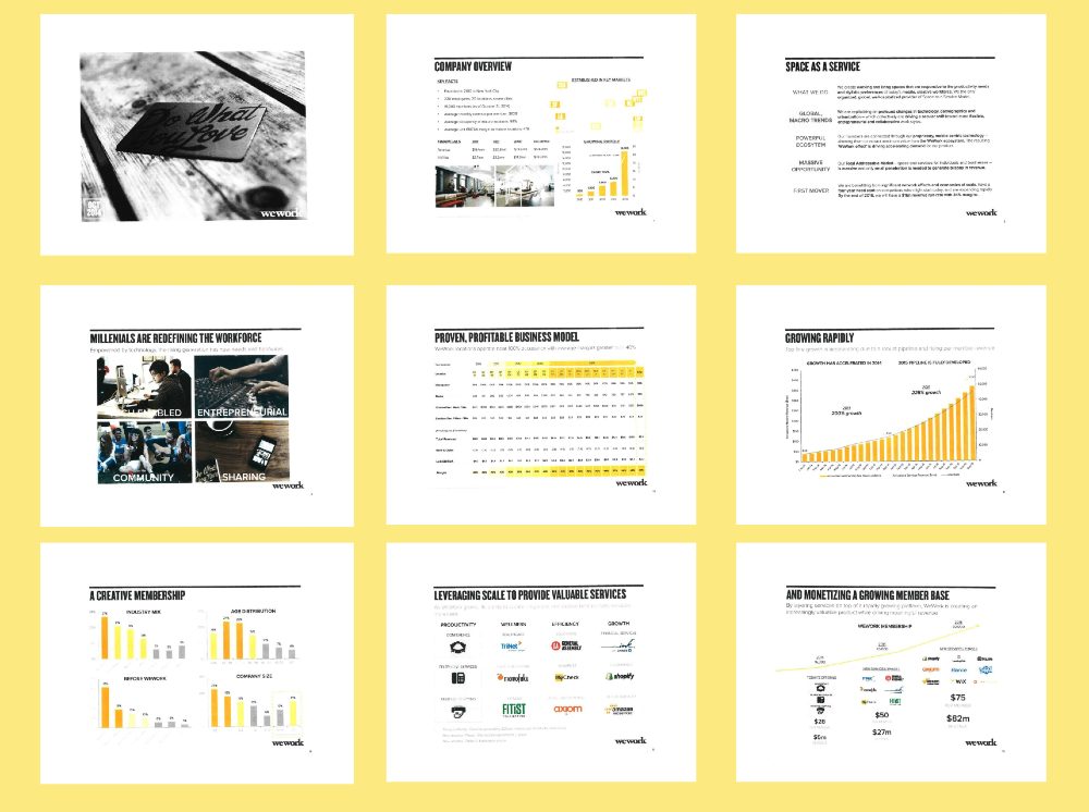
Images credit to Alexander Jarvis
Even if WeWork jammed information in their pitch deck design, it still looks organized. In marketing, visuals and other design elements such as structure and white space can level up your game. And in this example, you’ll notice how they used visual hierarchy. Plus, they limited the color to black, white, and yellow (and sometimes orange) to simplify their color scheme. And in terms of overall design, WeWork takes the cake as one of the best pitch deck designs on this list, thanks to its clean layout. No wonder they raised $1 billion during their Series H in 2019.
6. Buzzfeed
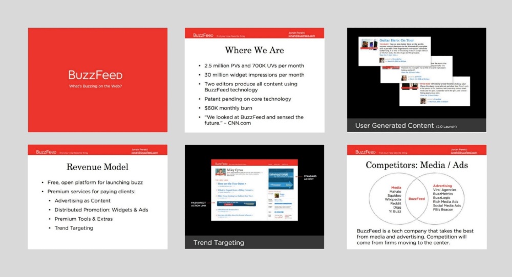
Images credit to startuphome
This one by Buzzfeed opted for a text-heavy pitch deck design. But they didn’t forget to include photos to show investors the look of the websites and their pages. The nice balance between text and images is a great factor when creating pitch decks. Plus, Buzzfeed’s bright signature red serves as the header color. Overall, if you want a modern and straightforward style, you can use Buzzfeed’s as inspiration for your future pitch deck designs.
7. Uber
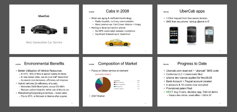
Images credit to Garrett Camp
Uber’s pitch deck design lacks the branding that the other examples have presented. However, if you want to go for something simple, you can use it as inspiration and improve it further. Like most pitch deck designs here, it’s text-heavy, only using images and graphs when necessary. You can snazz it up by adding color on the slides or use a different font to give it a contemporary look. Finally, Uber’s pitch deck presentation has every piece of information investors need to know about the entire concept and market.
8. TikTok
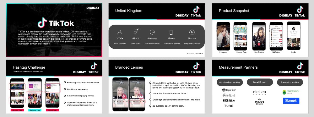
Images credit to Digiday
While most of the pitch deck designs here may look old, check out TikTok’s pitch deck design as a modern example. You want to ensure consistency in your pitch deck, and TikTok demonstrated that well through slide design, color, and logos. Not only that, their design is image-heavy, with only a few explanations serving as text to explain the slide. Plus, even if half the slide takes up space, they ensure that their text is readable for their target audience. Browsing through this pitch deck is a good “demo” for using TikTok.
9. FourSquare
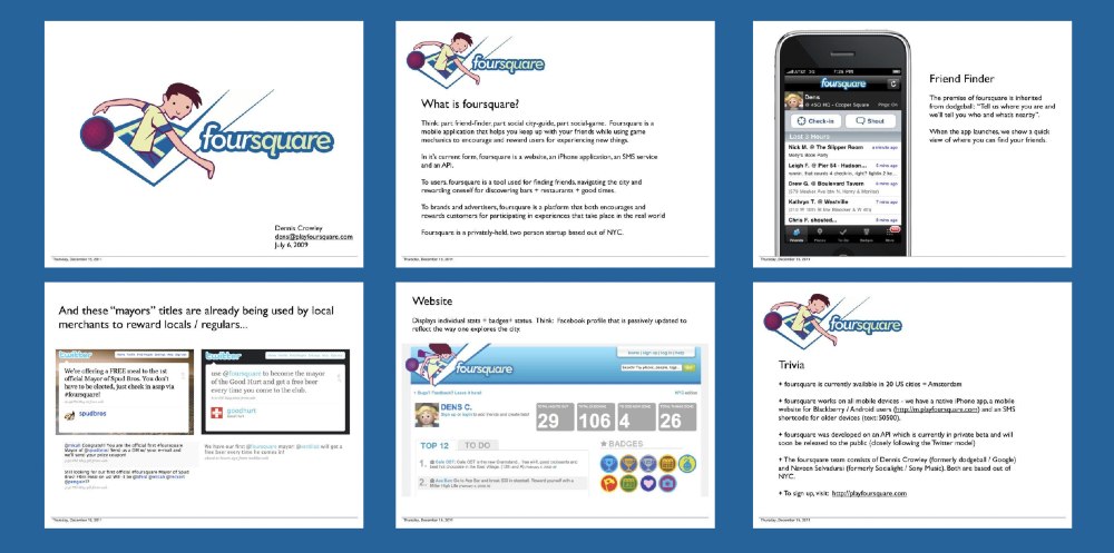
Images credit to Business Insider
You could consider the FourSquare pitch deck design contemporary and neat. After all, co-founder Dennis Crowley shared with Business Insider that pitch deck designs shouldn’t stick to what entrepreneurs have been taught. And that they did with their pitch deck. It’s good they have photos on their pitch deck to show pages of their app and website. Plus, the screenshots of Twitter users’ testimonials is a nice touch to add credibility.
10. Moz
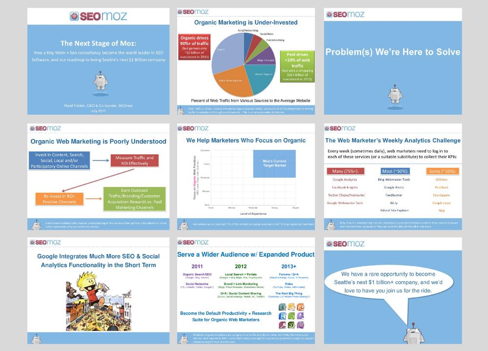
Images credit to Rand Fishkin
Before Moz became one of the SEO powerhouses, they started as a mom and son consultancy that needed funding to become a billion-dollar company. At first, the colors may seem overwhelming. But, it was necessary to have those to separate points and other details. They also have a footer, which is unusual for pitch decks. However, it was a great way to show investors the brand’s personality and learn other facts about the company.
11. Spotify
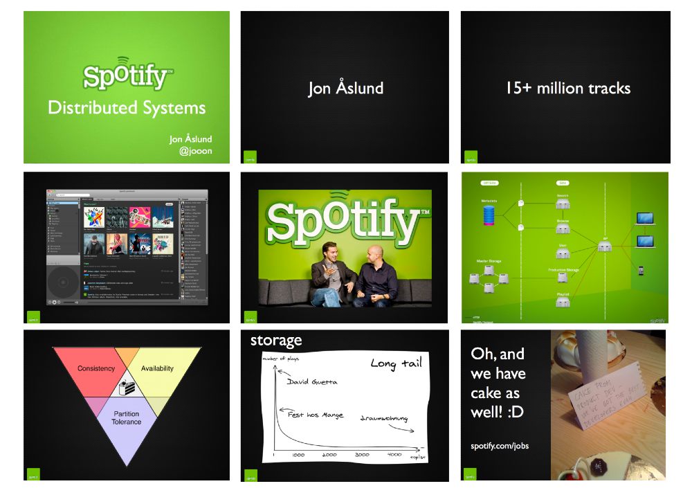
Images credit to Business Insider
If you want investors or clients to focus on you while presenting, check out this minimalist pitch deck design by Spotify. The majority of the slides are only text which was limited to fewer than ten words. They also use images, data, and charts to emphasize some important points. Plus, the black and green contrast shows Spotify’s fun branding. If the Spotify pitch deck would serve as an inspiration for yours, use pictures, icons, or illustrations to give it more life.
12. Crunchbase
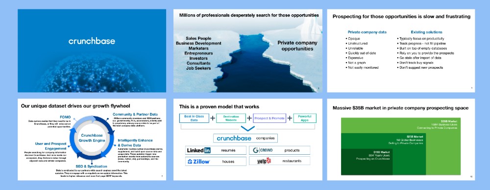
Images credit to Business Insider
Take a look at Crunchbase’s pitch deck design. Dubbing themselves as the LinkedIn of Companies, Crunchbase aims to provide public information about companies to help individuals learn more about them. Their no-fuss pitch deck design focused more on visuals than text. It was also a short presentation, wanting to get straight to the point and inform investors about the changes they have made and can make in the future. But the Crunchbase Growth Engine slide stands out from the rest as it presents long-form content in an easily digestible format.
13. Moderna
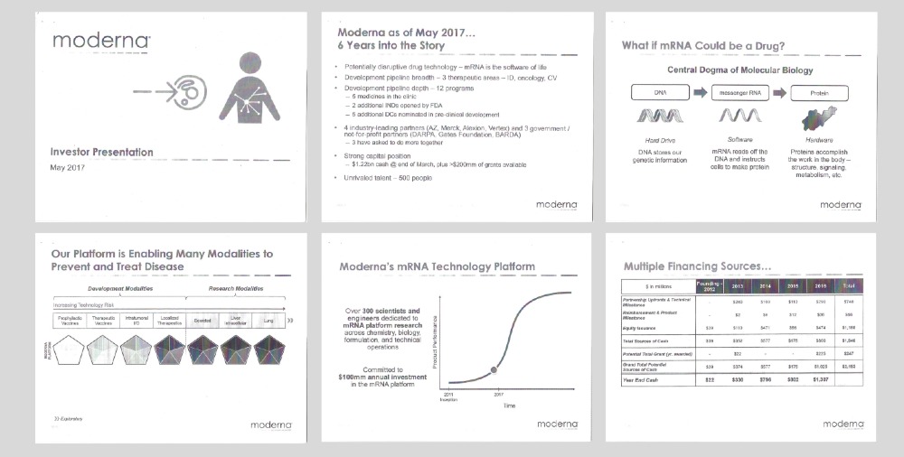
Images credit to Business Insider
Considering that Moderna is a pharmaceutical company, numbers are crucial when presenting to investors. But instead of just throwing figures on the slides, they added graphs, photos, and charts to simplify what their company is offering. Plus, they also included the results of their study and their current financials. As for their branding, they made sure to put the Moderna logo on every slide and stayed consistent by using gray.
14. Postmates
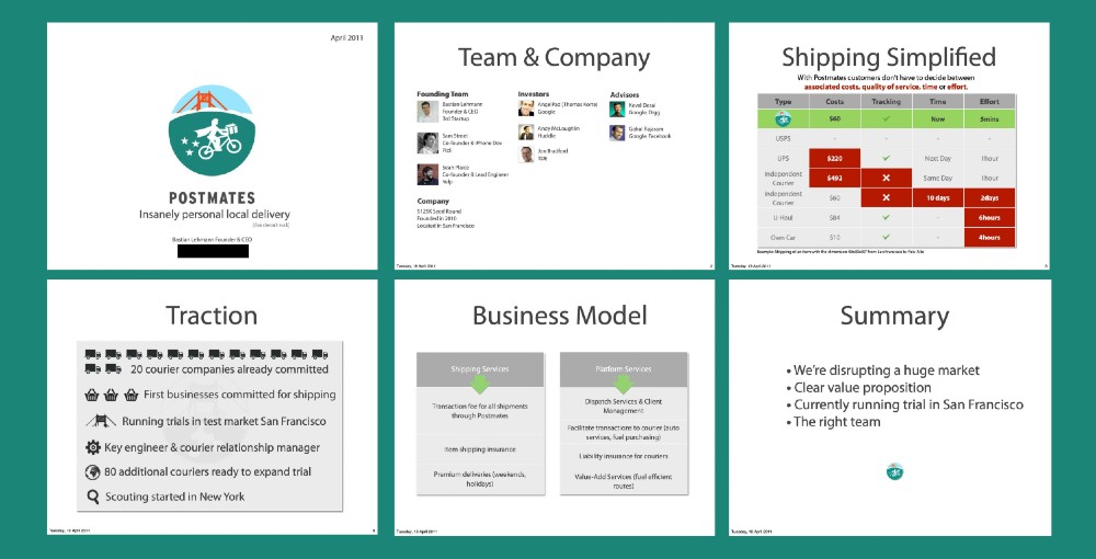
Images credit to Business Insider
While Postmates stuck to gray for most of their pitch deck, they integrated the colors of their old logo into the design. Once again, icons are crucial to pitch deck designs like this. In terms of the structure, Postmates makes it easy to follow their presentation and messaging. Plus, they used icons to anchor the text in the Traction slide, which is a fun way to keep investors interested. With that said, you can look to this example for a professional and uncomplicated pitch deck design.
15. Waze
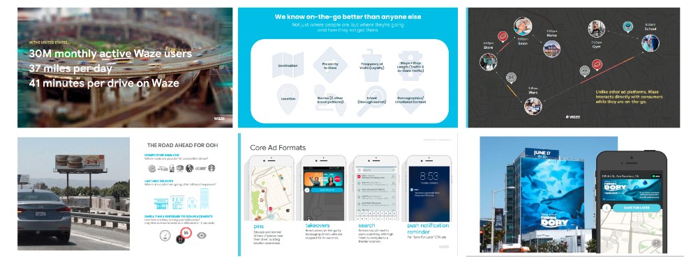
Images credit to Business Insider
Here’s another modern pitch deck design you can copy. Since it’s important to integrate your brand’s identity into your pitch deck, Waze used their signature blue and added their logo on several sides. Plus, their use of icons and illustrations also serve as inspiration for future pitch deck designs. The images are an excellent way to balance out the text on every slide. After all, you don’t want text-heavy slides on your pitch deck. Instead, let the pitch deck act as a way to communicate to investors in one glance, but give them context as you explain further.
Final Thoughts
It’s true that some pitch deck designs on this list are outdated, but their structure and format sold their story well to investors. And when you add amazing graphic design to the equation, you have a winner in your hands. This is why graphic design is crucial in pitch deck creations.
For that, you need Penji’s unlimited graphic design service. If you found a pitch deck design inspiration for your startup and want to make it better, subscribe to Penji today. Get the pitch deck design that will make your investors and clients say yes.
About the author

Katrina Pascual
Katrina is a content writer specializing in graphic design, marketing, social media, and technology. In her spare time, she writes monthly personal blogs to practice her craft.


