Choosing an octopus for a logo might sound unusual. However, an octopus is an excellent choice for a business logo due to its remarkable adaptability. Octopuses are known for quickly maneuvering their way in various environments. The animal’s eight arms are an indication that octopuses move independently. These symbolisms could imply that your brand is flexible and versatile. An octopus can represent a quick-thinking and problem-solving brand that adapts to a volatile market. To establish trust and authority in your industry, here are 15 octopus logos for inspiration.
1. Busy Squid Cafe
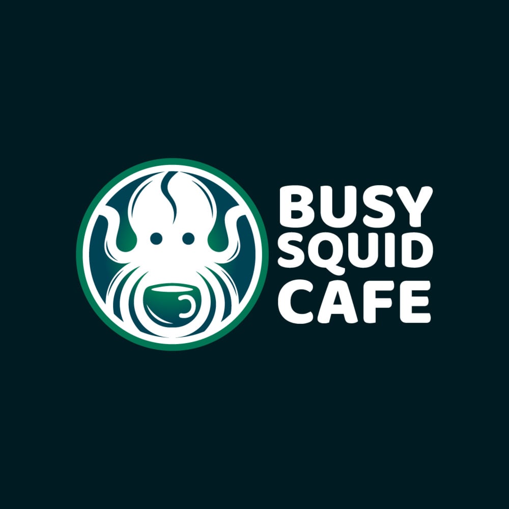
The octopus logo features a vibrant green circle background that exudes freshness and vitality, perfect for a cafe business. Against this backdrop, a beautifully crafted octopus takes center stage, portrayed in clean white space. With its intricate details, the octopus is positioned with its tentacles gracefully wrapped around a vivid green coffee cup. The octopus’s tentacles, delicately embracing the cup, convey a sense of care and attention.
2. Calamari Resort Hotel
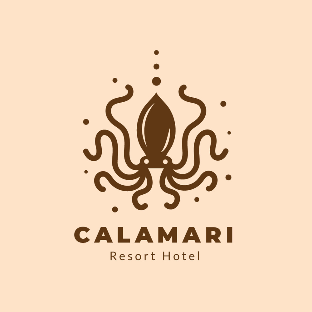
The Calamari Resort Hotel logo shows an image of a brown octopus showing off its eight tentacles. The beautiful curlicues of the tentacles exude nothing but class and sophistication, apt for a resort hotel business. The dots, especially the three dots aligned at the top with varying sizes, make this logo captivating. These dots balance the different shapes in this logo, giving this octopus logo design a unique touch. This logo design is inviting enough for a resort hotel business to welcome guests into its comfortable space.
3. DVL FSH Clothing Line
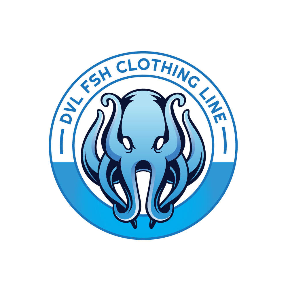
This octopus logo design for DVL FSH Clothing Line shows off an air of fun and playful rebelliousness. The seemingly angry octopus with beaming white eyes represents the streetwear culture that originated in the 1990s. However, the image of an octopus in different blue gradients implies that this brand caters to the younger demographic. The octopus’s tentacles are also intertwined at the bottom, giving this image a unique twist. Although blue dominates this design, the black highlights give this logo a nice contrast.
4. Octo Depot House Cleaning Service
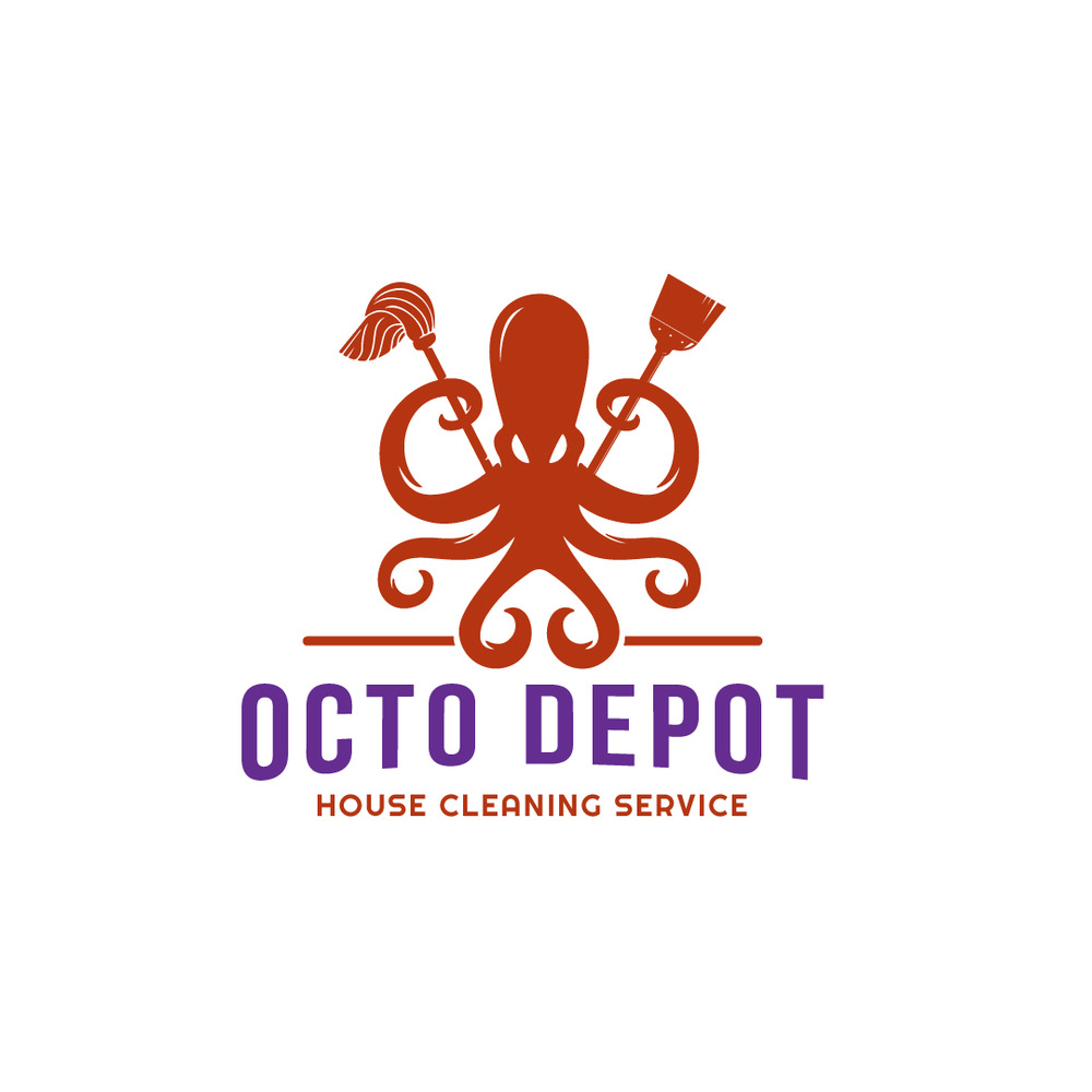
The striking red octopus logo captures attention with its bold color and dynamic design. The octopus, depicted in vivid red, stands out against a contrasting background. Its prominent white eyes bring a sense of liveliness and attentiveness. This industrious creature confidently holds a mop and broom in two of its tentacles, symbolizing its role in the house cleaning service industry. The logo conveys efficiency, thoroughness, and reliability, representing the company’s commitment to providing top-notch cleaning services.
5. Octo Pie
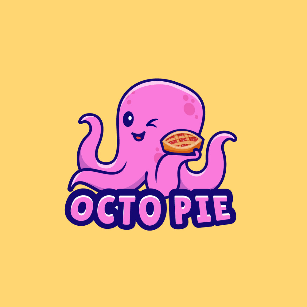
This is the octopus logo you want to see if you’re looking for delicious and fluffy pies and pastries. The Octo Pie logo exudes a welcoming atmosphere that seems to lure people with a sweet tooth. The happy and joyful octopus winking image shows a playful brand personality fit for a pie business. Choosing a pastel pink color palette is the best way to represent a brand that caters to hungry consumers. That’s because pink exudes a nurturing and playful feeling. The octopus holding a pie in contrasting colors is another way to say, “Hey, come in and try our delicious pies!”
6. Octo Push
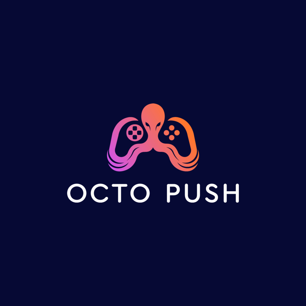
The Octo Push logo captures the essence of a video game company that caters to avid players. Resembling a sleek video game console, the octopus’s tentacles intertwine to form the console’s shape, creating a visually engaging design. The vibrant orange and purple gradients evoke a sense of excitement and adventure, reflecting the immersive gaming world. The tentacles cleverly incorporate buttons on both sides, symbolizing interactivity and gameplay. This logo represents the company’s dedication to crafting captivating video games.
7. OctoClub
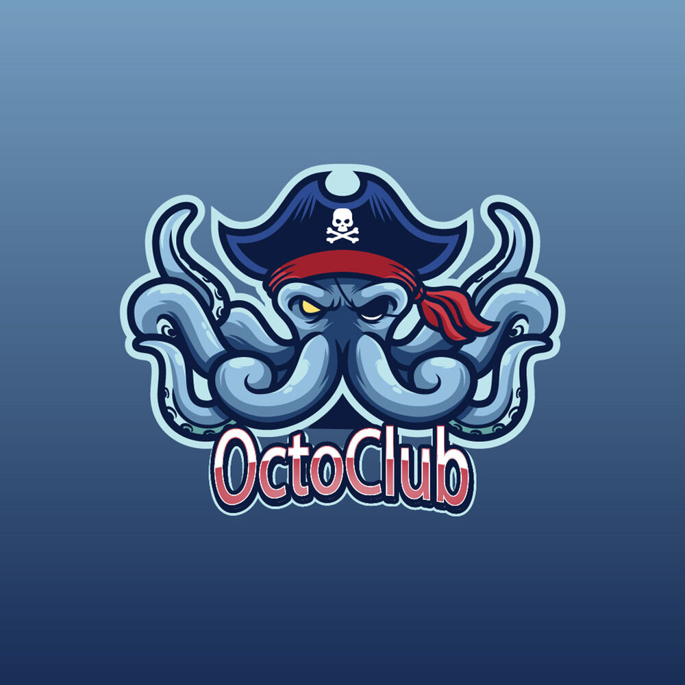
If you run a club, establishing authority through your logo could get more patrons through your door. And this OctoClub logo is an exemplary design that embodies a playful and adventurous spirit. It takes on a mischievous pirate persona, with a matching blue pirate and red bandana. A black eye patch accentuates its fierce gaze. Meanwhile, the other eye, a vibrant yellow, adds a touch of intensity. The logo’s typography is artfully designed, featuring contrasting red and white colors that evoke a sense of excitement and boldness.
8. Polpo Film Production
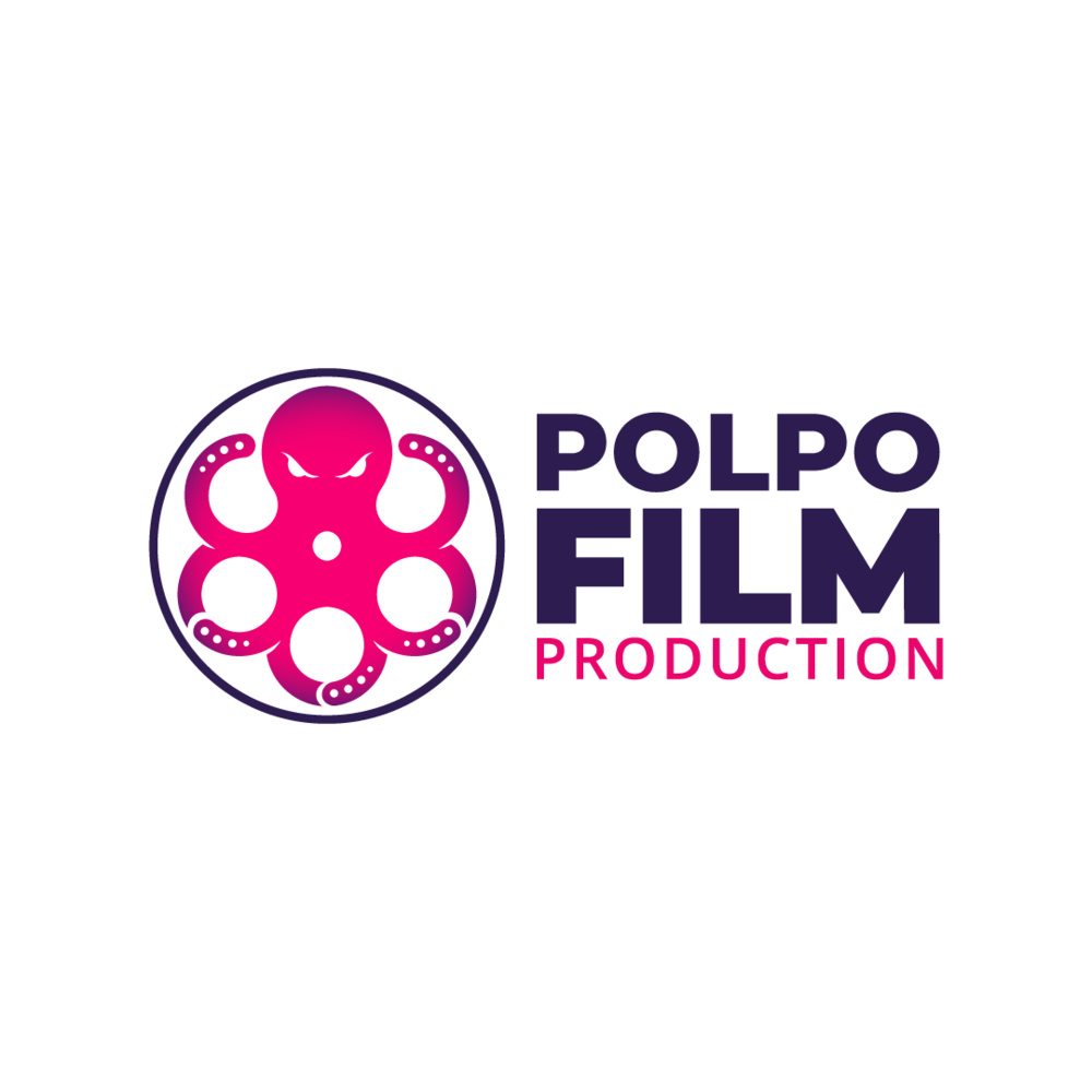
The Polpo Film Production captures the essence of vintage cinema with a modern twist. Resembling an old movie film roll, the logo showcases an octopus silhouette in a vibrant shade of bright pink. The octopus’s tentacles resemble the film roll’s holes, invoking a sense of adaptability. This symbolism is apt for a film production company due to the industry’s fickle demands and fast-paced nature. The contrasting dark blue background adds depth and drama, creating a visually striking contrast. The logo’s typography combines bold and light-faced fonts, evoking a sense of classic elegance and contemporary style.
9. Sannakji Restaurant
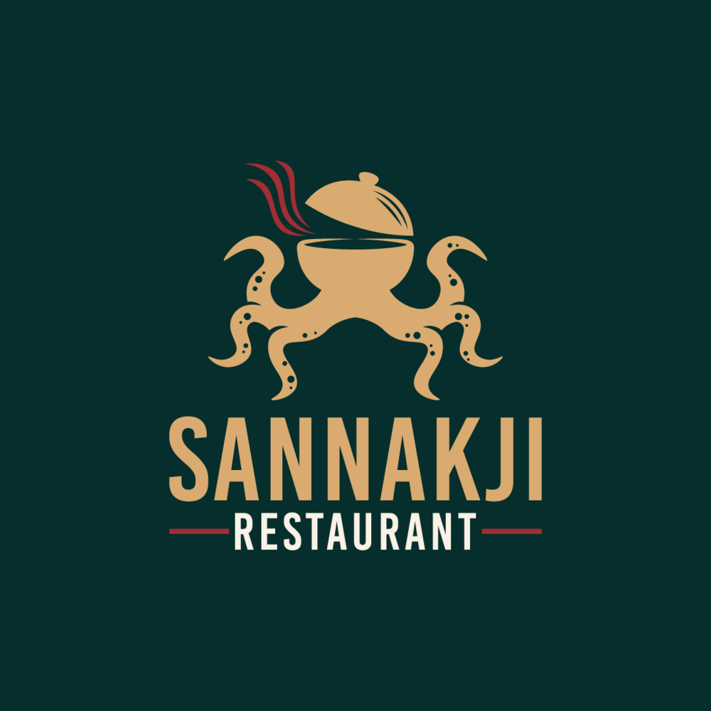
The captivating Sannakji Restaurant octopus logo represents a delightful Japanese restaurant experience. It captures the essence of their specialty: hot pot cuisine. The octopus takes on the form of a sizzling hot pot, complete with a half-open lid and steam seemingly coming out of it. Red steam billows out, evoking the aroma and warmth of the flavorful broth. The octopus’s tentacles elegantly extend downward, serving as the base of the hot pot. It symbolizes the foundation of the restaurant’s culinary mastery. This logo design embodies the essence of Japanese cuisine, inviting patrons to savor the rich and authentic flavors.
10. Tako Love
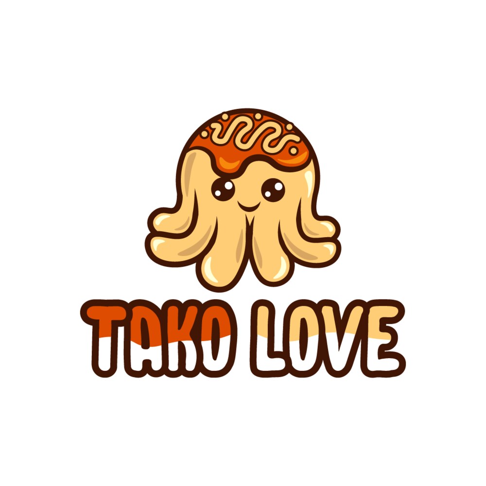
The delightful octopus logo for the Takoyaki restaurant is a burst of joy and playfulness. The Tako Love logo dons an octopus image in a vibrant yellow shade. It shows a smiling face that exudes happiness. Its head is cleverly designed to resemble a mouthwatering takoyaki ball, colored in a delicious shade of orange. The logo is further enhanced by a stylized font that complements the playful theme, capturing the attention of potential customers. This whimsical logo perfectly encapsulates the cheerful and appetizing atmosphere of the restaurant, inviting patrons to indulge in takoyaki flavors.
11. AquaOcto

This playful logo is for an exciting ocean park for kids and kids at heart. You’ll see a dynamic and vibrant Octopus in orange and blue with intertwining tentacles. This symbolizes adaptability and fluidity, perfect for representing the water element. The colors of the Octopus also show the colors of the ocean, mainly luring children to visit the ocean park.
12. Textacorps
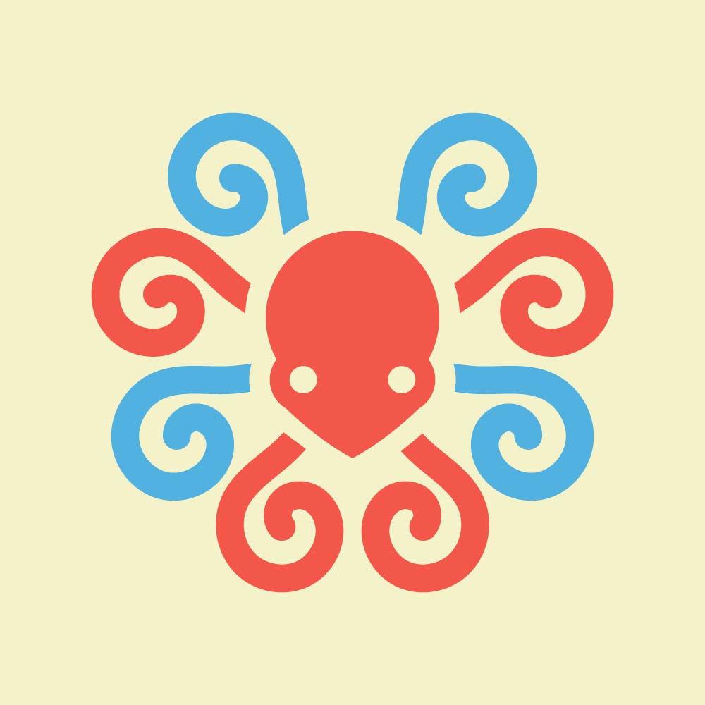
This logo is for a textile company, Textacorps. It shows off an abstract octopus with intricate patterns that resemble its tentacles. These colorful patterns symbolize the beautiful colors, designs, and textures of the various textiles they sell. It also represents craftsmanship, creativity, and precision, representing Textacorps’s eye for meticulous detail and imaginative solutions to the textile industry.
13. Ink Octo
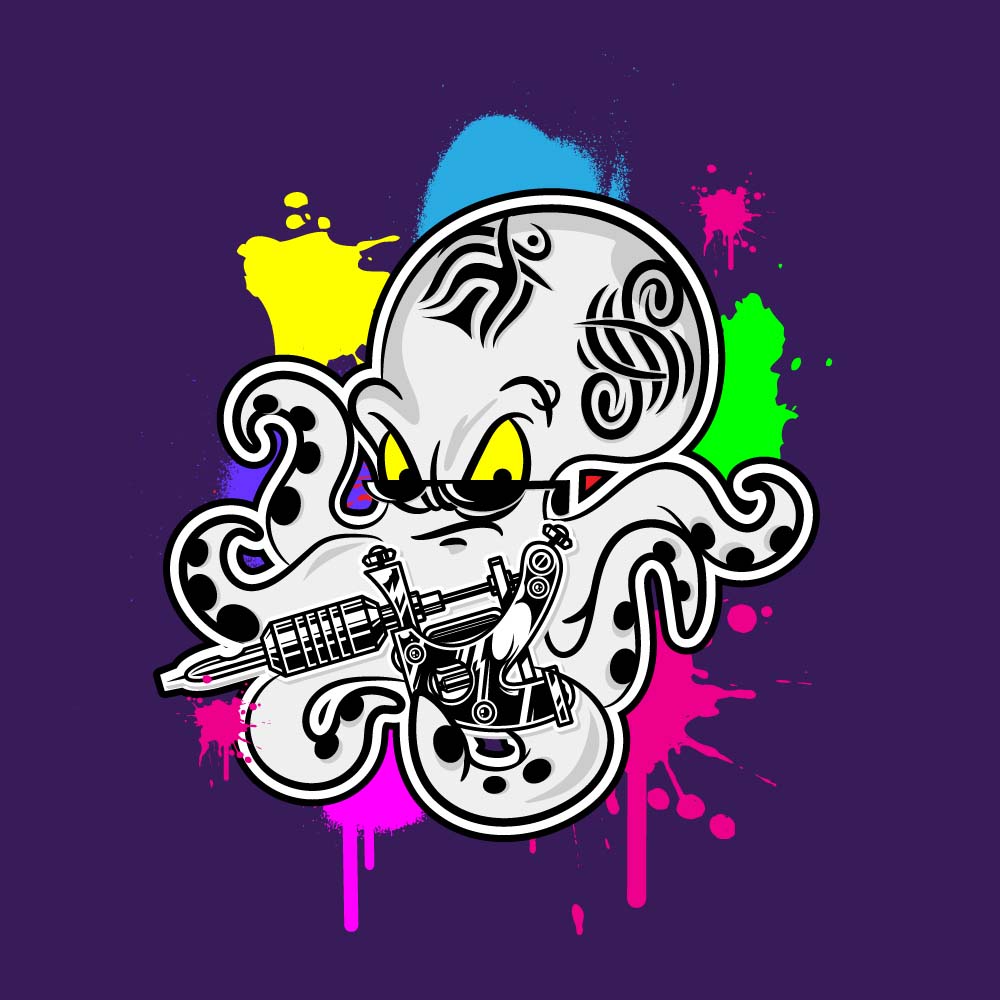
Ink Octo dons a graffiti-like logo design with a relaxed and hip octopus, sunglasses, and some tribal patterns that look like tattoos. This design is an excellent way to represent a tattoo studio, which shows off street-style art. The dark colors, mixed with vibrant ones, represent the kaleidoscopic nature of tattoos, body painting, and art.
14. Marine OctoGuard

This logo is for a nonprofit organization aiming to protect marine life and the waters that sustain it. Marine OctoGuard shows off an octopus with its tentacles forming a protective shield. This logo design embodies the commitment to safeguarding marine life. Marine OctoGuard upholds its role as a responsible steward of our oceans.
15. OctoFusion Delights

OctoFusion Delights is a seafood restaurant that serves fresh fish, squid, shrimp, crab, and more. The logo design is a happy octopus that looks like a plate, with its tentacles resembling a fork and spoon on both sides. The stimulating teal, orange, purple, and yellow colors celebrate the fusion of flavors and creativity.
Conclusion
With its unique qualities, the octopus can offer a range of potential meanings and associations for a logo design. It’s essential to look at your brand’s personality and values and see if they align with what octopuses represent. While these octopus logos seem easy to replicate, research and logo design techniques are required to create an impactful one.
Need help with your octopus logo? Work with Penji for the most unique, relevant, memorable octopus logos. Whether you need unlimited designs or one-off projects, Penji has every plan for you. Here’s a 15 percent discount to get you started.
About the author
Table of Contents
- 1. Busy Squid Cafe
- 2. Calamari Resort Hotel
- 3. DVL FSH Clothing Line
- 4. Octo Depot House Cleaning Service
- 5. Octo Pie
- 6. Octo Push
- 7. OctoClub
- 8. Polpo Film Production
- 9. Sannakji Restaurant
- 10. Tako Love
- 11. AquaOcto
- 12. Textacorps
- 13. Ink Octo
- 14. Marine OctoGuard
- 15. OctoFusion Delights
- Conclusion


