
Are you uncertain about the design of your logo for a business name that begins with the letter Q? Letter Q business names are rare to see, making them inherently distinctive. So, when you search for letter Q logo designs, you might find a limited number of options for inspiration.
Well, your quest for the best letter Q logo ideas is over. Get design inspiration below, which our professional design team made! And if you’re interested in getting one of these logos, scroll down to see why Penji is your best choice.
Different Types of Logos

Before we head over to the letter Q logos, know what kind of logo you might receive from our designers.
- Lettermark or Monogram – This type of logo consists of the letters of your business. Usually, most companies would use acronyms or abbreviations. It’s ideal to have this logo if you have a long name. One famous letter Q logo that dons this logo style is QVC.
- Wordmark – Your business name acts as the logo for this type. Although many logos are wordmarks, one way designers can make them unique to your business is through colors and fonts. One Q logo that has a wordmark is Quiznos.
- Pictorial or Abstract – Pictorial and abstract logos would use imagery instead of words or letters. Sometimes, designers would combine pictures and wordmarks or letter marks. The difference between them is that pictorials usually are related to the business name or brand. Meanwhile, abstract logos use imagery that may seem unrelated to the business name but have a deeper meaning. The Quiksilver logo is an example of a pictorial/abstract mark.
- Mascot – The mascot is different from the pictorial/abstract logo because it uses a character or a mascot to represent the brand. The Quaker Man is an example of a mascot logo for the Quaker Oats logo.
- Combination Mark – As the name suggests, the combination mark combines any of the types of logo above. For example, you can have a pictorial and wordmark or mix it up with a letter mark and abstract. The Qantas Airways logo uses a combination mark, wherein Qantas uses a wordmark and a pictorial mark, the airplane fin.
What Other Factors to Consider When Creating a Logo?
Now that we’ve discussed what logo types your Q logo can take form in, here’s what else you should remember when designing a logo.
1. Simplicity
When you see the logo design examples below and from some brands we’ve mentioned, you’ll notice they’re all simple. You don’t want to complicate the logo design by sprinkling too many elements that would confuse your target audience. You can stick to the basics of what your brand and industry is all about.
If you’re planning on an abstract or pictorial mark, choose an image that represents your brand or will intrigue your target audience. But if you’re going for intriguing, make sure that the image still has relevance to your business or identity.
2. Unique
One important principle in logo design is uniqueness. Your business needs to stand out, and copying an existing logo design is not only tacky but could be grounds for legal issues. Having a unique logo means a noticeable logo that represents your overall brand identity.
The process of designing a logo can be prolonged because of this principle. After all, you or your designer should conduct comprehensive research to ensure that your envisioned logo doesn’t have similar concepts to an existing one.
3. Relevance
Speaking of relevance, your logo should possess this characteristic. Relevance refers to the image you use in your logo. This applies to pictorial or abstract logo types. For instance, if your business name has the name “Quill.” Going for a quill pen will certainly get you noticed.
But relevance isn’t just about the image. It could also refer to the font used. For example, if you’re a tech company, a sans-serif font would be ideal to indicate modernity and forward-thinking ideals.
4. Versatility and Scalability
Do you ever notice that some branded logos are still recognizable without the brand name or the added imagery? That’s where versatility comes in. This is appropriate for businesses using combination marks.
That’s why it’s important to have custom and unique logos. This way, in whatever form your logo appears, it would still be familiar to your target audience and customers.
5. Timeless
Trends come and go, but your logo shouldn’t look outdated once new design trends pop up. Fonts and imagery contribute to the timelessness of your logo’s appearance. Sans-serif logos are your best bet in achieving a timeless look. Meanwhile, you can also have an illustration or abstract visual for your imagery!
1. Qabalas Antique
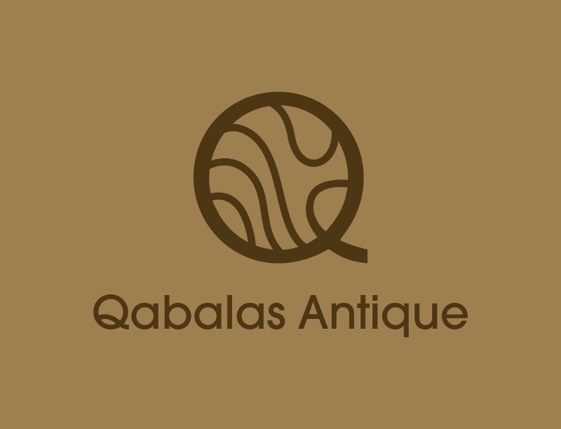
Stick to the essence of your business like this logo for Qabalas Antique. At first glance, it looks like a letter Q logo with lines inside it. However, the wavy lines are similar to what you see in antique vases or items. Plus, the colors give the logo an old-timey look.
Professionally-made Q logos to promote your brand
Create your logo project today and get your concepts tomorrow


2. Quadra Industries
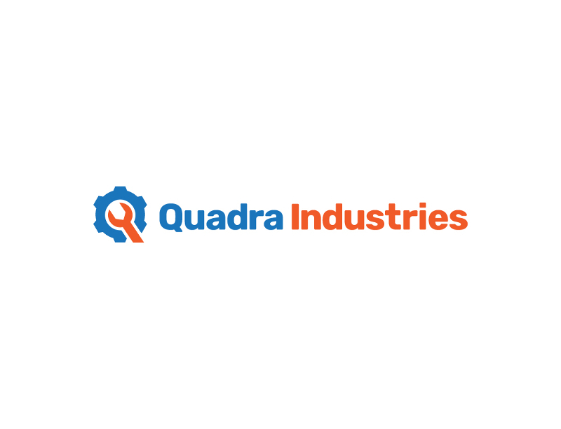
If you’re in the industrial sector, the Quadra Industries logo should serve as an inspiration for your business. The use of tools helps enhance their branding. In addition, the colors are complementary, and they would represent stability, trustworthiness, and innovation, which the business may hope to achieve.
3. Quadrillion Capitals
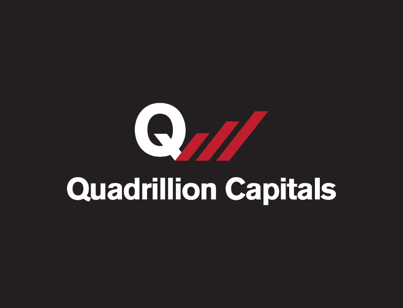
Show growth like this logo for Quadrillion Capitals. When it comes to investment or finance logos, you want to demonstrate that anyone investing with them will see growth. As for the chart, red is attention-grabbing, and it gives life to the logo.
4. Quarters Biz Marketing
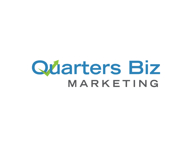
If you want to be the go-to and leading marketing agency, why not look at this logo for inspiration? The Quarters Biz Marketing logo is fairly simple, but the font used is professional and impactful, which could represent their business. Aside from that, blue may signify that they are a reliable and trustworthy agency. Plus, the green upwards arrow means growth.
5. Quartz Tech Services
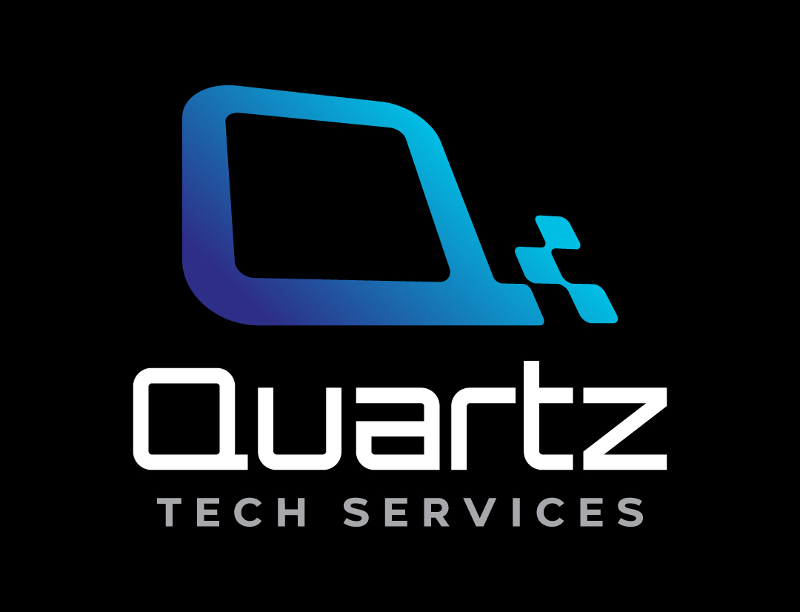
If you’re in the tech industry, why not look at the Quartz Tech Services logo? The symbol beside the Q seems like the imagery of computer networks, which you would usually see in diagrams. Aside from that, the font also makes the logo look modern.
6. Quatro Cantos Packaging
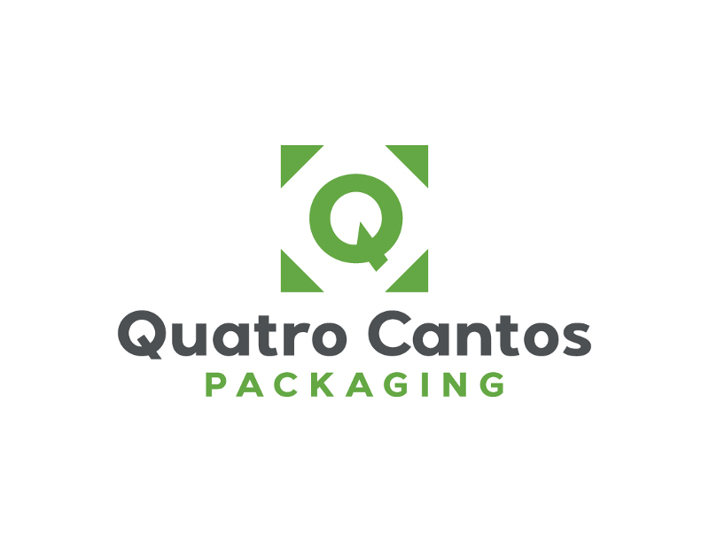
Here’s one simple, and appropriate letter Q logo. Quatro Cantos (four corners) strengthened their branding through the logo based on the imagery. The Q is situated at the center. Meanwhile, the four corners are represented by little triangles, making a square that looks like a package.
7. Qubits Network
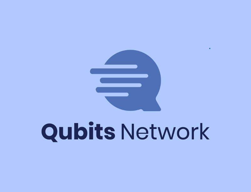
Here’s another version of a tech logo you can use as inspiration. The Qubits Network logo is unique and modern. The rounded lines in the Q may refer to the lines or networks you might see in qubit diagrams or charts.
8. Queensville Hospital
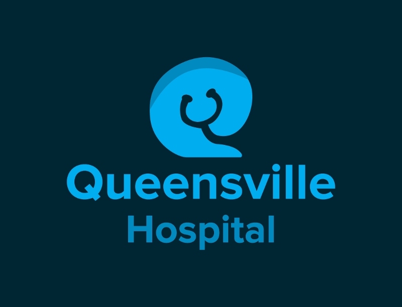
Hospital logos tend to have the cross, an illustration of the hospital, or the Caduceus. This logo for Queensville Hospital is different because it uses a stethoscope. It appears that the stethoscope forms the letter Q on the figure behind it. This is one way you want to be unique from other medical institutions without losing your branding.
9. Quesodillas Dairy
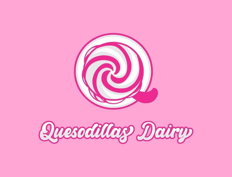
If you have a name that sounds like food but wants to veer away from that, use imagery to strengthen your brand, like Quesodillas Dairy. Since Quesodillas sounds like quesadillas, having the imagery of ice cream, yogurt, or swirled dairy will help customers realize that you’re selling dairy products. Plus, the added pink is reminiscent of brands that sell sweets, like Baskin Robbins and Trolli.
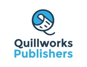
10. Quillworks Publishers
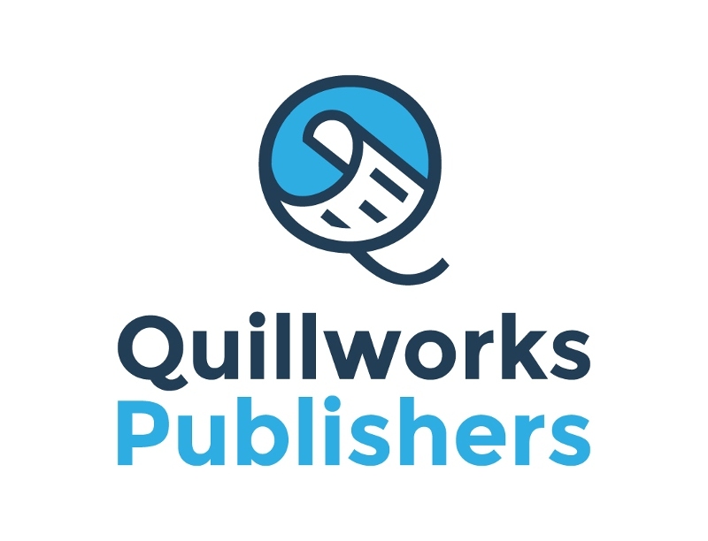
Although the actual quill doesn’t appear, the scroll imagery serves as the alternative in the logo for Quillworks Publishers. But it makes sense that they used the scroll for the imagery because they publish books, and it also represents the written word. Plus, the scroll inside the Q is a unique way of adding imagery inside the letter.
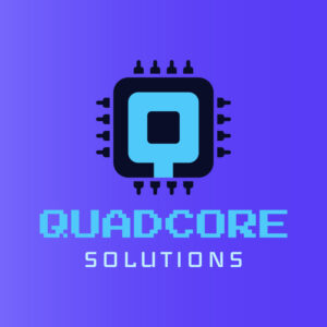
11. Quad Core Solutions

Your creativity in showcasing an identifying brand mark is essential when making a logo. So here is a unique q logo design for Quad Core Solutions to help you get started with your own company logo. Every element is related to information technology, with imagery of a quad-core chip being the focal point.
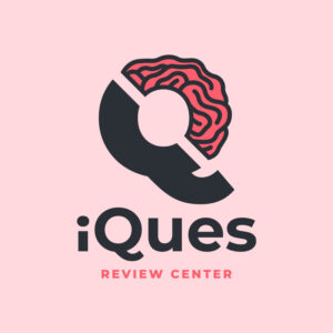
12. iQues Review Center

The following example features a wordplay of two words dominantly used in a review or tutorial center. The “iQues” combines intelligence quotient (IQ) and question. Meanwhile, the logo itself is divided into two sections. One is a solid drawing, while the other half is a brain illustration. Overall, it tells the audience the purpose of the review center, which is to give students mock exams and tips on answering questions effectively.
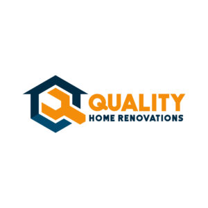
13. Quality Home Renovations

Here’s a simple yet creative logo design you can follow. Quality Home Renovations logo integrates the letter Q with images of a house and tool. It demonstrates the company’s goal to provide high-quality home renovation services to its clients.
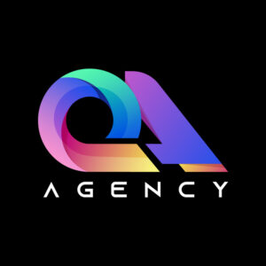
14. QA Agency
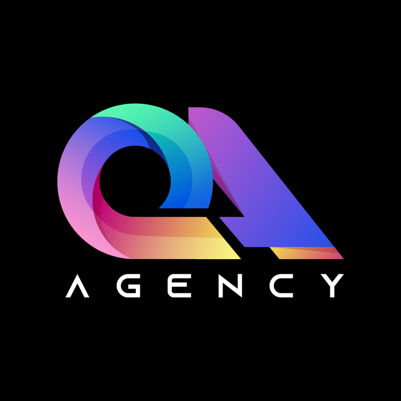
Draw inspiration from the colorful QA Agency logo if you want your business to stand out in the entertainment industry. The rainbow-colored brand name is unique and eye-catching. The designer chose a black background for a more balanced look, making the logo stand out from the rest.
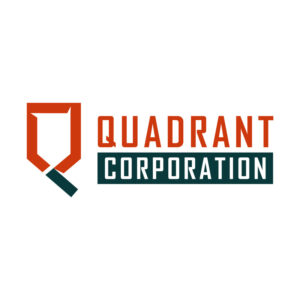
15. Quadrant Corporation
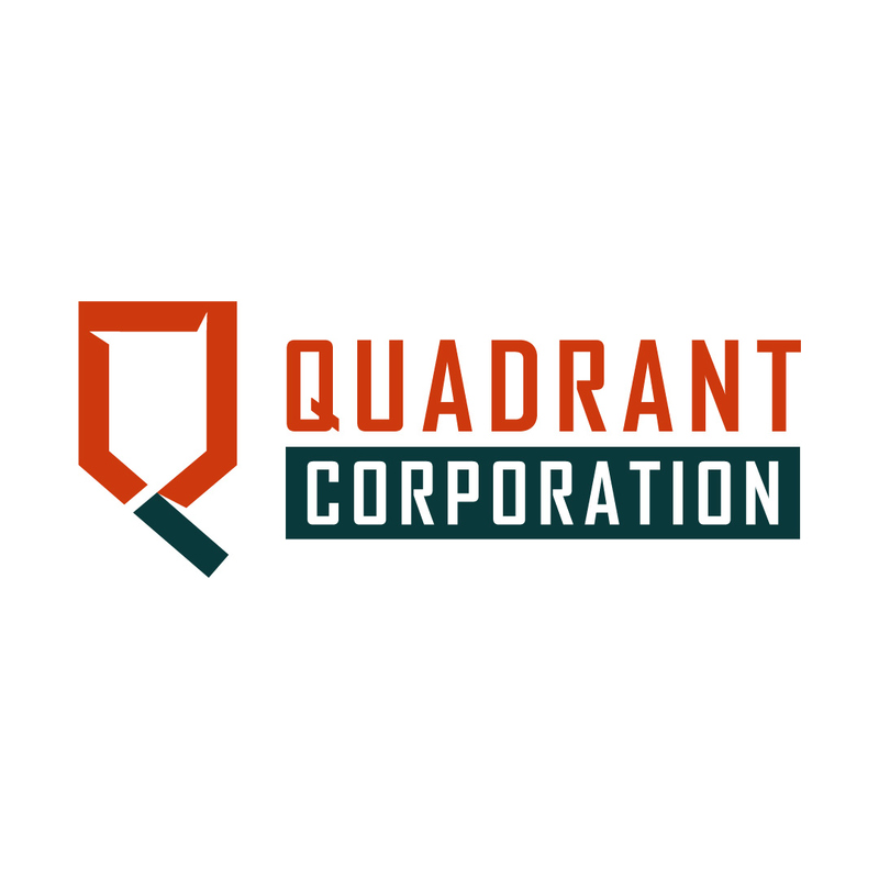
Color selection has a significant impact on logo design. With that said, red and black are considered classic and the most flexible combination. The plain iconic mark matches the basic and user-friendly font style. Create a remarkable logo using this pattern if you’re looking for an effortless design.
16. Q Productions
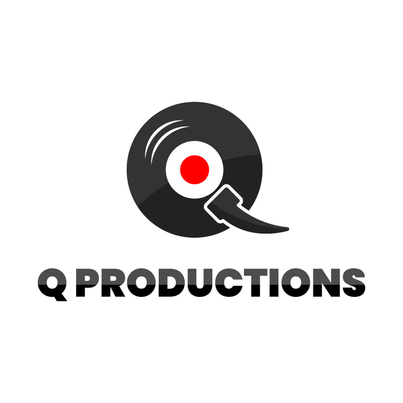
Go retro with this music and sound production agency logo design. The letter q is illustrated using analog sound storage called the phonograph record as the inspiration. Copy this logo idea if you are fascinated with a retro brand image.
17.Quickstart Consultants
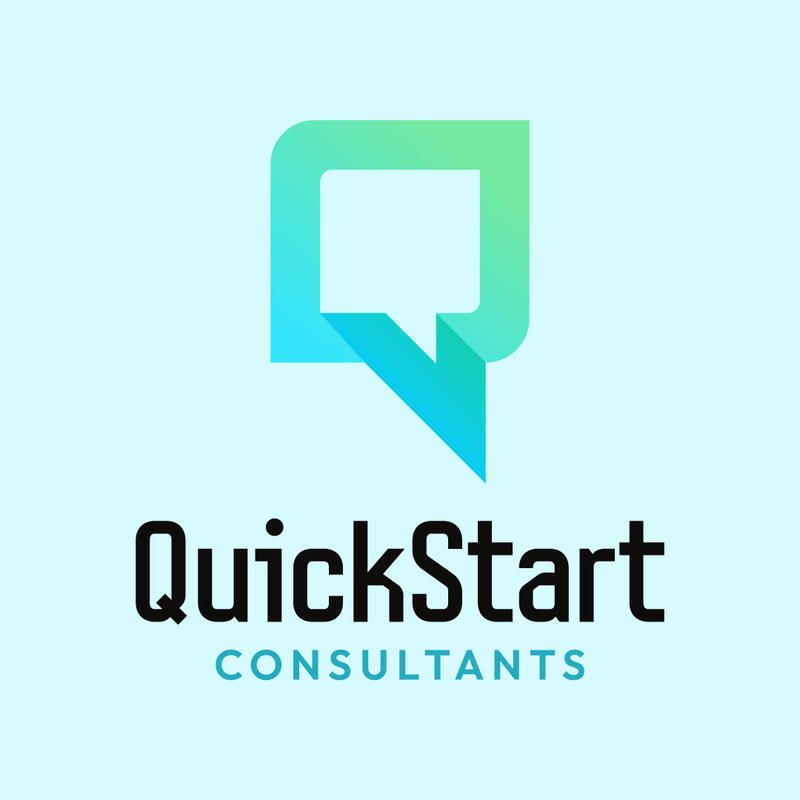
The Quickstart Consultants’ gradient green logo is refreshingly effortless. It has a lightning image effect that symbolizes the efficient services provided by a company. Similarly, the pointed tip of the letter Q means that a consulting firm comprises a team of experts with strong academic and industry backgrounds.
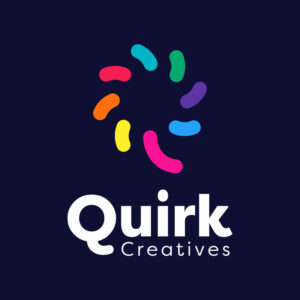
18. Quirk Creatives

Young and quirky – that’s how we describe this modern logo design. The abstract rendition of the icon and its color is an impressive quality of the Quirk Creatives logo. The colorful bean-like drawings make up a “Q,” making it the freshest idea among the symbols in this collection.
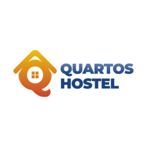
19. Quartos Hostel

The brand name is inspired by the Portuguese term “quarto,” which means bedroom or simply room. A house image characterizes the attractive logo with four boxes in it. The size of the imagery and text is flexible or can be altered depending on the promotional and branding materials you create.
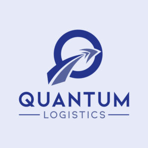
20. Quantum Logistics
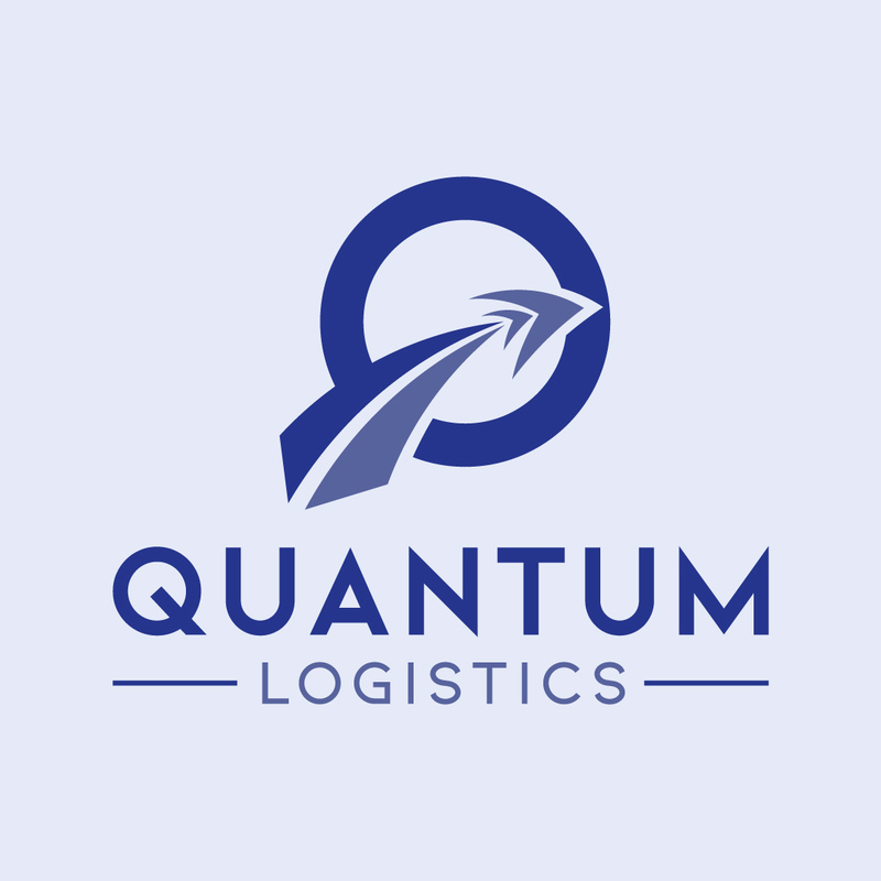
Showcase your dream of a fastest-growing business through this next q logo design inspiration. The two upward arrows mean fast and efficient logistic services and growth. Logistic designs like this apply to any business of any type and size.
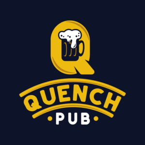
21. Quench Pub

Here’s another inspiring food logo design for a brand name that starts with the letter Q. The bright yellow text is a perfect example of an impressive logo design. The iconic glass of beer is an element that attracts plenty of potential customers.
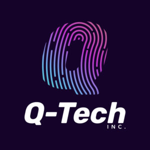
22. Q-Tech Inc.

This innovative logo boosts a biometric fingerprint illustration. The design conveys that Q-tech is a modern IT company ready to provide excellent and innovative services to potential customers. In short, the design makes a perfect example if you want to keep up with the latest technology trends in the business today.
23. Qore Entertainment
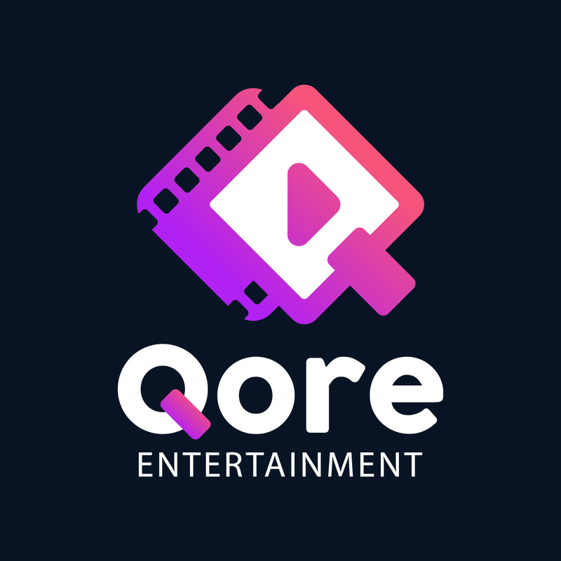
The camera and film strip is the focal point of the Qore Entertainment logo. Aside from that, the cheerful color palette creates a positive first impression on the target market. This design deserves a spot in your mood board, especially when you’re in a similar industry or with similar preferences.
24. Quick Fit Gym
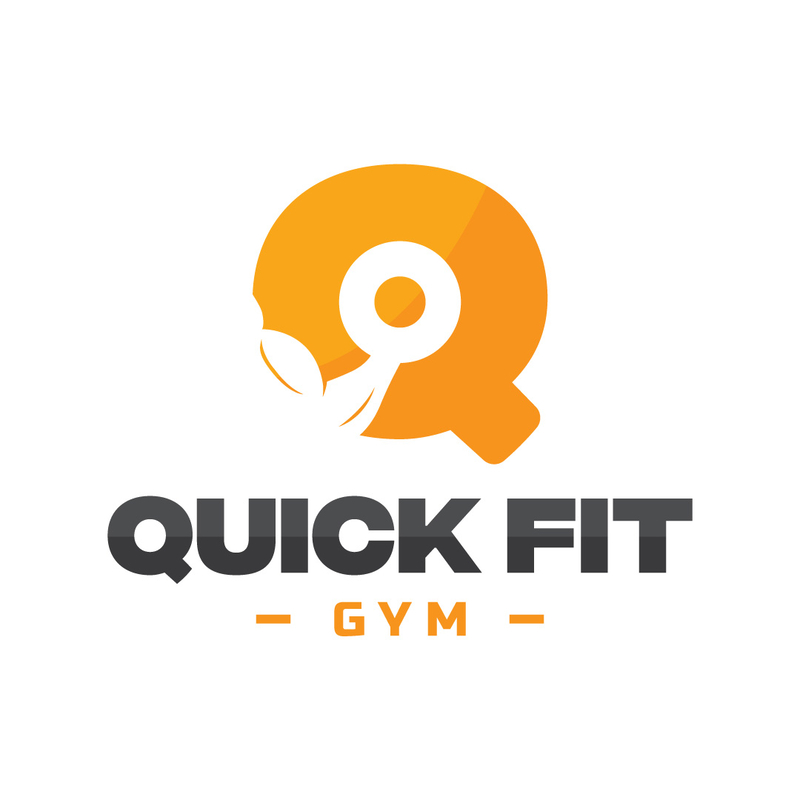
The circular logo of Quick Fit Gym shows a profile of a person doing a workout. It has a lovely color tone, too. The two main components make design a perfect example for a fitness center operator searching for a suitable logo.
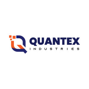
25. Quantex Industries

This precise industrial logo is worth emulating because of its flexible elements. Both the icon and the text are easy to find. If you’re considering an effortless logo design, check out this one from Quantex Industries.
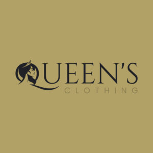
26. Queen’s Clothing

Your logo needs to look good as the clothes and accessories you sell. In other words, it has to communicate your sense of style, especially if the royals inspire your brand name in this logo. Besides, the image, text, and colors fit perfectly with each other.
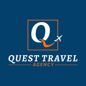
27. Quest Travel Agency
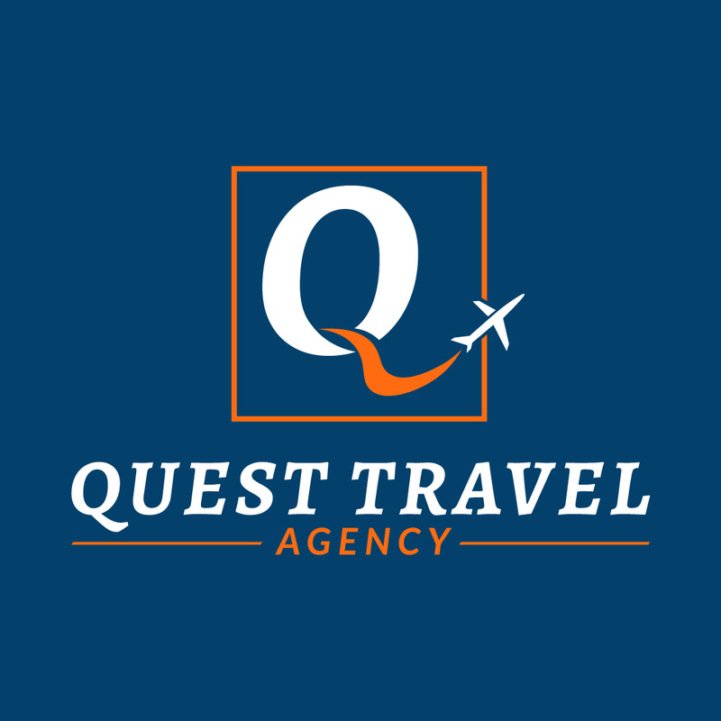
A well-planned logo attracts more people planning to book their much-awaited travel with your agency. Since it belongs to the tourism sector, you must be constantly creative and optimistic. Save this design to help you create an awesome logo for your own travel agency.
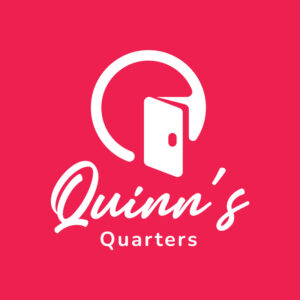
28. Quinn’s Quarters

This is the most attractive design on the list. First, the q logo with a door icon is a fantastic idea. Second, the color combination and font choices are well-defined. These qualities make the overall design attractive, relevant, and memorable.
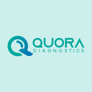
29. Quora Diagnostics

Determine your wellness status with Quora Diagnostics’ no-sweat logo design. Also, the light green color palette creates a relaxing feel for the audience. Placing the icon and text side by side makes it easier to adjust the size of the logo depending on the material you want to create.
30. Quarksoft Media
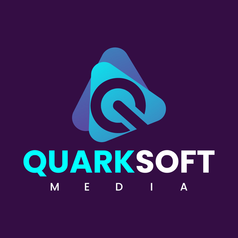
This purple logo for Quarksoft Media features a triangular illustration with an outline of the letter Q. The embossed letter also looks like a power button. End your search and hesitation. Just be brave and use more than one geometric shape into your q logo!
Where to Get A Business Logo?
- Use Graphic Design Tools – Canva and Adobe Express are the go-to DIY logo makers for small business owners. You don’t need prior design experience as these are intuitive tools to help you design simple and memorable logo designs.
- Hire Freelancers – If you’re not experienced with design and don’t have the eye for it, freelancers are the first alternative after DIY graphic design tools. They’re the ideal option because of their short-term commitment to projects.
- Subscribe to Graphic Design Services – Your brand identity doesn’t stop at logo creation. In fact, that’s where your visual branding identity journey begins. Your logo will be added to other visual assets, like business cards, stationeries, packaging, and more! This option is ideal for businesses looking for an affordable branding package or subscription! Here’s why you should hire Penji for logos and more!
Hiring Penji for Your Logos
Did you like the letter Q logo ideas above? If so, why not subscribe to Penji to get a letter Q logo for your company.
Letter Q logos are rare to see, but your logo would be the talk of the town or would catch your target audience’s attention when created by Penji designers. They will make sure to research your industry and competition and make a unique logo for your business. Entrust your graphic design needs to Penji while you sit back and wait for the fantastic designs you requested! Subscribe here now to get your designs!
About the author

Katrina Pascual
Katrina is a content writer specializing in graphic design, marketing, social media, and technology. In her spare time, she writes monthly personal blogs to practice her craft.
Table of Contents
- Different Types of Logos
- What Other Factors to Consider When Creating a Logo?
- 1. Simplicity
- 2. Unique
- 3. Relevance
- 4. Versatility and Scalability
- 5. Timeless
- 1. Qabalas Antique
- 2. Quadra Industries
- 3. Quadrillion Capitals
- 4. Quarters Biz Marketing
- 5. Quartz Tech Services
- 6. Quatro Cantos Packaging
- 7. Qubits Network
- 8. Queensville Hospital
- 9. Quesodillas Dairy
- 10. Quillworks Publishers
- 11. Quad Core Solutions
- 12. iQues Review Center
- 13. Quality Home Renovations
- 14. QA Agency
- 15. Quadrant Corporation
- 16. Q Productions
- 17.Quickstart Consultants
- 18. Quirk Creatives
- 19. Quartos Hostel
- 20. Quantum Logistics
- 21. Quench Pub
- 22. Q-Tech Inc.
- 23. Qore Entertainment
- 24. Quick Fit Gym
- 25. Quantex Industries
- 26. Queen’s Clothing
- 27. Quest Travel Agency
- 28. Quinn’s Quarters
- 29. Quora Diagnostics
- 30. Quarksoft Media
- Where to Get A Business Logo?
- Hiring Penji for Your Logos


