Every business owner dreams of getting as many customers as possible. To make this happen, the first step you need to take is to get the exceptional customized logo. If your brand name starts with the letter G, you’re in luck as we list here Penji’s best letter G logo designs.
1. Guyana Pollution Control Inc.
Lettermarks or monogram logos are a great way to instill recall in your customers. BBC, IBM, and CNN are some examples of these. In this logo for Guyana Pollution Control Inc., it is a cleverly designed combination of the first letters of the company name. This type of logo is easy to recognize, looks professional, and is highly scalable.
This means that it will still look legible whether you place this logo on a business card or a poster. The logo uses a light purple color, which is unexpected for a company dealing with pollution.
2. GR Concrete

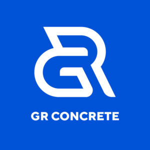
Another play on the brand name’s letters, this GR Concrete logo has a robust and solid feel. This matches the company’s business nature so well, which is crucial when designing logos. While it’s okay to think outside of the box, you also need to create it in a way that gives your audience an idea of what the business is about.
The color is spot on, as royal blue denotes authority, trust, and confidence. The construction industry should project these characteristics, and your logo should reflect this.
3. Giantic
This black against a neon green background logo undoubtedly stands out. The Giantic logo places high on the uniqueness scale because of this, plus the intriguing illustration it has. It is shaped like the letter G but with a hint of an elephant’s trunk, a true giant.
This type of logo gives out a trendy appeal that’s perfect for almost any business. But if your brand is in the fashion, restaurant/bar, or fitness niches, this would work really well.
4. Gamut

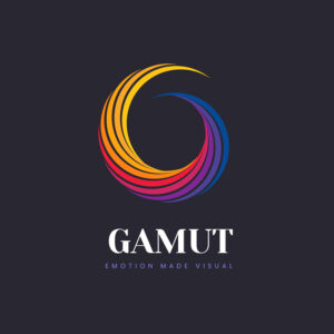
While the above logos use only one color, there’s nothing wrong with going all out. Gamut did this exactly with its logo that uses multiple colors. One of the “rules” in logo designing is to use a maximum of three colors. This company made an exception to this rule and went ahead with a rainbow.
And looking at it will make you think that they indeed broke the rule beautifully. The primary colors, the dark background, and the striking font contributed to this letter G logo design’s overall appeal.
5. Grand Wing

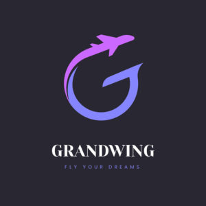
As stated earlier, it’s a good idea to add an identifying element to your logo. This is especially useful if you’re a startup. In Grand Wing’s case, they included an airplane icon in theirs. Their tagline, “Fly Your Dreams” is reflected in the logo as we can see the airplane soaring up.
It also added the letter G to the logo, making it even more charming. It uses different shades of violet, which effectively depicts bravery, wisdom, and stability.
6. Gun Stop

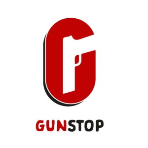
Another excellent example of showing what your business is about in your logo. This Gun Stop logo has a gun on it and forms the letter G perfectly well. This is good if you’re aiming for scalability, as you can place it on a variety of channels: T-shirts, letterhead, billboards, and many more.
The color combination of red and black fits the brand to a tee. Red is commonly associated with war, courage, and vigor, while black exudes power, status, and sophistication.
7. Good Sheep

Orange is a good choice for a logo design color. It is bright, dynamic, energetic, and outright cheerful. This Good Sheep logo fits the brand perfectly, as it is used by many food and beverage companies. It is conducive to quenching your thirst or satisfying a craving.
This logo has a letter G icon in it with shapes resembling sheep’s horns. Since the brand name is Good Sheep, it isn’t in any way intimidating or scary. On the contrary, this logo exudes warmth and friendliness all over.
8. Gravitea
One of the most deserving in this list of the best letter G logos is this one from Gravitea. It uses an image of the top of a drink with a straw to form the shape of the letter G. It ranks high on the appeal chart with its fantastic choice of illustration, fonts, and colors.
The dark background suitably emphasizes the logo to make it easily recognizable. The orange adds an attractive accent to balance the melancholy feel of the logo. The font is one of the most creative on this list, adding more class and sophistication to the logo.
9. G-Smack

Designed for a tech company, this G-Smack logo projects movement and speed. It has that authoritative and trustworthy feel you need if you’re in the same business. Like many of the logos in this list, it is shaped like the letter G, with the colors red, black, and white as its primary colors.
The grey background gives it an air of balance and neutrality. You can also use this color if you want to illustrate mystery, intellect, and a touch of class.
10. Green Leaf

Another excellent example of a letter G logo list is Green Leaf. As its name suggests, it has a green leaf on it beautifully incorporated into the letter G. This type of logo is advantageous if you want an instant recall, even if your brand name isn’t in the picture.
This company has a friendly and approachable brand identity, and its logo reflects this excellently. Using only lowercase letters in it adds a casual appeal. Lowercase letters are a good recommendation if your company caters to children, such as clothing, preschools, or food and drinks.
11. Galleons Marina

With the letter G shaped like a shrimp, this logo design was created for Galleons Marina Seafood Restaurant. At a glance, you can instantly see what the logo is about, which is its primary purpose. The color red is ideal for food-related businesses as it is known to stimulate appetite.
12. Gatdula Historic Society
This logo created for the Gatdula Historic Society evokes feelings of nostalgia and wonder. The color choice of brown is excellent as it is often associated with strength, reliability, and many other positive characteristics. The font pairing is superb as the main text used a serif typeface while the second line used a sans-serif one.
13. Gator Clamps and Power Tools

The bold font used is the first thing you’ll notice with this logo design for Gator Clamps and Power Tools. It is strong, robust, and commands attention, perfect for the company it represents. The primary black color fits the brand well, while the yellow provides an exciting accent to the design.
14. Giant Generation Group

This wittily-designed logo for Giant Generation Group is a great example of using humor in design. The letter G is incorporated in an illustration of a footprint, which folklore associates with giants. The bright and vibrant colors give the brand a fun and light personality.
15. Grande Hacienda
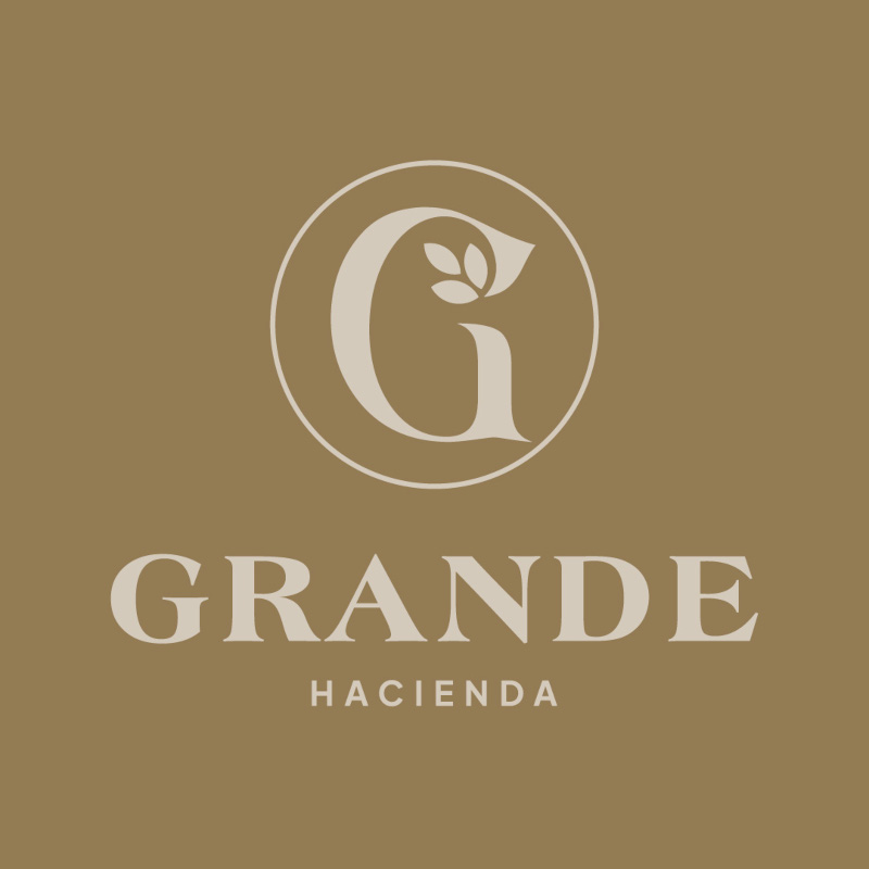
Just like its name, this logo design for Grande Hacienda is grand and elegant. The icon uses the letter G with illustrations of leaves that add beauty and interest to it. The fonts used are spot on, while the color is subtle and charming.
16. Gellerx Gasser Militia
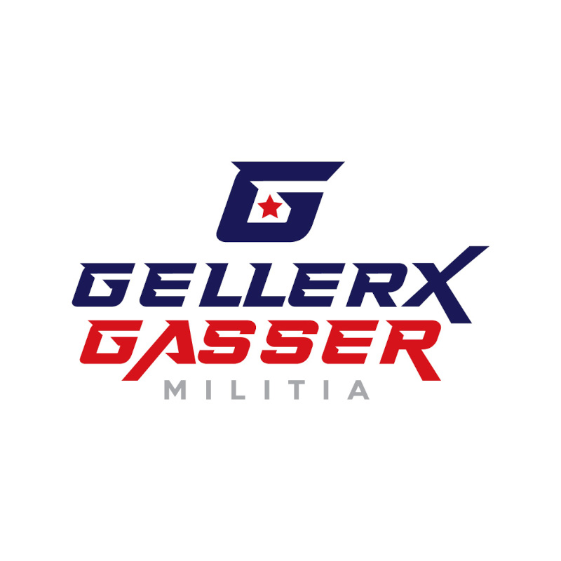
Forward-slanting fonts are typically used to show movement and speed in your designs. The fonts for this Gellerx Gasser Militia logo show strength and power. The color combination is an eye-catcher, making this letter G logo a winner.
17. Greco Wrestling Club

Using a muscled arm as its icon, this logo created for Greco Wrestling Club is very fitting. This is another example of a logo that would be recognizable even without the brand name attached to it. The color combination of red and black is also appropriate for its personality.
18. Gorilla Guards and Private Security

Custom illustrations make logos more unique and special. This example from Gorilla Guards and Private Security shows us why online logo makers just won’t cut it when originality is what you want. This logo ranks high in differentiation, which is the goal of many smart entrepreneurs.
19. Gascon Enterprise Group
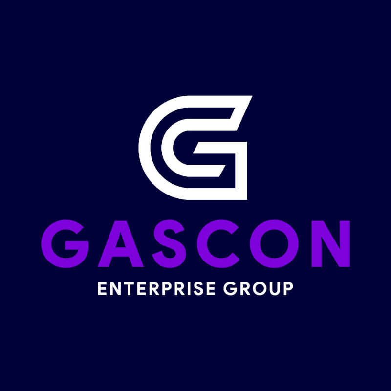
Did you know that the top color companies use for their logos is blue? It’s because it exudes trust, dependability, honesty, and many other traits people look for in businesses. Combine it with violet, and royalty, power, and ambition will be added to the mix.
20. Gracie & Accolades Law Firm
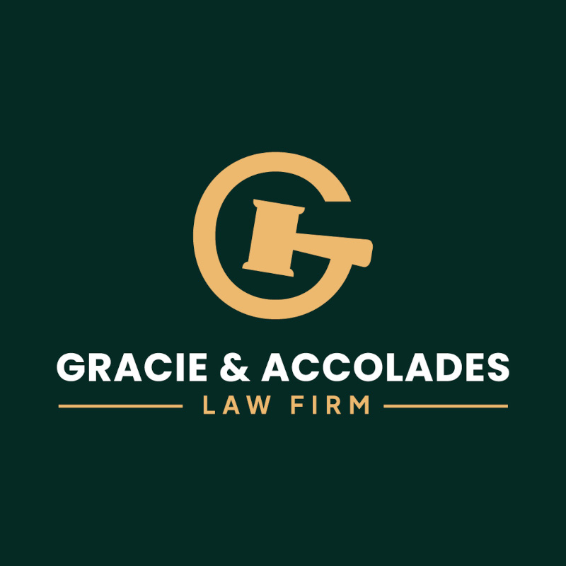
Designing a logo for a law firm can be tricky. First, you need to be professional and straightforward. This may be difficult to achieve, especially if you want to stand out. This logo design for Gracie & Accolades Law Firm is an excellent example of a logo that attracts attention.
21. Go Gelato Frozen Treats
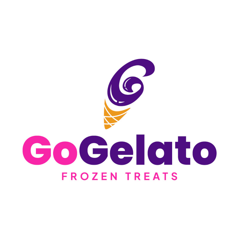
Using bright colors, a cute icon, and an overall fun and lively image, this Go Gelato Frozen Treats logo is noteworthy. Your logo should define your brand personality using appropriate colors and fonts, such as what the designer did on this one.
22. Glacier IT Solutions

This logo created for Glacier IT Solutions fits the brand quite well. It has an icon reminiscent of a computer motherboard with the letter G designed into it. This logo would look good on a business card or a t-shirt, something you should strive for when designing.
23. Galileo Tutorials

This logo for an education company used a graduation cap as its icon. The Galileo Tutorials logo featured the letter G as its primary logo component to show what industry it belongs to. It used a minimalistic approach, making it simple yet very appealing.
24. Grays Banking and Finance
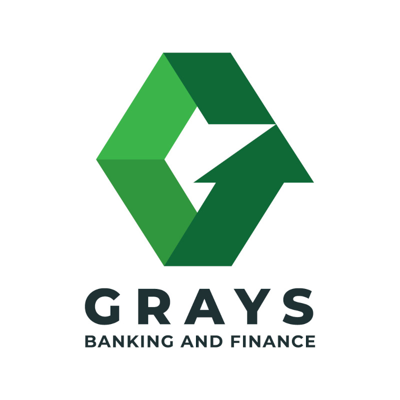
The color green is commonly associated with money. Thus, it’s no surprise to see it in many banking and finance companies. This logo designed for Grays Banking and Finance is no exception, as green is its primary logo color. The arrows are well-suited as you want consumers to see your brand as forward-moving.
25. Gabriel Guardian Groups
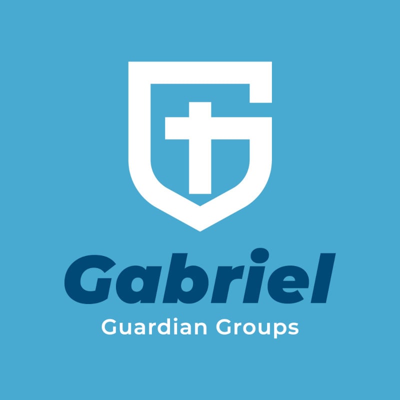
With a shield shaped like a letter G as its main design element, this logo designed for Gabriel Guardian Groups effectively shows the nature of its business. It is clear to viewers that this is a company that provides security and protection.
26. Gottfried Brick Builders

It’s only natural for Gottfried Brick Builders to use icons of bricks as its main logo component. The letter G stands out, thanks to the multi-colored bricks that comprise it. The orange and brown color scheme is well-suited as it livens the whole design.
27. Godiva Skin Care

This beautifully crafted logo design for Godiva Skin Care oozes elegance and sophistication. It uses a single-line illustration of a woman that shows exactly what the brand is about. The thin font projects a chic luxury that appeals to its target customers.
28. Guevarra Architects
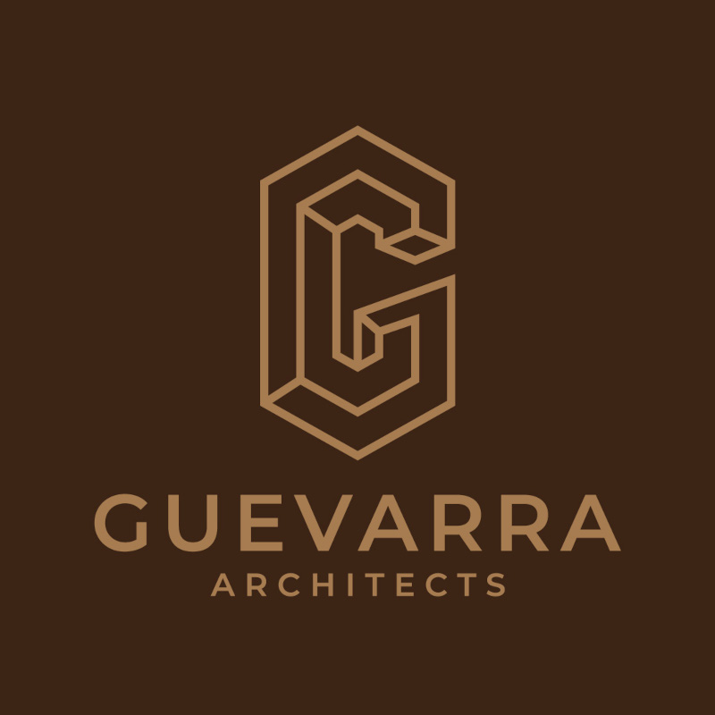
With its dark colors, tasteful illustration, and simple fonts, this logo for Guevarra Architects screams professionalism and class. It doesn’t have too many design elements that can distract viewers. The letter G in the design is shaped using a 3D effect that reminds us of a building.
29. Gigacloud Storage Solutions

This cute cloud with a G logo is sure to rank high in terms of scalability. This is a logo design that would look great wherever you place it. From letterheads to posters, this Gigacloud Storage Solutions logo would be very visible.
30. Greenthumb Seedlings

Aside from money, green is also commonly associated with nature. This logo for Greenthumb Seedlings comes in a monochromatic green that’s as fresh as nature. The letter G is shaped like a leaf to explain its business nature further.
Final Thoughts
Logo design is a complicated task that online templates just won’t work if you want individuality. In addition, copyright issues can become a concern. To get high-quality logo designs without the hassles, turn to Penji and our unlimited graphic design service.
To start your logo designs today, sign up through this link to have our designers create beautiful logos such as the ones above.
About the author

Celeste Zosimo
Celeste is a former traditional animator and now an SEO content writer specializing in graphic design and marketing topics. When she's not writing or ranking her articles, she's being bossed around by her cat and two dogs.
Table of Contents
- 1. Guyana Pollution Control Inc.
- 2. GR Concrete
- 3. Giantic
- 4. Gamut
- 5. Grand Wing
- 6. Gun Stop
- 7. Good Sheep
- 8. Gravitea
- 9. G-Smack
- 10. Green Leaf
- 11. Galleons Marina
- 12. Gatdula Historic Society
- 13. Gator Clamps and Power Tools
- 14. Giant Generation Group
- 15. Grande Hacienda
- 16. Gellerx Gasser Militia
- 17. Greco Wrestling Club
- 18. Gorilla Guards and Private Security
- 19. Gascon Enterprise Group
- 20. Gracie & Accolades Law Firm
- 21. Go Gelato Frozen Treats
- 22. Glacier IT Solutions
- 23. Galileo Tutorials
- 24. Grays Banking and Finance
- 25. Gabriel Guardian Groups
- 26. Gottfried Brick Builders
- 27. Godiva Skin Care
- 28. Guevarra Architects
- 29. Gigacloud Storage Solutions
- 30. Greenthumb Seedlings
- Final Thoughts


