Before starting a restaurant business, you should know that a logo is an imperative visual asset. People are visually oriented, and because of this, a logo should tell us so many things about a restaurant. A logo should identify what you are offering, it should give shape to what the experience will be like for the diners, and improve brand recognition, among many other uses.
The Italian mass migration to the US in the late 19th and early 20th centuries has made their food as American as apple pie. This paved the way for Italian restaurants to flourish. The primary reason your logo should make your business stand out.
Below is a list of the best Italian restaurant logos that you can use to get inspiration:
1. Babbo
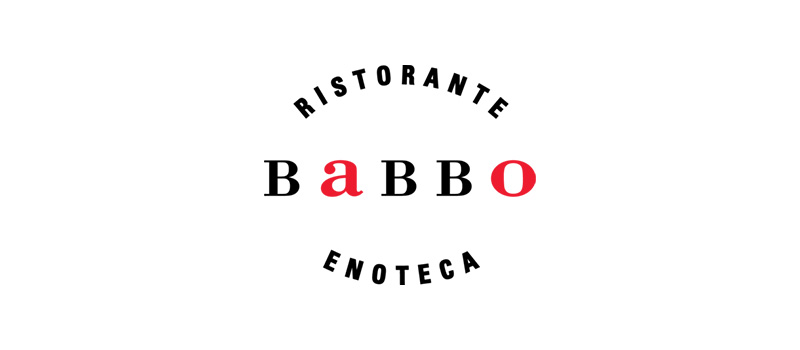
Known for being one of the hardest restaurants to get a reservation from, Babbo is the epitome of a classic Italian restaurant. From its website to its logo, its designs are simple yet sophisticated, classy, and exude elegance. This proves that logos should neither be detailed nor fancily decorated to work their purpose.
Babbo’s logo has its name emblazoned in the middle using a serif font style. It uses black with two letters in red to serve as emphasis. The letters surrounding the brand name use a sans-serif typeface, making the font combination visually appealing.
2. Osteria Mozza
Another Italian restaurant logo that genuinely reflects the ambiance of the business. Osteria Mozza is an upscale restaurant with dark wood, white tablecloths, and marble countertops in its interiors. These characteristics are clearly reflected in its logo.
Using three colors: burnt umber, yellow, and grey, the logo has somber yet chic and elegant vibes. Ambiance is crucial to a restaurant’s image as some people go to one solely for it. This is the reason your Italian restaurant logo should mirror it.
3. Vetri Cucina
Located in Philadelphia, Vetri Cucina offers the best in handcrafted Italian specialties. The restaurant has a rustic and vintage appeal that is well represented in its logo. Looking at their website, you can feel its harmonious look, making the logo a suitable brand identifier.
The brand name Vetri uses a handwritten font style, while the Cucina is in a serif font. This font combination makes the logo interesting, so make sure that when you create yours, choose fonts carefully. The logo also includes illustrations of ingredients and kitchen tools that add to the logo’s country appeal.
4. Quince
Don’t be fooled by the non-Italian-sounding name, Quince is as Italian as pizza and pasta. This Italian restaurant has a logo that’s as charming as the ambiance it projects. The restaurant chose charm and elegance as its primary personality, and the logo shows precisely these.
The logo has a capital Q with a long and squiggly tail that spans the whole brand name. The rest of the letters use a modern and stylish font that best describes the restaurant’s image. It uses black for that added elegance and sophistication.
5. Frasca Food and Wine
In Italian, frasca means a roadside farm restaurant that serves simple food from that specific region. Thus, the name Frasca Food and Wine aptly fits the bill. What’s even better is the restaurant’s logo which does exactly the same.
Following its food tradition of placing a tree branch over a door, the logo depicts this exceptionally well. The branch with leaves is a symbol of local cuisine, wine, and a warm welcome. The brand name is in lowercase letters that give out feelings of idyllic beauty steeped in rich cultural heritage.
6. al di la Trattoria
Hailed as one of the best Italian restaurants in New York City, al di la Trattoria has a quiet, home-style appeal suitably reflected in its logo. The restaurant’s interior has a warm, light, and friendly atmosphere that’s truly conducive to dining. The restaurant opted for a minimalistic approach in its design to match this ambiance.
The logo is that of the company name in a font that reminds you of a document written using a typewriter. It is placed in a rectangle with red as the background color. This is common in Italian restaurant logos as red is known to boost appetite aside from it projecting positive and energetic vibes.
7. Al Forno
Using New England produce to create Italian-inspired cuisine, Al Forno takes pride in its innovative cooking. From the restaurant’s website to its interiors, it oozes airs of warm hospitality, brick-oven food, and a country charm typical of most suburban regions in Italy.
The logo has an icon that includes a fork that stretches up to look like a wine glass. The serif font adds a classy appeal thanks to its simplicity. The overall design of the logo is clean, modern, and fully scalable.
8. Mora Italian

While we see many Italian restaurant logos use red as their color of choice, Mora Italian chose to go against the flow. They used a bright blue that’s sure to make them stand out. The restaurant aims to give out a feeling of dining in Italy’s neighborhood eateries but with a modern twist.
The logo perfectly depicts this with its color, font choice, and minimalistic design. On their website, they used the word “convivial” to describe the dining experience they are promoting. The logo is vibrant, and cheerful, and evokes a pleasant and joyful dining atmosphere to match the restaurant’s brand personality.
9. Ferraro’s Italian Restaurant
Having been around Las Vegas since 1985, Ferraro’s Italian Restaurant has a logo that has a timeless appeal. The restaurant is famous for giving a modern take on traditional recipes handed down from generation to generation. Its logo exudes those exact sentiments.
It has a sleek and classic appeal that can be felt in the choice of typeface it uses. The brand name projects tradition, while the red circle on the bottom left corner oozes with style. The font pairing is also commendable, as the two look good together.
10. Ports of Italy
Another Italian restaurant logo that didn’t conform to the norm is this one from Ports of Italy. The restaurant specializes in authentic, traditional Northern Italian cuisine. The interiors of their Boothbay Harbor branch look like it is the mess hall of a ship: it is airy, calm, and has a cheerful atmosphere.
The restaurant’s logo suits the brand quite well, as it includes an anchor icon and uses a bright blue color reminiscent of the ocean. The logo design emits an aura of vibrancy and modernism that pleasantly depicts the restaurant.
11. Primo Pasta Kitchen
A family-oriented Italian restaurant, Primo Pasta Kitchen is one of the best of its kind in Pasadena, Maryland. Using the word “primo” in its name to mean top quality, its logo suitably looks the same: premium quality, making it worth its place in this Italian restaurant logo list. The restaurant takes pride in using only the freshest and seasonal ingredients to create its wide array of Italian dishes.
The logo consists of the brand name with a leaf and fruit icon on the top. This signifies the business’s commitment to providing its customers with fresh food and the best dining experience. It uses a brownish-crimson color usually associated with warmth, passion, and beauty, ideal for this Italian restaurant.
12. Riccardo Osteria
This restaurant in Chicago, Illinois, specializes in Italian cuisine from the northern parts of Italy. The term “osteria” pertains to an Italian restaurant that provides simple and inexpensive food. The logo is pretty straightforward without the unnecessary frills we commonly see in many Italian restaurant logos.
The name Riccardo is well-designed and uses an excellent color scheme that makes the brand name stand out. It is paired with a simple font with serifs to add interest without overpowering the brand name.
13. Scampo

Offering a mix of flavors from the Mediterranean and the Middle East, Scampo has a most fitting name. In Italian, “scampo” means escape which is what the restaurant provides—an escape from the ordinary fare. It is located inside a hotel and boasts vibrant settings ideal for travel-weary hotel guests and those looking for gastronomic adventures.
Scampo’s logo is as lively and energetic as its restaurant interiors. Using orange as its main color, the logo is a square spiral with the letter S inside. The font is a simple, non-serif typeface that beautifully adds charm to the logo.
14. The Pink Door
When you visit The Pink Door, you’ll see that its interior is typical of an Italian restaurant. It has brick walls, wooden furniture, and warm lights, very conducive to dining in pleasure. However, what makes this restaurant stand out is its eye-catching logo.
Of course, it is in pink, but in a shade that many call old rose. Along with this, the font type it uses has that retro vibe that reminds you of diners and vintage ad posters. Diners describe their experience in this restaurant as spirited, friendly, and warm, exactly how the logo portrays it to be.
15. Vespaio Ristorante
Operating since 1998, Vespaio Ristorante takes pride in preparing its recipes from scratch. It uses the best quality ingredients of the season that are locally sourced. The word vespaio means a wasp nest in Italian, so it’s only natural for its logo to include an icon of the insect.
The logo has another version without the wasp on it. Instead, it has a background that has a honeycomb pattern on it. The brand name is in a handwritten typeface full of character, just like the restaurant.
Create Logos with Penji
Whether it’s a new logo or a redesign, Penji can help. Our graphic designers can create logos for all types of industries. Not only that, we can design a wide selection of visual assets for your social media platforms, websites, and marketing and advertising materials, to name a few.
Watch our 5-minute video here to learn more about what we can do for your business. And if you like what you see, you can start the design process by signing up here.
About the author

Celeste Zosimo
Celeste is a former traditional animator and now an SEO content writer specializing in graphic design and marketing topics. When she's not writing or ranking her articles, she's being bossed around by her cat and two dogs.

