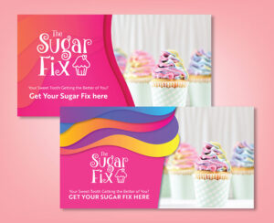
Combining fonts might sound easy to do. But the outcome could look jarring if you’re not selecting fonts carefully. This could fail to set the mood or tone of your message or convey the wrong brand personality. Learning how to combine fonts is as easy as knowing the most common font categories and how to pair them. Here’s the ultimate guide to font pairing.
4 Most Popular Font Categories
Before combining fonts, it’s essential to familiarize yourself with the four most famous font categories. Font pairing aims to give off a typographical design that is harmonious and complementary. The font pairing design must meld together, delivering the intended message or image.
Here are the four most common font families:
Serif font
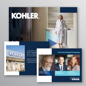
The serif font is the oldest font family, dating back to the 15th century. It’s distinguished by its feet extensions at the top and bottom of each letter, which are called serifs. These small lines or strokes are connected to traditional thick or thin letters. This font category is best for classic brands that want to convey respect, authority, tradition, or trust in their industry.
Serif font examples:
- Times New Roman
- Lora
- Merriweather
- Playfair Display
- Baskerville
Example of serif font logo:

Sans serif font
Sans serif fonts emerged in the 19th century, and this is the serif font’s counterpart. These fonts lack the “serif,” or “feet” attached to each letter, contributing to its semi-rounded, clean appeal. Sans serif fonts look minimal and simple, perfect for websites, blogs, and flat designs. Most modern brands prefer this font family because it looks more updated than its predecessor.
Sans serif font examples:
- Arial
- Roboto
- Open Sans
- Source Sans Pro
- Helvetica
Example of sans serif font logo:
Script font
For shorter headlines, script fonts are the perfect choice. This type resembles a handwriting-like style that is sometimes mistaken for decorative fonts. The nuance between the two is that script fonts are more balanced and fluid. Script fonts look feminine, artistic, and elegant. These fonts are popular for brands that want to be memorable and stand out. Script fonts are excellent for wedding invitations and greeting cards too.
Script font examples:
- Satisfy
- Pacifico
- Allura
- Lucida Script
- Dancing Script
Example of script font logo:
Decorative font
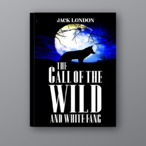
Another unique and stylish font family is decorative fonts. They give off a cursive aesthetic that looks innovative and creative. Decorative fonts are paired with serif and sans-serif fonts. This font family shows off a stylized look that is dramatic and playful. It also comes in various sizes, shapes, proportions, and forms. Brands must use this font in small doses as the distinct and graffiti-like nature might overpower the original intended message. Or improperly using this font might not contribute to a harmonious or cohesive design.
Decorative font examples:
- Bangers
- Lobster Two
- Axewell
- Fredoka One
- Fredericka
Example of decorative font logo:

How to Combine Fonts
Now that you’re equipped with the most popular font families, it’s time to learn how to combine fonts. Experimenting with multiple fonts is the key to finding the perfect, attractive typographical design that stands out. Without further ado, let’s dive right into font pairing tips.
1. Limit two fonts only
Limiting up to two fonts for font pairing isn’t a set rule, but combining more than two fonts might complicate your design. If you must incorporate more than two fonts, select simple fonts that complement each other.
Keeping it simple is the key to captivating font combinations. If you’re banking on typography for your logo, try to limit it to two fonts only. Having too many fonts might not allow each to shine. Each font will compete for attention, which voids the goal of creating a flawless composition.
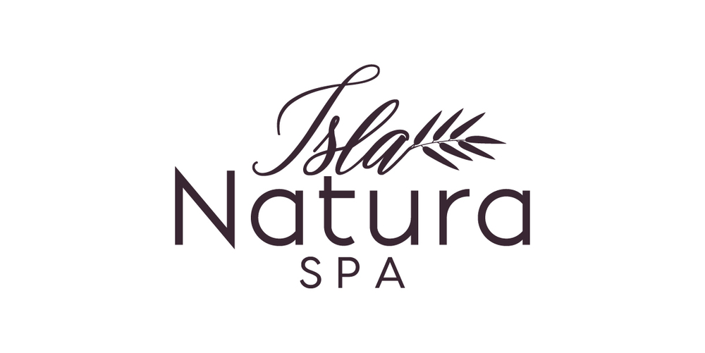
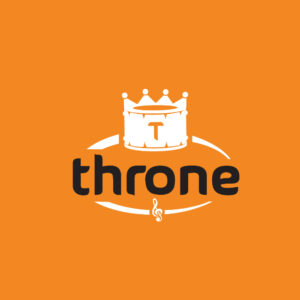
Here’s an example of a sophisticated font combination that shows off a script and thin sans-serif font.
2. Combine serif and sans serif fonts
Combining serif and sans-serif fonts helps you achieve balance, readability, and elegance. If you don’t know how to combine fonts, these are both safe choices. It’s a classic font pairing tip that’s almost impossible to mess up. Serif fonts are more legible and quickly transition the eyes from one letter to another, making this font easy to read.
On the flip side, serif fonts are more straightforward in nature with less distracting, cleaner or rounder edges, excellent for more complicated designs. With both fonts combined, you create a fine-looking mix of eye-catching and digestible typography.
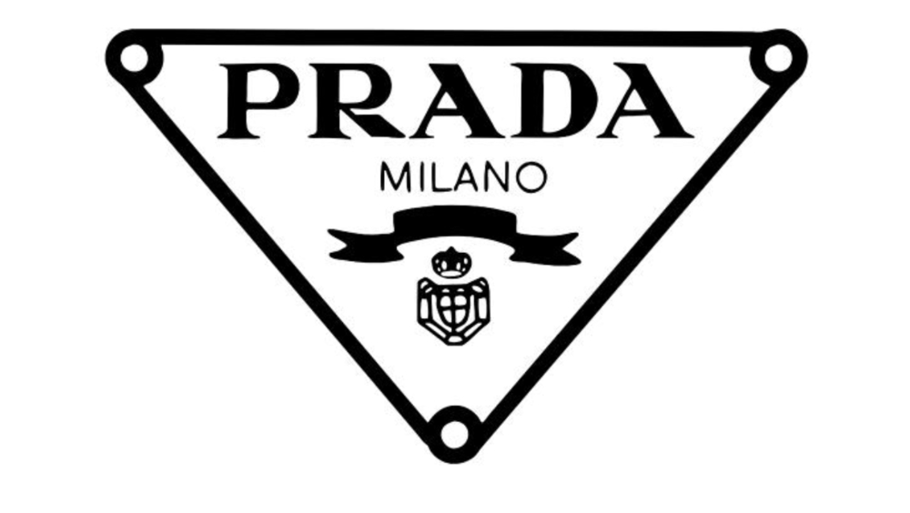
Take a leaf out of this logo from Prada. The design combines serif and sans-serif fonts, making one bolder and thinner. The contrast creates a good balance between the multiple elements, with the text “Milano” as a breather for the eyes.
3. Choose from a single font family
Unless you’re an experienced graphic designer, selecting typefaces from a single font family is the easiest route. So when in doubt, stick to one font family. If you’re still learning how to combine fonts, choosing a font family and checking styles under its category makes it easier to create a cohesive layout. Every font under different font families comes in various weights and sizes.
The rule of thumb is not to pick two similar font styles. The goal is to establish diversity to make each text pop.

For instance, the image shows two different font styles under the sans serif family. It combines both Alegreya Sans SC and Source Sans Pro. You can experiment with the weight by making one bolder or more significant than the other.
4. Select contrasting font styles
A rule of thumb indicates pairing sans serif and serif fonts for disparity. However, you can still choose a font style from the same font family if they have distinguishable features. If you pair fonts that are too similar, you won’t establish hierarchy and won’t be able to distinguish one from the other.
On the other hand, if you pair fonts with incomprehensible differences, the outcome will be a disaster. Ensure you choose distinct fonts yet still share subtle features for cohesion. You may play around with the fonts’ kerning, styles, sizes, and weights.
To know if you’ve chosen both appropriate fonts, you can put two different fonts side by side. Try looking at the comparison from a distance and squint your eye. If the fonts look the same, you’ve achieved both contrast and design cohesion.
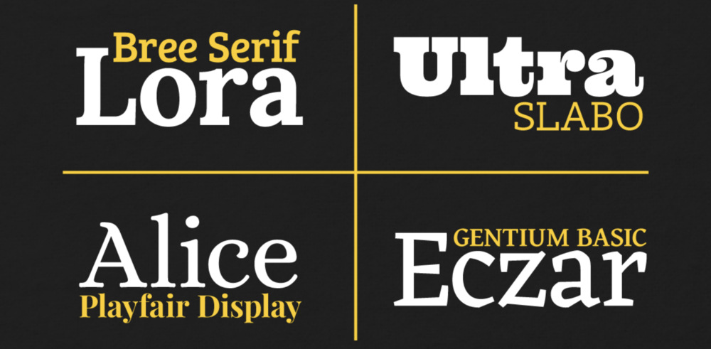
Here are a few examples of fonts that are distinct yet share similar features. These font pairings work because they differ in many aspects, such as style, weight, size, and kerning.
5. Avoid too much contrast
Contrast is essential to keep the eyes engaged. However, too much contrast makes the typography look like a mistake. If one font is too distinct from the other one, each will vie for attention. Your goal is to make your typography design work as a whole that attracts viewers. If a font is too different from its partner, both fonts will look out of place.
Too much disparity will create visual imbalance, which is the opposite of what you want to achieve. Remember, not all distinct fonts work. Particular fonts that still share a few qualities will likely achieve visual harmony.
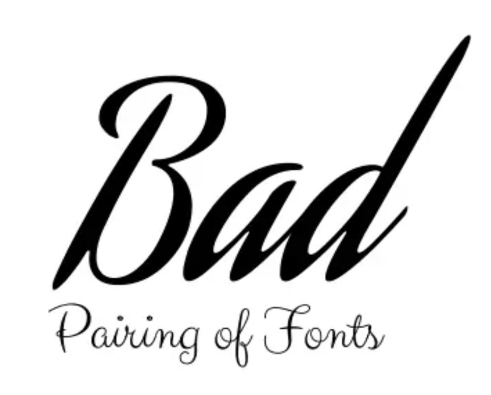
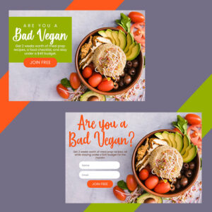
Here’s an example of a lousy font pairing. Both script-style fonts don’t match. Although the weight, size, and kerning are acceptable, the styles aren’t a match made in heaven. The text “Bad” is a script font that looks simple, modern, and casual. On the other hand, the text “Pairing of Fonts” has more complex curves that exude a somber and formal tone.
6. Use hierarchy
Hierarchy is crucial if you want to establish organization and order of information. Giving each text its proper size and weight according to importance will lead to a legible design and clean structure. A design with fonts of the same sizes will look monotone.
For instance, if you create a company logo, the brand name should have the most significant weight and size. The business category or industry must serve as a complementary text to the brand name. Additionally, if you combine fonts for a poster design, always make the headline the biggest and most apparent text. The subheading comes next after the headline, with a slightly smaller size and weight. Then the copy comes next with a smaller size than everything else.
The hierarchy ensures viewers will smoothly transition from one text detail to the next. This will also inform readers what the most essential details are down to the least important ones.
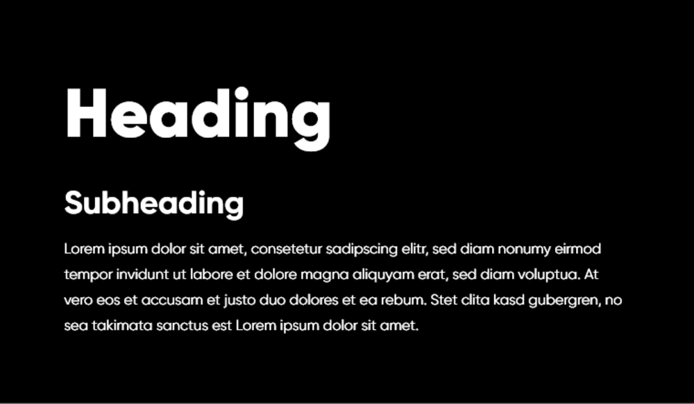
This text is the best example of how a good structure improves readability.
Fibonacci number series
If you don’t know how to scale your text, try the Fibonacci number series method. Determine the font size for the hierarchy by adding the preceding two font sizes.
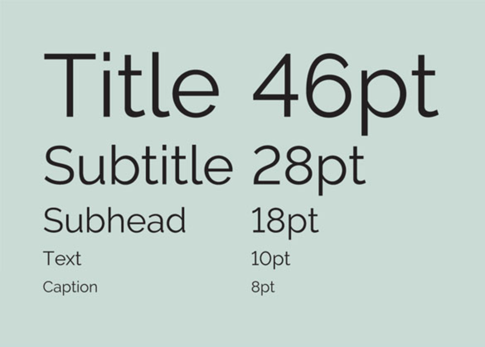
For example, if you add the caption (8) and text (18), that totals 18, which should be your subheading font size. Suppose you add the subheading (18) and subtitle (28), that adds up to 46, which should be the title size.
7. Convey the intended purpose and mood
Like colors, fonts also rely on psychology to impact readers’ decisions. Whether using fonts for promotional materials or personal projects, each font has its own personality. Select a font that aligns with your intended purpose, message, or mood.
For example, materials for children should lean toward decorative fonts. Meanwhile, formal documents must contain simple serif or sans serif fonts. Fonts evoke specific emotions within your target audience, so be careful in selecting one that tugs the right heartstrings.
Here’s a quick guide on how to combine fonts based on your intended message and mood:
Strength and power
If you want to convey strength and power, use bold, heavy fonts. These fonts are for more traditional companies like financial or educational institutions. Most of these fonts are also used for headlines on promotional materials or logos. They emanate stability, trustworthiness, authority, and assertiveness.
- Bebas Neue
- Impact

Since LinkedIn is a business-oriented platform, the bold and heavy sans serif font exudes a professional tone, fit for the social network’s concept.
Fun and playfulness
If your branding leans more on the casual and playful side, try decorative or display fonts. These font styles are informal, showcasing a more whimsical appeal. These fonts are perfect for children’s brands, artistic projects, and casual events. Using decorative fonts sparingly is recommended to prevent a chaotic outcome.
- Lobster
- Comic Sans
Elegance and luxury
High-end brands must consider using serif or script fonts with thin strokes. Calligraphic typefaces also convey elegance and luxury without being unwelcoming. These fonts are excellent for wedding invitations and high-end product packaging.
- Edwardian Script
- Bickham Script
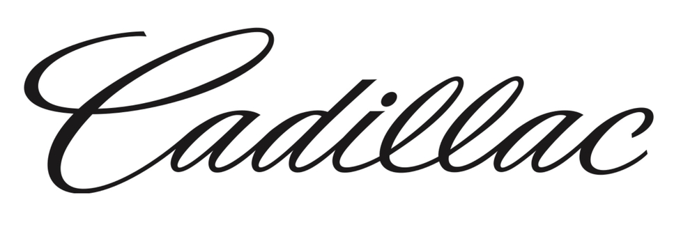
Check out Cadillac’s logo. The brand sells luxury cars, and this font conveys just that.
Friendliness and approachability
Use soft and rounded fonts if you want an informal connection with your readers. These styles establish approachability and friendliness, perfect for brands with relaxed and casual personalities. These fonts evoke warmth and develop a genuine connection with readers.
- Nunito
- Varela Round
8. Limit the number of fonts
Although limiting font combinations to two or three isn’t set in stone, keeping it within these numbers is vital for a harmonious layout. Some projects might need more than three combinations, and choosing simple and less obtrusive font styles is best.
Remember to keep fonts simple with a maximum of three font combinations when learning how to combine fonts.
Hire a Graphic Designer
Let the professionals do it if you’re unsure how to select and experiment with font weights, kerning, and sizes.
Penji can help create all your typographical logos and marketing materials. Try Penji for 30 days risk-free by signing up here. Watch a quick demo to learn how to get unlimited designs.
About the author
Table of Contents
- 4 Most Popular Font Categories
- Serif font
- Sans serif font
- Script font
- Decorative font
- How to Combine Fonts
- 1. Limit two fonts only
- 2. Combine serif and sans serif fonts
- 3. Choose from a single font family
- 4. Select contrasting font styles
- 5. Avoid too much contrast
- 6. Use hierarchy
- 7. Convey the intended purpose and mood
- 8. Limit the number of fonts
- Hire a Graphic Designer


