

I dated a graphic design student for a brief time during college. I know what you’re thinking, but we’re programmed to use that period of youthful naivety for otherwise unadvisable experimentation. Anyway, she wasn’t my type.
Puns aside, it was an enriching experience, and I think things might have worked out between us had I not been indifferent to her craft. One particular mistake was my gross misuse — and by that, I mean use — of one of typography’s worst fonts: Comic Sans. After which, something became deafeningly apparent: few fonts command as much universal abhorrence — from designers and laymen alike — as Comic Sans.
The internet doesn’t agree on much. See: everything.
So, when such a resounding consensus emerges around bad fonts, it begs some interesting questions. Can typefaces be inherently bad? What are the criteria? Are there other, similarly despised typefaces out there? Are they in the room with me right now?!
What makes these fonts suck?
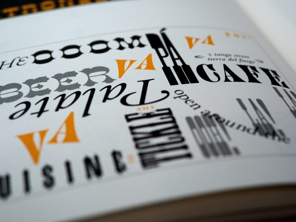
Whether the crime is illegibility, overuse, or poor aesthetics, some typefaces simply suck. Those unlucky enough to fit into the category of worst fonts should be avoided, lest they render your design ineffective and unprofessional. Maybe you’re crafting a business card. Or a restaurant menu. Possibly a logo? It hardly matters; all of these projects hold a consistent truth: Font choice is an essential ingredient in how viewers will receive information.
This article will tackle two typefaces sure to send a shiver down the spine of any graphic designer. Comic Sans and Papyrus.
Some of you may be thinking, “Justin, you’re really picking on low-hanging fruit here.” Well, it’s true. In recent years, these fonts have been relegated to meme status. And for good reason. But, while we’ll be picking on these specific examples, the points made throughout the article will help you when assessing any font. We will be dissecting what makes these fonts so agreeably disliked, so that we can easily spot similar downfalls in others.
Without further ado, let’s rip into these typographical atrocities.
[in_content_ads gallery=”logos” logo=”on” title=”Need graphic design help?” subtitle=”Try Penji’s Unlimited Graphic Design and get all your branding, digital, print, and UXUI designs done in one place.” btntext=”Learn More” btnlink=”https://penji.co”]
Comic Sans: The Worst Font
Long has this typeface been ridiculed for its childlike and playful-to-a-fault demeanor. We scoff at its clunky, outdated appearance, and its ability to immediately call out the amateurism of its users. And sure, it has its fair share of apologists. (Sus.) But what is it about this particular typeface that makes it pretty much the worst font of all time?
It manages weight poorly.
You’ve likely heard the phrase “to carry one’s weight well”. Perhaps in the context of a backhanded compliment from a snippy aunt at Thanksgiving dinner. Just me? Well, It refers to the ability of someone or something to evenly distribute its weight in a visually unoffensive manner. And Comic Sans perfectly exemplifies what it means — in typographic terms, anyway — to not carry your weight well.
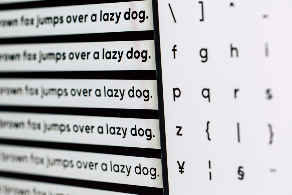
Like many sans serif typefaces, Comic Sans has a relatively even stroke. This is because it has unmodulated letterforms, meaning there is little to no contrast in the thickness of the characters. However, unlike fellow unmodulated sans serifs like Ariel or Helvetica, Comic Sans doesn’t account for the added thickness at the junction points of the stem and shoulder. (That’s the spot where the arching part connects with the straight part.) This leads to uneven characters and contributes to legibility issues.
For comparison, we can look at the Helvetica font. A universally beloved font. Helvetica sees a marginally thinner stroke where the shoulder meets the stem. Comic Sans doesn’t make this adjustment, leading to a lopsided junction point.
The unbalanced look is amplified further in body copy, where the eye can scan the entire swath of text at a glance.
It makes you look like a goober.
Comic Sans just has a goobery vibe. That’s not a technical term — or a word, per Grammarly’s ruling — but it’s certainly a feel. And when it comes to optics, it’s really all about feeling. The vast majority of people who come across your design will not possess a degree in graphic design, nor will they be applying technical theory to your work.
They will, however, be relying on what their immediate senses tell them, and let’s face it: this font imitates a child’s magic marker doodle. Sans the magic.
Few things can so boldly dismiss your credibility as using a font that could be described as “goobery”. Seriously, don’t force me to make up words to properly express your brand’s identity. Nix the Comic Sans for all things business-related, and, honestly, for anything not related to a five-year-old’s birthday invitation.
It’s a victim of misunderstanding.
Comic Sans gets a bad reputation, but perhaps it’s the designers who are to blame. That’s right. Maybe it’s my ex-girlfriend who’s wrong after all. The worst font of all time, in all its lowly shame, is actually the victim. Bear with me here.
In 1995, just as the computer was becoming a staple of the individual household, Microsoft sought to create a program that familiarized new users with the platform by approximating it to your home. And, because everything involving Comic Sans needs to be wholly absurd for some reason, they named it Microsoft Bob. If you’ve never heard of Microsoft Bob, it’s because it was a bit of a flop. Melina Gates even referred to it as “a spectacular failure” in a 2017 interview. I think that’s just hilarious.
For those curious about Microsoft Bob, go to town. But, here’s a succinct description of it as it relates to Comic Sans:
Microsoft’s Gift
Microsoft Bob would teach new PC users the basics of operating the technology. Created by Vincent Connare, Comic Sans was designed to fit the program. In that particular context, as you can see from the image above, he actually didn’t do a half-bad job. However, the commissioned typeface wasn’t finished in time and, as a result, wasn’t used in the program.
But destiny just finds a way. Later that year, when Windows 95 shipped out, Comic Sans was included.
In some strange sense, Comic Sans is mocked for achieving what it set out to do: be a goofy typeface for a goofy program. Just imagine, in a universe parallel to ours, we all learned how to use Microsoft in Comic Sans, leading to its eventual legend status as a relic of the infantile digital age.
But that doesn’t mean it has a place in your branding. So, it’s best to avoid this typeface, and similarly ill-conceived typefaces, when tasked with your next design.
Papyrus
Perhaps its most famous (infamous?) appearance is as the typeface for James Cameron’s 2009 epic sci-fi, Avatar. But its history is much more storied, tragically.
Papyrus is actually considered to be of accidental origin. Go figure. It was created by 23-year-old Chris Costello during his period as an entry-level illustrator at an ad agency. Costello would put his downtime into crafting this typeface, entirely unaware that it would work its way into the annals of typographic infamy as the worst font.
Perhaps unsurprisingly, Costello’s design career has roots in calligraphy, having been taught hand-lettering by his father as a child. And you can see this influence in his magnum opus. Inspired by the Middle East and Biblical Times, Costello drew up his doodles, eventually submitting his creation to type companies. It was rejected by all but one: Letraset.
First being marketed in Letraset catalogs, it was eventually licensed and picked up by Microsoft.
Most designers will do their best to steer you away from certain mockery, but let’s try and dissect the reasons why we’ve come to hate this damned-to-hell typeface in the first place.
It’s excessively kitsch.
Like most handwritten fonts, Papyrus possesses an air of silliness. A quirky quality, if you will. But surely it isn’t the crudest perpetrator of these traits, right? I mean, it’s no Bradley Hand.
While not necessarily as kiddish as some of its peers, the kitsch value paired with its relative overuse makes Papyrus an easily-identified visual nuisance. And no one is using Bradley Hand for the title card of one of the highest-grossing films of all time — God help us.
As stated in my lambasting of Comic Sans, a goofy typeface elicits sensations of goofiness toward your website designs. And not in a pleasant way; in the dreadful, lifelong victim of online bullying way. Not to be advised.
Its form is too loud.
Here’s a good rule of thumb when choosing typefaces: avoid those that speak louder than the text itself.
Using a typeface with too much character can evoke prior appearances in the mind of the viewer. Imagine seeing the Star Wars font used for anything not Star Wars related. On the face of it, it shouldn’t be too offensive, right? There’s nothing inherently cosmic about it, and if someone crawled out of a cave, never having been witness to the pervasive branding of the franchise, the font likely would not conjure sensations associated with the film.
But its personality is huge. So huge that if you were to see more than one brand, logo, or graphic print with that typeface, you would note it. And you would stuff it into an internet blog about the worst fonts.
Conclusion? Hire a Designer
These are definitely among the worst fonts of all time. The unfortunate truth is that once something has been culturally agreed upon to the extent that it’s granted memehood, it’s nearly impossible to reclaim it. So, If you’re deadset on using Papyrus for your logo, display text, or — most egregiously — body copy, all I can say is: godspeed.
Sidenote: If you’re looking to skip the arduous learning curve on all things typography and design, you’re in luck. Penji’s unlimited graphic design services gets you/your business all the graphic designs you need for a flat monthly fee. Never deal with crappy freelance designs or pay a fortune for on-staff designers ever again. Get started with Penji and start submitting design requests today!


