

TL;DR: Choose typefaces that match your brand values, keep them readable, and apply them consistently. You can work with branding services, design-as-a-service, or a design subscription service to help you find the right typography for your brand.
It’s a fact: consumers judge brands visually even before they read a single word. Your logo, headline, and the font on your landing page have the power to set the tone instantly. Typography is the silent communicator of trust, emotion, and recognition, better and faster than any tagline you can think of. So, if you’re wondering why many businesses invest in branding services, we’ll show you why and how you can choose the right fonts for your business.
Why Fonts Matter More Than You Realize
According to research, typography can enhance a design’s appeal and communicative effectiveness. Before someone reads your copy, the typography has already set the mood: professional, quirky, elegant, or corporate. This is what influences how consumers judge your credibility and whether they feel a connection with your brand.
Furthermore, typography affects readability and perceived professionalism. A single message can feel totally different depending on the font:
- Luxury brands often use elegant serif fonts that suggest class and refinement.
- Tech startups lean on clean sans-serif fonts that convey innovation and simplicity.
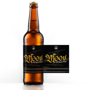
- Creative brands can be experimental, but we often see them use expressive display fonts that convey originality and boldness.
In addition, consistency, as with any other aspect of doing business, is just as crucial as the font choice itself. You need a unified typography across all your platforms to strengthen recognition and build trust. This is what branding and creative design services do best: provide scalable options to make sure your typography is consistent.
Skip the DIY, Get Unlimited Design
Get all the graphics you need with Penji


Step #1: Define Your Brand’s Personality
Going for a favorite font or one that looks appealing to you may seem the right choice, but oftentimes, it’s not. Don’t choose fonts at random. They’re emotional cues that tell prospects whether your brand feels playful, professional, or elegant. Think in categories:
- Modern and minimalist: clean sans-serifs
- Elegant and premium: refined serifs
- Fun and youthful: rounded or quirky typefaces
- Bold and energetic: heavy geometric fonts
- Trustworthy and professional: balanced, readable styles
- Artistic and creative: expressive display fonts
In short, choose fonts that match how you want people to feel when they see your brand. If you find font selection overwhelming, you can always go to the pros to help you. This is why many brands use branding services to get this exact help.
Step #2: Understand the Different Font Categories
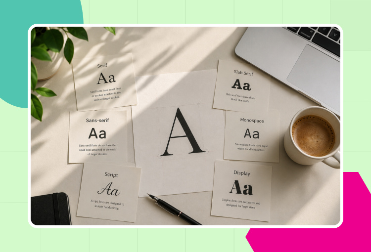
While a reputable creative and branding design service can help you choose the right typography, knowing the basics can significantly help. Here are the different font categories you need to know about:
- Serif Fonts: traditional, trustworthy, elegant. Typically seen in luxury, the law, and publishing.
- Sans-Serif Fonts: clean, modern, and simple. Commonly seen on tech and SaaS companies.
- Script Fonts: elegant, personal, creative. Must be used sparingly, mostly for accents only.
- Display Fonts: eye-catching, unique. Suitable for headlines and campaigns.
Pro tip: Combining two complementary fonts looks better than using multiple styles at once. You can pair a clean sans-serif font for your body text with a bold display font for your headlines to achieve balance without looking cluttered.
Step #3: Match Fonts with Your Industry
Every industry has visual cues that its audience expects. Fonts play a significant role in meeting these expectations. Balancing familiarity with uniqueness is what stumps many business owners.
- Restaurants typically use warm, inviting typography to convey an approachable, appetizing appeal.
- Finance brands often go for stable, readable fonts to project trust, stability, and professionalism.
- Ecommerce stores often use versatile, digital-friendly fonts that adapt well across websites, apps, and ads.
One thing is for sure: avoid copying competitors’ fonts too closely. You want to match your industry, but not to look like everyone else. And this is where the help of a reputable branding service can do wonders for your brand’s typography choices. They are experts in creating that balance.
Step #4: Prioritize Readability
While using the most beautiful fonts for your brand is only natural (we all want our visual identities to be the best), it will serve you no good if people struggle to read them. Your font choice should be guided by readability, more than anything else.
- Mobile-friendly typography: see how your fonts look on small screens.
- Website readability: choose clean, legible fonts for body text.
- Social media graphics: headlines should be clear even in quick scrolls.
- Email marketing: choose clarity over aesthetics.
- Ad creatives: balance eye-catching styles with easy comprehension.
A few practical tips:
- Avoid overly ornate fonts for body text.
- Maintain spacing and hierarchy to guide the eye.
- Test fonts on both desktop and mobile devices.
These are exactly what branding and creative design services follow to stay consistent, readable, and appealing.
Step #5: Build A Consistent Typography System
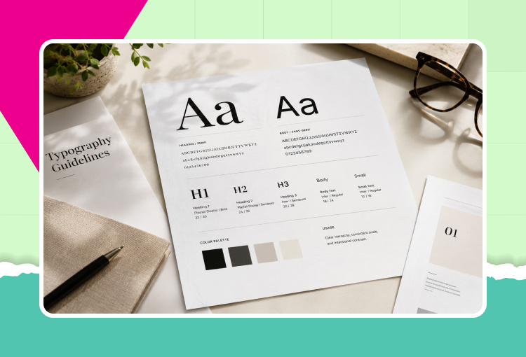
Do as the strong brands do, they don’t just pick fonts, they build a consistent typography system. To get the most from your fonts, apply them consistently on all your platforms:
- Heading fonts: set the tone and hierarchy.
- Body fonts: to provide clarity and readability.
- Font weights: to place focus without switching styles.
- Brand guidelines: document usage rules.
- Spacing and sizing: keep layouts uniform and balanced.
That said, consistency allows your brand to be instantly recognized: without it, even the best-looking fonts will lose impact.
Common Font Mistakes to Avoid
Before going out to select your typography, take note of the following:
- Don’t use too many fonts: this creates clutter and inconsistency. Instead, limit to two complementary fonts: one for headings and one for body text.
- Don’t follow trends easily: what looks fresh today may be outdated a few days from now. And sometimes, trends age poorly, so avoid getting caught in that.
- Don’t ignore readability: decorative fonts in body text may confuse and frustrate audiences. Use simple, legible fonts and reserve the decorative styles for the headlines or accents.
- Don’t use inconsistent typography across platforms: this weakens trust and recognition. Document your font choices in your brand guidelines and have everyone apply them across channels.
- Don’t use free fonts without checking licensing: Avoid legal issues and costly rebranding by checking and verifying licensing before you use any font.
While these may be too much for business owners who are already neck-deep in managing their businesses, the experts can handle them with ease. A design-as-a-service platform or a design subscription service can help you use the right fonts.
Final Thoughts
The right typography builds trust, emotion, and recognition. However, the wrong choice can set you back, so it’s crucial to define your brand personality and style by strategically choosing your fonts. If you need help finding fonts that suit your business to a tee, you need to work with the top design subscription service, Penji.
Watch our quick demo video here to learn how you can choose the most fitting fonts for your brand. Click here to submit your first design request today.
FAQs
A branding service can guide you in choosing the fonts that reflect your personality, style, and values. This allows for consistency across all your platforms.
Design subscription services provide ongoing, affordable support, including typography and branding visuals.
Yes. Incorrectly chosen fonts can result in inconsistent, unreadable, or mismatched visuals that can make your brand look unprofessional or forgettable.
About the author

Celeste Zosimo
Celeste is a former traditional animator and now an SEO content writer specializing in graphic design and marketing topics. When she's not writing or ranking her articles, she's being bossed around by her cat and two dogs.


