Contrary to what many business owners think, flyers are still effective in marketing your brand. A Direct Marketing Association (DMA) study shows that 48% of consumers, after being handed a flyer, visited the store that was advertised and asked for additional information about the product on the flyer. The research has also found out that consumer response to flyers is higher than direct marketing or television advertisements.
If you want customers flocking to your store or buying products, you need to hand out a great flyer design too. To do that, find a reliable design service that could produce those collaterals for you. Enter, Penji. As an unlimited design service, Penji can fulfill all your design requests. All you need to do is sign up for a subscription, and you can get started!
For now, read the 12 proven tips to create a great flyer design. Furthermore, know how you can request one by reading a quick tutorial below.
1. Well Thought Out

Start with narrowing in on the purpose of the flyer. How do you want the reader to feel? Excited? Happy? Hungry? What do you want the reader to do? Where do you want the reader to go after reading the flyer? These are all questions you have to answer before beginning the design.
Know exactly who you’re targeting. When you know who your audience is, it’s 1000x easier to design the best flyer to catch their attention. You want to stop people in their tracks and put their life on pause for 10 seconds to absorb the information that you’re presenting on your flyer. It should speak directly to your audience and be informative enough that they understand what you’re advertising. A great flyer design is convincing enough to get the audience excited and eager to find out more.
2. CTA (Call To Action)

Your call to action is everything in this case. This is one of the most important pieces of copy in your flyer design and should stand out. The call to action has to be clear and encourages people to check out your service, event, or product.
To ensure that your flyer design is effective, make your call to action trackable. You can do this through custom promo codes, hashtags, or having the customer verbally say something specific at the door. A great flyer design example for tracking is to design it to double as a coupon. That way, not only is it visually stunning, it’s also functional.
3. Images
Your color choice reflects your brand image. The colors you choose can also make the audience feel a certain way. Warm tones like red, yellow, and orange can have a different effect than cooler tones like blues, purples, and greens. Whatever you choose, make sure you use your brand colors as well to have cohesive branding.
A picture is worth a thousand words. So, make sure your images have an impact on your flyer design. Sometimes having a large image against minimal words can have a larger impact than a word-heavy flyer. A great flyer design many times rely on pictures, especially if you are selling a product.
If you do not have your own pictures to use, there are websites that offer free stock photos that are labeled for commercial use. Pexels and Unsplash have beautiful pictures taken by both professional and amateur photographers. You’ll definitely find something in there to make your flyer POP!
4. Icons
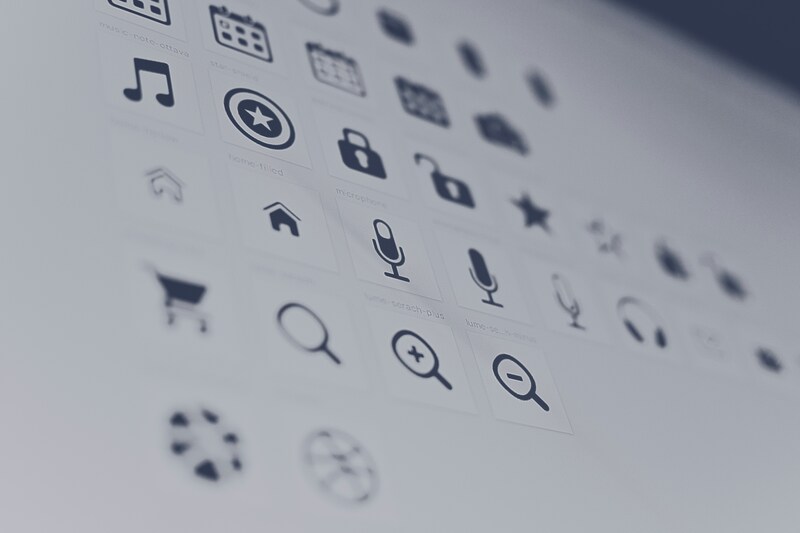
A great flyer design is able to deliver information using a small space. This means that every inch counts! That’s where icons come into play. You see icons everywhere, and for good reason. They’re minimal and recognizable and can sometimes replace the text in your flyer design. Icons can represent different options offered by your business.
Finding icons that are free to use may be difficult to find. But, Canva has compiled a list of 50 free icon resources that you can use to make your flyer exactly what you want it to be. You’ll be able to find high-quality icons available in any format you need.
5. Fonts
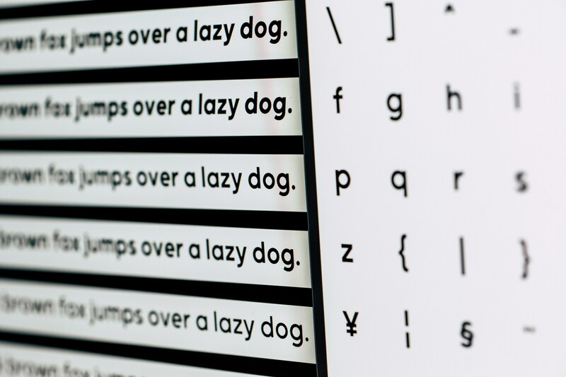
Your fonts should be selected wisely. Make sure your flyer is easy to read, or else your information won’t be lost in the design. Sure, it can be tempting to use beautifully ornate fonts, but they’re not exactly legible. Readability should always be your priority when it comes to great flyer design.
Your grammar and spelling are incredibly important. If you have misspellings on your flyer, how can people trust you as a business? Always double-check every single piece of information. It can make all the difference.
6. Shapes
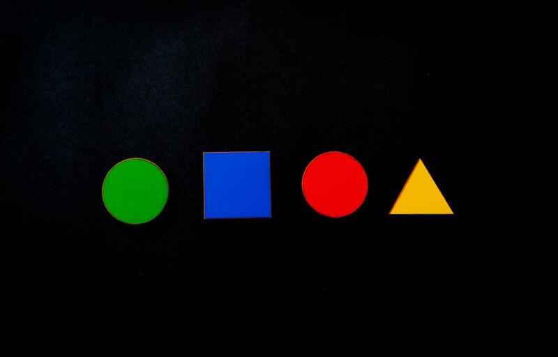
Depending on your flyer design, try overlaying several shapes to create a nice middle-ground for text or negative space. Adding simple geometric shapes can help with readability. Placing your text on top of a semi-transparent shape makes the words easier to read, especially if the background is loud. Adjust the transparency so the background is still visible. When you are using shapes, make sure that it still flows nicely with your other design points. You don’t want it to interfere with everything else.
7. Simplicity
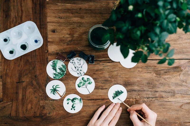
Don’t underestimate the power of minimalism in design. Having white space or negative space is not necessarily a bad thing. Minimalism allows for your flyer design to look polished. It allows your words to stand out and your audience to consume information faster. People will only stop to glance at a flyer. If it is too busy, they will move on quickly. A great flyer design should be plain enough to read but also visually appealing enough to stop someone in their tracks.
8. QR Code

You see QR codes everywhere, and for good reason. It’s an easy way to share information using a small amount of space. Your audience can find out more about your business, enter contests, receive exclusive offers, and more. Explore all the possibilities of using a QR code to maximize the purpose of your flyer.
What’s cool about QR codes is that you can design around it into fun shapes. For example, Snapchat designed theirs so that the logo still stands out and it makes it easier to add your friends. Some companies choose to reshape QR codes completely so it blends in with the rest of the design. You have creative freedom and will ultimately result in a great flyer design.
9. White Space
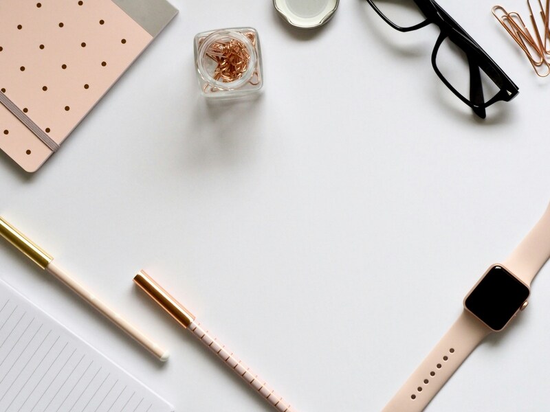
In art and graphic design, white space (or negative space) refers to the area that surrounds the elements. It is neither white nor negative; it can be any color or pattern that envelops fonts, images, or illustrations. It is vital as it creates emphasis, leads the eye to the essentials, increases readability, and conveys a mood or feeling.
With the human attention span currently at just eight seconds, according to a Microsoft study, a great flyer design is one that uses white space. They say less is more, and using white space can result in a good flyer design that’s pleasing to the eyes. When a potential customer is handed a flyer that’s cluttered with too much information, it’s highly likely that the flyer will go straight to the trash bin.
For this reason, the use of white space is imperative if you aim to create a great flyer design online or on paper.
10. Integrate Branding
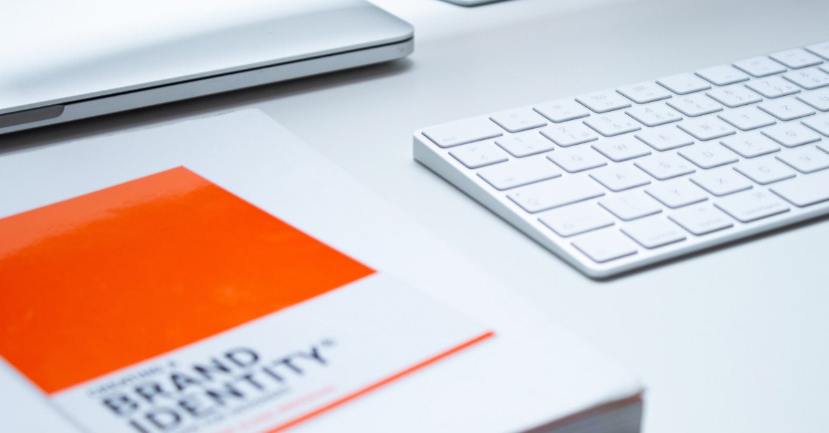
Using a flyer as a marketing strategy is only effective if the recipient gets to read them thoroughly. When creating your flyer design, it’s highly recommended to incorporate your branding as much as possible. After all, the primary purpose of having them is to increase sales through efficient brand identity and awareness.
Making a great flyer design means creating something that’s uniquely yours. Whatever medium you use, people will recognize you and give them a good sense of who you are. This translates to establishing a connection with your customers.
Integrate the flyer design with your brand colors, logos, and other identifying elements. In this sense, consistency is also essential. Being consistent with your brand identity across all your marketing strategies give a harmonious look and feel to your campaigns. Consumers can easily associate your flyer design with your brand and, thus, build awareness, gain loyalty, and increase revenues as well.
Entrust your flyer design with Penji, and our design team will incorporate branding as requested. Learn more about how the Penji platform works so you can make your first request.
11. Contrast
Your flyer can benefit from a good contrast in its design elements. A good flyer design is one that the recipient will read through from start to finish. Likewise, a great flyer design is one that the recipient will keep.
In terms of contrast, you need a combination of light and dark, large and small, thin and thick, and so on. Using the color wheel as a reference, you can see what contrasting colors are the best and what will work well for the overall flyer design.
You can also show contrast in the fonts that you use. Using two matching fonts instead of just one makes the design more exciting and appealing. These and many other techniques to add contrast to your flyer design can make it more outstanding.
12. Your Contact Information
This may seem quite obvious, but wouldn’t it be a mess if this is the one that you forget to add to your flyer? Once you follow these tips to great flyer design, you’ll want to make sure that your contact information is written at the end, which can only mean that the reader has gotten through the end part of the flyer.
Request a Great Flyer Design on Penji
When you subscribe to a Penji plan, you finally get access to the Penji platform. This means you can start submitting your design requests. Furthermore, you can do that in three easy steps. Here’s how you can do it.
Step 1: Create a Flyer Design Project
Upon sign-up, you need to head over to the Penji platform, where you’ll see the Penji dashboard. Then, click the +New Project button. After this, you need to fill in a form where you’ll provide details of your design project.
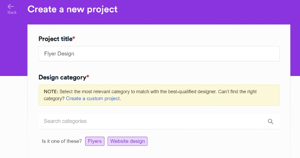
First up, you need to supply the Project title and Design category. When you finally name the project, select a design category. You can type the word “Flyer” on the search bar and click on it.
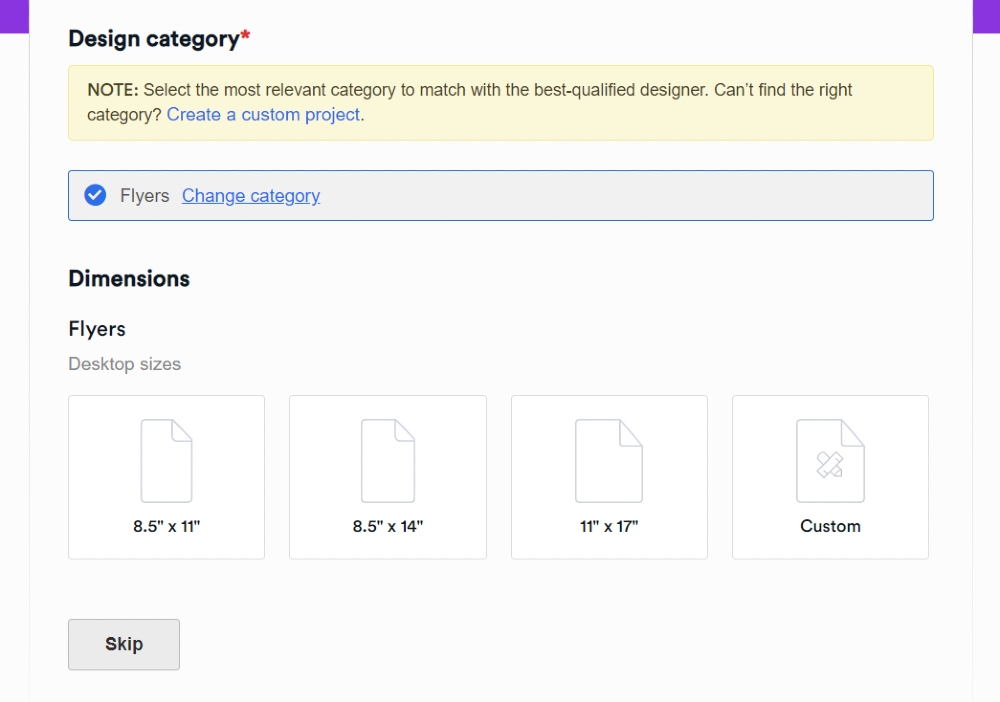
After that, you have to choose the dimensions of your flyer. You can choose among the ones below or select Custom if the flyer has a specific size. Then, please click Next, then the Description box will appear.
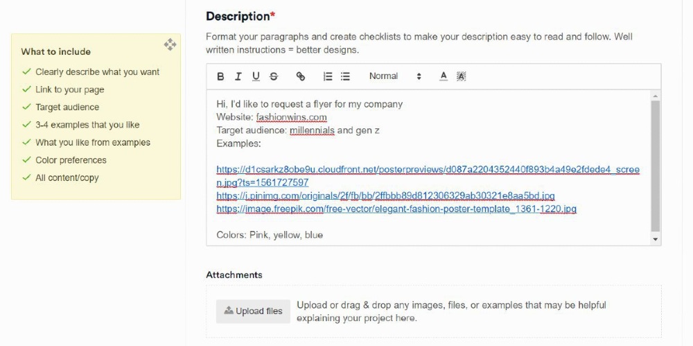
On the Description box, please make sure to include all details of your design project. You can even refer to the guidelines found on the left side of the page. This way, your designer can produce a design according to your specifications.
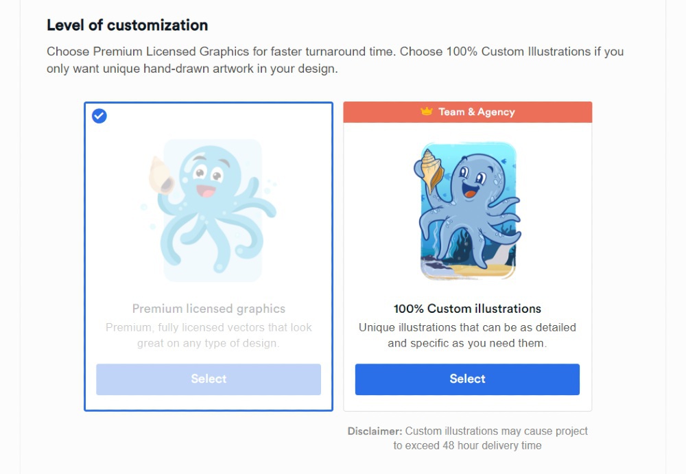
Once done, click Next. Then, select the Level of customization, File deliverables, and Associated brand.
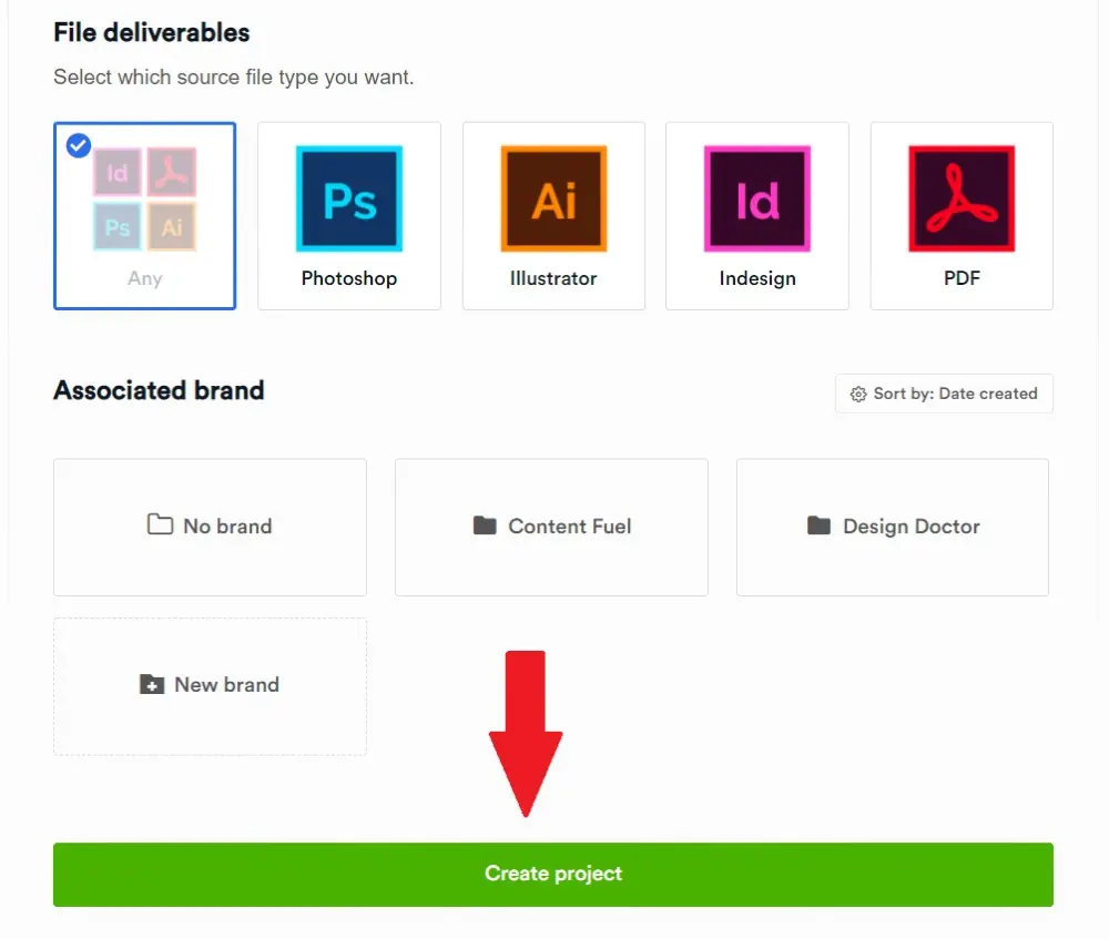
If you’re all set, click Create Project. Congratulations! You finally have your first active project on Penji.
After this, Penji will assign a designer to your project. They’ll read the project brief and work on it straight away. Expect to receive the first draft within 24 to 48 hours.
Step 2: Review the Flyer Design
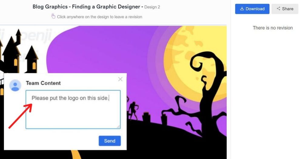
When the designer submits the first draft, you can review the design. If it needs more improvement, you can leave revision notes. To do that, you can use the handy built-in revision note tool. This way, the designer will know how to revise the design and send over a new and improved one.
Step 3: Download the Flyer Design
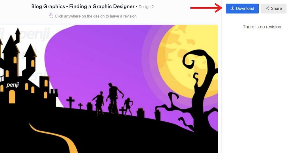
Once the designer fulfills the project, and you’re 100% happy with it, you can download the design. All you need to do is click the blue Download button, and the files will be saved to your computer.
Final Thoughts
Get more people interested in your business by handing out flyers that will turn heads. These 12 flyer design tips will get people’s attention and won’t end up crumpled in the trash. And if you want to get compelling flyer designs, sign up for a Penji plan today.
For only $499/mo, get all the marketing collaterals you need. In the same plan, you can even request website and app design, illustrations, and infographics! Other design services will require you to subscribe to another plan on top of a current subscription. With Penji, it’s all included! Subscribe now and try the platform risk-free for 15 days!
About the author

Jie Kuang
Jie is a Marketing Manager and Content Writer for Penji. She has a background in design, technology, and innovation strategy.


