


Competing against hundreds of other ecommerce stores in your niche is a challenge. On top of offering the most valuable products, your ecommerce web design must also cater to convenience. Creating the most user-friendly ecommerce website will lead to navigability, offering a seamless shopping experience.
Looking for ecommerce web design inspiration? Here are eight we found that could boost your online sales!
1. Help Scout
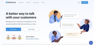
Help Scout is a B2B business that makes communication a breeze within an organization. The website design is also built to garner more sign-ups from businesses. It’s clean and provides a detailed menu with descriptions of each item. This makes it easier for users to know Help Scout’s features and benefits. They also feature a moving “Testimonials” page underneath, allowing users time to read and enjoy every recommendation.
One web design feature that stands out is the hover effect. An icon represents every brand feature, and users can hover over that icon to get a detailed description. Often, brands want to display all information about their products or services. However, this can be a recipe for disaster as it makes the web design cluttered. Help Scout’s hover feature is a smart way to prevent a hodgepodge of various menu items on your website.
2. Shopify

Shopify’s primary brand color welcomes website visitors from its homepage. The color green serves as a background, which dons a video explaining what Shopify is all about and a free trial offer. The offer is direct, with only a one-liner enticing users to sign up. One field is displayed, coupled with a light green call-to-action (CTA) button on the right.
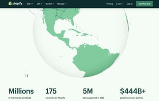
Shopify also uses grids and colors to separate various details about the brand. Additionally, the large animated globe is eye-catching, especially with the numbers underneath for social proof.
Finally, the brand displays a clip to explain three categories. This runs slowly and moves from one category to the next. Overall, Shopify’s ecommerce web design is soothing to the eyes.
3. Allbirds
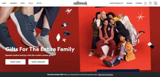
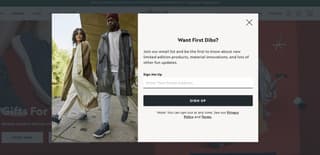
If there’s one ecommerce design trend you must tick, it’s utilizing bright colors for more appeal. Allbirds uses vivid colors that don’t overwhelm users. Once you land on their homepage, a popup form welcomes you with a conversational copy and field for your email.
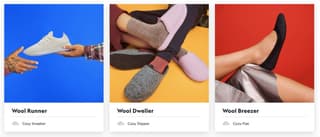
Allbirds’ homepage also displays images of happy people wearing the brand’s products. The brand also features its shoe products once you scroll down the homepage in various colored backgrounds.
Moreover, Allbirds communicates its advocacy for sustainability in grids, showing different images. Underneath dons an evident CTA button, “Our Sustainable Practices,” which users can click if they wish to know more.
4. Skullcandy
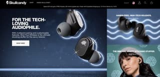
If you want to maximize online sales, getting into the holiday spirit is key to garnering more leads. Skullcandy transforms its website into a holiday-themed design, showing snowflakes that imply winter or snow. It also features its best-selling product front and center. With the large image, it’s hard not to click and learn more details about the earbuds.

Skullcandy also contrasts the blue color with this colorful and welcoming Gift Guide page.
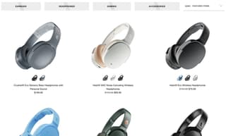
Moreover, Skullcandy’s product page is clean and easy to browse. The brand displays four categories, a search field, and individual products, each with its description and corresponding price.
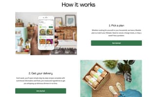
5. Hello Fresh

Your aim as an ecommerce entrepreneur is to cater to user experience, and you should take a leaf out of Hello Fresh’s web design. It’s built for user experience, with a good structure from top to bottom and on every web page.
Hello Fresh showcases its kit with a bulleted-style description for easy browsing. This is followed by a green CTA button that compels users to click.
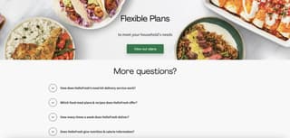
Additionally, Hello Fresh also displays high-quality images of meals, coupled with an evident CTA button. And to further cater to user convenience, the brand includes a FAQ section at the bottom of the homepage.
6. Bliss
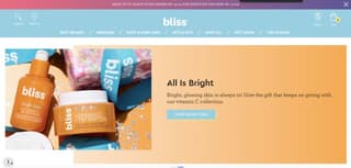
This ecommerce web design from Bliss is the total eye-candy for website visitors. The pastel colors make this design approachable and suitable for a cosmetics brand. Also, the consistency in using pastel colors is commendable that even the footer dons the same color combinations.
The CTA buttons on the homepage and every page are also in blue and yellow palettes. Additionally, Bliss displays some fun animated icons for a more enjoyable engagement with users.
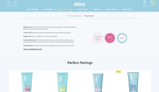
Finally, the brand’s product page is built for optimizing conversions by including the key ingredients and directions for use. At the bottom is the “Perfect Pairings” section, which is an excellent idea for upselling. Overall, this virtual store website design is well-thought-out and marketing-ready.
Related Article: 7 Design Elements in Ecommerce Advertising
7. Black Star Pastry
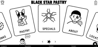
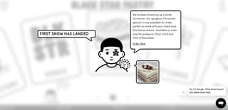
The black-and-white color combination doesn’t have to be drab. Take Black Star Pastry’s online store web design, for example. The overall appeal is welcoming yet provides an edge over other online stores. You’ll see the unique popup first once you visit its homepage and a chatbot on the lower right side.
Once you click anywhere on the page, fun black-and-white illustrations also double as the brand’s menu. These illustrations comprise the entire homepage, which users can click left or right to choose an item.
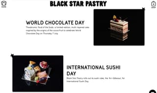
The sophisticated product page, with professional and quality images of the pastries on black background, is beautiful. And with a brief and compelling copy for each item, consumers will be urged to order a treat!
8. Pop Fit
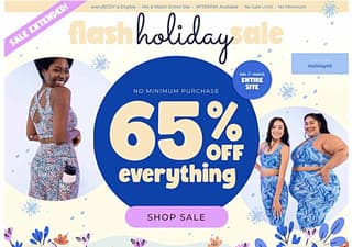
Keep your ecommerce web design straightforward by showcasing your promo offers—just like Pop Fit’s website. The animated flashing blue circle, coupled with the flashing pink ribbon on the left, locks the eyes in. The promo code is also conveniently displayed, along with the pink CTA button, for a smooth customer journey.
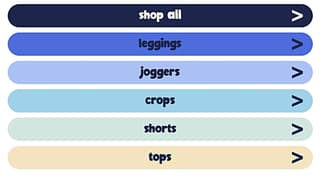
When you scroll down, you’ll see various product categories in different bright colors. Clicking on one of the categories will let users choose the size first before they can continue shopping. Overall, Pop Fit’s website is simple yet has all the qualities of a user-friendly online store website.
Conclusion
A top-notch ecommerce web design is your key to more leads and higher conversions. That said, it’s best to work with professional web designers to create the most compelling ecommerce website design.
Work with Penji for your online store website design, and we guarantee a professional-looking website built for maximum sales. Not sure if you want to subscribe for a whole month? Try Penji’s 30-day money-back guarantee and request your first website design by signing up now!


