Ecommerce has become a global economic juggernaut, and it’s only getting bigger. In 2023, it’s expected that 20.8% of all shopping worldwide will be done online.
As you can imagine, there’s more and more interest in building an ecommerce business—and more and more competition for consumers’ attention. How do you stand out in an industry with such rapid growth? The answer is simple: branding.
At Penji, we know a thing or two about ecommerce branding. We’ve provided design services for hundreds of ecommerce brands, and we know exactly what practices can yield the best results—and what mistakes can sink your business.
What is ecommerce branding?
As you should know by now, “ecommerce”—sometimes written as eCommerce or e-commerce—is a technical term for online shopping. From Amazon to Zara, there’s millions of online retailers in the ecommerce world. And new innovations like drop shipping are causing the industry to expand even further.
Branding is much more than just a logo. It comprises all the elements of your brand that you want your audience to keep in mind. Ecommerce branding can include:
- Logos
- Brand colors
- Typography
- Social media graphics
- Website design
- Formatting
- Tone of voice
- Mascots
- Product design
- Sense of humor
- And much, much more
If you’re already feeling overwhelmed, don’t fret. This blog will walk you through every step of the process to create unique, unforgettable ecommerce branding.
The 7 steps to perfect ecommerce branding
These are the 7 steps necessary to build a memorable ecommerce brand:
- Brand identity
- Personality
- Values
- Name
- Fonts and colors
- Logo and brand guidelines
- Website design
[in_content_ads gallery=”logos” logo=”on” title=”Need graphic design help?” subtitle=”Try Penji’s Unlimited Graphic Design and get all your branding, digital, print, and UXUI designs done in one place.” btntext=”Learn More” btnlink=”https://penji.co”]
1) Brand identity
One of the biggest mistakes people make when building their brand for the first time is skipping to what seems like the easy part: the logo. It’s the first thing you think of when you consider a brand, and with so many free custom logo makers out there, it seems like the simple way to go.
In reality, you don’t want to wed yourself to a logo until you have your brand fully fleshed out. Professional logo designers know that your logo is the face of your business. That’s why they’ll want to know as much as possible about who your business is before they design your logo.
To get started, the first question you need to ask yourself is the same question customers will ask you: “Who are you?” What do you offer? What sets you apart from other companies that offer the same thing?
Ecommerce branding example: ILIA Beauty
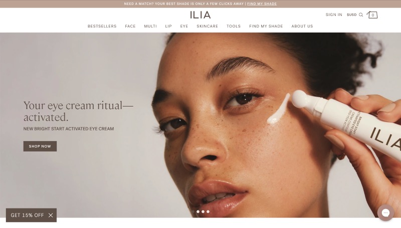
There are simple ways to show off your unique personality in ecommerce branding. ILIA’s ecommerce site follows some of the classic hallmarks of beauty branding: skin tones, a slim sans-serif logotype, and words like “bright” and “activated.”
At the same time, ILIA’s look is distinctly different from Sephora or Ulta. They only carry one brand—their own—and they use design to showcase why their brand is healthy, natural, and worth your loyalty.
2) Personality
This seems to go hand-in-hand with identity, but it’s a little more specific. In addition to your logo, your brand personality affects all the copy you write in ads, press releases, on social media, and on your ecommerce website.
If your brand was a person, what type of person would they be? Are they someone your target audience would be friends with? Someone they’d be attracted to? A trusted advisor?
Ecommerce branding example: Bon Bon Bon
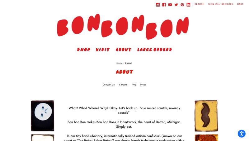
This Detroit-based food ecommerce sells bon bons nationwide, and theirs is one of the more unique examples of ecommerce branding. Their hip, bohemian style comes across in everything from their sharp red logo to their eclectic packaging.
This branding doesn’t just attract hip young adults; it sets them apart from competitors, making them stand out more to a broad range of consumers.
3) Brand values
Not every brand needs to champion social causes, per se. But appealing to a moral value that your audience shares is a great way of fostering connection. This is done in subtle ways, whether you realize it or not.
Ecommerce branding example: BLK & Bold
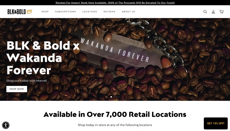
This Black-owned coffee shop lists its key values as quality, convenience, community, and diversity. For people who go out of their way to support Black businesses, that message rings loud and clear through their name, logo, and the historical coffee facts they post on Twitter.
4) Name
Like the logo, a lot of people rush to come up with a name for their business. After all, how do you introduce your business to someone without a name?
But the truth is, you’ll have a much easier time coming up with a name once you’ve settled on your ecommerce brand’s identity. It can help you decide what information to convey with your brand name, and how to convey it.
Ecommerce branding example: SSENSE
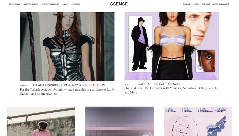
Luxury brands often look for elegant, distinctive names, pulling from their founders’ histories. But online luxury brands like SSENSE and FWRD have their own ethos. They embrace their digital focus, playing with spelling and capitalization to create names you have to be “in the know” to know.
5) Fonts and colors
Now, we get into more traditional ideas of ecommerce branding. Your font and color choices will have implications across all channels for your business, and many first-time business owners make the mistake of choosing carelessly.
First of all, you need to buy a commercial license for any font you use in your logo. That means you need to pick a font and commit to it. While colors are obviously free for all, they can have a tremendous impact over how your business is viewed.
Ecommerce branding example: Shapeways
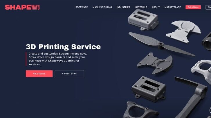
This 3D printing service illustrates how font and color choices can not only help set your brand apart, but help convey what you do. The logo uses ultra-wide and ultra-thin type to showcase Shapeways’ ability to build and shape new creations. They use an inviting, bold sans serif font and a unique shade of red, where most of their competitors use blue.
6) Logo and brand book
Now it’s getting serious. You know exactly who your brand is, what you want to convey with your branding, and what elements you want to use. Now it’s time to put them into action.
There’s a lot of theory that goes into how ecommerce logo design can convey your brand’s personality. Rounded edges can convey friendliness, while sharp lines indicate authority. Pastel colors are kid-friendly, while darker shades target pros.
Ecommerce branding example: Amazon
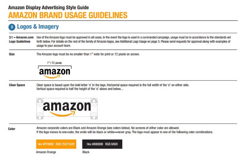
We had to get to the granddaddy of ecommerce eventually. Part of Amazon’s success story is their impeccable branding, which has stayed consistent for over 20 years. The yellow arrow suggests a smile while also pointing from A to Z, hinting at Amazon’s wide range of products.
Amazon has extensive guidelines for the right and wrong ways to use their logo. Consistency is key, so when you find the perfect look for your brand, commit.
7) Website design
This step is especially key for ecommerce branding. As an online retailer, branding and convenience go hand in hand in your website design. Everything from your product page to your shopping cart is an opportunity to showcase your brand and provide consumers with the best possible experience.
Ecommerce branding example: Poketo
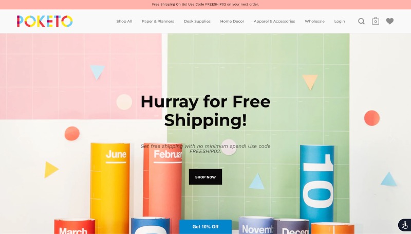
This stationery store is all about bright colors and minimalist design. That attitude comes across in their products, their logo, and their online store. It’s not just bright colors that suit the brand. The easy navigation, simple copywriting, and use of white space all help convey that Poketo is friendly, simple, and transparent.
Step up your ecommerce branding with Penji
Ready to get your branding on point? The best place to start is with Penji!
We offer unlimited graphic designs from certified design pros for a simple monthly fee. That means that from your logo to your website and everything in between, we’re up to the challenge.
Sign up for a demo to see how Penji can help your ecommerce business grow.


