
When you’re buying something online, how do you pick the right ecommerce site? Maybe you go with a trusted brand name, someplace you’ve ordered from before or seen in an ad. But there’s an unconscious factor that you might not have even realized informs your purchasing decisions: product page design.
Sure, there are good examples out there to crib from. Anyone could take the basic outline of an Amazon product page and remake it. But ecommerce is still an industry on the rise, and the tools to create a perfect page for your product aren’t always readily available.
No need to worry—here are 9 great examples of product pages to help inspire your ecommerce web design. We’ll also share key lessons to learn from each of our examples.
The basics of product page design

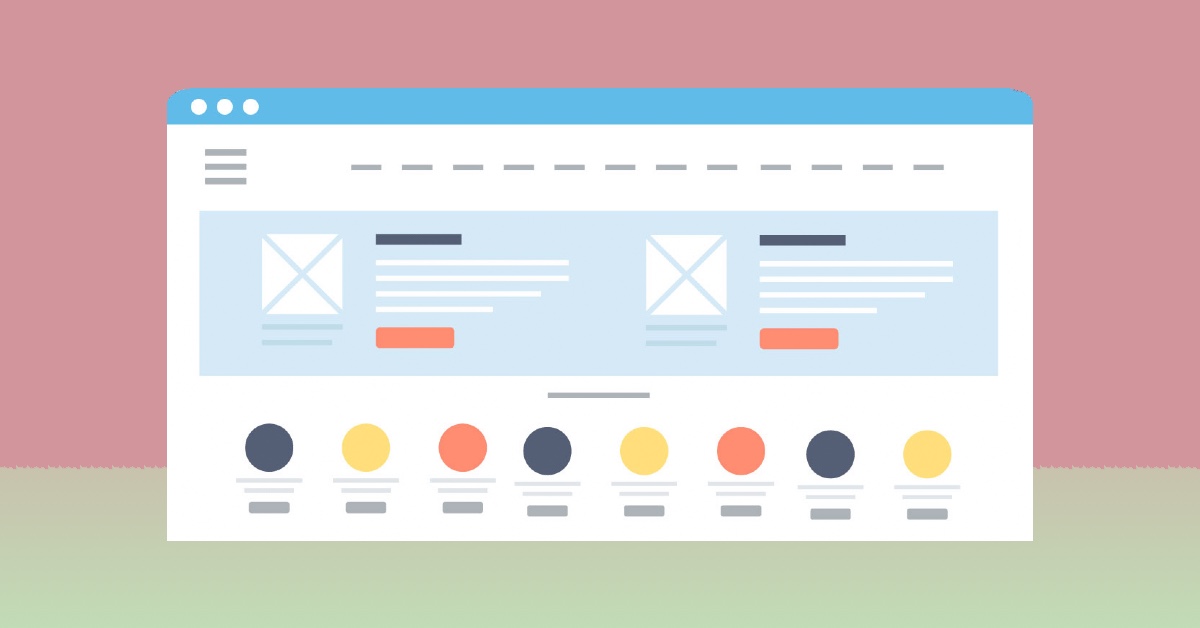
In ecommerce, a product page is the page you view when you click on a product. It’s one of the most important elements of an online store, separating it from a mere catalog. It allows customers to view the important details of a product and decide if they want to buy it.
However, it’s possible for a branded website outside of ecommerce to have a product page. This is often the case for food and drink brands. Their product pages include information on flavors, nutrition, etc.
The basic elements of a product page include the product’s name, an image of it, a description, its price, and the ability to add it to the user’s cart. You’ll also often see customer reviews and suggestions for similar items.
9 product page design tips and examples
We’ve prepared some essential tips for ensuring your product page design attracts and retains customers. We’re also featuring some of the most well-designed product landing pages that provide examples for those tips.
The most important things to consider when designing an ecommerce product page are:
- Use high-quality images
- Write persuasive copy
- Put visual appeal first (and match your brand)
- Make key details accessible
- Describe a product’s benefits
- Suggest similar products
- Include social proof
- Make options and availability clear
- Direct customers to their next step
Below, you’ll find further details on each of these steps, as well as 9 of our favorite product page designs for inspiration.
1) Fitbit: Use high-quality product images

This may strike you as the bare minimum of product page design, but you’d be surprised how often it goes overlooked. If a product page looks untrustworthy, the most likely culprit is low-quality, deceptive, or stock photos.
Crisp, clear images are a great way to get customers. Fitbit uses detailed models of their products against a slick gradient background, but a well-lit professional photo will also do the trick. If possible, allowing customers to zoom in on your product is always appreciated.
[in_content_ads gallery=”logos” logo=”on” title=”Need graphic design help?” subtitle=”Try Penji’s Unlimited Graphic Design and get all your branding, digital, print, and UXUI designs done in one place.” btntext=”Learn More” btnlink=”https://penji.co”]
2) Glossier: Write persuasive copy

Once your pics are on lock, the next place to look for improvement is the text that appears next to it. As we’ll get into, it’s important to give potential customers access to the essential details of your product. But that doesn’t mean you can’t exercise some marketing know-how in the process.
Each Glossier product page includes a one-sentence description that sells the product, followed by a paragraph that expands on it. You want the first sentence your customer reads to convince them to keep reading, so make it count.
3) Orangina: Put visual appeal first (and match your brand)

A consistent branding package is a must-have for any business. Colors, fonts, and motifs should carry across all your branded designs, and that includes product pages. It’s important for product pages to be informative, but putting visual appeal first will help improve user experience and set you apart from competitors.
Many ecommerce sites use black text on white space to get their point across. But even those sites follow design principles when it comes to layout, font choices, and splashes of bright color. Speaking of splashes, brands like Orangina choose to go all out with unique, colorful product page designs.
4) Good Dye Young: Make key details accessible

The more your customer can learn from your product page design, the better. One of the biggest downsides of online shopping is not being able to physically see and interact with a product before you buy it. Ideally, your customer should feel that they know exactly what they’re getting when they check out.
Good Dye Young offers a stellar example of not just how to include this information, but how to organize it in a persuasive visual hierarchy. Below the product photo on the trendy brutalist website are the highlights—key benefits and how long the hair dye will last. Below that is a paragraph summary, then a bulleted list of features, followed by instructions, ingredients, and more. A customer can be satisfied with the basic info, or keep scrolling until they find what they’re looking for.
5) Rocky Mountain Soap: What’s in it for me?

Yes, customers are looking to be informed when they look at a product page. But really, they don’t just want to know all the nitty gritty details of what goes into your product. They want to know how they could benefit from buying it, and that’s what your descriptions should emphasize.
Rocky Mountain Soap puts persuasion at the heart of all its product descriptions. It won’t leave you dry, it’s hydrating, it’s got nourishing ingredients. Scroll a little further and you’ll find information on the soap’s seasonal scent, how it’s vegan and cruelty-free. These are the kinds of details that satisfy your consumer base, making them not just interested in your product but excited about it.
6) Rent the Runway: Suggest similar products

Some people know exactly what they’re looking for when shopping online. But be honest: how often have you entered an ecommerce website looking for one thing and left with something completely different?
Product recommendation tools elevate the shopping experience by encouraging users to buy more, but they also help them find what they’re looking for. A product page for a dress from Rent the Runway includes suggestions for clothing in a similar product category. If the thing they clicked on isn’t quite what they need, it’s convenient to access similar products right from the same page.
7) Poo-Pourri: Include customer reviews (social proof)

Psychologically, people like to do what everyone else is doing. Moreover, the words of actual human beings who’ve tried the product make a huge difference in a purchasing decision. These are the reasons that every good product page design includes social proof in the form of customer reviews.
The trouble, of course, is getting those reviews. If you look at Pourri’s store, you’ll note that some products don’t have any reviews yet. Fake reviews are a slippery slope, so it’s best to encourage your customers to leave reviews on your site.
8) Sonos: Make options and availability clear

This goes hand-in-hand with suggesting similar products. You want to make sure that your customers find exactly what they’re looking for. Every dead end they hit is an opportunity to take their business elsewhere.
As such, it’s important that they know exactly what they can get when they click on a product. Sonos goes above and beyond color palettes and design elements; their product pages include drop-down menus that suggest different bundles of products you can combine.
One of the biggest ecommerce pet peeves is products that are unavailable still being listed on the site. If you can’t provide a customer with a product, they shouldn’t have to visit that product’s page—or worse, add it to their cart—to find out.
9) Jackbox: Direct customers to their next step

A huge part of web design for ecommerce is designing the customer journey. Think of entering a store: once you enter, you start browsing, pick out your items, and then check out.
But do you look around first, or go straight towards what you’re looking for? What items are near the entrance? How many different sections will you look through? What items will you find in the checkout area?
The same “what if” questions inform the customer journey process. Since Jackbox sells video games, they anticipate that most shoppers will only buy one at a time. When you click the “add to cart” call to action, you’re taken directly to your cart, with the option to return to shopping if you wish.
Product page design for everyone
With these foundational elements, you can make sure that your product page attracts customers and keeps them coming back for more. The other piece, however, is graphic design. Colors, logos, illustrations, typography—all these and more can help set your ecommerce site apart from the crowd.
To get all your graphic design needs for one simple price, sign up for Penji today.
About the author

Table of Contents
- The basics of product page design
- 9 product page design tips and examples
- 1) Fitbit: Use high-quality product images
- 2) Glossier: Write persuasive copy
- 3) Orangina: Put visual appeal first (and match your brand)
- 4) Good Dye Young: Make key details accessible
- 5) Rocky Mountain Soap: What’s in it for me?
- 6) Rent the Runway: Suggest similar products
- 7) Poo-Pourri: Include customer reviews (social proof)
- 8) Sonos: Make options and availability clear
- 9) Jackbox: Direct customers to their next step
- Product page design for everyone


