The rise of mobile bank apps allows customers to do things efficiently and conveniently. It’s now easy to verify your balance, check recent transactions, transfer funds, and pay bills. According to statistics, 71 percent of bank customers prefer a user-friendly digital experience over friendly staff. Financial institutions must consider a mobile bank app to provide a remarkable user experience. Here’s why.
Caters to customer convenience
Bank apps cater to customer convenience because apps save them a trip to the bank. If they ever need to pay someone or check recent transactions, logging into the bank app is all it takes. Moreover, online apps are constantly improving their interface and adding features. For instance, logging in requires a fingerprint ID only, making it easier to access your account online.
Decreases bank expenses
Although a bank app caters to user experience, it also offers a win-win situation for banks. With a bank app, your company can eliminate options for sending paper bills and delivery. A mobile banking app can also save employees time and effort within your organization.
Imagine a client who only needs to check her bank balance and has to drive to the bank. The client has to wait in a long queue, and employees, on the other hand, must cater to a simple inquiry. Employees could entertain other more critical concerns than catering to a simple one, such as a bank balance.
Offers 24/7 services
Whether customers need to check their accounts, transfer funds, or have inquiries in mind, a bank app provides services 24/7. Brick-and-mortar banks only operate between office hours, not offering flexibility for people who also work a nine-to-five. These customers might be unable to squeeze in some time to visit their bank for concerns.
On the other hand, having a bank app that they can access 24/7 is a big deal for busy customers. Now that technology is leaning more toward AI, mobile apps with integrated chatbot technology can cater to simple questions. This not only saves banking organizations money for hiring more customer service representatives. But it also offers customers convenience by not having to wait by the phone for these reps.
Reduces employee workload
Bank employees would no longer have to tend to simple concerns like bank balance inquiries. Instead of entertaining clients with trivial matters, employees can entertain clients with more significant issues.
Moreover, depositing checking accounts or transferring funds doesn’t have to be a pain in the neck. Clients can do all this on the bank app, even without the help of competent staff.
Provides more control

Since technology aims to connect every application in similar niches as much as possible, bank apps offer more control. Some bank app features include integrating third-party services like digital wallets or ecommerce platforms. Some mobile banking apps also let clients activate or deactivate credit cards in one click.
Another feature that offers more control within a bank’s client base is the availability of investment products. Some banks partner with other companies and services and provide investment options for customers.
Lets clients pay their IOUs
If clients owe someone money, they no longer have to drive to the ATM, get the cash, and hand it out to the person. They also don’t have to go to the bank, wait in line, withdraw some money, and give it to the person they owe. It’s easy to log into their bank app, input the other person’s bank account details, and send money.
Also, it’s easy to pay bills using a bank app. With third-party integrations, customers can pay their electric bills, credit card bills, and even insurance via their mobile bank app.
5 Bank App Design Examples to Follow
If you’re convinced to create your mobile banking app, check out some examples for inspiration. A bank app must have a clean and straightforward interface, with as many insights and information at a glance. Here are five real bank app design examples that consider users first.
1. Alfa-Bank
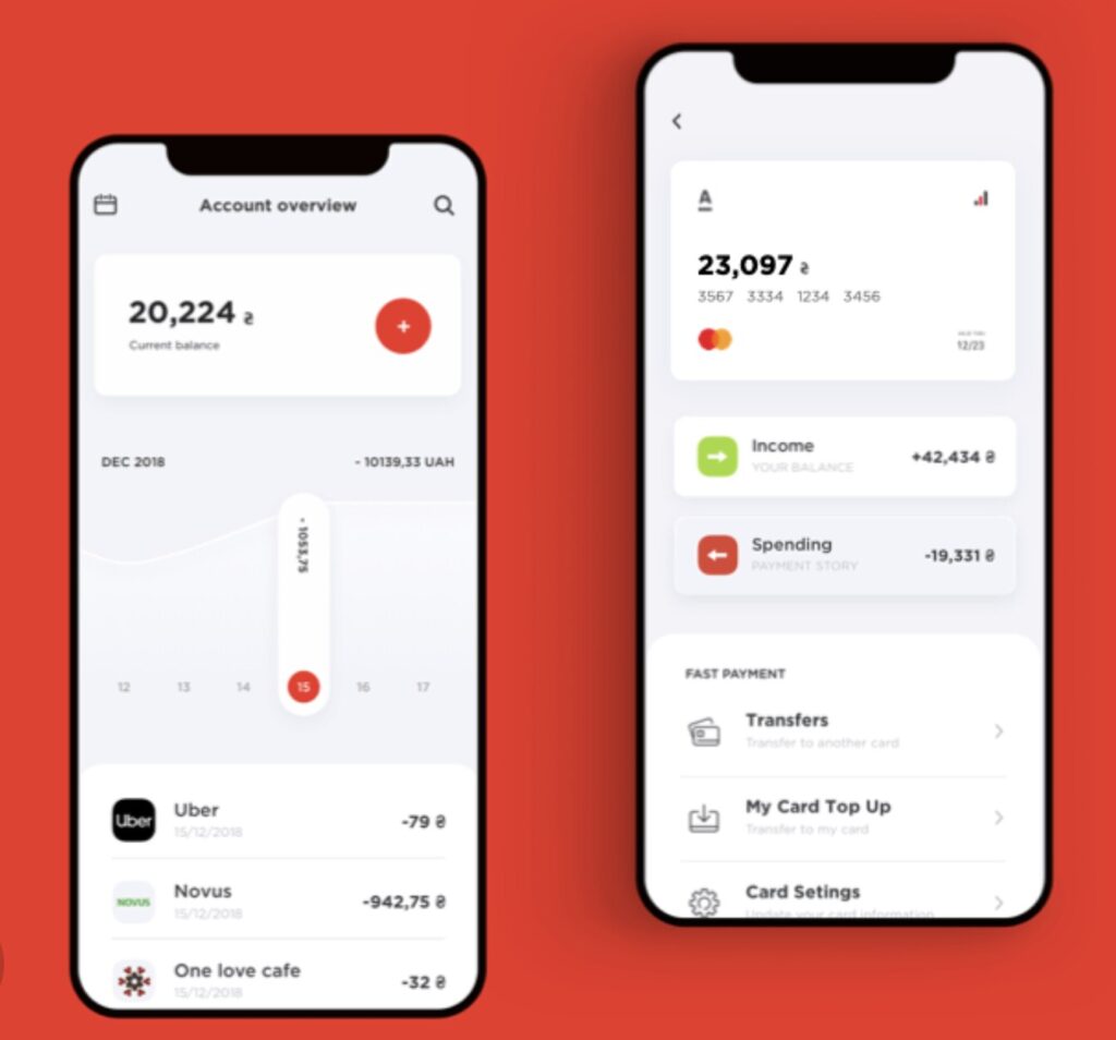
Alfa-Bank is the largest private bank in Russia. Businessman Mikhail Fridman founded it in 1990 and now operates in seven countries, amassing over 22 million active customers. You won’t see a lot of fuss in Alfa-Bank’s mobile app because it’s simple without too many distractions.
You’ll see the total bank balance at the top and a nice vertical feature that shows the date and debit or credit transaction. Green and red arrows also represent the entire balance and spending, allowing clients to see these details without clicking on the transaction history.
2. Revolut
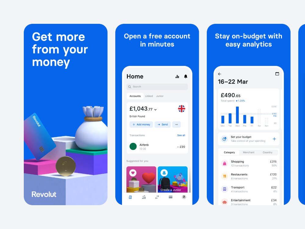
This British financial technology company is headquartered in London and was founded in 2015. Revolut dwells on its primary color and includes it on every bank app page. It has a clean interface with a few buttons for navigation. You’ll see the bank balance at the top, a search field, and buttons to add and send money.
3. Cradle
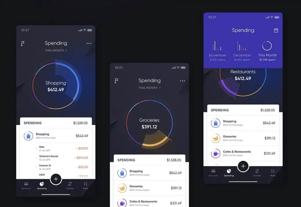
This is the app to collect payments and offers business buyers purchase credits. Cradle is also one of the bank apps that allows customers to open an account regardless of their geographical location. The app design is also bolder, not shying away from using bright and dark colors for contrast.
The spending is represented by pie charts, and a detailed summary is displayed at the bottom if you want to know more.
4. Bank of America
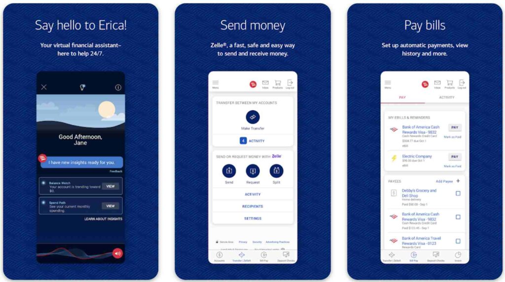
Headquartered in North Carolina, this multinational investment and financial services holding bank takes banking app design to the next level. Bank of America offers human-like interactions by introducing its virtual financial assistant, Erica. Essential details are also displayed at a glance, coupled with blue CTA buttons for ease.
5. Chase
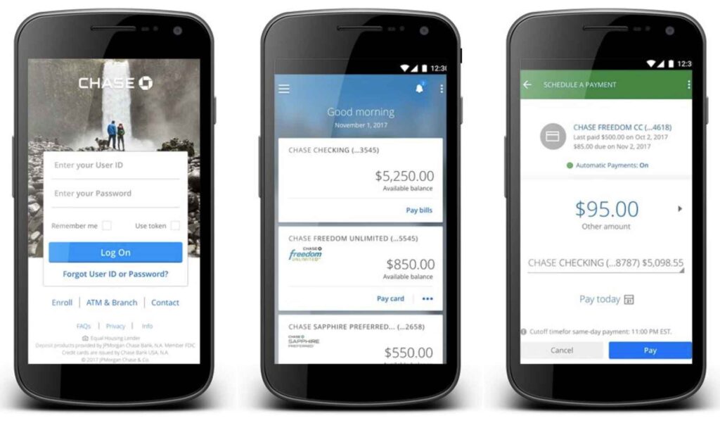
Chase is an American national bank in New York City with a multinational banking and financial service subsidiary, JPMorgan Chase. Chase’s bank app design has a simple layout and structure. Essential details are displayed from top to bottom. Users can scroll up or down to browse the insights from the app’s main page. Plus, a kebab menu sits at the top right for quick navigation.
Conclusion
A bank app is essential, especially if you’re a multinational financial and banking company. It connects and engages with customers, making it easier to retain them and have customers for life. If you don’t know where to start with your bank app design, Penji can help.
We’re an unlimited graphic design company that can help you with your bank’s logo, branding and marketing materials, and web and app designs. Subscribe to Penji’s 30-day money-back guarantee now, or take this 15 percent discount we’re giving away for today!


