
Any financial institution or company is perceived as trustworthy or professional. Banks, in particular, need to embody those characteristics to become seen as reliable. Plus, they want to show they safeguard their clients’ money. If you need a bank logo, take a look at some examples made by our amazing Penji designers. Plus, get a logo from Penji here!
Why You Need a Professional Looking Bank Logo
Creating a professional-looking company logo will set the right tone for your business. Since your company logo reflects the kind of company you are, ensure that it’s memorable, unique, relevant, scalable, and simple.
Here are the benefits of letting professional designers create an excellent and unforgettable bank logo:
Makes a good impression
You want your prospects to trust your financial institution from the get-go. Since you’re dealing with people’s hard-earned money, you want to make an excellent first impression, so clients trust you.
Makes you stand out from the competition
A well-thought-out logo created by experts will undeniably stand out from the crowd. You want your company logo to establish top-of-mind awareness within your target audience. This way, your company is the first thing that pops up whenever they need financial-related assistance or services.
Tells prospects who you are
A company logo says a lot about your branding and brand personality. Some bank logos feature icons and drawings that tell a brand’s history and story. Check out the 10 bank logo examples below to understand how to infuse storytelling in your company logo.
Builds trust
A bank logo must instill trust and confidence within its target market. That’s because dealing with people’s money shouldn’t be taken lightly. This industry needs credibility for your company to stand out from the competition. That said, a professional-looking logo can build trust, especially with the careful process, research, and design.
Attracts new clients
Your company logo is the first advertising tactic that can garner more clients. Your quality bank logo may appeal to the right audiences if promoted in the proper channels.
10 Bank Logo Examples from Penji’s Professional Designers
Here are 10 bank logo examples we’ve made for our former clients:
1. Stonehenge Bank and Holdings
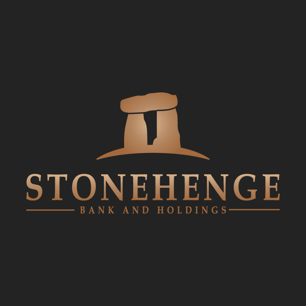
This bank logo is for a company in England, and you can tell from the prehistory monument icon. The drawing also reflects the bank’s name, Stonehenge Bank and Holdings. This is an example of how you integrate relevant storytelling into your company logo. It dons simple gradients of brown that make the logo look sophisticated.
Become a trusted institution with a bank logo
Tap professional designers to create your logo!


2. Citizen Savings Bank
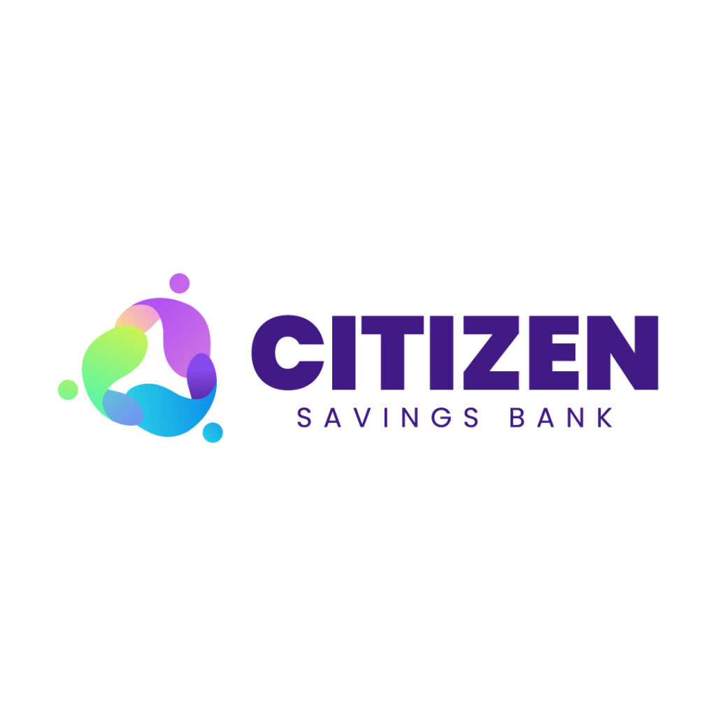
This is an interesting bank logo that plays with unique and creative shapes. The bold font paired with the thin typeface captures your attention immediately. However, the drawing that complements the brand name stands out. You’ll notice that the icon features different pastel colors, making this bank’s branding light and playful. But if you look closely, the icon seemingly looks like three people gathering into a circle. This reflects the company’s vision of establishing tight-knit communities built on trust and camaraderie.
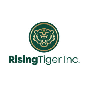
3. RisingTiger Inc.

RisingTiger Inc.’s bank logo exudes an air of authority and power, instilling reliability within its target audience. The color green dominates the entire design, an apt color representing dollar paper bills. Also, the tiger is an ancient Chinese symbol of ferocity, courage, and dignity. It’s also a symbol of protection and a perfect icon to represent your financial company.
4. Summit Bank Group

One of the elements of good logo design is simplicity because it prevents confusion among your audiences. Moreover, a bank logo should eliminate many embellishments as you want to keep it straightforward. Typography can help achieve simplicity without needing other accompanying design components like icons or illustrations. And Summit Bank Group’s logo is one such example.
5. Royalty State Inc.

The bank Royalty State Inc. creates a relevant logo with a drawing of a castle standing loud and proud. The castle implies protection and guardianship, which reassures clients that their money, investments, and financial-related dealings are safe with Royalty State Inc. The plain white semi-bold text also matches the other simple design elements. Overall, this logo will look good on any branding and marketing collateral.
6. Gibraltar Credit Union

Here’s another simple bank logo design from our expert logo designers at Penji. The overall ensemble is clean and neat, giving off a modern yet sophisticated logo. While this is a commendable typographical logo, the designer puts an exciting twist by replacing the letter “A” with a mountain illustration. This drawing perfectly represents the island of Gibraltar in British territory.
7. Alliance Mortgage and Lendings
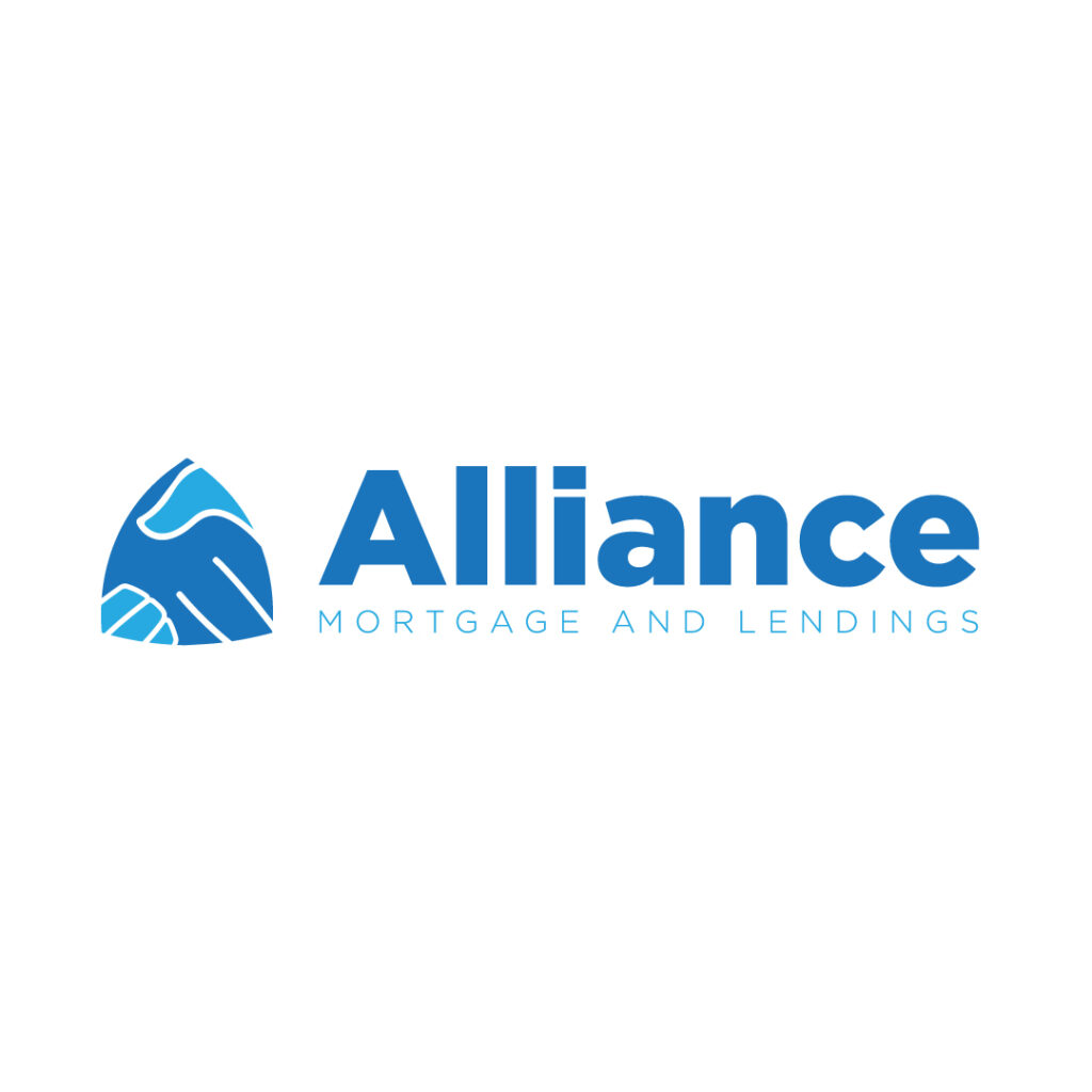
Alliance Mortgage and Lendings features a unique bank logo with blue as its primary color. This color theory in business invokes feelings of security, reliability, loyalty, and confidence. For a bank, these are crucial characteristics you need to carry so people will trust you with their money and investments.
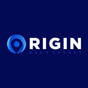
8. Origin Bankshares
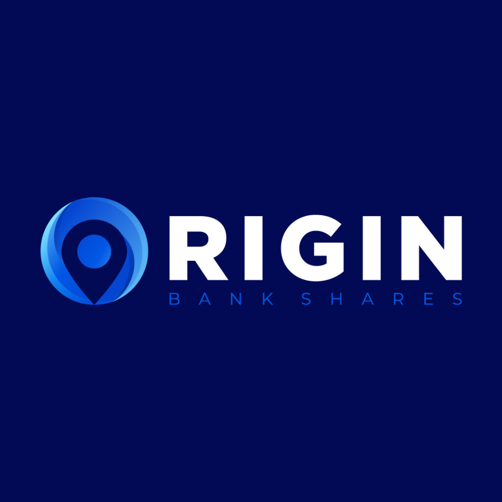
Here’s an innovative twist on a wordmark logo with the letter “O” seemingly looking like a map pointer icon. The circle with various hues of blue can also act as a stand-alone pictorial mark to represent Origin Bankshares. The font combination also looks good and is eye-catching enough to make prospects take a second look.
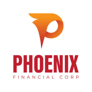
9. Phoenix Financial Corp
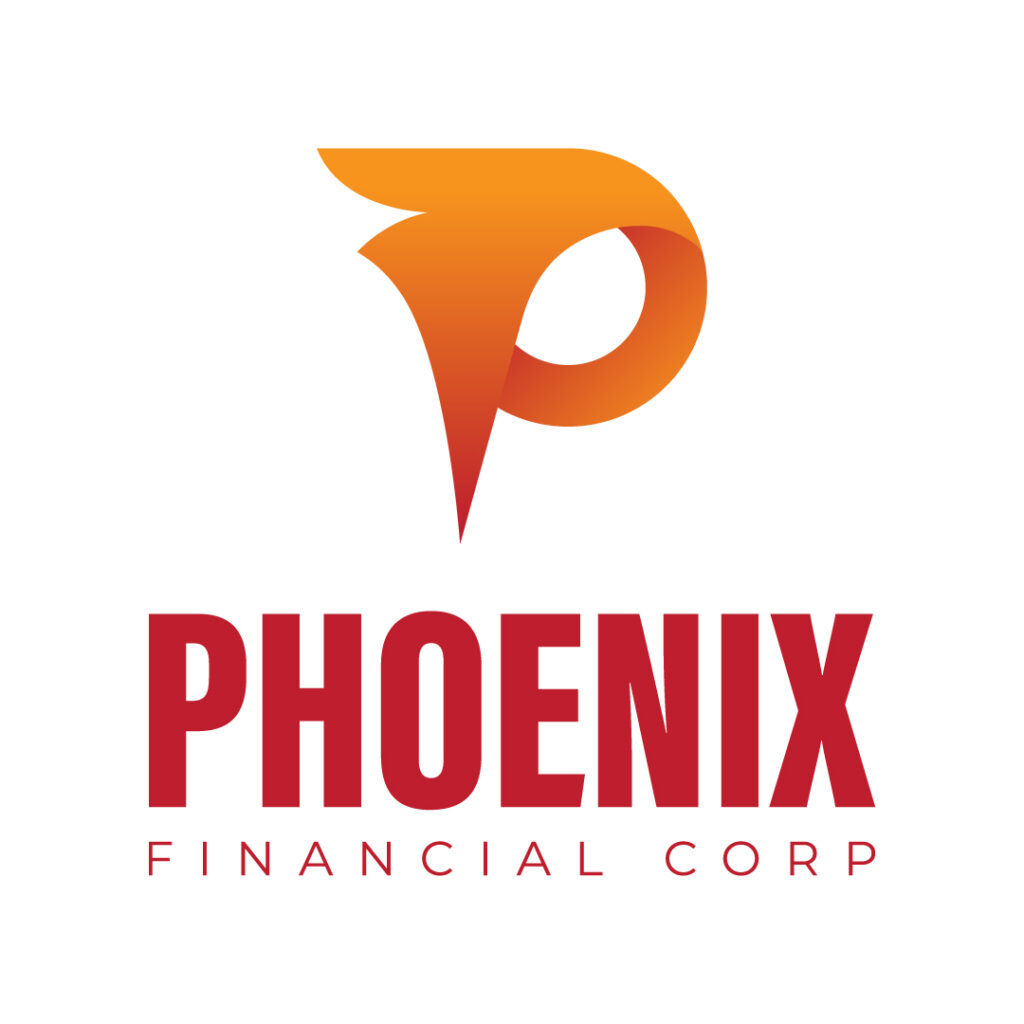
The logo for Phoenix Financial Corp is a combination mark of a symbol that looks like a phoenix’s head and a sans serif text. The overall design exudes modern branding that looks relevant to the bank’s target audience. Also, the letter “P” icon and the text will undoubtedly scale on various branding assets.
10. Crown Royalty Corp
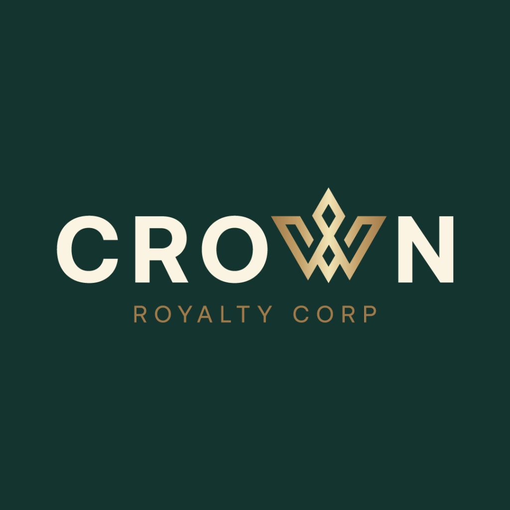
The Crown Royalty Corp bank logo exudes an air of authority and elegance despite its straightforward design. The logo features a crown icon formed in the shape of a “W.” Plus, the icon also stands out from the rest of the design elements due to the light brown gradients. Overall, this bank logo design evokes feelings of reliability and trustworthiness.
Conclusion
Let your bank become the trusted institution in your city or neighborhood. It all starts with a logo. And if you need one, why not subscribe to Penji? But if you don’t want to subscribe yet, we have one-off designs too! Check out our new Marketplace here!
About the author

Table of Contents
- Why You Need a Professional Looking Bank Logo
- Makes a good impression
- Makes you stand out from the competition
- Tells prospects who you are
- Builds trust
- Attracts new clients
- 10 Bank Logo Examples from Penji’s Professional Designers
- 1. Stonehenge Bank and Holdings
- 2. Citizen Savings Bank
- 3. RisingTiger Inc.
- 4. Summit Bank Group
- 5. Royalty State Inc.
- 6. Gibraltar Credit Union
- 7. Alliance Mortgage and Lendings
- 8. Origin Bankshares
- 9. Phoenix Financial Corp
- 10. Crown Royalty Corp
- Conclusion


