
In whatever industry you’re in, establishing a genuine brand identity will place your venture a cut above the rest. That said, many businesses struggle with getting the perfect logo design for their brand. Fortunately, AI-ready designs abound, and it’s only a matter of finding the best to get the most suitable one for your business. Here is Penji’s list of the best AI logo ideas to help you build your brand.
1. Tap into Your Mind
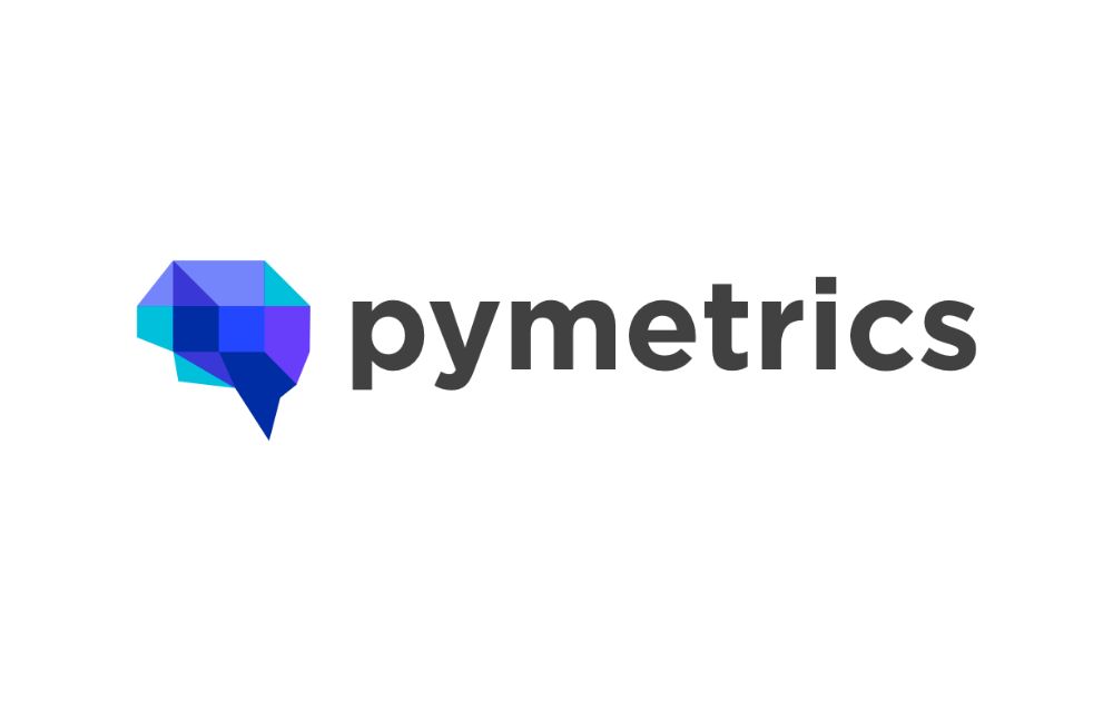
Most AI logos from tech companies tap into the cognitive aspect of human nature. In other words, they pay a lot of homage to our brains and minds in their branding. This trend often comes in various iterations. For instance, some companies will depict a human head with a brain inside. But Pymetrics uses a simple brain icon in blue geometric shapes to deliver its message. Added to that, it’s somehow a complex take on a cube logo. The soft, muted colors and the brain icon perfectly capture the essence of this hiring and talent management platform.
Get a Penji logo for authentic branding
Design unique logos in 1-2 days
2. Fall in Love With Gradients
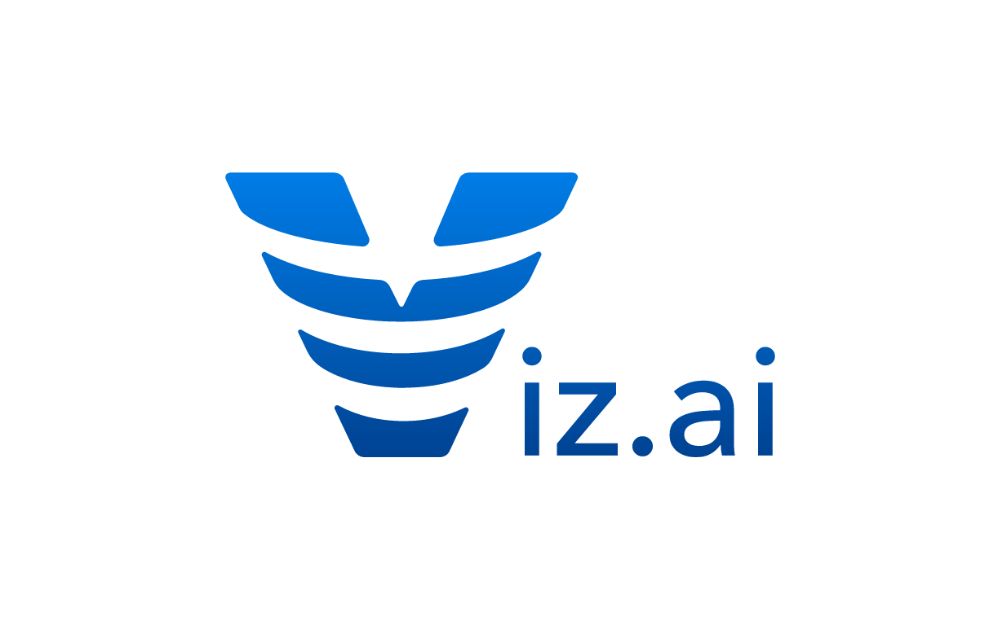
Gradients have always been a staple in logo design. In fact, they’re a simple way to keep the eyes focused on the icon without having too many distractions. Because of this, it has become a favorite design tool used by companies involved in tech. This design by Viz.ai uses deepening shades of blue to spell out the letter V while adding striped grooves across the letter. In addition, their use of blue and white also pays homage to their background in the healthcare industry.
3. Hide a Message
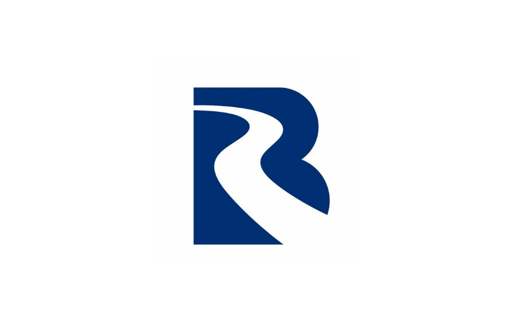
Blue River Technologies is a good example of how to conceal a hidden message within a logo. At first, your eyes may be drawn into the white river flowing in the middle of the logo. Upon a closer look thought, you may notice that it’s not just any blue background. It’s actually the letter B. The logo is a smart and fresh take on an AI logo design. And although some might say this interpretation is a bit on the nose, it’s a creative visual that incorporates two concepts into one.
4. Stick to Cool Colors
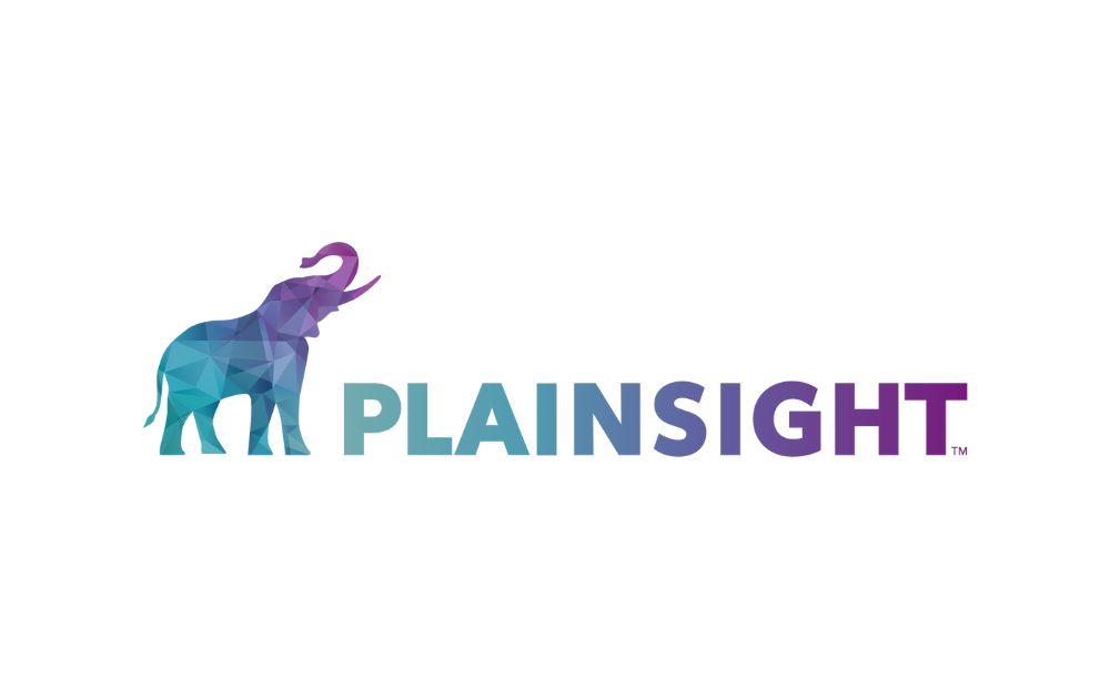
Like Viz.ai, the Plainsight AI logo design uses gradients to bring a pop of creativity to the table. But this time, they stick to cool tones like blue, green, and purple to catch your eye. Cool tones are a great color to use to generally evoke trustworthiness and honesty. Plus, the slow transition from lighter shades to darker shades is pleasing to the eye and doesn’t distract from the main character: the elephant. Apart from that, it also uses the same cool-toned geometric triangles to shape the animal.
5. It’s in the Name
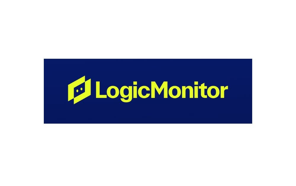
Meanwhile, you can also go a more creative route with LogicMonitor. Not a lot of tech companies that use an AI-generated logo experiment with symbols or abstract elements. But play your cards right, and you can get a functional and fluid design. LogicMonitor places two squares on top of each other and makes the overlap into a negative space save for two “eyes.” It’s a human-centered design that uses simple shapes and contrasting colors to keep things interesting.
6. Keep Designs Versatile
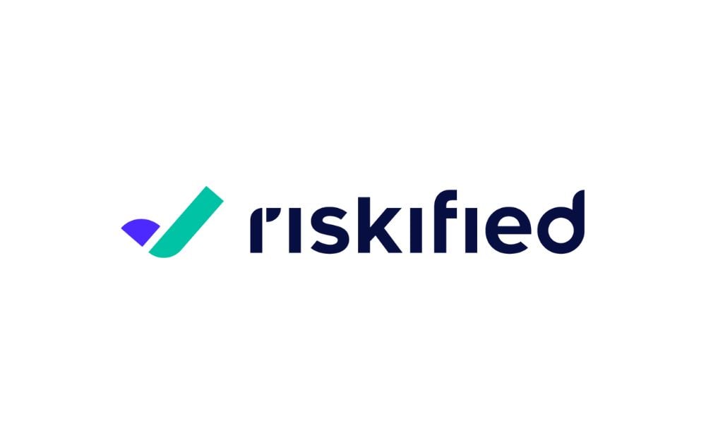
Riskified is an interesting example of a logo design that isn’t afraid to use simple designs to create a big impact. At first glance, it seems like their logo design is a simple check. But rotate it clockwise, and it becomes the letter R – now that’s an awesome twist you won’t find in a generic AI-generated logo. The logo works because of the symbol that you can closely associate with the company’s work in risk management. Because of this, their logo design can be reused and iterated in a variety of ways, making it a versatile signifier of the brand.
7. Use Negative Space
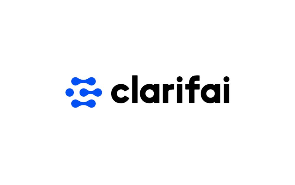
If you want to stand out from the crowd, draw some inspiration from Clarifai’s logo design. Their AI logo makes use of blue atom-shaped links and circles. However, instead of using their atom-like elements to spell out the letter C, they take the opposite road and use those elements to shape the negative space. Thus, the links actually turn out to shape the C itself in white. It’s a clear homage to their scientific background as a company, but it also invites customers for a second look at their brand. This type of thoughtful design. is definitely something you won’t get from a generic logo creator platform.
8. Take the Minimalist Route
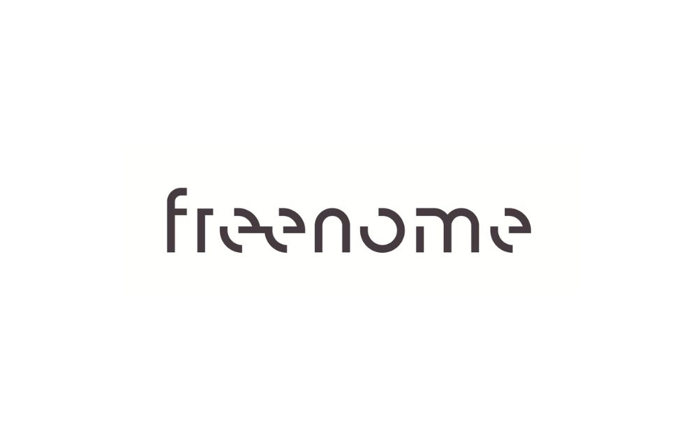
Freenome is one of the few AI logos that use minimalist designs for their branding. Their logo AI, a simple, rounded acronym version of their name, is not immediately eye-catching nor groundbreaking. But go to their website, and you’ll see how they’re able to blend their lettering into a beautiful website design pattern. It’s a good example of how seemingly plain designs can become something refined and elegant.
9. Hone Inspiration from the Obvious
Like CognitiveScale, your AI company can take inspiration from the most obvious elements around you. In this case, the brand used the symbol of a cloud infinity logo. Cloud computing is an essential tool for making AI technology work. Plus, the infinity symbol seems to be a crowd favorite among Big Tech companies, which might be because of its symbol for longevity and constant innovation. Meta, for instance, has recently adopted the infinity loop as part of its rebranding campaign.
The Bottom Line
Creating an AI logo is the first step in creating a reputable artificial intelligence brand. As businesses continue to ramp up their AI strategies and incorporate them into their operations, the need for reliable logos that accurately represent these efforts grows even more critical.
Need a professional logo that expresses your real brand identity? Penji is here to help! We offer unlimited designs at a flat monthly cost, so you’ll get more value for your every buck. Best of all, we’ve got the top 2 percent of designers, so you’ll be in good hands.
Sign up now and get a 30-day money-back guarantee. Plus, here’s an offer for you – enter voucher code LOGODESIGN15 at checkout to enjoy 15 percent off on your first month.
About the author

Carla Deña
Carla is a journalist and content writer who produces stories for both digital and legacy media. She is passionate about creativity, innovation, and helping small businesses explore solutions that drive growth and social impact.


