


A brand mark can do wonders for a business, and there is no better example than famous brands like Coca-Cola or Nike that have built their identity around an iconic logo. If you’re looking to create an infinity logo for your business, look no further!
Our amazing Penji designers produced these stellar infinity logos! And if you’re curious how else Penji can help your brand, watch a demo video here!
1. Be Playful
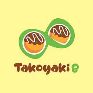
It’s okay to inject fun into your logo design, especially when the brand or product calls for it. Like in this infinity logo, the infinity sign shows more playfully and uniquely using two takoyaki balls. Also, note how they used the same color on the number 8 and the outline of the infinity sign to further connect their concept.
This design not only highlights the main product but also exudes positive energy that entices people to give it a try.
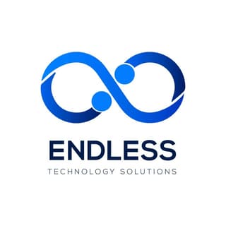
2. Go for Timeless
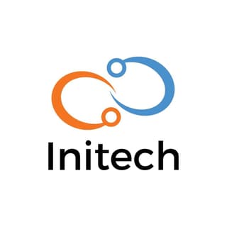
The design trends around you will likely impact your logo design. Your brand, however, is intended to endure for years after it makes its debut. Consider whether the elements in your logo will still be relevant in five to 10 years. If not, a more timeless look is recommended, such as this infinity logo for a tech company. The classic infinity symbol combined with a clean yet sophisticated look will still appeal to the market in 10 years or more!
3. Take a Cue from the Name
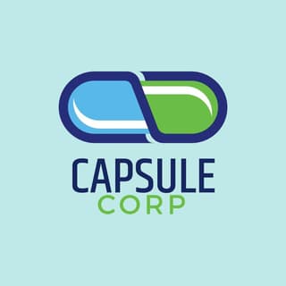
The brand or company name itself can serve as the best depiction of your logo design. Consider this logo as an example. Although it shows a literal image of a capsule, the design also has a deeper meaning because it mimics the infinity symbol. The two letters C for Capsule Corp. are also formed as an infinity logo text that surrounds the capsule.
Green and blue are also the perfect color combinations for this brand. Green denotes health, while blue fosters a sense of trust in a business, according to the Psychology of Colors in Marketing and Branding.
Compelling infinity logos to charm your audience
Hire a logo designer
4. Less is More
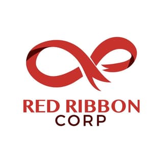
Never undervalue the effectiveness of a simple design. You might be surprised at how much value it can provide. Take, for example, this Red Ribbon logo. At first look, it seems to be a typical ribbon image. However, upon closer inspection, you will notice that it forms an infinity shape.
The use of red as the sole color, with small dark red highlights, also appears too simple in concept. However, when viewed as a whole, the monochromatic combination works. Because red stimulates and increases one’s appetite, it is a very effective color for food brands and companies. Look at the cool logos of successful food brands Mcdonald’s and Coca-Cola. They sure know what they’re doing!
5. An Image Within an Image
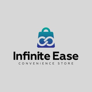
Playing with shapes and figures can open up a world of possibilities you may not have considered before. By placing an image within an image, Infinite Ease was able to represent the overall message of the branding – to constantly provide convenient access to goods.
Make several logo designs using this concept and decide which one suits your brand the best.
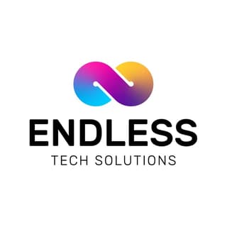
6. Think About Scalability
Your logo will be present on various platforms and mediums. You might need to post it online, on a poster or billboard, in a publication, on your website, on social media, and in many other places. You should consider scalability while you prepare your custom logo design.
Remove any intricate elements from your logo that could become blurry as it gets smaller. Look at this infinity logo for a technology firm with a simple yet sharp design that works well in any size and platform.
7. Be Subtle
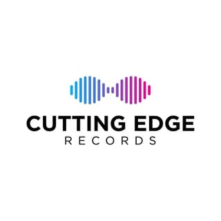
You don’t need to explicitly state everything in your logo. Including subtle layers of meaning in the design is a clever way to surprise and amuse your audience. For example, this recording company logo almost appears to be just sound waves. However, upon closer inspection, it also embodies an infinity sign, representing how music can transcend time.
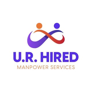
8. Eye on the Mission
The logo for your company should reflect who you are and what you do. The typography, shapes, and colors you use all contribute to how well you convey your message.
Take a look at this staffing agency logo. Two people are shown arm in arm and forming the infinity logo 3D style. It exemplifies the company’s mission to continuously help people find work.
9. Consider the Competition
There’s a logic behind why the logos of companies in the same industry share the same colors, forms, and typography. Some industries have a longstanding tradition of enduring trends.
For example, according to LinkedIn, more than half of the successful tech companies have some application of blue hues in their branding as it depicts power and confidence, which are very important in the tech world.
So if you want your branding to hit the right target market, it might not hurt to consider where your competitors are going.
10. Pick your colors carefully
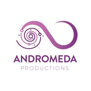
The colors employed in brand logos have a scientific and psychological basis. Each hue has a deep meaning, a certain emotion it generates, and inspires people to act in a certain way.
For instance, the creative industry tends to use a lot of purples, as shown in this production company’s galaxy and infinity logo. According to the Psychology of Colors, “purple represents an imaginative, wise and creative brand.” That said, it’s a good hue to use in the creative industries.
11. Stand Out

There is a distinction between designing a logo that is relevant to your industry and simply copying other successful brands. While adhering to existing branding rules and guidelines, your logo must still stand out from the crowd.
Many brands have used the infinity symbol, but if you want to use it in your design, you must establish a distinct infinity logo meaning from the crowd. A modern twist on a traditional symbol, a different shade of a similar hue, or a logo shape that your competitors do not use, such as this unique bike shop logo, can help you stand out to clients.
Creating an Awesome Infinity Logo
The infinity symbol may look like an awesome shape that lends a certain softness and flow to an image. But did you know that it holds a deep meaning? Here are a few thoughts about the meaning behind the symbol:
- In ancient India and Tibet, the infinity symbol represents the dualism and unity between male and female.
- The infinity symbol can be combined to form a Celtic knot, representing life’s unending cycle.
- In various religions, infinity symbolizes how life is infinite – our stay on earth may be limited, but souls exist forever.
Given the meanings above, infinity is surely a loaded symbol that you can use to reflect your business vision and mission.
Does the infinity sign hold meaning to your brand’s identity? If so, an infinity logo is ideal as the symbol of your overall brand. And with Penji’s help, we can bring your logo to life!
It starts with signing up here! Oh, make sure to enter the voucher code: LOGODESIGN15 to get a discount on your first month! However, if you want to give Penji a test drive, but have a set budget for logo design, our Marketplace is open for business! Check out one-off designs you can request here.


