In many cultures, monkeys symbolize good fortune and positivity. They are also seen as playful and good-hearted creatures, making them a favorite animal to use in branding. Check out these Penji monkey logos and use them to inspire you. If you want to add loyalty, courage, generosity, and many more positive characteristics to your brand personality, this is the way to go.
1. Ape DJ Service
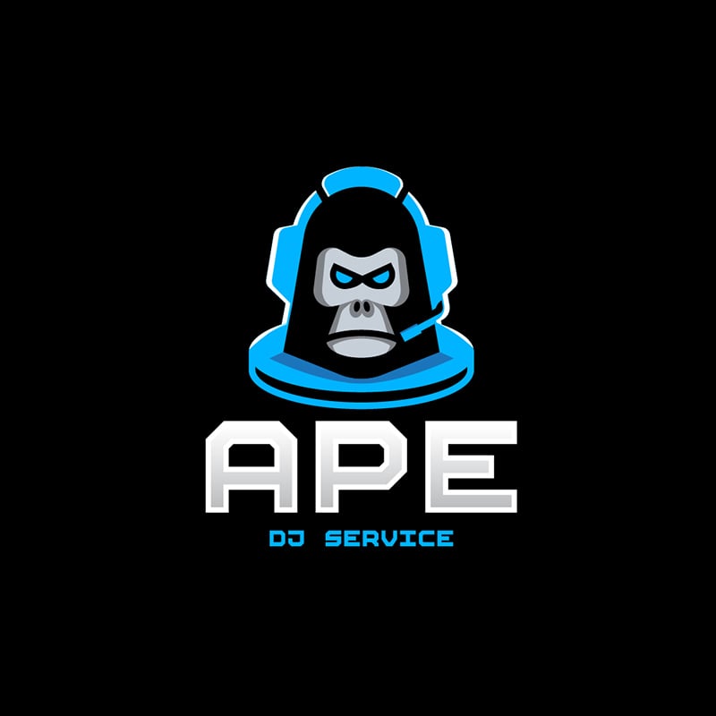
If your business requires you to be trendy, hip, and stylish, a monkey logo can be a fantastic choice. These animals are known to be adventurous, sociable, and full of life. The DJ service industry would need this vibrancy in its branding efforts, and this example is an excellent option.
The black background adds sophistication, class, and elegance. The neon blue gives the design an innovative feel, while the font looks futuristic and sleek. The angry look on the monkey gives it attitude and a sense of authoritative stance.
2. Blue Monkey Software Company
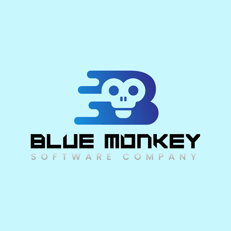
Another business that needs to display its innovation is the Blue Monkey Software Company. Monkeys are intelligent animals; what better way to show your brand’s knowledgeable persona than through a monkey logo? This has a letter B, resembling a motherboard, with the face of the animal in the middle.
Blue is a perfect choice for the branding’s palette as it projects wisdom, trust, and reliability. All these characteristics are what a consumer would want to see in a software company.
3. Chango Mexican Tacos Shop
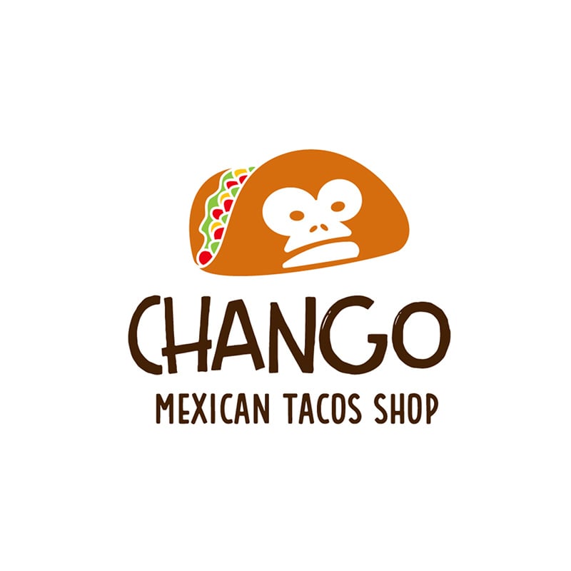
A cute image of a taco with a monkey’s face completes this beautiful logo design created for Chango Mexican Tacos Shop. It is colorful and lively and would look perfect on a business card, signage, table napkins, and other marketing materials. The white background suits the design well, giving negative space while emphasizing the icon and brand name.
The font used is a hand-drawn type that gives the logo a casual and friendly vibe. Logos should match your company’s personality to give people an idea of what it is about.
4. De Brazza’s Cafe
Coffee shops typically use brown and different shades of it on their branding. However, it can sometimes be dull and commonplace. This one designed for De Brazza’s Cafe uses brown, but the addition of a special shade of dark green gives it a one-of-a-kind look.
The colors complement each other and add elegance and class to the design. It has a metallic finish that gives it a modern and sleek appeal. The monkey-shaped cup has eyes that can’t be mistaken for anything else than a monkey.
5. Gelada Ice Cream Store
The monkey’s cute, funny, and light-hearted personality works perfectly for the Gelada Ice Cream Shop. Its energetic and contagious smile entices consumers to invite themselves in for a taste of their frozen delights. Thanks to its colorful design, it is projected to lift spirits and give an overall good feeling to its customers.
The simple font choices balance out the slightly complex design of the monkey logo. If you want an easily recognizable logo, avoid using too many design elements that can distract the viewer from the meat of the matter, which is your brand.
6. Mandrill Gym

The monkey is a truly versatile animal to use for logos, as it can convey a variety of emotions and characteristics. In this logo designed for Mandrill Gym, the animal is depicted as a solid and powerful creature. With a set of seemingly heavy weights, the muscular monkey shows what the gym can do for would-be lifters and pros in the athletics department.
The use of black showcases the brand’s strong and robust side. The orange circle behind the monkey adds emphasis to the illustration, making it pop out of the page.
7. Mon Key Locksmith
Monkeys are proficient tree climbers and are known for their dexterous and nimble bodies. This is why Mon Key Locksmith has chosen to use it for their company logo. The characteristics mentioned represent the agility and skillful nature of the locksmith profession.
The logo uses an illustration of a monkey hanging tightly on a curved key. It uses an orange and black color scheme, adding class and style to the overall logo design. The font choices are plain and straightforward to make the logo scalable.
8. Olive Baboon
Another proof of the monkey’s versatility is this logo created for Olive Baboon Kid’s Playhouse. It is colorful, cute, and upbeat, ideally suited to a business that caters to children. The icon is similar to a monkey you can see on a totem pole, but in this instance, it seems to be smiling and inviting.
The designer opted for simple and informal fonts, adding a whimsical approach to the logo. A rule of thumb with logo design is to use a maximum of three colors only. However, this is not a hard rule you should adhere to.
9. Rolo Way Film Production
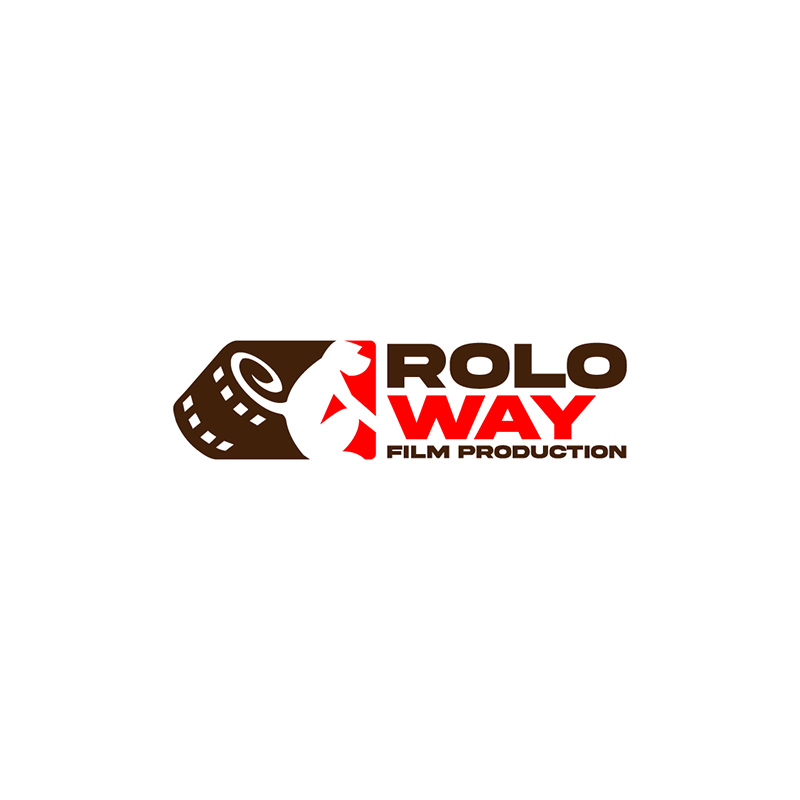
Using a monkey’s profile and a roll of film, the Rolo Way Film Production logo clearly indicates its nature of business. This is a must, especially if you’re a new venture and want consumers to know instantly what you offer. Doing so will give your brand the impact it needs to break through to the industry.
This logo uses a red and brown color combination that suits the brand well. They serve as dividers to make the monkey clearly separate from the film. The font types it uses also fit the brand’s personality quite well.
10. Mandrill Sports Center
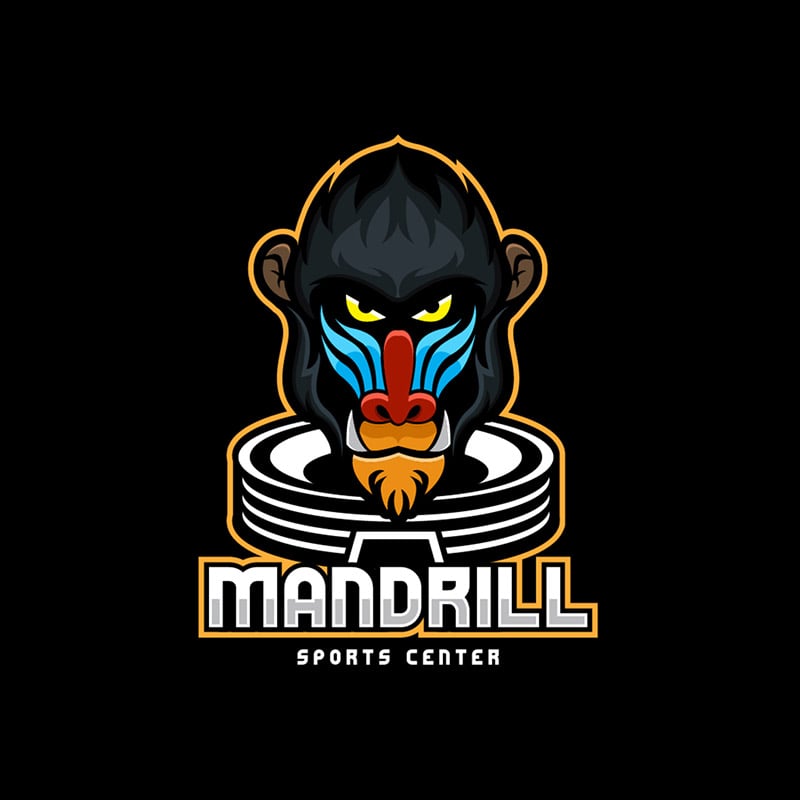
The Mandrill Sports Center monkey logo is a powerful design that fits the brand to a tee. The icon of the animal dominates the design with its fierce stare and bright and bold colors. You can’t help but notice the design when you see it on billboards, letterheads, t-shirts, and many other marketing paraphernalia.
The monkey’s head is shaped like fire to show the brand’s dynamic stance. The other parts of the logo use black and white as the designer decided to highlight the monkey’s head.
Final Thoughts
If you need monkey logos for your business, work with us at Penji. Watch our demo video here, or better yet, click here to get our talented designers started.
About the author

Celeste Zosimo
Celeste is a former traditional animator and now an SEO content writer specializing in graphic design and marketing topics. When she's not writing or ranking her articles, she's being bossed around by her cat and two dogs.


