

Having the best ecommerce design ensures a top spot in the ecommerce world. Remember, a good ecommerce website is tailored for navigability, convenience, and speed. When you achieve this, you’ll have the most conversions out of all website visits. Follow these 10 best ecommerce website designs from top brands.
1. Patagonia
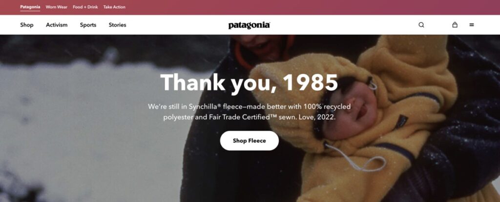
We all know Patagonia because of the founder’s deep love for the outdoors. Yvon Chouinard started climbing when he was 14 and was a member of the Southern California Falconry Club. When he founded Patagonia, the aim for more sustainable sourcing, production, and delivery never faltered. And you can see this passion and purpose throughout their website design.
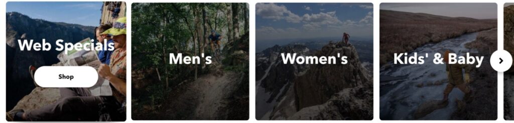
If your brand has advocacies and causes, display this on your website. People prefer brands that align with their values and principles. For instance, Patagonia’s homepage oozes with the brand’s mission to make its business less detrimental to the environment. The design also features a hover effect, which shows the call-to-action button once you display the mouse on top of a category.
The company’s history page is fantastic; once you scroll up, the texts and images transition to the next.
2. Gap
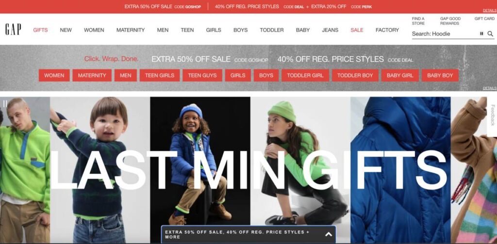
Gap’s mission was to encourage inclusivity in its branding. The brand lived in an era when women weren’t expected in corporate buildings, let alone the board rooms. Today, Gap wants to offer jeans that fit everyone, including women of different frames.
Gap’s website is clean, donning images of people wearing its products. The homepage displays big images, with no menu but a logo under the pictures. This is the best ecommerce design built for conversion, as discount offers are sprawled across the page. Plus, an arrow offers more discounted items once you click it. You can also hide these items if you find these distracting.
3. Zillow
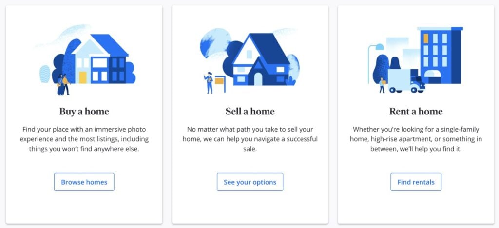
Zillow is the most visited real estate website in the United States. The company ensures a seamless end-to-end customer service experience. This is the place to go if you want to sell, buy, rent, or finance your housing with 100 percent transparency. And as straightforward as their offer, their website also shows the most compelling and concise copy.
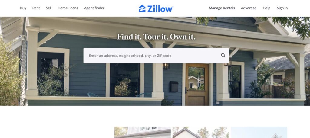
You’ll find the search field under the copy that takes up most of the homepage space. Additionally, Zillow also offers a signup form for more personalized recommendations. Plus, the brand used illustrations to show different service categories. Overall, it’s easy to find what service you’re looking for from the homepage alone.
4. Casper
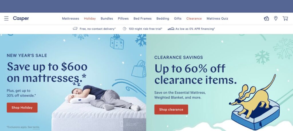
Brands driven by passion succeed, and Casper is one of those brands. The team believes that “sleep is the superpower that charges everything people do.” With that being said, the brand offers people outrageously comfortable mattresses that power sleep.
Casper’s website is a sight for sore eyes. The pastel colors are soothing that you’ll think they induce sleep. You’ll notice good typography that doesn’t overwhelm you, even though the texts make up most of the page. Plus, the red CTA buttons create a contrast that pops amidst the pastel-colored background.
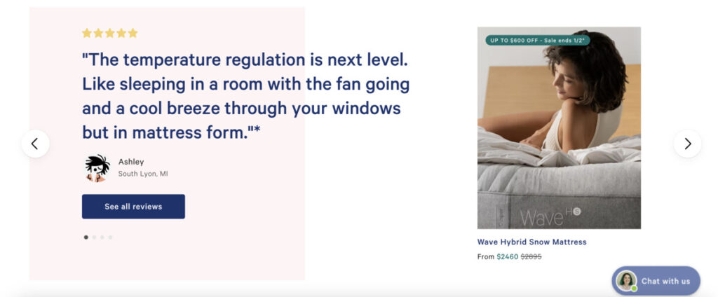
Once you scroll down to the bottom of the website, you’ll see some customer reviews and ratings. This is coupled with a chatbot on the lower right for complete and convenient website browsing.
5. Etsy
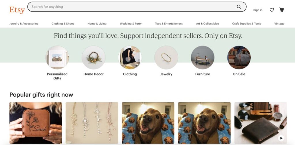
This ecommerce brand is the place to go if you’re looking for unique handcrafted items or vintage finds. You’ll find extraordinary pieces on this website, and the web design is also commendable. For instance, the search field sits loud and proud, catering to customer convenience immediately.
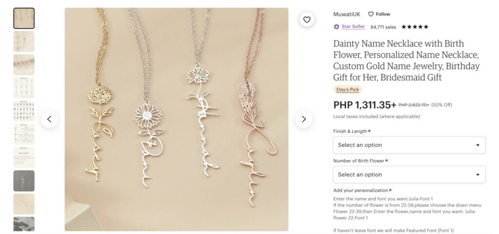
Etsy displays the product categories under the menu, so visitors will immediately find what they’re looking for. Moreover, the product page shows every essential detail you need, such as the price, description, number of reviews, estimated arrival, return policy, shipping fee, and message button for the seller.
6. Amazon
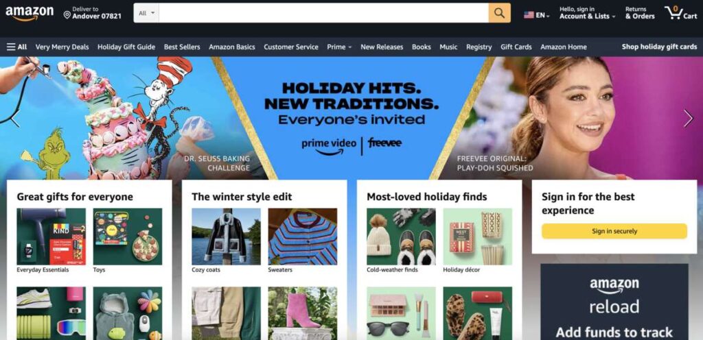
Everyone knows Amazon as it’s considered the largest online store today. It has everything you need—from kids’ clothing to the smallest gadgets. But despite its size, it’s easy to shop on Amazon. You’ll see the various images of different products and a prominent search field on top.
Once you type a product, Amazon gives you top results, best-selling, highly rated, and climate-friendly options. Finally, the complete filters on the right help in browsing for suitable items to cater to user assistance.
7. Ikea
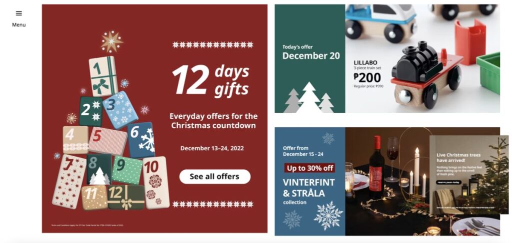
Ikea is the place to go if you’re looking for functional and affordable home furnishing products. You’d be surprised how quick and easy it is to shop on Ikea’s website, making it the best ecommerce design. First, the website is holiday-themed, sticking to colorful and bright palettes. The grids and images are attractive, keeping website visitors hooked.
Moreover, the flashing ad on the right doesn’t distract online shoppers but grabs attention instead, perfect for ecommerce advertising. Ikea also shows home design ideas for homeowners in a pickle about what they need and want.
8. Glossier
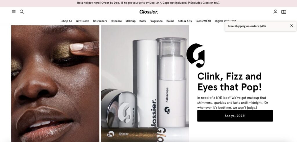
Glossier sells makeup, skincare, body care, and fragrance that are all perfected for all users. The brand believes beauty is about having fun, making their ecommerce website fun and enjoyable to shop!
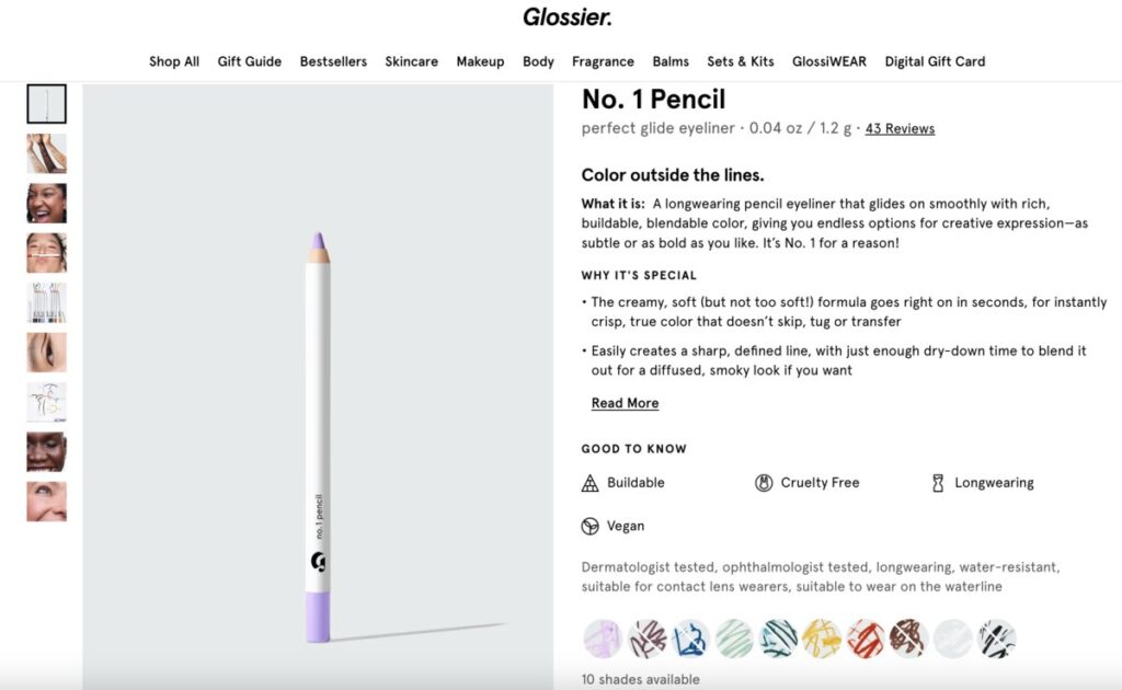
The most impressive part of Glossier’s website is its product page. On top of the usual details like product information and price, it features “Why it’s special,” “Good to know,” “How to use,” and “Full ingredients” sections.
9. Target
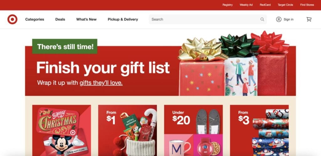
Target sells every item you need at home or the office that is more affordable than most ecommerce stores. The company deserves a spot in this “best ecommerce design” list because of its branding consistency. As you know, red is Target’s primary color, and the brand displays splashes of red from the header to the footer.
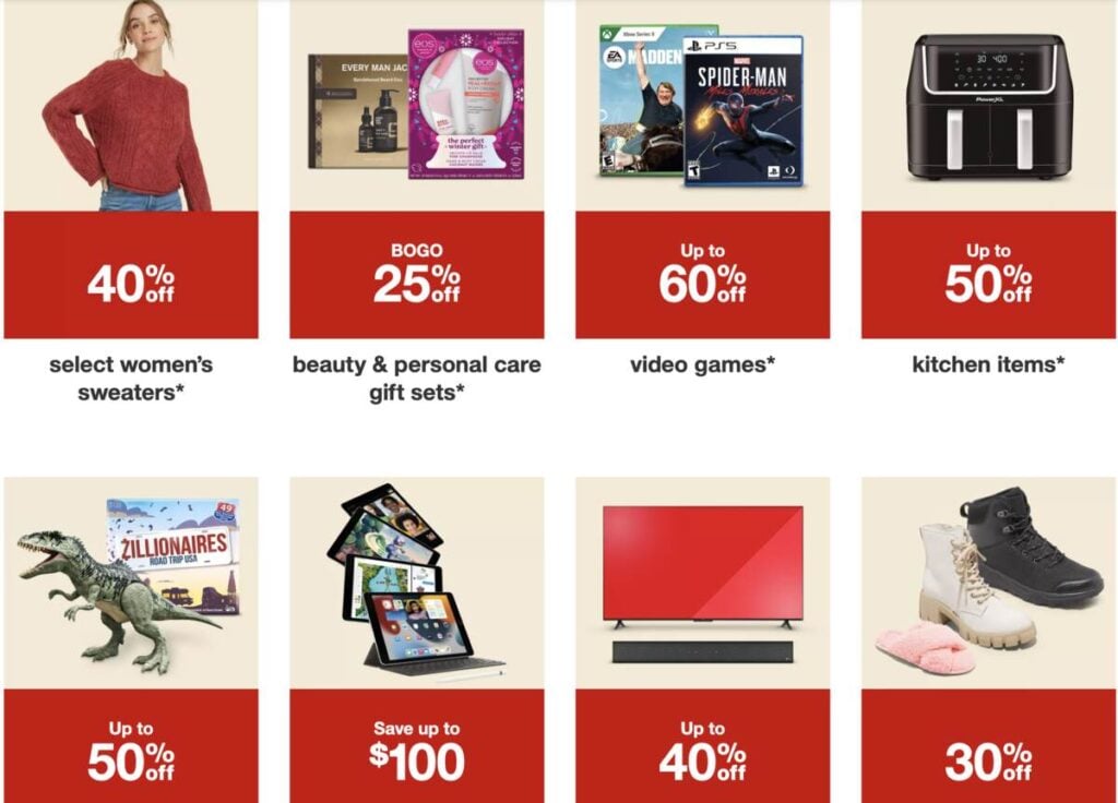
The website is also holiday-themed, attracting website visitors shopping for holiday gifts. Target’s website design is built for conversions, as you’ll see CTA buttons on every image. And this is how every online business should create the best ecommerce design and increase sales.
10. Macy’s
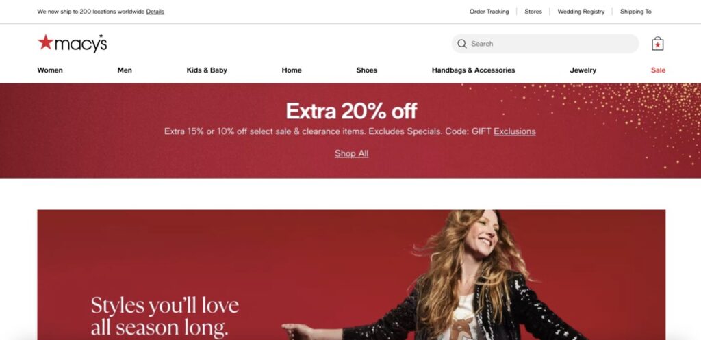
If you’re shopping for off-price to luxury items, Macy’s is your best bet. You can shop and celebrate special moments, whether big or small, on Macy’s clean website. The big red banner with the discounted offer pops out on the white background. The CTA copy is also consistent with the text “Shop All.”
Macy’s homepage also welcomes you with various product categories. Plus, once you click on a category, this is then further subcategorized. For example, if you click on kids’ clothing, the page shows you subcategories of kids’ ages, coupled with less confusing filters. Overall, Macy’s website is user-friendly and offers easy navigation.
Want the Best Ecommerce Design?
Try Penji’s unlimited graphic design plans at affordable monthly rates. You can get unlimited web and app designs, online store logos, online ads, social media ads, and more!
Try Penji’s 30-day money-back guarantee or sign up here for a 15 percent discount.


