Make your mission well-known to the world with a memorable charity logo. And if you need ideas for it, here are ten charity logo examples! Plus, if you need a logo, Penji can design one for your charity! Here‘s how to get one from us.
1. Stayne Foundation
This charity logo design for Stayne Foundation emphasizes the letter S in the image. The swirls add movement to the design, guiding our vision toward the brand name. The design is dominated by the color grey, which signifies neutrality and balance.
The green part of the logo shows growth, nature, and renewal, which suits charity work quite well. The font choice is appropriate as it is straightforward. The smaller size for the word Foundation adds emphasis to the brand name.
2. Cullen Welfare Association
With an image of ovals depicting people, this charity logo designed for the Cullen Welfare Association has that human touch. In this world where almost everything is done through digital means, showing humanity in your logo is a superb idea.
The color combination of blue and violet also fits the organization well. Violet represents wisdom, peace, and spiritual fulfillment. On the other hand, blue is ideal if you want to project stability and dependability.
3. McDuck Foundation Limited
Not only does the McDuck Foundation Limited logo have a human image in it, but it also has a heart. This is an ideal way to show how the organization cares. A logo is a representation of your values, and this one did an excellent job in delivering it.
The color scheme is also commendable. Pink is a variant of red which we know projects love, passion, and life. It perfectly embodies the heart in this charity logo design.
4. RockSolid Foundation
This cleverly-designed logo for RockSolid Foundation uses two hands forming a rock in a rock paper scissors game. The brand name mainly pertains to being as solid as a rock foundation, but the hand gestures add a bit of humor. Even the font choice points to it as an organization that’s strong and brave.
The color brown is usually associated with strength, the earth, and nature. Along with black, this color combination befits the logo perfectly.
5. Luther Foundation

You know Luther Foundation is dedicated to helping people when you see the logo Penji designed for it. It has human figures in a circular formation, perfectly showing unity, cooperation, and camaraderie. The best part about it is that the design can stand alone.
The warm colors add to this charity logo’s appeal. It uses orange and yellow plus white as an accent to the overall design. It gives off a welcoming and friendly vibe ideal for this niche.
6. Howell Aid Foundation

There is nothing more fitting to describe a charitable organization than a hand and a heart icon. This logo for Howell Aid Foundation uses these two and looks beautiful. The blue monochrome gives the design a serene and calming appeal while projecting a reliable and robust image.
This logo uses simple font types on its primary and secondary texts. It is s straightforward combination that adds authority and trustworthiness to the brand.
7. Gekko Charity Limited

Getting inspiration for its name from a lizard, Gekko Charity Limited uses a gecko’s foot as a logo icon. It is cute, easily recognizable, fun, and upbeat. Even the color choice matches the brand’s trendy personality. This charity logo is the perfect example of thinking outside the box.
When you’re in a particular niche, it does not always mean that you must follow what others are doing. Especially in logo design, where the whole point is to stand out.
8. Amity Foundation
Another charity logo that features a heart, This Amity foundation logo is classy, elegant, and heart-warming. The combination of black and red has that fiery touch that describes the passion we see in most charitable organizations. The name Amity is done in white which is an excellent way to make it pop out of the design.
The letter A is beautifully incorporated into the heart to give it an ethereal quality. The font pairing is superb and adds charm to the whole design.
9. Lannister Foundation
Environmental charities also abound, and a great way to carve your niche is through a compelling logo design. This one designed for Lannister Foundation has trees in it, complete with leaves. The primary color is green, an automatic choice as it represents nature.
The font choice is one that leans towards a casual brand persona. It is borderline cartoony, which gives out a friendly and accommodating atmosphere. This is a perfect inspiration if you want to project a helpful, amicable, and trustworthy brand identity.
10. Gatsby Church Limited
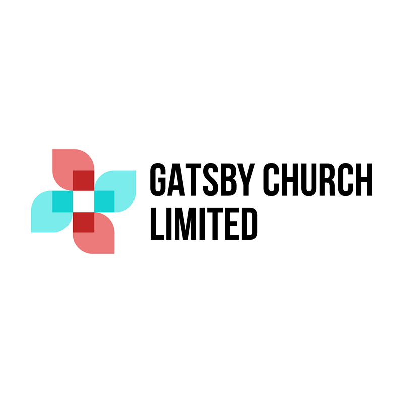
Using a cross carefully incorporated in the flower image, Gatsby Church Limited’s logo has charm and grace. The soft colors add a vibrancy that’s not too overpowering. The design is simple and impactful. But it’s not loud or flamboyant.
It uses a simple typeface rendered in black, making the icon even more noticeable. Going with a minimal design approach is ideal for charity logos as you want to be as clean and uncomplicated as possible.
Valuable Tips When Designing a Charity Logo
When designing for a charitable or non-profit organization, thinking clean and simple is imperative. Clean lines, muted colors, minimal details, and sans-serif typefaces are highly recommended. The goal should be to identify your organization and avoid confusing your audience.
Logos are expected to tell your story, but this does not mean that you have to include every little detail in it. Like the charity logos on this list, a heart, hand, or human figure is enough to let people know what you are about.
Conclusion
Are you ready to make a difference? One way to start is with your charity’s branding. That’s why you need a meaningful logo. And we can help you with that! Or, if you need just a logo, don’t worry; Penji now offers one-off designs for any visuals you’ll need! Explore our new Marketplace here!
About the author

Celeste Zosimo
Celeste is a former traditional animator and now an SEO content writer specializing in graphic design and marketing topics. When she's not writing or ranking her articles, she's being bossed around by her cat and two dogs.

