On average, Tech Jury finds, a smartphone user will have 80 mobile apps downloaded on their phone. However, they use nine only each day, while 30 a month. That low number can be attributed to low storage, too many advertisements, or bad experience and design.
Make users keep their app by applying minimalist UI on the design. This will reduce complexity and increase functionality and usability. If you want to implement minimalism on app design, you need to find an expert app designer or a graphic design service that will do the job for you.
Entrust your app design projects to a reliable graphic design service like Penji. Don’t delay client projects any further and double your output rates when you sign up. Penji is an unlimited graphic design service providing high-quality graphics at an affordable rate. No more onboarding, no contracts. Subscribe to a Penji plan now, and fast-track all design projects without compromising quality.
For now, learn why less is more and check out the list of 17 minimalist app designs. Plus, read on further how your agency can request an app design by using the Penji platform.
Why Apply Minimalism in App Designs?
In a study published by Microsoft Inc., our attention spans have been reduced to eight seconds. Goldfishes have a one-second advantage over us. As a response, Prezi attempted to debunk this and found that our attention spans aren’t shortening. It’s evolving. People have become more selective with the content they consume.
That’s why it’s more important than ever to hook your audience with an engaging design.
April Studio says that making something simple will allow your audience to process and understand information easier.
You don’t want to make it cluttered. You should know how to convey your message by using necessary elements that won’t make them click Close Tab or uninstall the app.
By applying minimalism, a design will look cleaner and more organized. You can look at the Jo Loves, The Len Co., and Regnum Hotel minimalist website designs as examples. They won honorable mentions from Awwwards.
In a minimalist UI mobile app design, app designers and developers mix functionality and design. For example, they would hide navigation bars. It’s so the user can focus on the content on one page. They also apply this by using elements like buttons, cards, icons, illustrations, and the like. It’s how they can simplify information or content without overwhelming the user.
Plus, by applying minimalism, it might speed up load times on the app. Google reveals that 29% of smartphone users might use an alternative app if the current one they’re using is slow.
See how the apps below execute minimalism, and how you can apply it to your app design.
Examples of Minimalist UI Inspirations
1. ADA
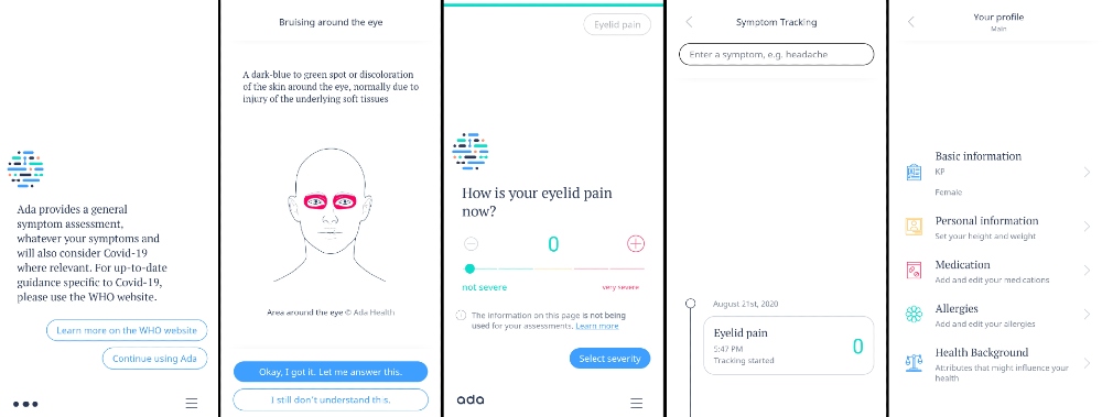
The ADA healthcare app design presents an excellent example of minimalist UI. Once downloaded, an AI will guide the user during onboarding. They use white space. Plus, they also included illustrations to point out the symptoms that users experience. As the user answers questions, there’s also a Progress Bar at the top of the page.
Unlike most apps, the content and hamburger menu are found at the bottom of the screen.
The use of buttons helps provide selections for the users. Plus, it’s also great they use icons to visualize the text like Profile or Medication.
2. Dollar Shave Club
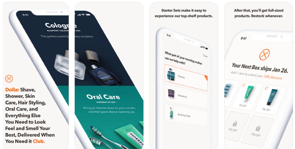
Once a user accesses the Dollar Shave Club app, they will see a navigational tab where they could explore further the features of the ecommerce app. The user can easily navigate from tab to tab and discover content quickly. They use various design elements to engage the user in scrolling down and browsing on the app.
The use of cream looks pleasing to the eyes, and with the help of emphasized or bolded text, users can read the text clearer. Plus, the user can navigate easier with the tabs below.
3. Habitify
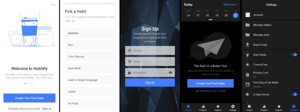
From the get-go, Habitify presents animated illustrations. A user can also swipe to learn more about the app. The app enables the user to take immediate action by telling them to “Create Your First Habit.”
Inside the app, they use simple illustrations and icons as well. As for the color, the use of blue will help in instilling trust. Buffer also suggests that blue will keep a person focused and calm. That’s why it’s good they used blue on the app, so users could always use it.
If your client also asked for custom illustrations on their project, explore what Penji designers have produced for our clients.
4. Collect
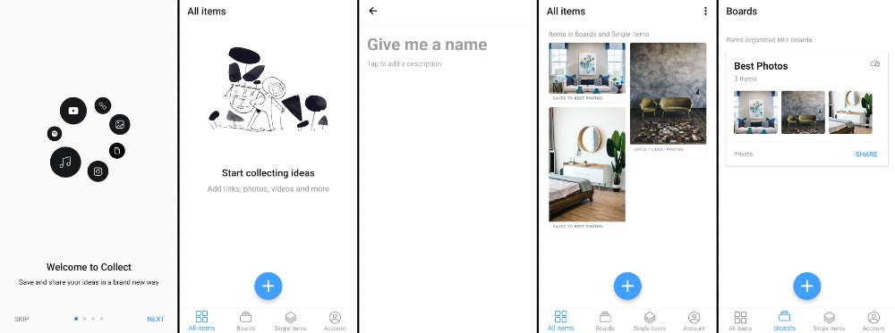
Illustrations play a significant role in the launch of the Collect app. The same illustrations also take center stage once the user clicks, “Let’s Go.” There’s also a pop-up that appears that may enable the user to upgrade to a Premium subscription.
In the app, a user can go through the other pages through the navigation tab found below. When a user decides to create a board, it will become a card.
5. Spectre Camera
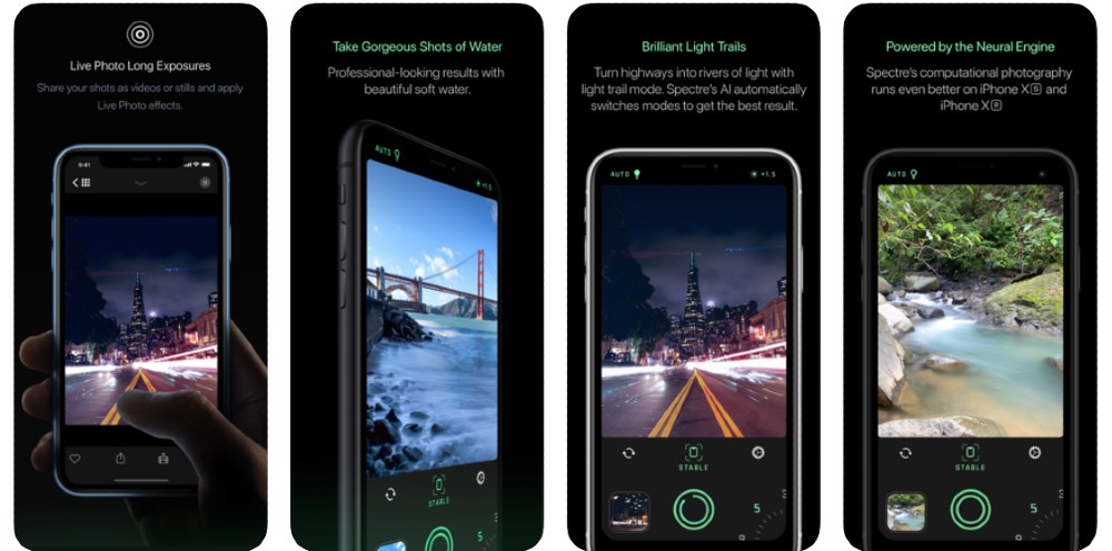
When users download the Spectre Camera, they will need to read a tutorial to take better photos. As seen in the picture, they use headers and visual hierarchy elements, so that text can pop up against the black background.
As for using the camera, it observes similar elements like any Camera app. But it has an added slider at the button. Meanwhile, the Settings doesn’t have that many features, observing typical minimalist UI elements, but has a small banner that users can read to take better photos on the app.
6. Timepage
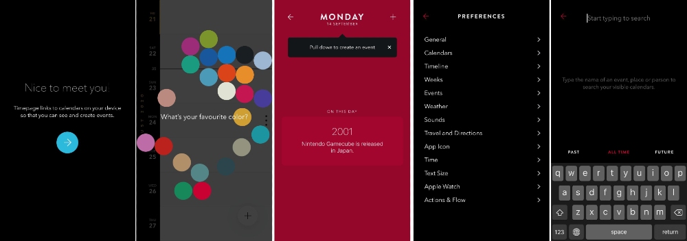
At the launch of the Timepage app, there’s a button with a directional cue. It helps to move along the process of using the app. After this, the user can select their preferred color on the app and start adding events.
First-time users will see tooltips on how to add events. Those who want to explore further can slide right and see the navigation menu with directional cues once more. Plus, they also used a search bar so users can find current, future, and former events. As for the overall aesthetic, the use of black leaves a sleek finish.
7. Endel
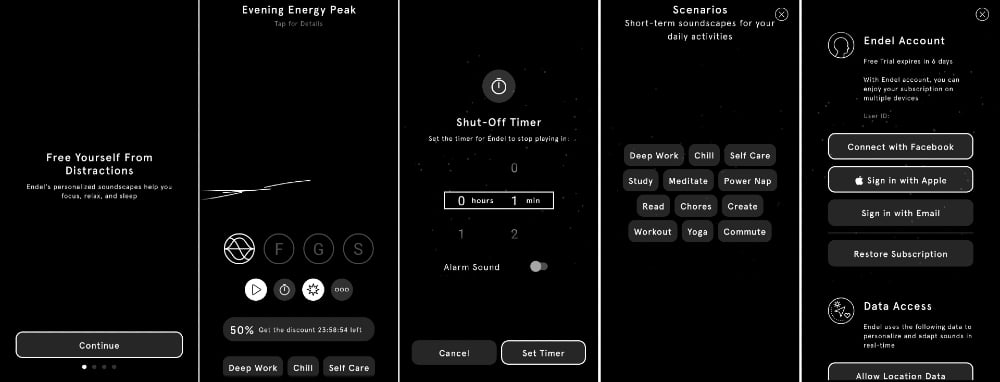
Unlike most of the apps on this list, Endel has a black background with white text and elements. At the start, it follows a carousel onboarding method. The app uses rounded buttons where users can toggle between modes. Plus, there are icons and a meatball menu, where users can access their account and data.
8. MyQuit Coach
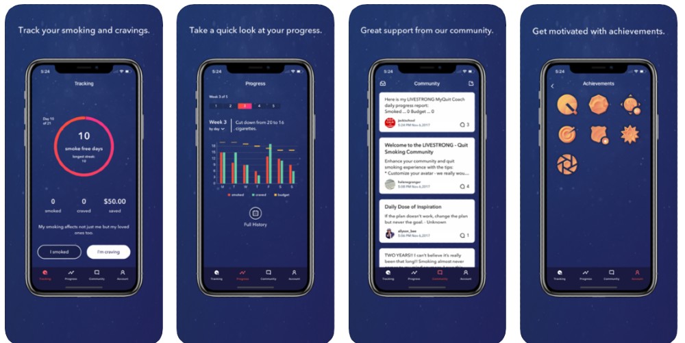
The MyQuit Coach App can help smokers break the habit by visualizing their progress. It uses charts or graphs to present data. As listed by the Next Web, the app follows minimalist design elements like harmony, contrast, and navigation.
9. Py
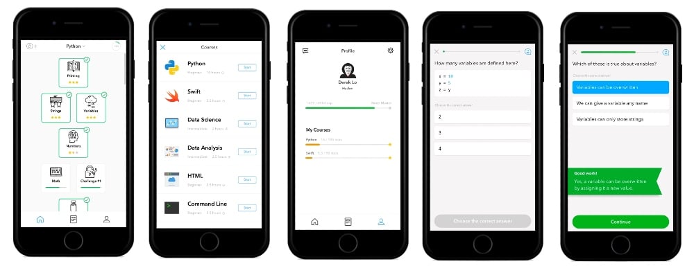
For those who want to learn how to code, Py is a great resource. From the get-go, users will see the minimal UI design they’ll also observe in several pages in the app. A user will have to answer a few questions, where they’ll also see a progress bar. The UI also observes white space and uses buttons to select the correct answers. Most would compare Py to the Duolingo UI.
10. Drop
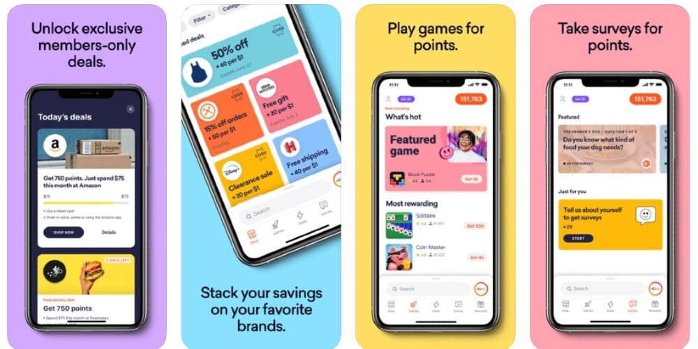
Rewards program app, Drop, may feature different brands, but it manages to observe a minimal UI and keep it organized. It uses cards on every page, so it’s not overwhelming to the user. Plus, through the navigation tab, users can browse easily and scroll for more deals and games to play.
11. Peanut
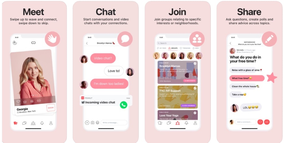
The Peanut app observes a minimal UI design on most of its pages. It observes UI elements like buttons, sliders, and grids. In terms of design, the app uses a reddish-pink combo that is appropriate for the target audience. Besides, it’s striking against the white background.
12. Cone
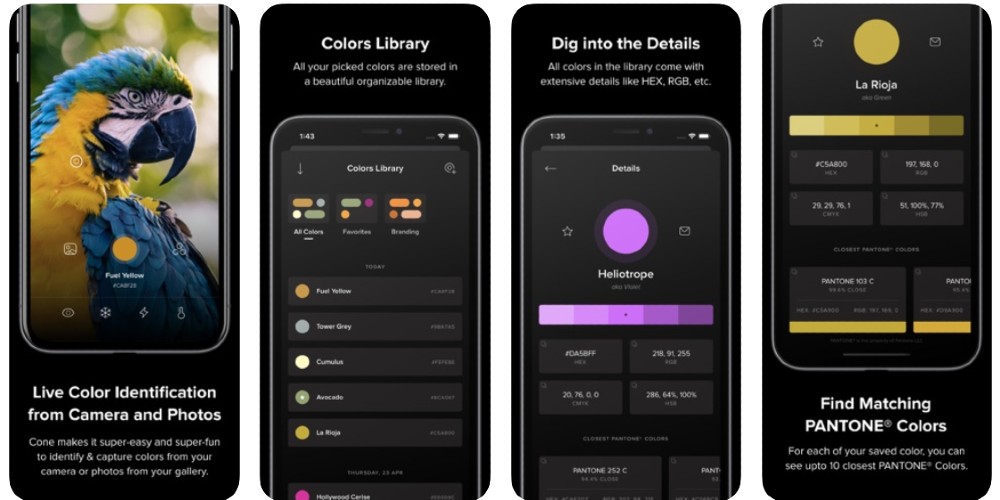
For those who want a color picker app, Cone is an app they can consider downloading. The interface isn’t complicated, and it looks neat because of the grid and card design. It’s also organized because a user can store their used colors in a library.
13. Noon Pacific
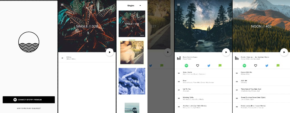
For those who want to explore new music, Noon Pacific is one app a music lover can consider. The music mixtape app presents a minimalist UI design focusing only on the songs and album cover.
It’s easy to navigate by using the hamburger menu on the left-hand side. It’s also where users can use a drop-down to reveal a curated mixtape created on different days and cities. You can also see icons below a song, where users can listen to on Spotify, like it, or share it through Twitter or text.
14. Pyrus
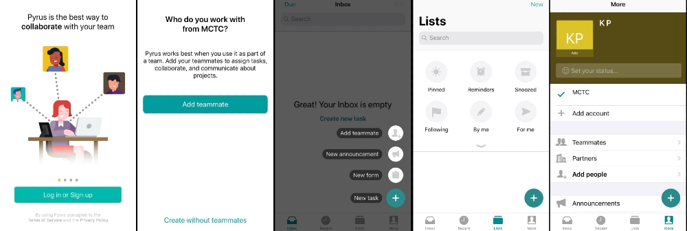
Upon launch, Pyrus uses a carousel-style introduction with a call-to-action for the user to log in or sign up. It’s a great way to illustrate what users may expect when they finally access the app. They added a tooltip for first-time users to introduce them to their features.
The app is simple, and there’s no fuss involved. It’s easy for a user to browse on the app without any distractions.
15. Done
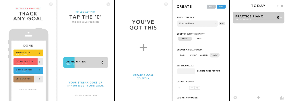
The productivity app, Done, uses a progress bar on onboarding. It also uses white space, which is already present once the user opens it for the first time.
When the user wants to add a new task, they’ll see input fields and toggles. The use of gray on the habit menu will help the user focus on completing the task, and the blue Save button contrasts it. It follows hierarchy too as it uses slightly larger fonts for headers, but maximizing the space enough without having to scroll further down.
16. Balance: Meditation
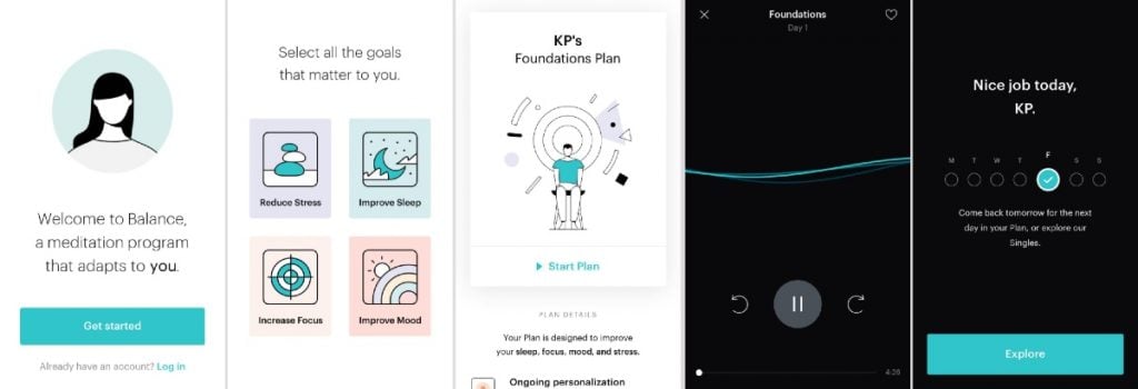
Upon launch, the Balance: Meditation app will guide the user to answer a few questions to personalize their meditation journey. They use stacked illustrations as buttons for users to select their answers. The app also uses pastel colors, which are pleasing to the eyes. Their UI includes illustrations and icons as well.
Fun fact: Balance: Meditation won as the Best All-Around app at the MUX 2019 Awards.
17. Brightmind Meditation
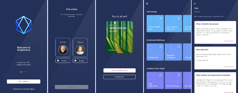
The app, Brightmind Meditation, uses a gradient as a background. It then leads the user to get started. They use empty button-style buttons with rounded edges.
Brightmind Meditation employs colored cards and organizes them into different categories. The card system also applies to the FAQ page.
Outsource Your App Design with Penji
Once you sign up for a Penji plan, you get access to the Penji platform. This will allow you to request and receive minimalist UI app designs in three simple steps. And it’s all done on the Penji platform. Let’s go through it one by one:
Step 1: Create a Project
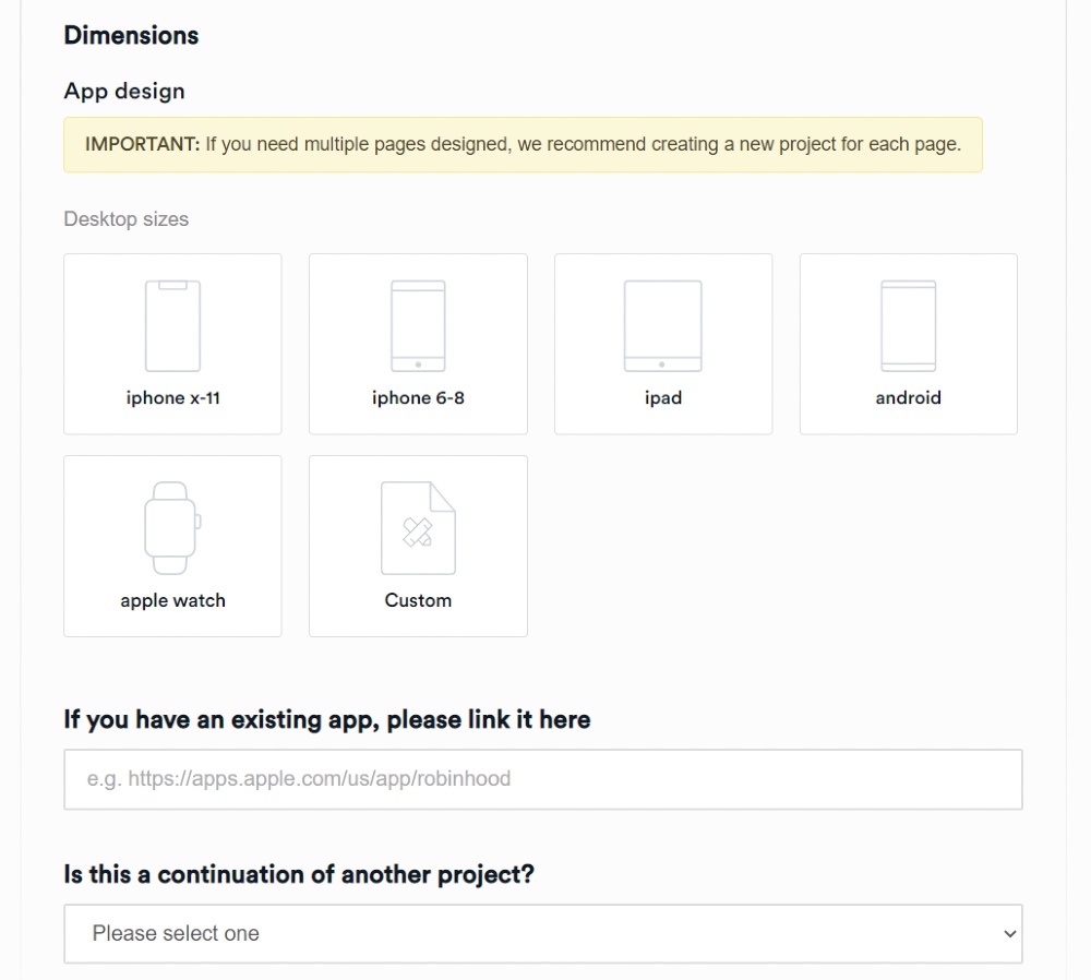
Click the New Project button. You’ll see a form where you’ll fill out the details of your design brief. Make sure to supply a Project Title and choose a design category. In this case, please select App design.
After this, you’ll see apps for operating systems or platforms. You can choose from any of those available or use Custom if needed.
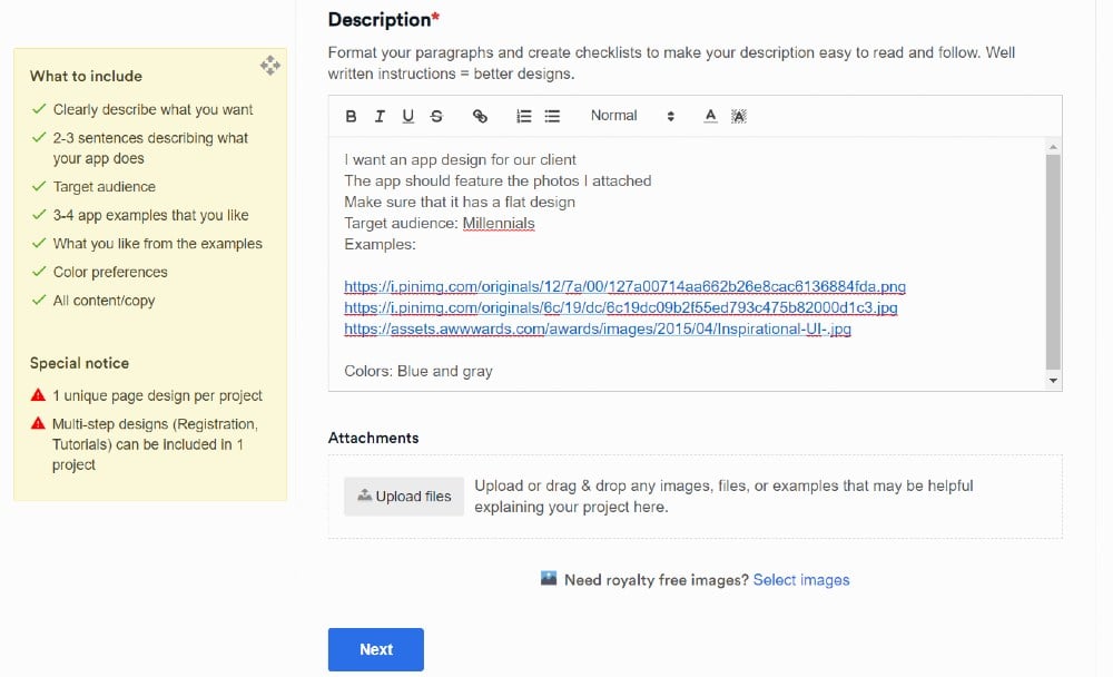
Once you’ve chosen the required details, you’ll have to write your design project on the Description field. For your app design to have faster lead time, follow the What to Include guidelines. Then, select the Level of Customization, file deliverables, and Associated brand.
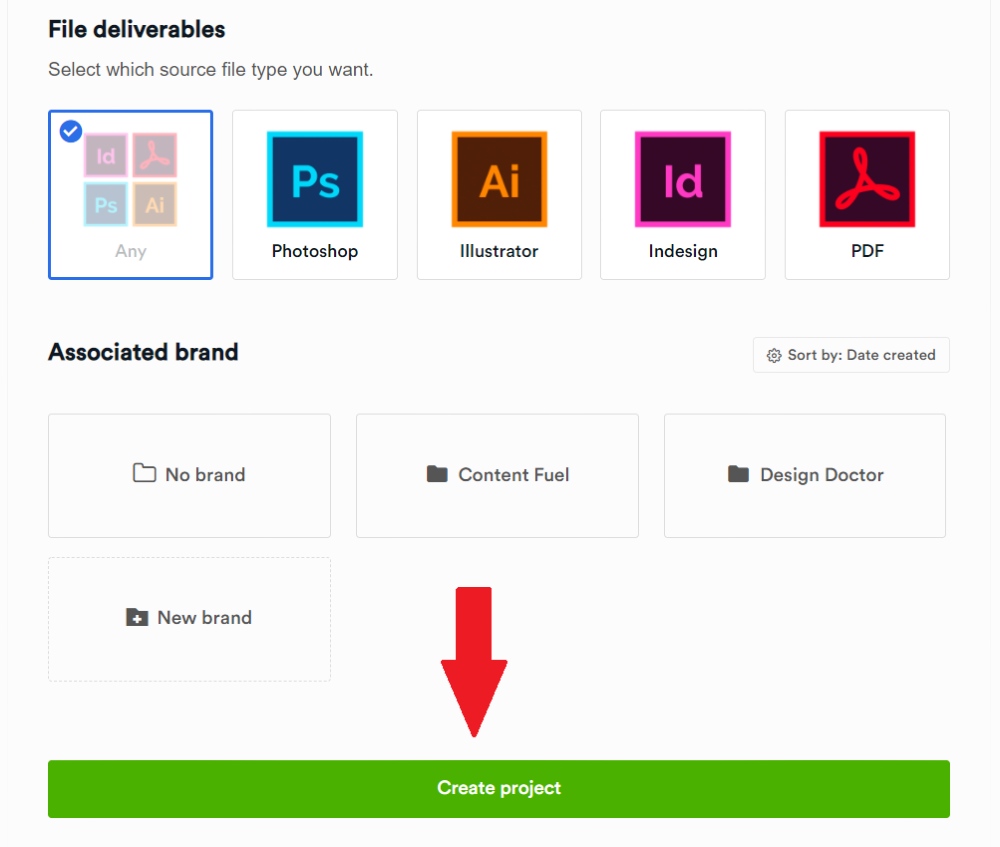
Finalize all the details, then click Create Project, and you’ve created your first active project on the Penji platform.
Once it’s active, Penji assigns a designer to your project, and they’ll go over the project details. You can expect the first draft for an app page design completed within 24 to 48 hours.
Please note that Penji can only provide design and wireframes.
Step 2: Review the Design
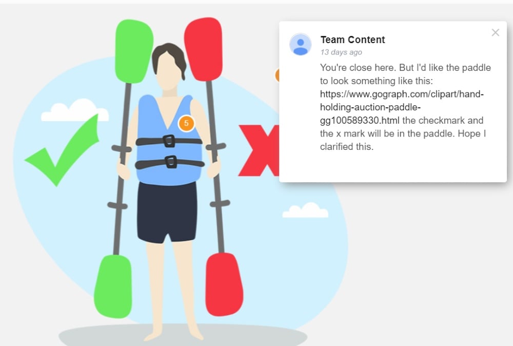
Your assigned designer will submit the first draft of the app page once done. From here, you can review the design if it needs more enhancement. Use the handy revision tool built-in on the platform.
You can pinpoint what needs enhancement in the design. There’s no need to download the first draft or use external design software to draw over what needs improvement.
Plus, in any Penji plan, you get unlimited revisions too. You won’t get that from freelance designers or other graphic design services. You can revise until you’re satisfied at no extra cost!
Step 3: Download the Design
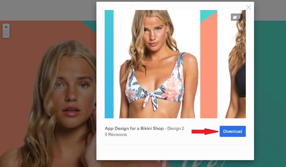
If you’re 100% happy with the minimalist UI design, all you need to do is download it. Click View Design and Download. It’s as easy as that.
Plus, you don’t have to worry about losing your files. Penji stores your files on a cloud, and you can download it whenever you need them again.
Final Thoughts
A minimalist UI app design serves not only an aesthetic purpose but also a navigational function that will provide ease in use. Clutter may turn away a user from continuing to use an app and might consider an alternate option. That’s why minimalism reigns supreme in design. And if it works well on an app design, it may receive more good reviews and fewer uninstallations.
If you have ongoing app design projects and might need extra pairs of hands to move it along, sign up for a Penji plan. Agencies like Momentum and Kohn Creative have tapped Penji for their projects.
Join the list of agencies that trust Penji by selecting the Agency plan. For only $899/mo, get access to ALL design requests. Plus, Penji prioritizes your design projects. We know how much you need to get things done instantly. No more delays or mediocre designs. Only high-quality graphics that your clients will surely love.
About the author

Katrina Pascual
Katrina is a content writer specializing in graphic design, marketing, social media, and technology. In her spare time, she writes monthly personal blogs to practice her craft.


