
If you want to know what the most recognizable online store logo designs in history look like, we made a list. Their careful integration of psychology and logo design elements placed them a cut above the rest.
If you want a professionally made company logo, reach out to Penji. We are an unlimited graphic design service that prioritizes quality, affordability, and efficiency.
Why an Online Store Logo is Vital
For most e-commerce businesses that don’t have physical stores, it’s hard to establish a sense of familiarity with your consumers. Since no store signage helps you in your advertising strategy, you have to make sure you create an online store logo that makes an impact. The same goes for all your other online marketing assets.
Here’s why not skimping on virtual store logos is imperative:
- It instantly grabs attention
- Showcases your brand’s personality
- Acts as the foundation of your brand
- Makes a long-lasting impression
- Creates top-of-mind awareness
- Separates you from your competitors
- Makes your brand more credible and trustworthy
- Cultivates band loyalty
12 Online Logo Design Examples
1. Zappos
![]()
Founded by Nick Swinmurn, this online shoe and clothing store has an exciting story of how the idea came about. One day in 1999, the founder was strolling along the mall to find a specific pair of shoes to no avail. Frustrated and empty-handed, he searched for the shoes he wanted online but had no success. And that’s when he had a ‘eureka’ moment.
He initially thought of the name ‘Zapos’, which came from ‘zapatos,’ the Spanish word for shoes. Since he didn’t want people to mispronounce it as zay-pos, he added an extra ‘P.’
This logo stands out because of the different elements that are brilliantly put together. Because Swinmun wanted to showcase the most dominant product category, the simple and unique shoe symbol is a nice touch that sticks out.
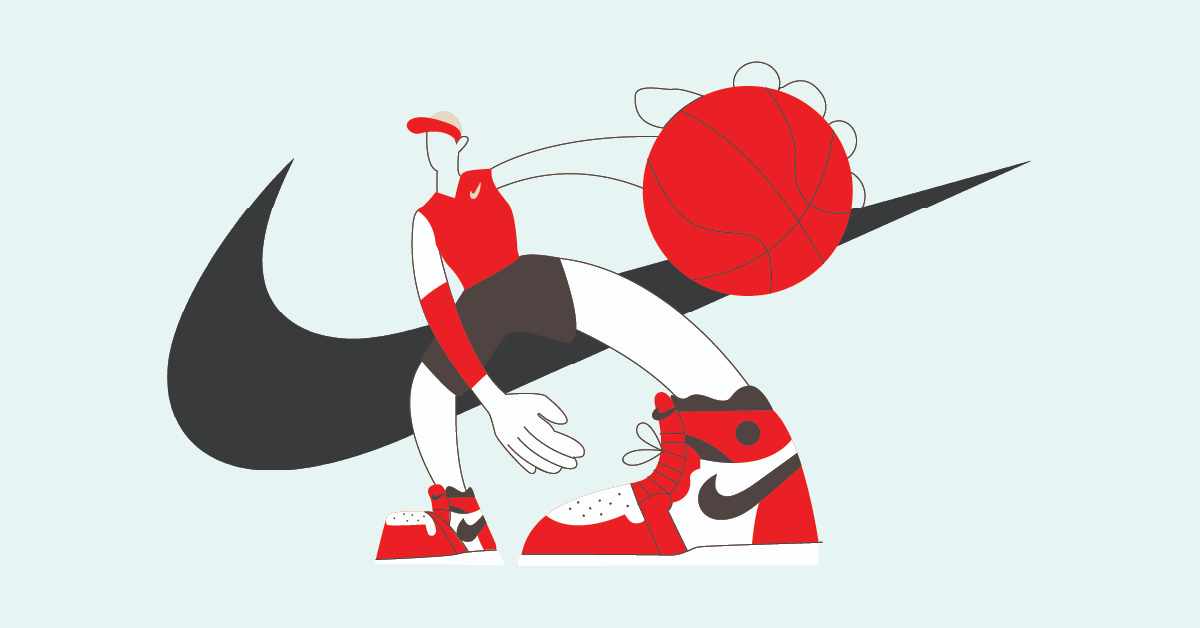
Online store logo designs that add impact to your brand
Design unique logos in 1-2 days
2. Nasty Gal
![]()
Inspired by Betty Davis, Nasty Gal Vintage started in 2006 and sold old pieces of clothing. The online store received an award as the “Fastest Growing Retailer” in 2012 and rebranded to Nasty Gal later on.
Strong typography is essential in an excellent online store logo. However, the usual cliches and eCommerce design trends aren’t always suitable for your brand. Since the Nasty Gal caters to young women’s fashion, the playful and youthful font style says it all.
3. Etsy
![]()
Etsy is an e-commerce website that sells handcrafted or factory-made vintage items. From bags, apparel, home decor, toys, art, jewelry, and more, it’s a platform where creativity is a selling factor.
Robert Kalin, one of the co-founders of the brand, was thinking of ideas and thought of the Italian word “etsi” which means “oh, yes.” He heard this word in a comedy-drama film by Federico Fellini more than a handful of times and thought it was fascinating.
The site features a very simple Georgia font with a capital ‘E’ that gives it a traditional look and classic typography relating to vintage items sold on the site. The orange color was also because of the orange chair Kalin was sitting on while he was thinking of name ideas.
4. Amazon
![]()
Founded by Jeff Bezos in 1994, Amazon is one of the leading e-commerce giants in the market today. It started as an online bookstore and probably has every product category you can think of now.
This online store logo is a crowd-puller because of two elements: timeless design and brand principles. The arrow, which starts from A and ends in Z, indicates that the company has everything you need from A to Z. However, it also portrays several things. Firstly, it resembles a smiling face together with the text, which means the company is a friendly and trustworthy website. Secondly, the arrow signifies speed and progress regarding ordering and shipping processes.
5. eBay
![]()
Operating in more than 30 countries since 2011, it’s no surprise eBay is considered a household name for your online shopping needs. Founded in 1995 by Pierre Omidyar, it is now a multibillion-dollar company that provides business-to-consumer and consumer-to-consumer sales. Aside from buying products on the spot, it also facilitates an auction-style selling mode.
We picked the eBay logo because it exudes the core elements of its branding. The vibrant colors imply enthusiasm, entertainment, and candid energy. Before, the letters were positioned in a “baseline shift.” It’s a type of zigzag pattern in graphic design. However, the company rebranded and placed all letters equally, offering a more modern look. The touching letters from the old and new logos also connote connectivity within their comprehensive community of more than 100 million users.
6. Alibaba
![]()
Jack Ma is one of the 18 founders of this Chinese e-commerce tycoon and is the person who thought of the name “Alibaba.” One day, while Jack Ma was in a coffee shop in San Francisco, he asked several people of different nationalities if they knew the word “Alibaba” and everybody said, “Yes, open sesame!” Ali Baba is a poor and smart woodcutter who helped the people in his village. Jack Ma wanted to be the ‘Ali Baba’ in providing everyone convenience in online shopping.
The logo features a small letter ‘a’ and a negative space which resembles a smiling face. This supposedly means a happy and satisfied customer. The different components in the logo can be scaled in big and small prints.
7. Target
George Dayton spearheaded the Target Corporation. It’s the eighth largest retailer in America that everyone recognizes. In fact, a survey in 2003 states that 96 percent of Americans recognize the Target logo. Why? Well, first and foremost, the logo itself is an overall representation of the brand name.
A bullseye is the most suitable icon for an online store called “Target.” Though this online store logo is undoubtedly one of the most memorable logos to date, it underwent a myriad of redesigning to craft a perfect one.
From a classic bullseye three-ring logo to a ring with a small circle in the middle, people still have this affinity towards the brand more than others. The logo in 1962 donned the name “Target” in black strewn across the bullseye.
The logo today is a more simplified version that is fresh and keeps up with the changing times and buyers’ needs.
8. Betty Crocker
If any of you are wondering if Betty Crocker is a real person, she’s not. In 1920, Washburn-Crosby Company created this fictional character to put a human face into the brand. The character was then seen on several print marketing materials and portrayed by different actresses.
For an online store that’s famous for its sumptuous recipes and pastries, Betty Crocker’s logo is one that’s relevant and distinctive. General Mills decided on the red spoon logo, and the casual script font on it is a beautiful touch. The spoon depicts the cheerful and passionate service of cooking for consumers, just like the name “Betty.”
9. Walmart
Since 1962, Walmart has been serving millions of consumers for their daily essentials. As an American multinational chain of hypermarkets, Walmart’s logo deserves a spot on this list. The six spokes are reminiscent to that of Archimedes’s famous exclamation — Eureka. According to the founders, these six “sparks” represent the ever-changing ideas and innovations that keep the company up and running.
10. Barnes&Noble
According to Logo Design Guru, a colored logo increases brand recognition by 80 percent. And Barnes&Noble has taken advantage of color psychology to establish memorability. The green-brown combination emanates growth, freshness, wisdom, tranquility, and reliability, appropriate for one of the biggest booksellers in America.
11. Mr. Chocolate
Although the website URL says Mr. Chocolate, the logo pays homage to the genius behind all the decadent desserts served to kings, celebrities, and presidents in history. Jacques Torres’s love for chocolate reverberates in his mouthwatering creations.
His logo design’s typography is as tasteful as his gourmet chocolates. There is a stunning balance between the elegant script typeface and both the serif and sans-serif fonts. The logo design instantly evokes a happy emotion of how chocolate makes you feel once it melts in your mouth and lets its sweetness linger.
12. Rakuten
This Japanese-based electronic eCommerce company centers on one philosophy: Optimism. While the Japanese word “Rakuten” means “optimism,” the company’s mission is to empower individuals and businesses to build a more optimistic future.
Rakuten’s online store logo is empowering in a bright, red shade. The eCommerce logo exudes determination, passion, and enthusiasm, well-suited to the company’s principles.
Need an Eye-Catching Logo for Your Virtual Store?
If you’re in the process of creating an eCommerce logo, Penji can help. Subscribing to Penji’s lowest plans offer you these benefits:
- Unlimited designs and revisions
- Fast 24-hour turnaround
- Dedicated account manager
- 120+ design services
- Custom design platform that lets you add up to 10 members
- 24/7 Customer support
- Money back guarantee
Signing up for Penji means one thing–hassle-free design process. Grab this limited 15 percent off now!


