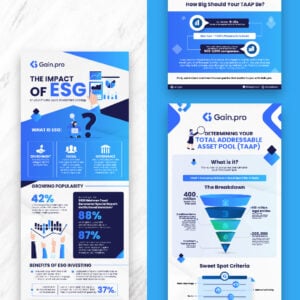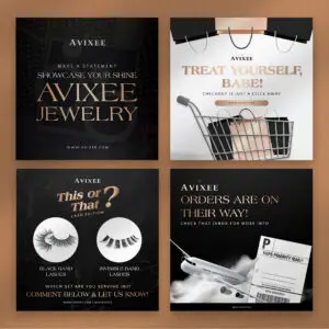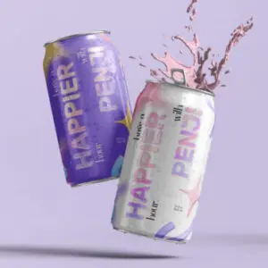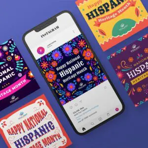
Visual metaphor in advertising pertains to graphics that associate a thing or person that represents a concept or idea. The overall composition of these images is meant to symbolize something else. The outcome? Truly remarkable and powerful imagery that opens up visual interest. Using visual metaphors in advertising gives your audience a unique visual experience. Here are 20 visual metaphor examples for inspiration.
1. Braun
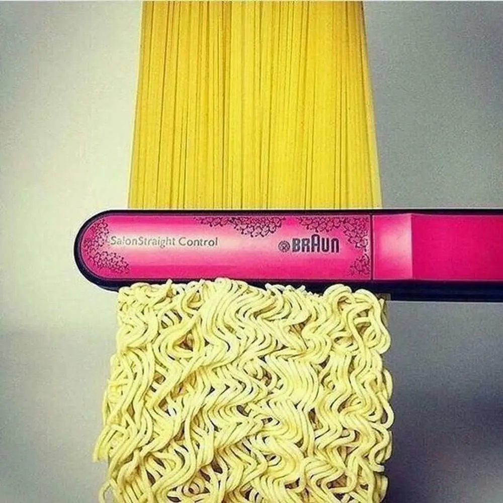
Braun is known for a wide product range of epilators, razors, and products for your hair grooming and removal needs. Well, Braun sure knows how to symbolize hair by replacing it with noodles.
Featuring their hair straightener product, Braun banks on visual metaphor to show how it does the trick. The hair iron shows how it straightens the noodles from their curled-up form inside the packaging. It shows that Braun products can straighten even the curliest hair.
2. Tabasco
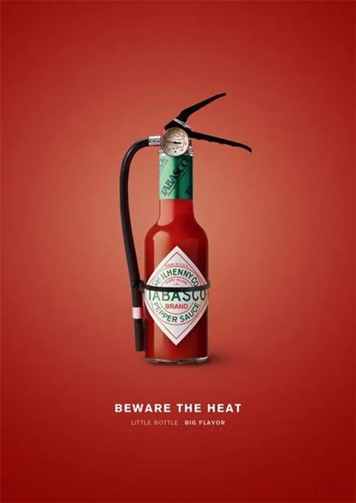
At first glance, you’ll notice the small Tabasco bottle. But as you look at the image’s entirety, you can see that there’s a hose, nozzle, pin, and pressure gauge attached to it. The entire visual displays a fire extinguisher.
This visual metaphor from Tabasco depicts how this small bottle can be extremely hot. The fire extinguisher illustrates how one might need it to put out the “fire,” or in other words, if they can’t handle the heat.
3. Nivea
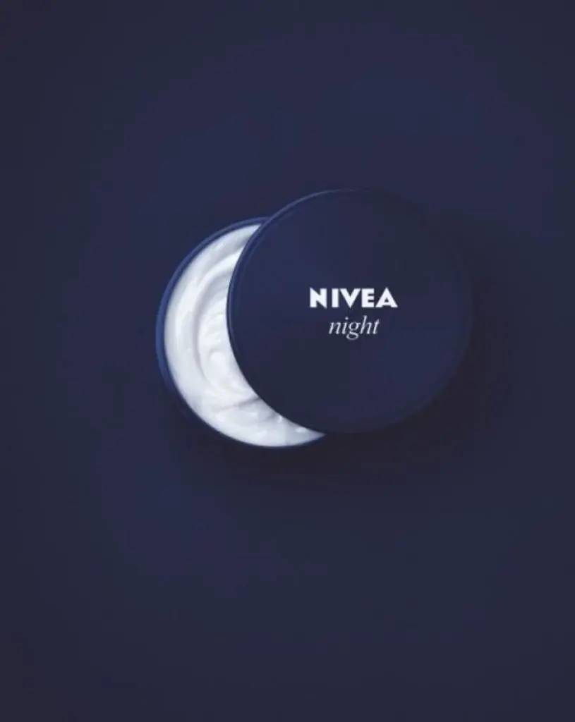
This is a straightforward graphic that has a lot of significance behind it. It doesn’t take rocket science to create something brilliant. And Nivea knows how to play it cool with simplicity.
Promoting their night cream, Nivea presents a half-opened bottle, exposing the cream inside the can. However, the cream resembles a half-moon, which symbolizes “night.” A brilliant way to represent the brand’s product.
4. Volkswagen Beetle Denim
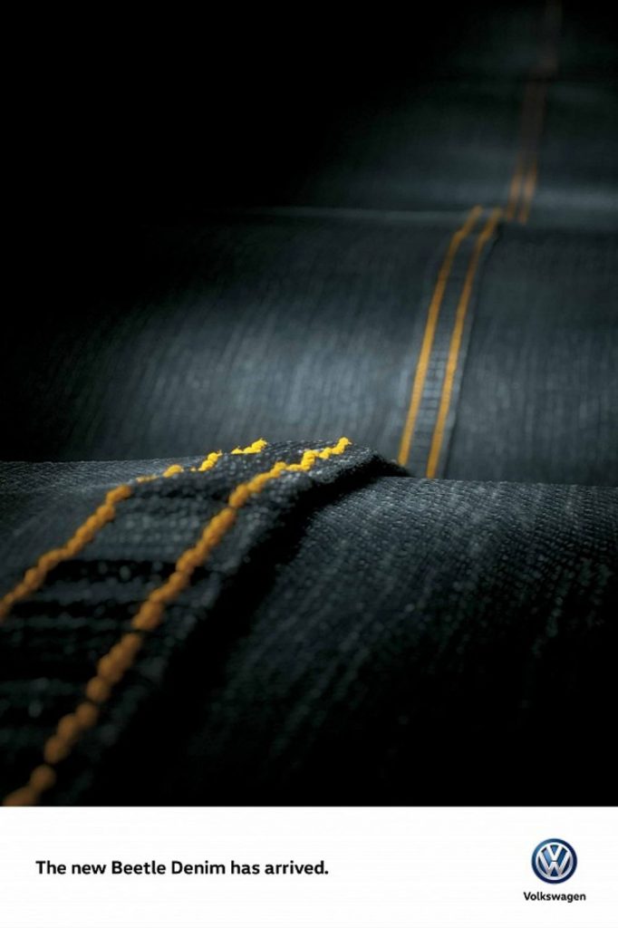

Motorists were in for a treat as Volkswagen released their Beetle Denim models. These vehicles feature unique accents and interiors not found in any regular Beetle. The interior features light blue denim seating and jeans-inspired backseat pockets.
One way to promote your unique product design and branding is to feature it front and center. The seams remind you of the dashed lines that you see in the middle of the road. Volkswagen paints a picture in viewers’ minds about taking their new Beetle on a long drive.
5. BusConnects
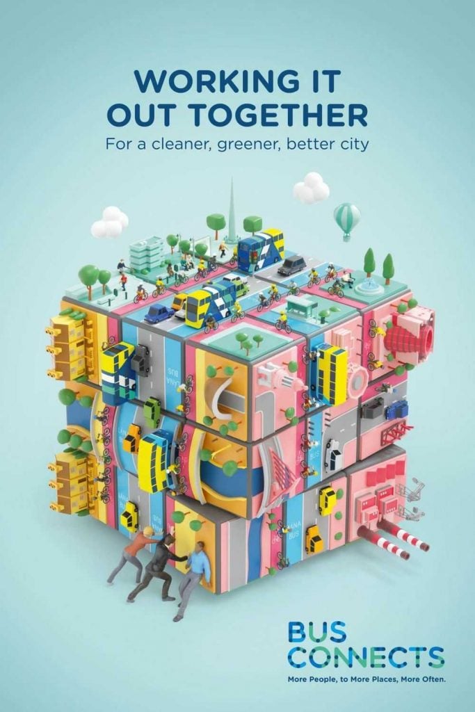

BusConnects is a program that helps Irish cities improve bus services and make public transport sustainable. This propaganda is for a cleaner and greener Dublin. But why use a Rubik’s Cube?
As you know, a Rubik’s Cube is solved when all colors are placed on one side of the cube. And it would take good analysis and strategy to achieve it. BusConnects shows that achieving a cleaner and greener city would need the people’s collective effort.
6. Save the Children
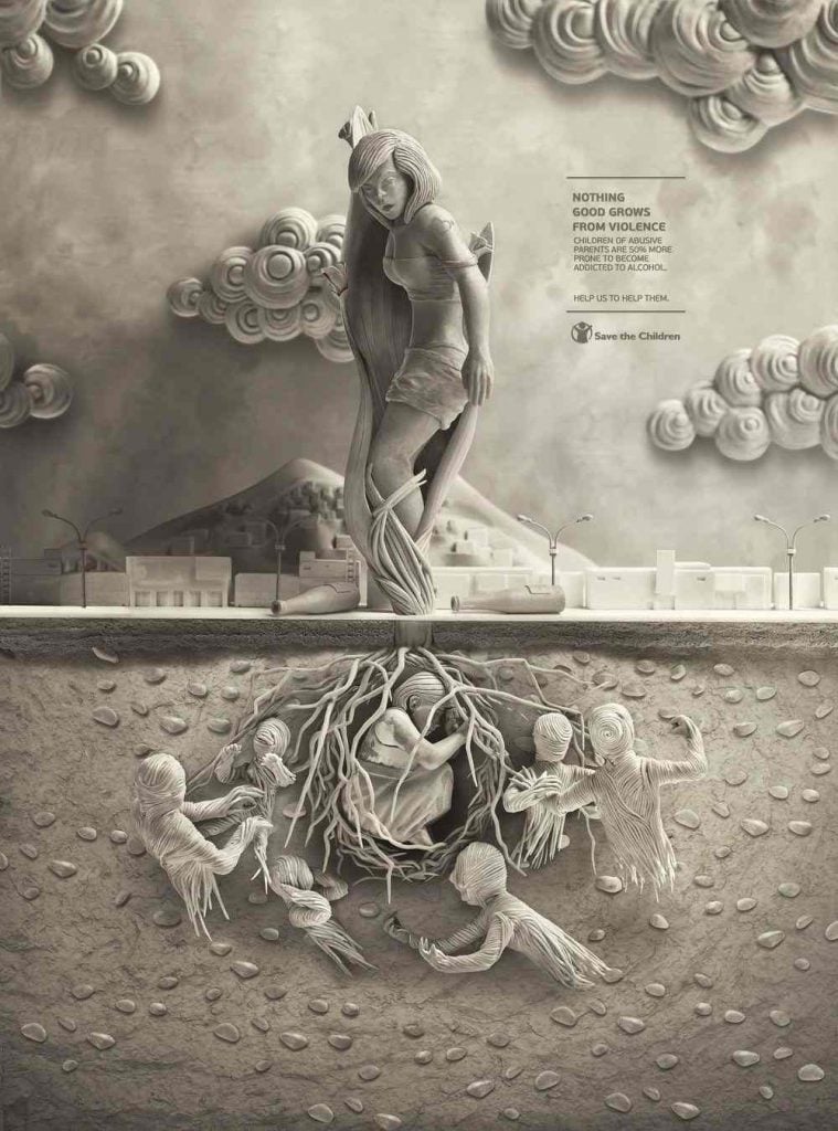

Save the Children features an impactful visual metaphor with this design. For their anti-violence campaign, they advocate how abusive parents could lead children to alcohol addiction.
The imagery shows a child encapsulated in a tree’s “root.” But the tree is represented by a woman, who is seemingly the mother. Overall, the graphics symbolize that every bad experience is ingrained in every child from the early stages — just like a seed.
7. Tropicana
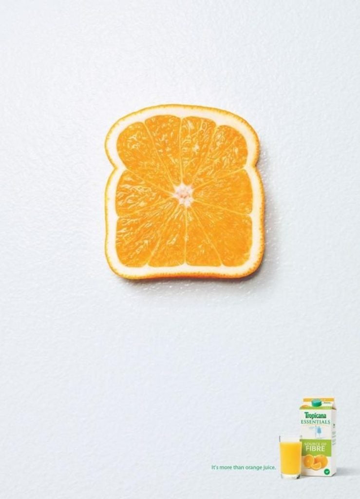

Tropicana is your go-to brand when you’re craving orange juice. Orange juice can be a good addition to a meal or a great refreshment on a sunny afternoon. But Tropicana claims orange juice is more than just orange juice.
The brand wants consumers to ensure their daily intake of orange juice because it’s a complete breakfast. And the brand plays a clever visual metaphor by shaping an orange into a toast to resemble breakfast. Plus, Tropicana implies that the meal will be complete with a drink of their tasty orange juice.
8. Burger King
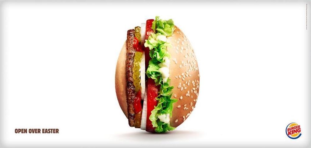

Burger King communicates with its audience through a visual metaphor during Easter. Since the hamburger fast-food chain is open during Easter, they turned a burger to its side to resemble the shape of an egg. A perfect representation of the traditional Easter Sunday egg hunting.
9. McDonald’s
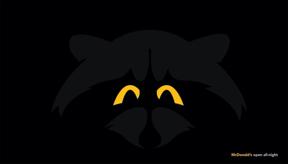

Here’s another example of a visual metaphor in advertising that banks on simplicity. McDonald’s is known for its innovative advertising designs, and this one is no exception.
To show consumers that the fast-food giant is open 24/7, they showcase nocturnal animals with their eyes shining brightly. However, they’re not an ordinary set of eyes. The eyes are the McDonald’s logo split in half. This is an ideal way to promote your offer while staying on brand.
10. World Wildlife Fund


WWF leaves no stone unturned in protecting voiceless animals. More often than not, they do it through thought-provoking and compelling marketing designs. WWF is known for its unorthodox visuals in advertising.
Take this Jenga advertisement, for example. WWF compares the ecosystem to Jenga. Jenga is a game that involves pulling blocks carefully without knocking down the entire structure, which is a great challenge. WWF shows how the ecosystem will come crashing down when an animal species is eliminated.
11. Nokia
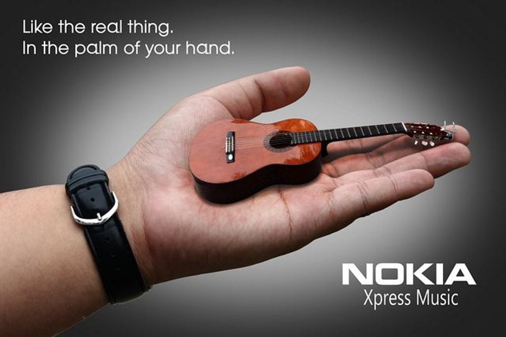

Although it has been kicked out of the spotlight, Nokia reinvented visual metaphors in advertising during its prime days. And this particular one is a perfect example!
With a wide range of mobile phone models, Nokia relaunched a specific one solely focused on music. It was Nokia’s relaunch of the XpressMusic phone. The mobile phone company claimed that it was like having all your favorite tunes in the palm of your hand. A guitar on a hand shows how accessible music is on a portable gadget.
12. Diniz






Double meanings are also an excellent way to engage your audience’s minds and encourage fun at the same time. It’s an outstanding achievement when you can convey two different concepts in one image. And Diniz achieved that through their eyewear collection promotion.
Launching their summer eyewear pieces, Diniz used tropical fruits and shaped them into sunglasses. The fruits represent how timely the sunglasses are for the sunny weather. Plus, the fruits’ shadows are also shaped according to different eyewear styles.
13. Jordan Insurance Company
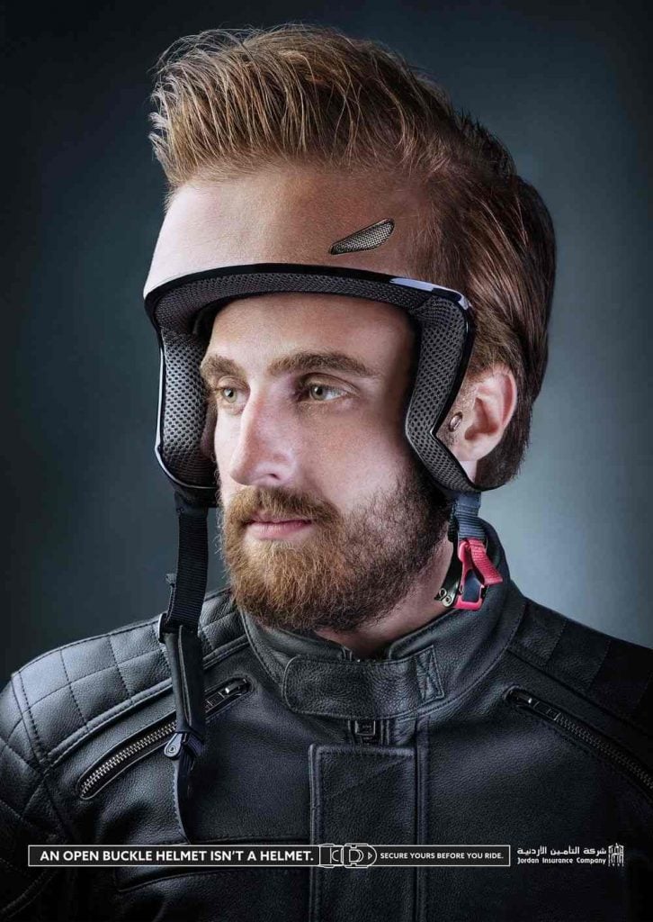

Visual metaphor in marketing is both bizarre and captivating. Achieving success in this department means stimulating the minds of your viewers. Here’s one example from the Jordan Insurance Company that’s both bizarre and captivating.
Viewers might not get the ad’s concept at first glance. But you need to look at it hard enough to understand the message it communicates. It means wearing a helmet for safety is the smartest thing to do. But some motorists are too complacent about not locking their helmet securely. This ad means if you don’t lock the helmet straps, the helmet serves no purpose to protect your head.
14. Tic Tac
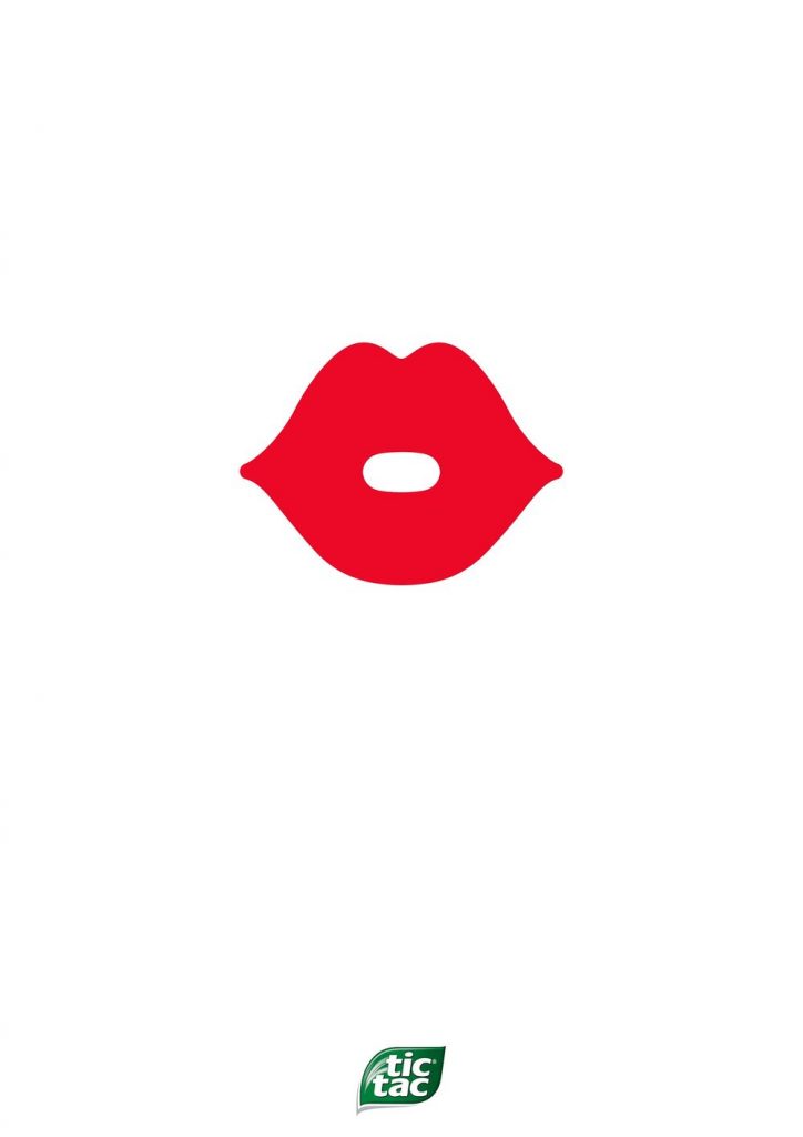

Another clever marketing design from the famous candy brand Tic Tac. There might not be a lot going on in this visual, but the message is there. It means that you’re never too sure when special moments happen.
That’s why you should always carry your Tic Tac container with you because you’ll never know when someone’s going to lean in and kiss you! And that’s not all, the negative space in the middle of the lips is also shaped like a Tic Tac candy.
15. United Nations
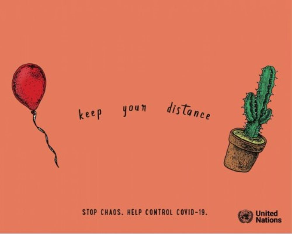

The COVID-19 pandemic has changed the normal that people were once used to. We now have to keep our distance and practice safety measures by washing our hands. The less interaction we have with other people, the lower our chances of contracting the deadly virus.
The United Nations wants to remind people to keep their distance while poking fun at their audience and keeping the imagery lighthearted. They released a series of designs with simple images of two things. These two things, when put together, could lead to destruction or damage. Here’s an example of a cactus and a balloon. You know what happens next when both things are kept in close proximity to each other.
16. First Call
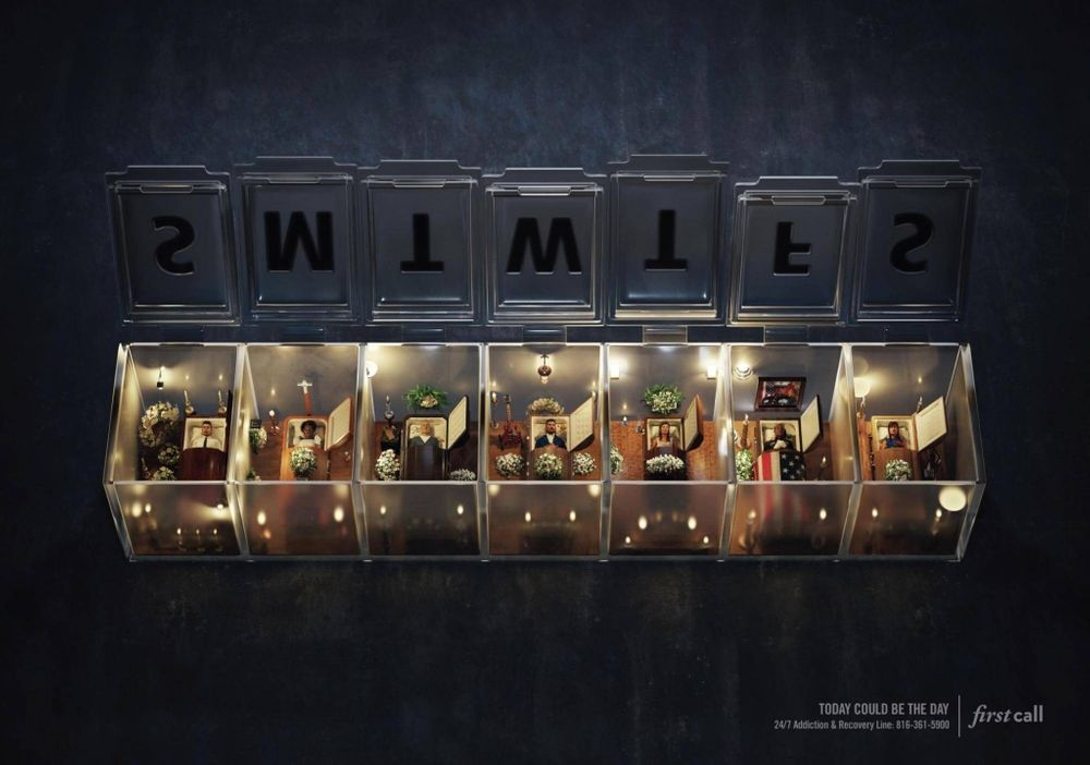

Emotional marketing is also essential in creating advertisements that tug at people’s heartstrings. Moreover, making your visual metaphor a little bit dramatic can also help in conveying your message.
Here’s one campaign from First Call, an addiction and recovery hotline. As you know, pills can be detrimental to your health over time. First Call made their message clear about how people shouldn’t be reliant on pills. The brand displays a coffin in every compartment to depict that relying on pills could damage your health, leading to your demise.
17. Floslek


Another figure of speech that can also be used in visual metaphor advertising is hyperbole. Hyperbole means exaggerating a person or thing and making it seem bigger or better. Floslek is a sunblock brand that magnifies the imagery in this particular example.
They placed the colossal sunblock behind beachgoers to show that it protects their skin from the heat of the sun. Plus, they situated it along the beach to show that the sunblock is water-resistant.
18. IKEA


People who are constantly moving from one home to another could be living “in a box.” IKEA reminds people that living in a box isn’t all that bad, especially if you buy the brand’s high-quality and affordable products.
IKEA tells homeowners to “Unbox your life” by buying from this ready-to-assemble and affordable furniture brand. The ad shows a simple contrast between other habitants seemingly living a dull and boxed life. The colors symbolize IKEA’s way of making your life more fun and exciting.
19. TriHonda
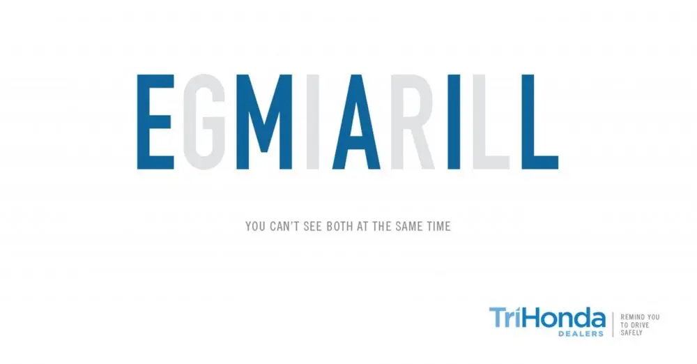

You must also try to bank on copy to create compelling ads that make people think. TriHonda has a lovely message for drivers to never be on their phones while driving. In this ad, you’ll see the words “GIRL” and “EMAIL” combined in one line with different colors.
At first glance, you can’t decipher both words. This signifies that it’s hard to see pedestrians crossing when you’re using mobile phones while driving. And this could lead to disaster. So TriHonda reminds drivers to either stop the vehicle when they check their phone or focus on the road.
20. Thinx
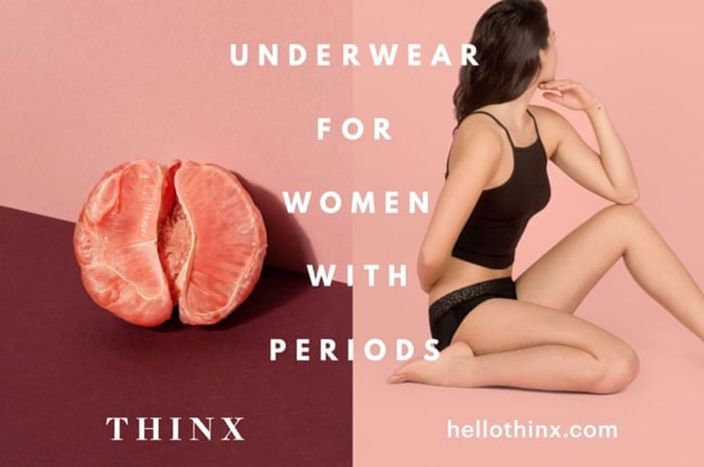

Thinx is a brand that sells underwear for women with periods. If you’re not able to represent your product literally, using symbols is an excellent way to get your message across. Thinx achieved this by using the half-peeled grapefruit as a symbol of a vagina. It’s a feminine and visually communicative way to promote lingerie without going overboard.
Conclusion
Visual metaphor in advertising is becoming common in brands’ marketing campaigns. Not only are visual metaphors unique, but they also drive more engagement due to their unusual imagery.
But visual metaphors in marketing aren’t easy to deliver. You’d need the help of professional graphic designers for that. Penji can help you create unique and interesting visual metaphor designs, like these 20 examples. Subscribe now and get a limited 15-percent discount.
About the author
Table of Contents
- 1. Braun
- 2. Tabasco
- 3. Nivea
- 4. Volkswagen Beetle Denim
- 5. BusConnects
- 6. Save the Children
- 7. Tropicana
- 8. Burger King
- 9. McDonald’s
- 10. World Wildlife Fund
- 11. Nokia
- 12. Diniz
- 13. Jordan Insurance Company
- 14. Tic Tac
- 15. United Nations
- 16. First Call
- 17. Floslek
- 18. IKEA
- 19. TriHonda
- 20. Thinx
- Conclusion

