Nothing beats an exemplary company logo that speaks volumes about your brand. When infused with memorability, simplicity, relevance, and versatility, a business logo will appeal to target audiences in many ways. So carefully considering colors, typography, and symbols is crucial to create an impactful one. Here are 13 types of logos and when to use each.
Do you need help with your company logo? Get Penji to design your logo in one to two days for only $75!
1. Wordmark Logos
A wordmark logo consists solely of a company’s name without any additional symbols or imagery. Many famous wordmarks have a way of projecting confidence and class. For example, The New York Times, Sony, Braun, and Dior all have minimalist wordmark logos that have stood the test of time.
When we designed this logo for Indian restaurant Swalloo, we wanted to give the impression of a modern and convenient brand. The small spoon and fork adds a touch of playfulness to match the cheery tone of the company.
2. Lettermark Logos
A lettermark is a type of logo that contains the initials or acronym of a company. The whole word isn’t spelled out as it is in wordmark logos. Famous lettermark brands include P&G, Louis Vuitton, IBM, HP, and Warner Brothers. Lettermarks are ideal for companies with long names that want to abbreviate.
3. Combination Logos
Combination logos include both text and a symbol or icon to create a unique visual representation of a brand. Tons of brands have these types of logos, and for good reason. It gives you the opportunity to combine language and imagery to become more memorable to your target audience. When customers come across a combination logo multiple times, they begin to associate the symbol with the brand and remember both.
The most important thing to remember with combination logos is that the imagery must match the words – much like this example for Neuro. Both wording and imagery should give insight into the brand without creating confusion or appearing disjointed.
4. Monogram Logos
A monogram logo displays a combination of two or more letters, much like a lettermark. But monogram letters are interwoven or overlapped in a unique way. It’s also possible to choose two different types of logos to use in different situations. For example, fashion brand Louis Vuitton has both a wordmark logo and a monogram logo with L and V intertwined. That’s what our designers did with this Defining Moments logo, which features both a wordmark and monogram that can be used together or separately.
5. Line Logos
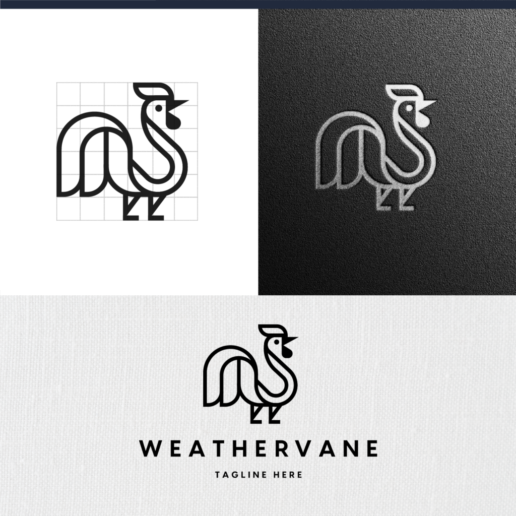
At first glance, line logos may not always seem bold enough to get attention. But the intrigue of many line logos is that they draw attention without demanding it. The simplicity communicates quiet confidence and the details can be alluring to the eye. They’re also great for stripped down brands that communicate concisely and without frills.
6. Irregular Shape Logos
Irregular shapes give your brand a chance to truly stand out. Originality is the name of the game here. Brands that opt for irregular shapes are naturally memorable and can let their creative side shine. These wave logos are another great example of irregular logo shapes at play.
With this style, the only risk lies in making your logo too obscure or hard to comprehend. If your logo intrigues viewers to learn more, you know you’ve done abstract logo design correctly.
Figure Logos
In a world of lettermarks and simple icons, figure logos can seem risky. They’re less common and often more detailed, which means they might take longer for the eye to process. But a figure logo is the perfect fit for some brands. For example, a hair salon whose logo is a woman with flowing hair, or a grooming business whose logo is a dog in a bathtub.
7. Mascots
For many big companies, their mascot is more famous than they are. Well-designed mascots can take on a life of their own, gathering a loyal fanbase all to themselves. Sports teams (and cereal brands) know this better than anyone. Designing a company mascot is all about getting the characteristics on-brand – facial expressions, gestures, clothing, etc. Otherwise, your mascot will appear disjointed from the rest of your visual identity and people won’t embrace it.
8. Animals
Animals are highly symbolic, making them the perfect subject of a logo. Humans have long held collective ideas and judgements about animals, which a brand can use to its advantage. For example, many people have positive associations with dogs and cats, making them good logo candidates (along with these owls!) A cuddly bear might be the perfect type of logo mascot for a kids brand. It’s all about finding the appropriate fit. Browsing through these animal associations is a good place to start.
9. Humans
No matter who your audience is, they’re human (we hope?) Using human imagery in your logo can help your target audience identify with your brand. Perhaps even on a subconscious level, you are communicating that your brand is for a particular audience – a certain demographic like young women, or even a particular psychographic like nature lovers.
Geometric Shape Logos
Whether you believe in the power of symbolism or not, shape psychology is a thing. Different shapes are said to give a different, subtle impression. Sharp angles communicate authority and precision, while rounded edges give a soft and inviting appearance. While shapes are a seemingly minor choice surrounding your brand, they contribute to its persona and visual identity.
10. Circle or Sphere
Circular logos are visually appealing and versatile, which is why they’re such a common choice among businesses. They can easily be scaled, recognized, and placed on various backgrounds. Circle logos are great for brands that want to emphasize things like community, support, openness, trust, and nature. Famous companies who pull of these types of logos include Spotify, Mastercard, NASA, Pepsi, and Volkswagen.
11. Oval Logos
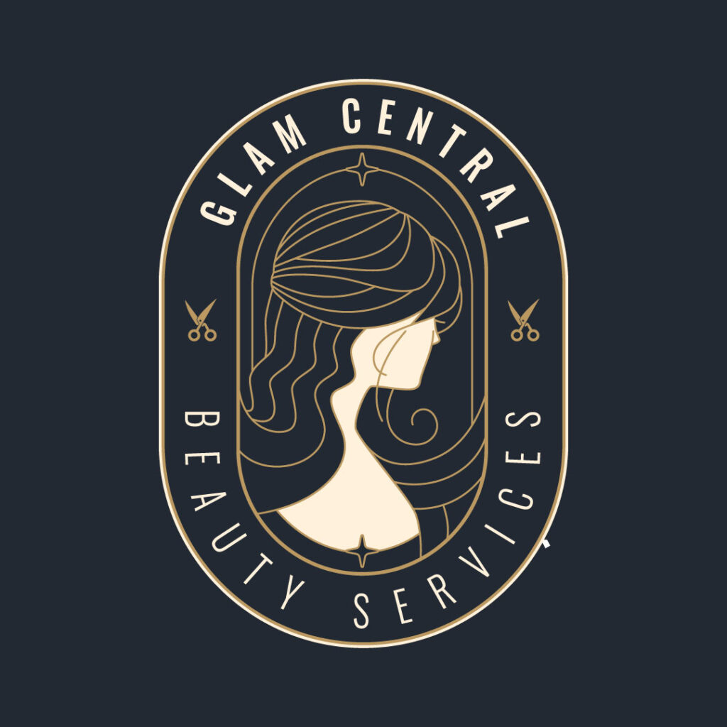
Oval logos can give a similar impression to circle logos, but they can also convey a sense of elegance and sophistication – as shown in this beauty logo. You might choose an oval shape if you need to fit a horizontal word within it. Oval shapes are perfect for brands that want their logo to appear sleek, professional, and polished. Plenty of consumer brands have found success with oval logos like Evian, Ikea, Kleenex, and Barilla.
12. Square or Cube Logos
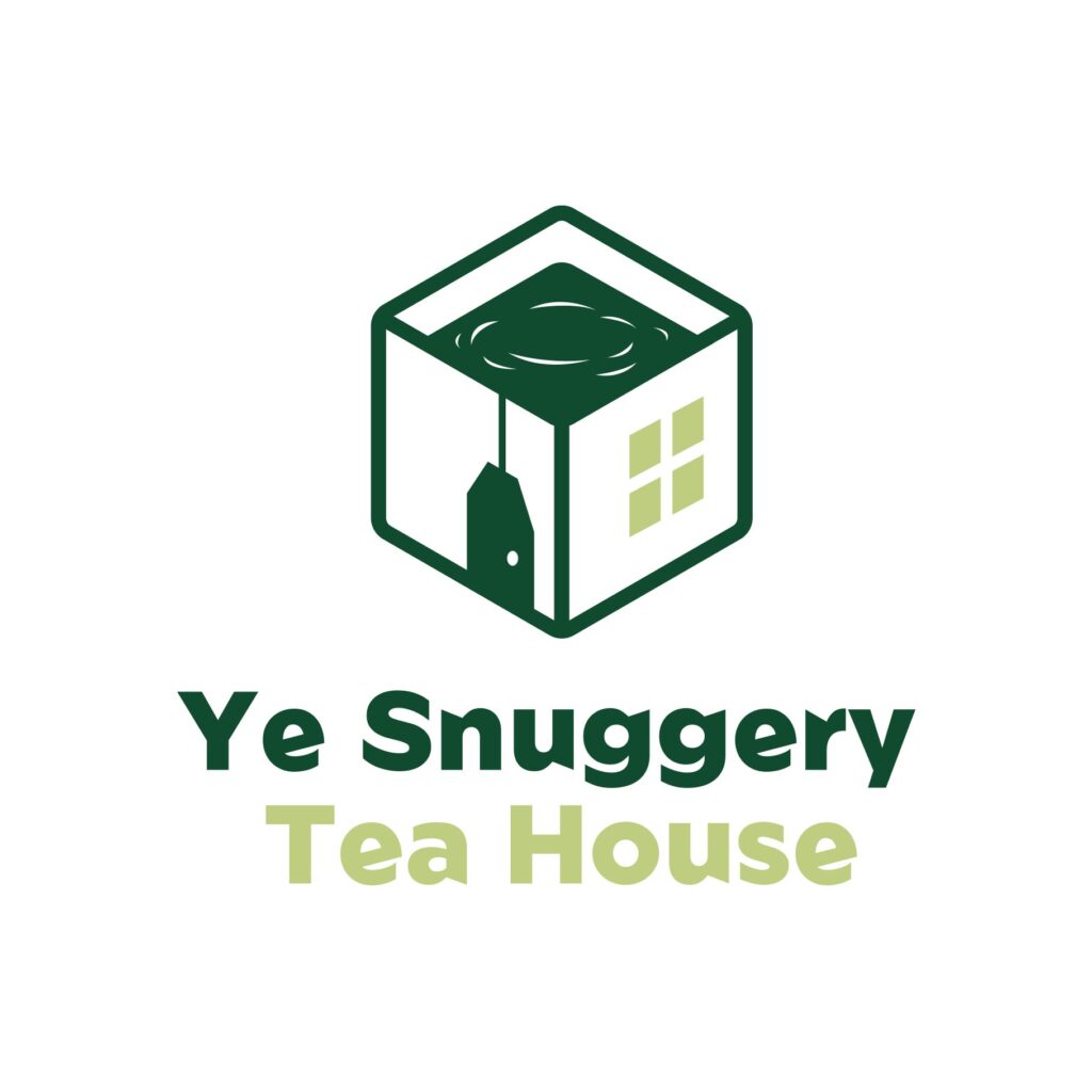
Squares have 4 corners, suggesting stability and predictability. Cubes give a similar impression but with more complexity. These elemental shapes are one of the most common types of logos and have been used by brands like Microsoft, Home Depot, Dropbox, and the Gap to name a few. In this example, our designer cleverly uses a cube to depict a tea house (with the door as a tea bag).
13. Triangle Logos
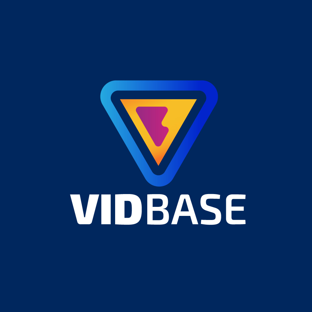
Triangles are distinct and carry a lot of symbolism. They’re probably the rarest of the shape logos, which gives brands with triangle emblems a chance to stand out. Historically, they also have spiritual associations, so if a brand wants to infuse elements of mystery and intrigue, a triangle is one way to do it. Brands like Prada, Mercedes, and Guess have employed the triangle in some versions of their logos.
Get unlimited designs – and logos – with Penji!
If you liked these logos by our designers, you’ll love partnering with Penji for all your design projects.
By subscribing, you gain access a team of professional designers who are always working for you – all types of logos, social media graphics, websites, product packaging, and more. The more designs you need, the more money you save with a subscription to Penji. Just submit your design requests and get drafts back in as little as 24 hours.
Ready to learn more? Check out a demo to see how it works.
About the author

Brianna Johnson
Brianna is a professional writer of 10+ years who specializes in branding, marketing, and technology content.

