
Freight or courier companies are competing to become the best movers in the industry. Speed is of the essence for movers. Although that’s the case, some companies choose trucks as their symbol. And if you want the iconic vehicle to be the main character of your logo, check out these ten truck logo ideas to help you envision your logo.
Before we forget, take a look at what Penji can do for your business!
1. Monochrome Logos
Monochrome truck logos use one color on a black or white background. This color can be your brand’s primary or neutral color that doesn’t distract from the image. A monochrome truck logo is a great option if you want a simple design that doesn’t use many colors. For instance, ABC uses a monochrome logo that, as Variety puts it, offers simplicity in a complex era.
2. A Pop of Color
This logo uses an image akin to a cube logo and creates interest with a pop of color. You can choose a primary color that represents your brand’s values and use a secondary color that complements your primary color.
This logo uses dark blue to represent authority and intelligence. But the pop of bubblegum pink adds a dose of playfulness, making the logo more striking.
3. Sharp Lines for Motion
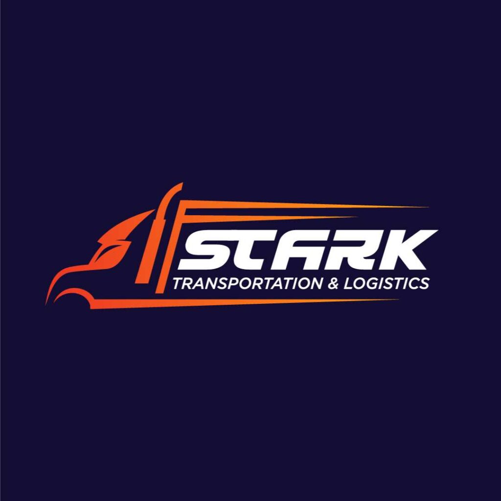
Most truck logos use even, straight lines to convey stability. But sharp lines can also offer a uniquely energetic visual appeal. If your brand is lively and fast-paced, this logo can help you project that energy to potential customers. For instance, Qantas’ logo offers certain vigor and spirit, fitting for its brand identity.
Drive your brand to success with a truck logo
Need a logo? Let Penji create one in 1 to 2 days!
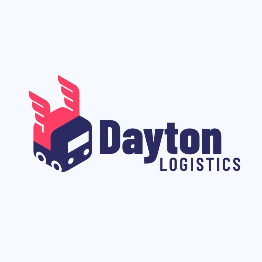
4. Gradient Images
Gradients, or multiple colors that blend, are a great way to catch the viewer’s attention. This type of truck logos is ideal for ventures that want to use a logo with a lot of colors. It’s also a typical choice for businesses that want to appeal to younger customers.
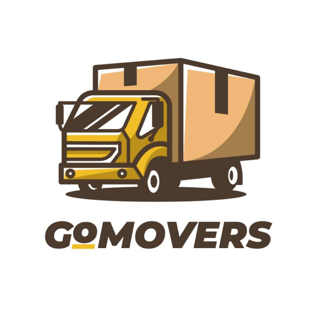
5. Cartoons for a Friendly Vibe
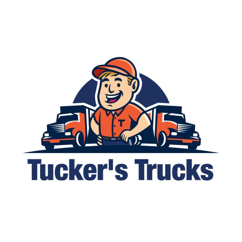
A truck logo with a cartoon image is a great choice for businesses that want to come across as friendly and approachable. This type of truck logos is ideal for brands that want to use visuals to bring their customers in with an inviting feel. It’s also an excellent branding style if the business is centered on or associated with a specific person or a character.
6. Point of View Matters
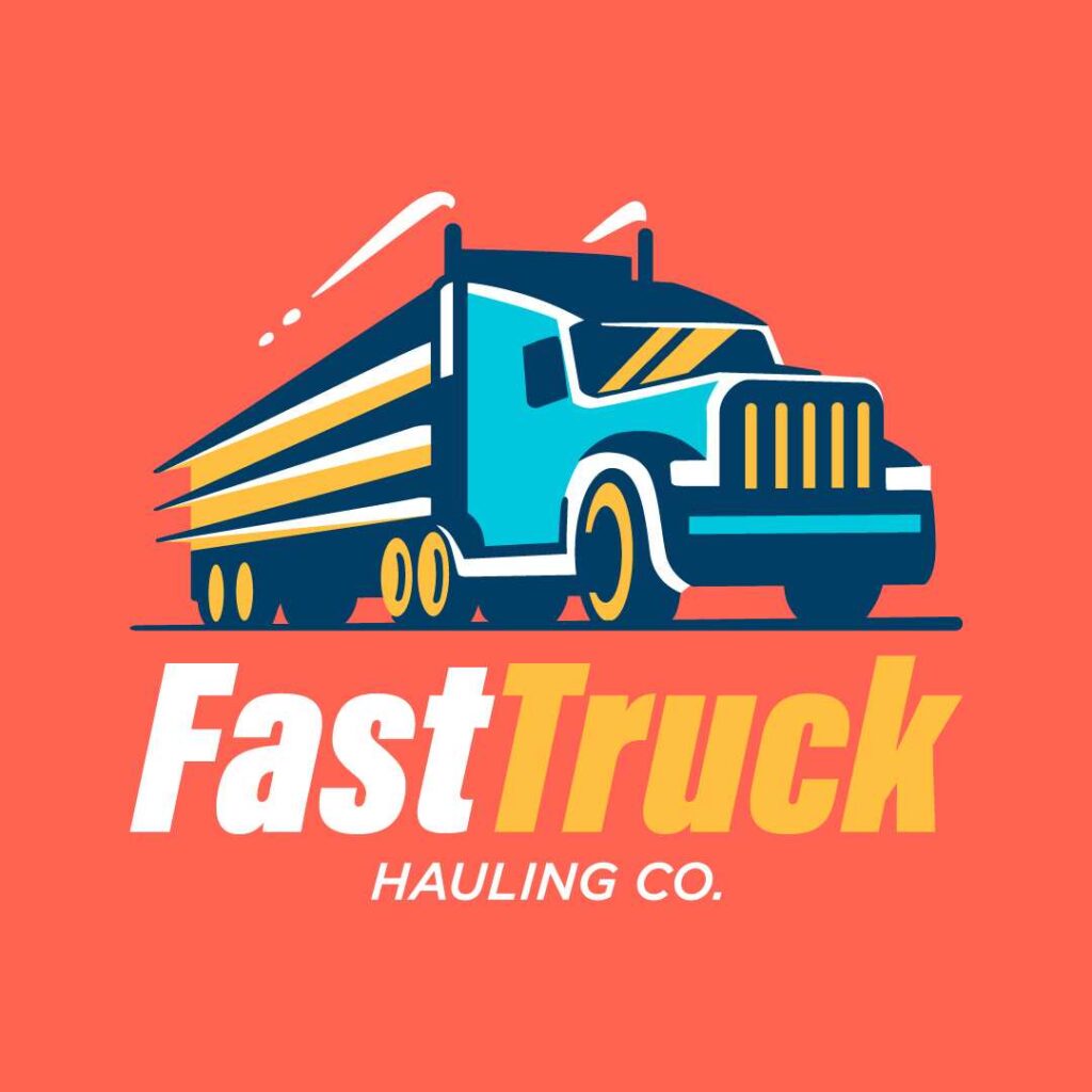
If you think truck logos are about showing a vehicle on a side or front view, think again. This logo features a 45-degree point-of-view, offering a fresh take on transport-themed logo designs. The image makes you feel like the truck is speeding toward you, making for an interesting visual that makes a lasting impact.
7. Make it Round
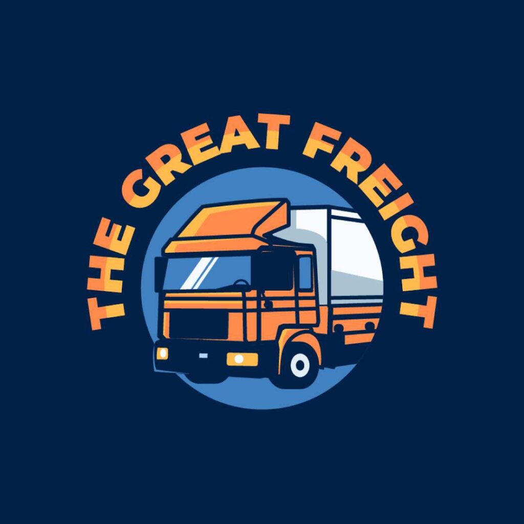
Just as an infinity logo offers a certain softness and flow, a round image is a great choice for ventures that want to project a sense of togetherness and unity. It’s also an awesome design for truck logos that use multiple colors – the round shape ties up all the elements into one simple form.
8. Logo with a Story
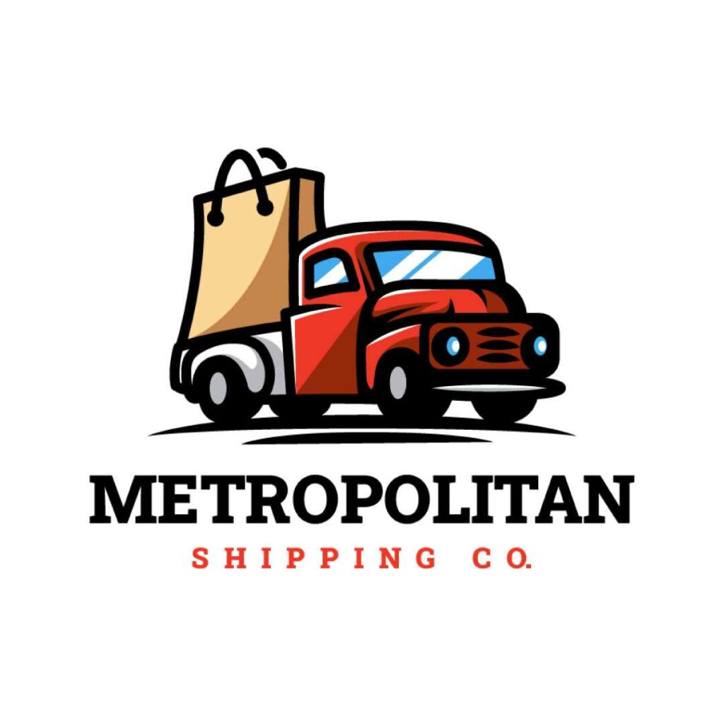
You can use logo designs to tell your story uniquely. How? By incorporating elements that are unique to your business. For instance, this logo tells the viewer that they cater to e-commerce buyers – the shopping bag gives it away right from the get-go.
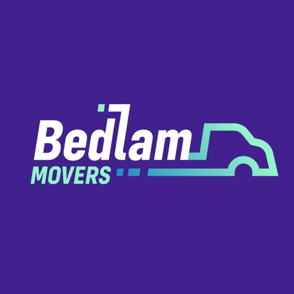
9. Simple Outlines Go a Long Way
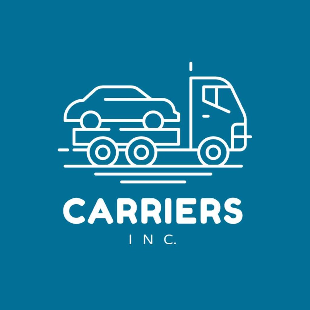
If you’re looking for a simple logo, you can choose an image that uses lines to create a simple outline of a vehicle. An outline logo is a good choice for businesses that want a truck logo that is simple and straightforward.
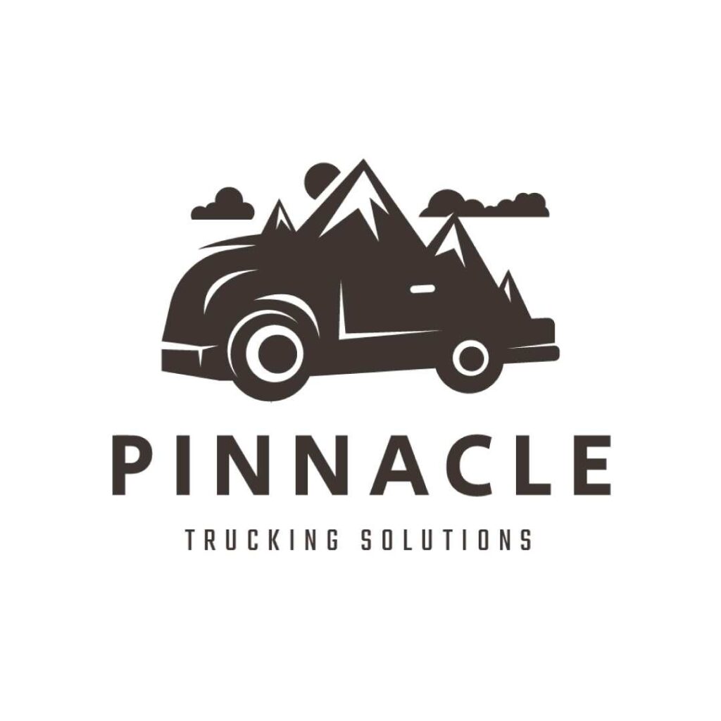
10. Shading for a 2D Effect
A truck logo with a shading effect uses light and dark shades to create a two-dimensional image. It’s a good choice for ventures that want to give their logo a modern, high-quality feel. However, keep in mind that shading a logo is a complicated process, so it’s best to leave it to the professionals.
Tips for Creating a Truck Logo
When creating a truck logo, you want to make sure that it is visually appealing and easy to read. Here are a few tips to keep in mind when brainstorming about a truck logo:
- There are two main types of logo designs: textual and visual. Textual logos use words to create a logo design. Visual logos use shapes, images, and symbols to create a logo. Most logos incorporate both visual and textual elements.
- The visual elements often help create a unique and memorable logo. On the other hand, the textual elements provide info about the company, such as the name or slogan.
- Pay attention to colors – make sure that the hues you use are in line with the identity you want to project. You can review color psychology basics to pick out the best colors for your logo.
- When designing your logo, make sure the visual elements fit your company’s identity and values. For example, if your company is eco-friendly, add an image of a tree or a sun to your logo. If you are a construction company, add an image of a hammer or other construction tools to your logo.
- Before you begin designing your truck logo, make sure you have a good idea of what your business is all about. You should also understand the different types of logos and what they are used for. Once you have this information, it will be much easier to design a visually appealing logo that meets your business needs.
Want a roaring truck logo but no idea how to make one? Our designers at Penji are here to the rescue! We offer unlimited designs at a flat monthly cost to get the most out of your buck. Best of all, we have the top 2 percent of designers – you’ll be in good hands, that’s for sure.
Subscribe now and try Penji risk-free for 30 days! However, if you want a logo only, visit our Marketplace to get a logo within 1 to 2 days!
About the author

Carla Deña
Carla is a journalist and content writer who produces stories for both digital and legacy media. She is passionate about creativity, innovation, and helping small businesses explore solutions that drive growth and social impact.


