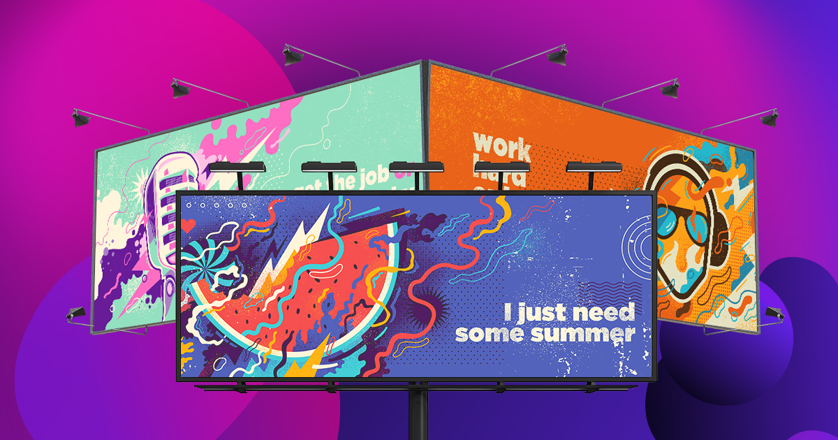
Getting your company a billboard can be a stressful process. There’s research, scouting locations, negotiating prices, and coming up with the perfect image and wording. In this blog, we’ll give you some examples of epic billboard ideas to get your creative juices flowing.
It’s not as easy as it looks to just slap up a billboard. You’ve probably seen billboards that confuse you, make no sense, or worse, are offensive billboards. So if you’re not sure what to say on a billboard or how to make the imagery pop, better look to the experts.
19. Louis Vuitton
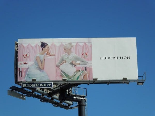
Let’s start with something classy, like Louis Vuitton. This fashion brand has been around for over a century and is known for its quality material. Although the ad is rather simple, it shows the product with clear, striking imagery. When promoting a product as high-status, restraint is often the best way to draw attention.
[in_content_ads gallery=”logos” logo=”on” title=”Need graphic design help?” subtitle=”Try Penji’s Unlimited Graphic Design and get all your branding, digital, print, and UXUI designs done in one place.” btntext=”Learn More” btnlink=”https://penji.co”]
18. ALDO’s Billboard Idea
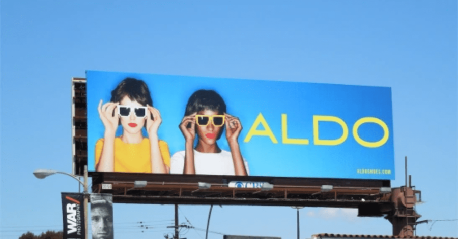
Here’s another fashion brand with a simple, memorable outdoor billboard. If you’ve got a high-quality product to sell, less is more. ALDO uses a bright combination of colors along with two beautiful models to promote its products. A bold, clean design is surprisingly effective at highlighting your product.
17. This Fruut Juice Ad
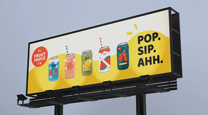
Of course, catchy slogans also work. Sometimes to brighten the day, you just need to pop open a can of sweetness. This billboard draws the eye with its colorful artwork, only to grip you in with an immediate call to action. It’s a decent billboard idea.
16. This McDonald’s Ad
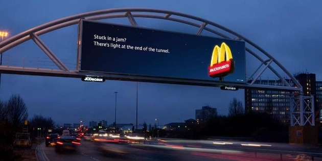
McDonald’s is known for its captivating billboard ideas. With instant brand recognition and locations across the globe, they’re an easy sell. McDonald’s billboards play on the fact that their restaurants are always just around the corner. If a driver is feeling hungry, tired, or bored, this ad persuades them to take a pit stop.
15. Another McDonald’s Ad
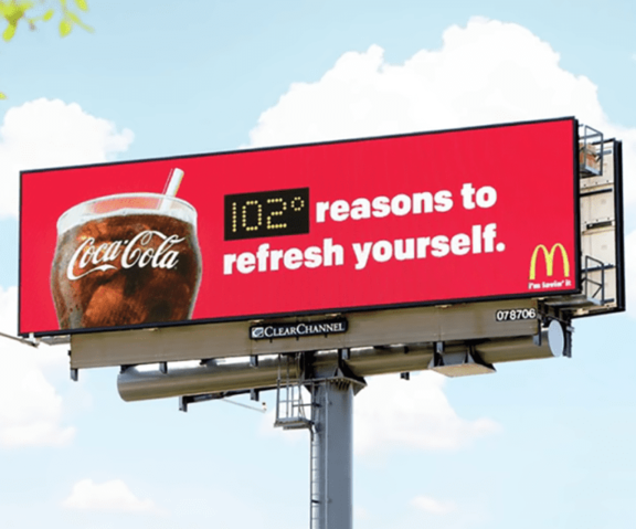
This impressive LED billboard idea finds the exact temperature of the surrounding environment. The simple font alongside the bright red background is designed to alert anyone driving or walking by. On a summer day, the image of a cool glass of soda can get people rushing toward the nearest Mcdonald’s.
14. Okay, One More
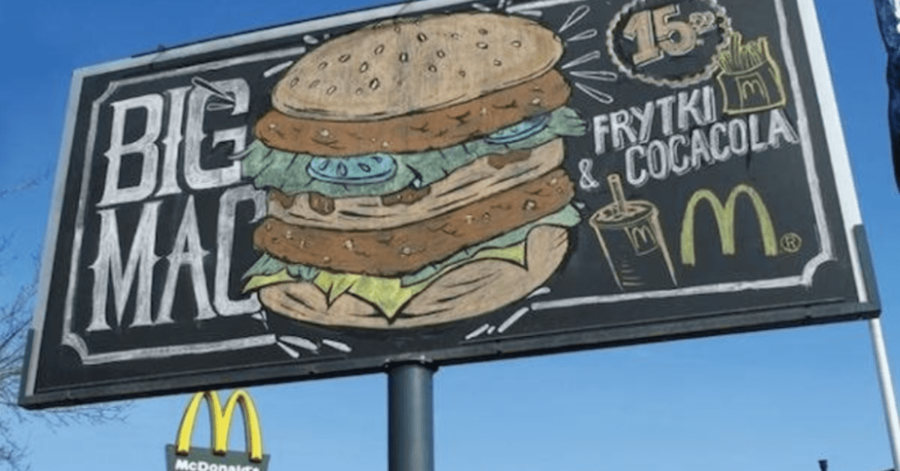
While McDonald’s is known for its bright, clean advertisements, this outdoor billboard subverts the norm. Here, the restaurant chain uses vintage imagery to invoke a feeling of nostalgia. Although it’s not as colorful, the “chalkboard” appearance works to stand out from the surrounding modern billboards.
13. Vigoss‘ Billboard Idea
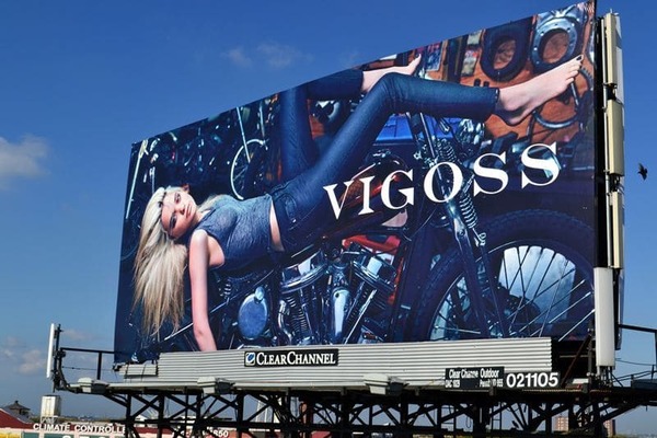
Vigoss is known for its beautifully crafted jeans and casual outfits. To add a sense of intrigue, the clothing brand poses its model alongside an elaborate background.
The model in question uses her beauty to promote the brand she’s wearing. All of this combined with Vigoss’ stark serif logo makes for a highly captivating image. It is the perfect way to increase brand recognition.
12. Deception
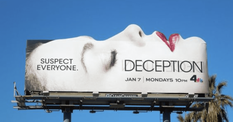
The NBC drama series Deception displays an interesting approach to billboard design. It uses cut-out imagery to offset the structure’s natural shape. The end result is a billboard that stands out from the rest.
Aside from the obvious, NBC uses a slogan, as well as key information in clear view. Anyone who glances at the ad will immediately know when and where to tune in for a new episode.
11. Whitlock Ave Dental’s “Squeaky Clean” Ad
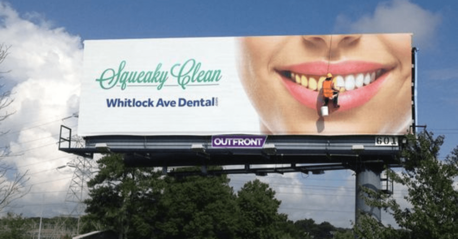
Here’s a more low-cost way to get creative with your ads. This outdoor ad uses art that creates the illusion of a man going to work on someone’s teeth. The result? People will surely do a double-take to make sense of what they’re seeing.
It’s the perfect design trick to garner quick attention while highlighting the exact service provided by the advertiser.
10. Horizon Dental Cares’ Ad
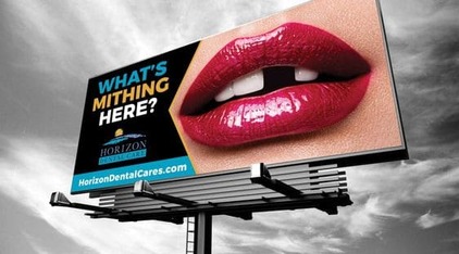
Here’s another dental billboard. Instead of relying on a creative optical illusion, this one banks on humor and striking imagery. The missing tooth offsets the picture of perfect lips. It’s also combined with a silly pun that mimics a missing-tooth lisp. The ad creates a diversion that’s hard to miss.
9. Midwest Billboards
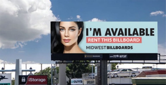
Even billboard companies have their own ad designs. This design from Midwest Billboards showcases the use of beauty, sex appeal, and humor to get attention. Again, we see a company using puns to its advantage. While most billboard companies use a generic “insert ad here,” Midwest Billboards went above and beyond to make this spot noticeable.
8. BMV’s “Become Electric” Ad
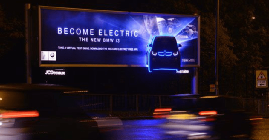
This outdoor advertising campaign consisted of multiple billboards for the BMV i3. You may know it as the world’s first fully-electric premium car. Such an amazing innovation needed an equally innovative ad, and Posterscope succeeded with flying colors.
This billboard has a memorable slogan, with glowing technology that can be easily seen in the dark. The call to action is simple, straightforward, and most of all, tempting.
7. Divorce Attorneys
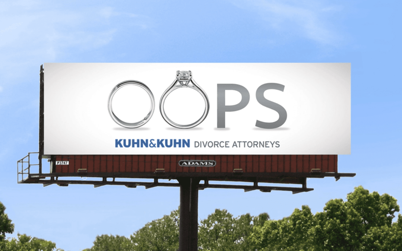
We all make mistakes. This Kuhn & Kuhn billboard conveys that there’s no shame in hiring a divorce attorney.
The design choice is not only hilarious but also incorporates unique formatting elements. The two rings paired with the simple typography immediately let people in on what the ad is about. Once again, a perfect way of giving brand awareness to those who need it.
6. The Cinematic Legend of Zelda Billboard
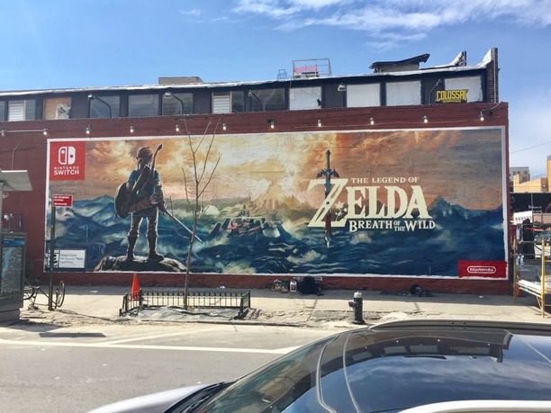
With its detailed scenery and captivating character design, this billboard immediately takes you on an adventure. The Legend of Zelda is a franchise that has always been known for its heroic plots and intrepid gameplay. But even those who aren’t familiar with these games can instantly decipher its theme.
If the brand in question is owned by a larger company, you always want to mention that somewhere. In this case, you can clearly see that this is a Nintendo game, giving it additional appeal for Nintendo fans.
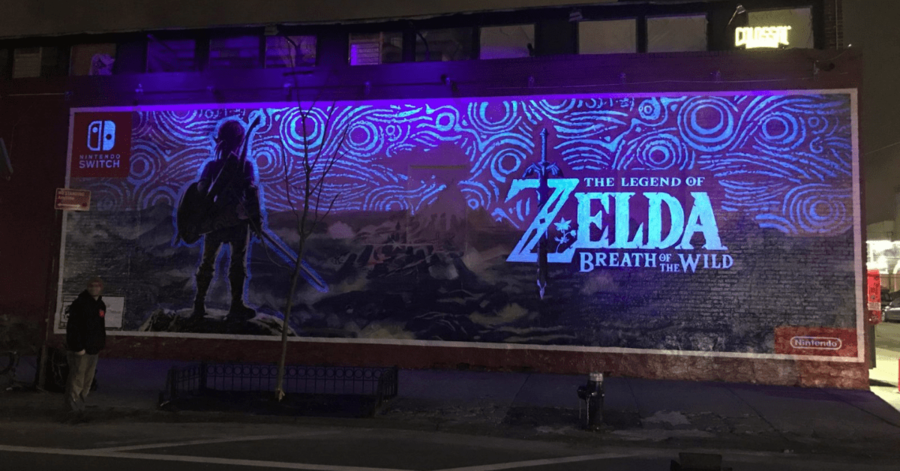
Oh, and did we mention that it glows in the dark?
5. A Fun Fact About Diamonds
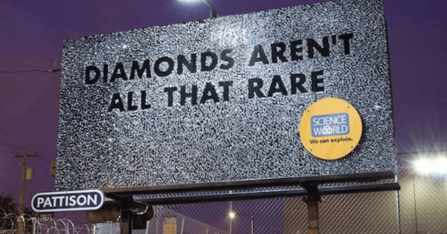
Here’s another rather inexpensive design that’ll inspire you. The printed-out sparkles add a sense of luster to this Science World billboard. The fun fact in bold letters draws immediate attention while bringing up unanswered questions. It encourages onlookers to seek out more information.
4. The Golden Billboard
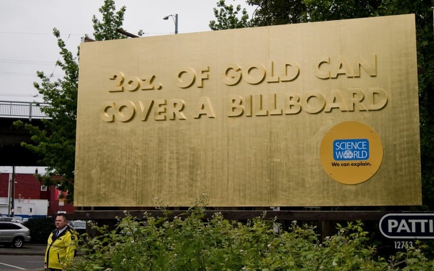
This Science World Billboard has a similar effect. Instead of sporting a bold, black font to garner attention, it demonstrates its fun fact in real life. Here’s the real kicker; the billboard is made of real gold! While it may be more expensive, this billboard succeeds in creating a public stir.
3. Wind-Powered Billboard
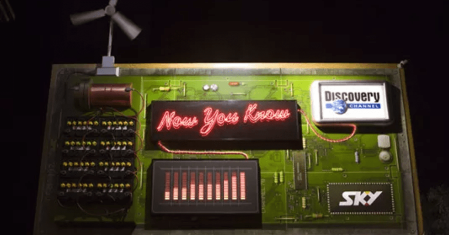
Ready for another science-based advertisement? This billboard, designed by DBB New Zealand, was made to look like a circuit board. The 3-dimensional materials consisted of a wind turbine, which powered the remaining cables to showcase a glowing slogan: “Now You Know.”
2. Another “Now You Know” Sign
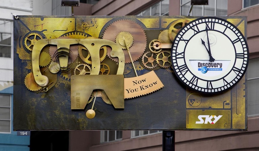
Discovery Channel made several billboards with this slogan, one of which revolved around the inner workings of a clock. A slogan that’s used often generates lasting brand recognition. Furthermore, this design provides an amazing vintage look that differentiates itself from bright, flat, modern billboards.
1. Corona’s Billboard/Sculpture
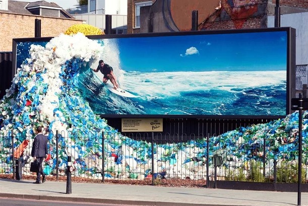
This isn’t simply a billboard idea; this is a work of art. The beer brand decided to take a stance in light of 2018’s World Oceans Day.
You may be wondering: why would Corona of all companies strive to highlight environmentalism? When corporations take passionate political stances, it often increases brand loyalty. It’s a smart billboard idea to gain favorability among customers.
This Amsterdam ad is raising awareness for a good cause. It is doing this in an unusual way that makes people look at it. No matter who you are, or what company you represent, there is always a way to make your billboard pop.
Get Ad Designs with Penji
Save time and headaches by outsourcing your design needs to Penji. Using an unlimited graphic design service for all your advertising needs ensures that you always have the promos you need, whether they’re physical or digital.
About the author
Table of Contents
- 19. Louis Vuitton
- 18. ALDO’s Billboard Idea
- 17. This Fruut Juice Ad
- 16. This McDonald’s Ad
- 15. Another McDonald’s Ad
- 14. Okay, One More
- 13. Vigoss‘ Billboard Idea
- 12. Deception
- 11. Whitlock Ave Dental’s “Squeaky Clean” Ad
- 10. Horizon Dental Cares’ Ad
- 9. Midwest Billboards
- 8. BMV’s “Become Electric” Ad
- 7. Divorce Attorneys
- 6. The Cinematic Legend of Zelda Billboard
- 5. A Fun Fact About Diamonds
- 4. The Golden Billboard
- 3. Wind-Powered Billboard
- 2. Another “Now You Know” Sign
- 1. Corona’s Billboard/Sculpture
- Get Ad Designs with Penji


