
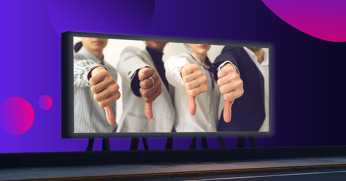
Have you ever seen something so bad that you simply can’t look away?
It’s no secret that the process of billboard design can be tricky. There are a plethora of things to consider, such as colors, sentence structure, and imagery. With the right amount of strategy and oversight, billboards can be a superb way to grow your business. Unfortunately, for every spectacular piece of billboard advertising, there are twice as many poor examples.
Here, we’ll guide you through the absolute worst cases and analyze where they went wrong.
11. Trust Me, I’m A Lawyer!
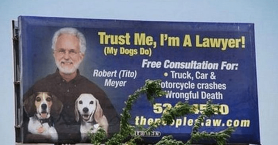
Starting off, we’ve got a rather cluttered advertisement. This billboard is advocating for the lawyer Robert Tito Meyer, though it’s hard to tell with the amount of text. The picture of Meyer is cute and makes him more approachable. Though when paired with the yellow text, he appears very unprofessional.
When advertising your brand, think about what your target audience is looking for. Lawyers that handle serious court cases should always list their credentials (and “trust me” doesn’t count).
[in_content_ads gallery=”logos” logo=”on” title=”Need graphic design help?” subtitle=”Try Penji’s Unlimited Graphic Design and get all your branding, digital, print, and UXUI designs done in one place.” btntext=”Learn More” btnlink=”https://penji.co”]
10. This Billboard for… Who Knows What
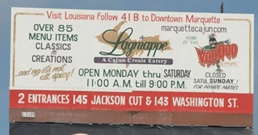
Here’s another billboard that multiple fonts and logos have swallowed. It’s advertising a Cajun diner, but if you were driving on a highway, you would never know. Even a pedestrian wouldn’t take the time out of their day to read this.
Remember, people have short attention spans. With billboard advertising, you must make your message quick, concise, and bold.
9. The Creepy Faces of Barneys New York
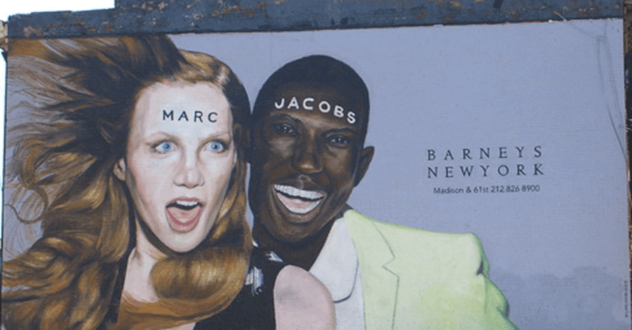
This would’ve been a perfectly decent example of billboard advertising, if not for the horrifying facial expressions. In case you didn’t realize, this is an ad for Barneys New York.
If you were initially mistaken, then join the club. The words “Marc Jacobs” are printed in bold, contrasting nicely with the models’ skin tones. Meanwhile, “Barneys New York” is printed in grey lettering, making the logo almost blend within the background.
Overall, the message is very unclear. There’s no way of telling what Barneys New York is saying about Marc Jacobs or their brand in relation to it.
8. Yp.com’s Squint-or-You’ll-Miss-It Ad
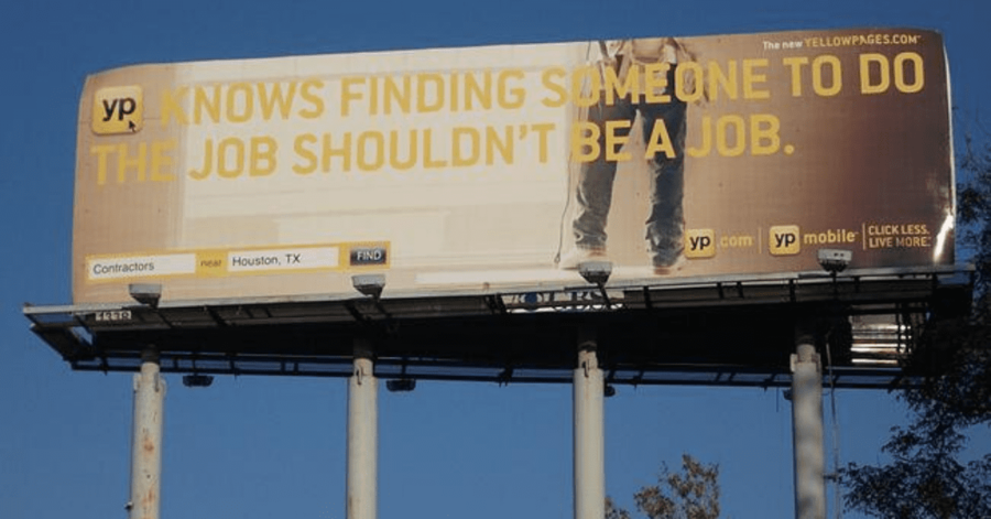
As another example of poor formatting, here’s a billboard for the Yellow Pages’ yp.com. It’s clear to see that this advertisement has awful contrast. The yellow lettering is barely legible when paired with the light background.
When making the effort to read this billboard, most people will still find it difficult to decipher the message. The phrase fails to convey what YP has to offer in a concise way.
7. Whatever This Is
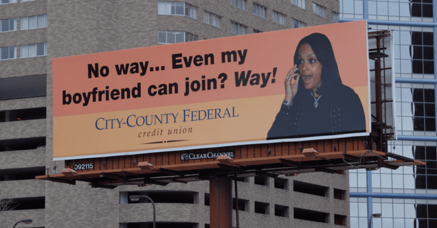
There is absolutely nothing more cringeworthy than a company trying too hard to be relevant with the kids. My advice? If your goal is to appeal to a young demographic, hire a young person to run your ad campaigns. Otherwise, you’ll end up with something like this.
Furthermore, teenagers and young adult are a weak target audience for a credit union. The audience who would be interested in the subject matter will be turned off by the language. This is a great example of a company failing to understand its target audience.
6. Mr. Happy Crack…
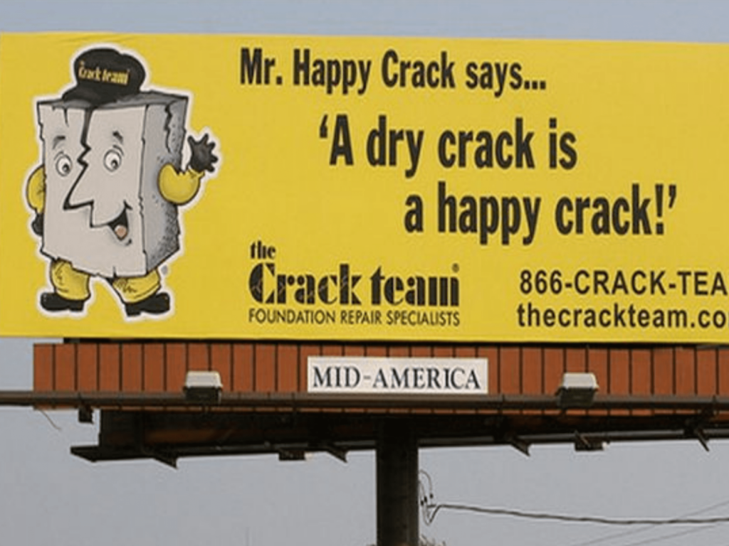
Oh, dear. Where do we even start with this one?
Well, from a less obvious standpoint, the formatting is very cluttered. Much like the first two billboard advertisements, it’s hard to tell what the viewer should be looking at. Is it the awkwardly hilarious quote? The unfortunate mascot name? Or is it the equally unfortunate brand name?
Perhaps the most detrimental aspect of this billboard is its clarity. Every billboard advertisement should emulate the company’s purpose and what it provides. “The Crack Team” is a group of repair specialists. Though you couldn’t tell without carefully reading everything.
In fact, with a name like “The Crack Team,” you’d think this was a very different team of “specialists.”
5. This Spelling Error
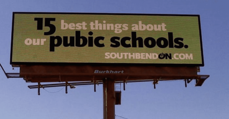
When it comes to billboard advertising, spelling errors are never a good thing. If you’re spending hundreds or even thousands of dollars on a billboard, it is crucial to check for any grammatical mistakes. As shown in the above picture, the simple oversight of one letter can change the entire perception of your ad.
4. An Even Worse Spelling Error
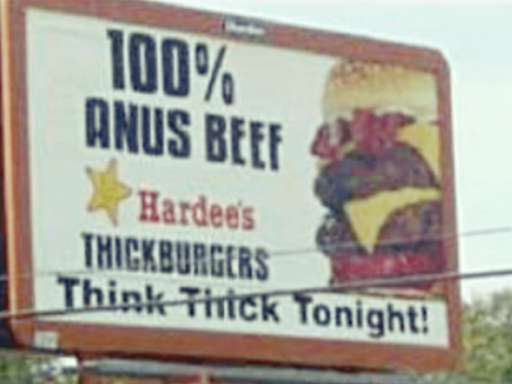
Here’s another example of a spelling mistake. One that’s sure to ruin anyone’s appetite.
Hiring a professional writer and/or designer will help prevent these disasters.
3. Ugly Kids…?
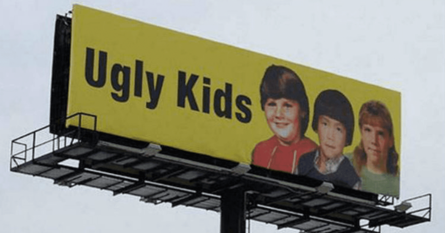
If you’ve been on the internet long enough, then you’ve probably seen these images floating around. Huge billboards that simply state, “Ugly Kids.” There’s no product to sell or service to mention. No call to action. No rhyme or reason.
Here’s the thing: I’d be lying if I said this advertisement wasn’t humorous. I mean, how could you not laugh at it? Still, keep in mind that most people are laughing at this billboard, not with it. This is mainly due to not knowing its purpose.
It’s not a bad idea to use humor as a selling point. In fact, it’s often very beneficial. Though in this case, there’s no setup to link the joke back to whatever’s being advertised.
After doing some background research, I found that these billboards are, in fact, advertising something. They were part of a campaign by Clear Channel Outdoor and an anonymous client.
These photos were not random. They were old childhood pictures of local DJs, meant to prompt fans to call into a particular radio station. It was an attempted form of outrage marketing.
The problem with this attempt was that there was no way for the average viewer to know this background information. Unless you recognize these local DJs, there’s no way you’re calling into those radio stations. Instead, you’ll simply laugh at the image, maybe take a picture, and then go about your business.
Even when this campaign went viral, people still had no idea who was behind it. When creating a funny ad, you must provide a logo, a name, a phone number, or something to signify your brand.
2. Nightmare Fuel from Jack Daniel’s
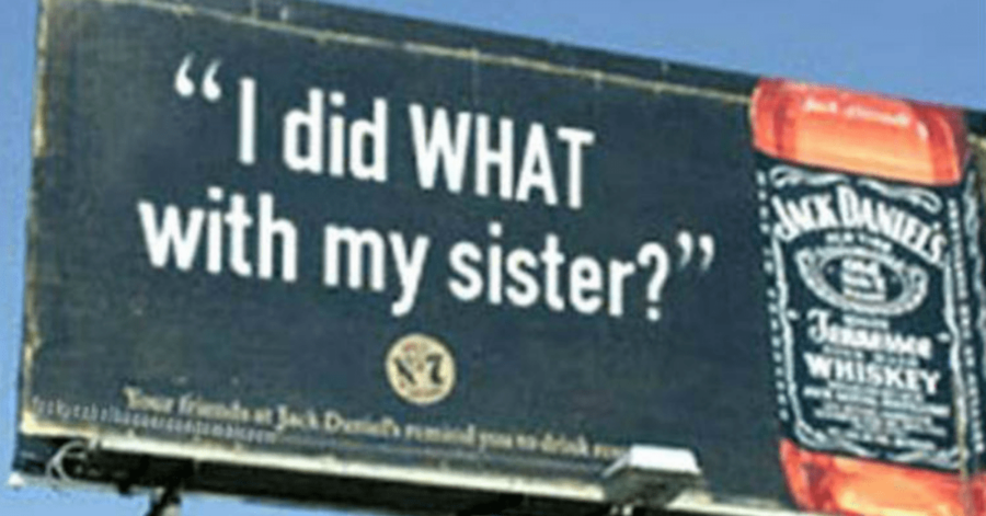
In case it isn’t clear to you, this billboard is meant to promote a beverage. It is not, in fact, a call to action against drinking. Although you may want to abstain from alcohol entirely after reading this.
Jack Daniels is clearly out of touch if they think this is what defines an appealing crazy night. It seems like more of a nightmare situation to the average passerby. While it works at catching people’s attention, it fails at doing so in an appealing way.
Even the most well-known brands should get a second, or third professional opinion before spending money on a billboard design.
1. PETA’s Autisim Propaganda
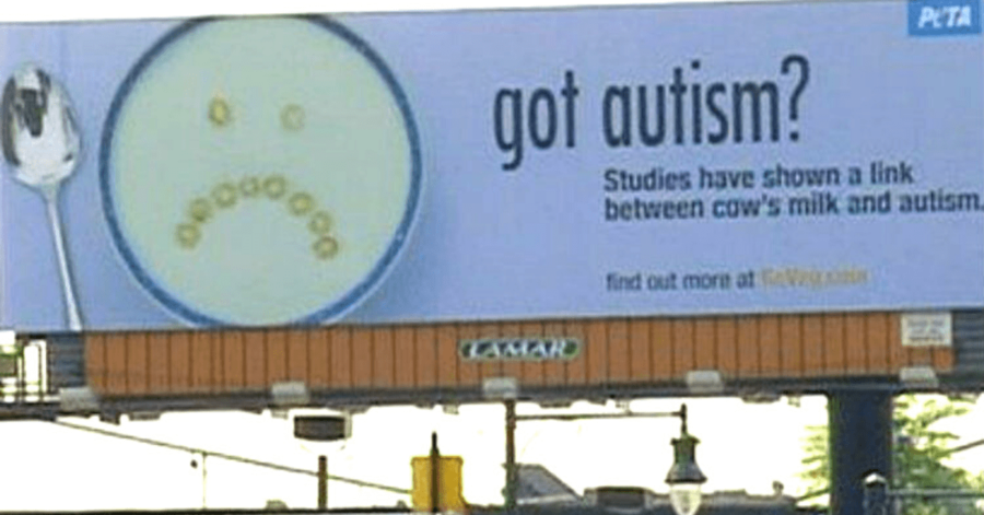
Is there anyone who doesn’t have a strong opinion on PETA? Whether you love them or hate them, there’s no question that this billboard is a terrible way to promote their cause.
While the basic rules of advertising are being followed, the underlying message doesn’t work.
Not only does it spread misinformation, but it also contributes to the stigma against autism spectrum disorder. It’s very offensive, and not in the way that sells.
According to ClinicalTrials.gov, “Previous preliminary research studies have suggested that a diet devoid of milk and dairy products might be useful for some people on the autism spectrum in reducing certain types of behaviors or other symptoms that can affect quality of life.”
PETA’s billboard, on the other hand, suggests that autism is caused by consuming cow’s milk. No reputable scientific data supports this. The resulting advertisement proves to be misleading and fear-mongering.
I believe we can all agree that there are more effective ways to encourage veganism. No matter what it is that your brand is advertising or promoting, be sure to research and fact check.
Billboard advertising may not be the easiest feat, but if you avoid the pitfalls listed here, you’ll be headed toward a successful campaign.
About the author

Table of Contents
- 11. Trust Me, I’m A Lawyer!
- 10. This Billboard for… Who Knows What
- 9. The Creepy Faces of Barneys New York
- 8. Yp.com’s Squint-or-You’ll-Miss-It Ad
- 7. Whatever This Is
- 6. Mr. Happy Crack…
- 5. This Spelling Error
- 4. An Even Worse Spelling Error
- 3. Ugly Kids…?
- 2. Nightmare Fuel from Jack Daniel’s
- 1. PETA’s Autisim Propaganda


