
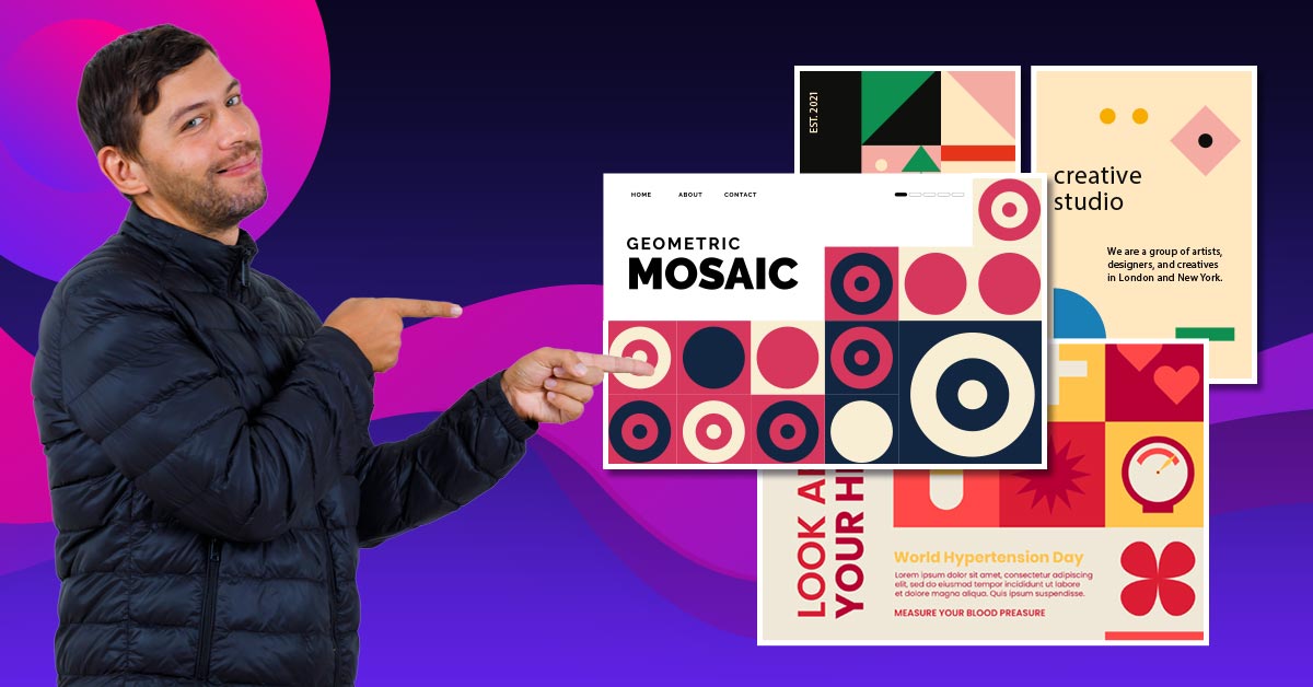
Swiss Style graphic design grew to prominence in the early to mid-1900s. Lauded for its angular, gridlike approach, minimalist executions, and sans serif typefaces, this design trend quickly became one of the defining styles of the 20th Century.
Today, we will unpack the core tenets of Swiss Style graphic design and showcase some of the typefaces most commonly associated with the style.
What are the tenets of Swiss graphic design?

The Grid
Swiss style is known for its association with a mathematical grid. The grid is considered the most legible and harmonious means for structuring information.” This makes creating a visual hierarchy much easier.
This adherence to a grid system contributes to the design’s stark angularity— a trademark characteristic of Swiss Style design.
Objective Style
A founding principle of Swiss design is the abdication of the artist’s subjective voice. The design should be spared of any frivolous ornamentation. Swiss Style deliberately rejects the embellishments of Britain’s Arts & Crafts and Germany’s Jugendstil movements.
The Arts and Crafts movement was born out of criticism from the industrial revolution and thus sought to reintroduce humanity back into art, embracing attention to detail and nuanced adornments. Jugendstil was Germany’s answer to France’s Art Nouveau, taking inspiration from the unruly aspects of the natural world.
Swiss Style sought neutrality, favoring order and clarity.
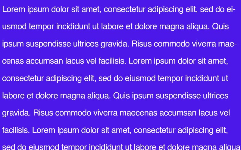
Use of Negative Space
Swiss Style graphic design is built on letting the text breathe. Properly wielding a minimalist approach when laying out a design can help you get the most out of your work. Negative space is often understood.
Maximalists believe that white space equates to wasted opportunity. But Swiss Style designers deploy this stark layout to emphasize the information being expressed.
What are common typefaces in Swiss Style design?
Swiss Style typographic design is known for its heavy use of sans serif typefaces. The clean, low-contrast letterforms lend themselves to the ethos of the Swiss design style. These five typefaces are the perfect starting place when looking to incorporate a Swiss feel into your graphic design.
Helvetica

Perhaps the typeface most synonymous with Swiss Style is Helvetica. After all, Helvetica does mean Swiss. In Latin, Switzerland was the “Confederatio Helvetica”. Designed in 1957 by Max Meidinger, Helvetica has been applied to everything from branding to the New York Subway.
Looking for a fresh take on this classic style? Check out these alternatives to Helvetica.
Akzidenz-Grotesk
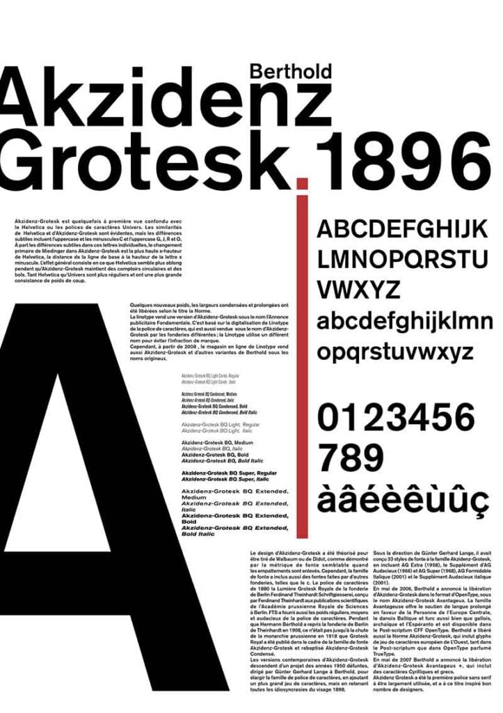
Designed in the late 1800s and published by Berthold, Akzidens-Grotesk was intended for used for commercial use. Grotesque was the standard name for sans serifs at the time, as they were typically regarded as irregular or brutal, lacking the adornments of the typical serif fonts. Upon its development, this Akzidens-Grotesk quickly became a favorite of Swiss graphics designers.
Univers
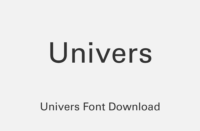
In the late 1950s, Swiss typographer Adrian Frutiger developed Univers, taking inspiration from 19th Century German typeface. It is technically classified as a neo-grotesque sans serif. Univers is one of the first typefaces to form a family of consistent, related designs. Each font within the family would carry similarities between different weights.
For more information about different design styles, check out Penji’s learning center.


