
Have you ever wondered why so many online stores fail after a year of setting up shop? Establishing a startup is no easy feat. No one knows who you are, so why should people choose you over more popular competitors? The first solution to increasing your website visits is to let your website speak for your brand. Here are 12 elements that your startup website must have to prevent shooing away visitors:
1. Clear value proposition
You have to be more clear with your value proposition. No one knows about your brand or your company’s products or services. Ensure that you capture your visitors’ attention during the first 10 seconds they land on your homepage. If they read your unique selling proposition and like it, they will explore your site more.
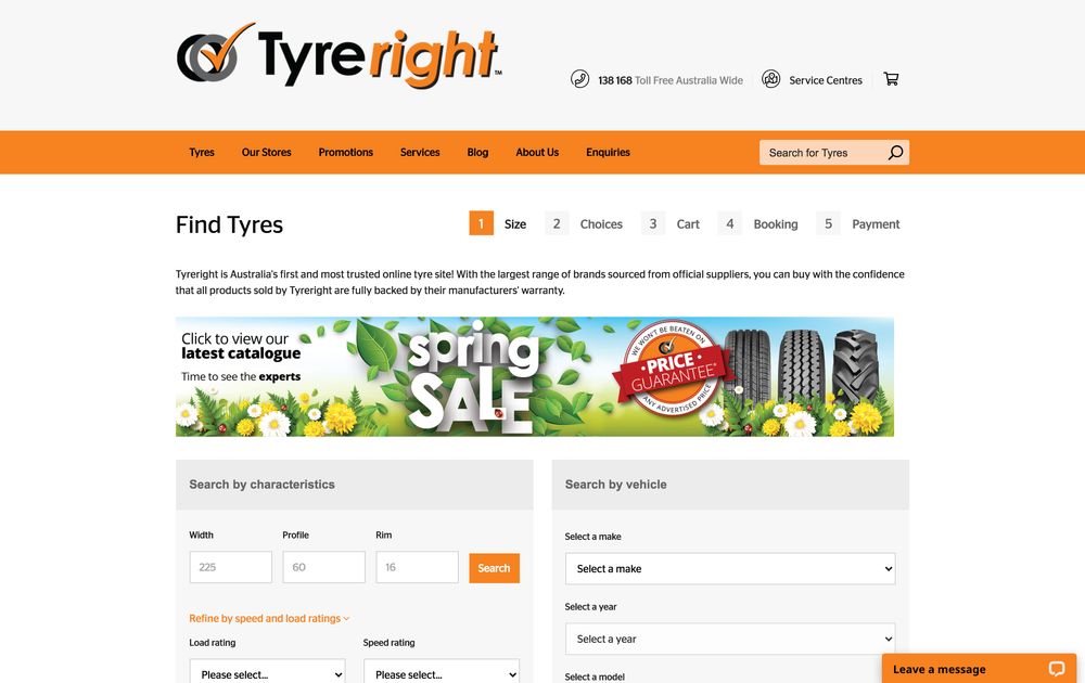
Tyreright is an online tire retail store, and they clearly wrote that in the above-the-fold section of their homepage. It’s a one-liner that tells who they are, what they offer, and why customers should buy from them. Moreover, they have a “Search” feature where customers can search tires by characteristic or vehicle.
2. Clear calls to action
As a startup, garnering sales might be an uphill battle during the initial phase. You have to boost brand awareness first and instill brand recognition. This way, your audience will be willing to listen to your offer. Ensure your site will always lead prospects further down the sales funnel.
From Awareness, Interest to Desire, and Action, your website should be clear on what step visitors should take next. And this is why your web design must have evident calls to action after your product or service highlights. Whether it’s getting email addresses or signing up for a free trial, clearly displaying your calls to action will help you achieve your goal.
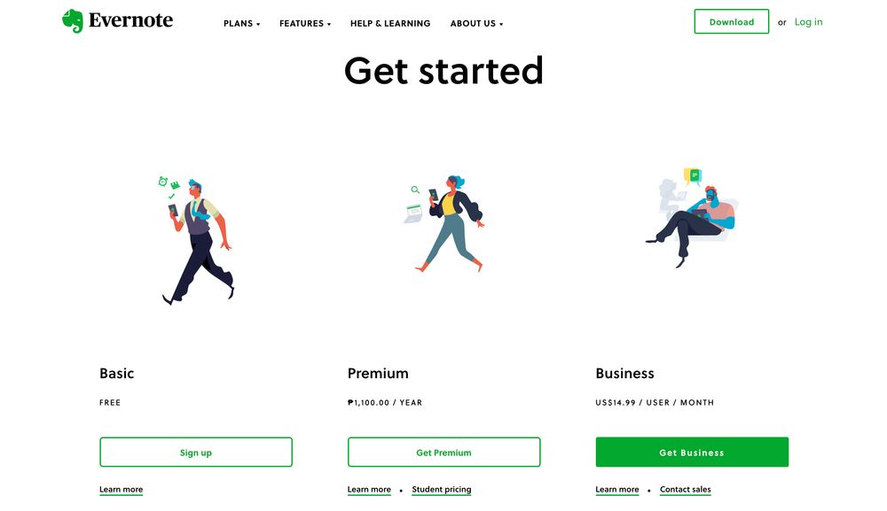
Evernote is the best example of this. First of all, the structure is pretty clean, with lots of negative space. Everything is easy on the eyes. Plus, three call-to-action buttons under their three main offers stick out like a sore thumb.
3. Powerful heading
It’s recommended to captivate user attention in the first eight to 10 seconds. And this is the reason why you must have a powerful headline that can make users stop and read further. Use heavy fonts for your headline to ensure that this is the component that dominates the entire page.
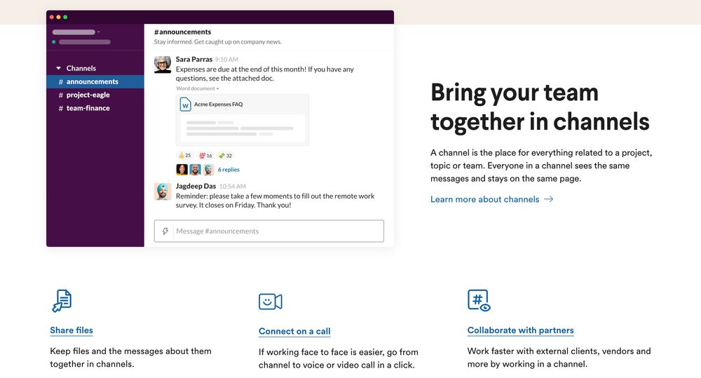
As a startup, you want to showcase everything on your homepage to reel your audience. Here’s Slack’s homepage with an impactful headline. In as little as six words, it tells everything about the benefit of using their product. Plus, Slack also displays a snippet of its messaging platform to accompany the copy.
4. Quality and compelling images
Some startups might be working with a shoestring budget. New entrepreneurs think that using stock images might save them money. But this is farther from the truth. Using stock images on your website makes your startup website mundane. Custom-made graphics should be strewn across your site for emotional impact and memorability.
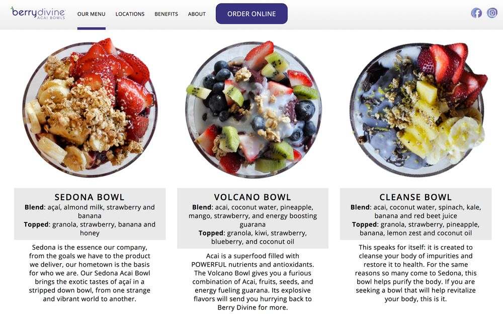
Berrydivine seems to have its graphics on point. They feature large images of their Acai bowls and an easy-to-digest copy underneath them. Putting your products front and center can make your offer more appealing.
5. Quick registration form
Registration forms on your small business website bring you one step closer to conversion. And for startups, getting more registrants, whether subscribing to email newsletters or getting freebies, is a challenge. And it’s even harder if your onboarding involves a tedious process.
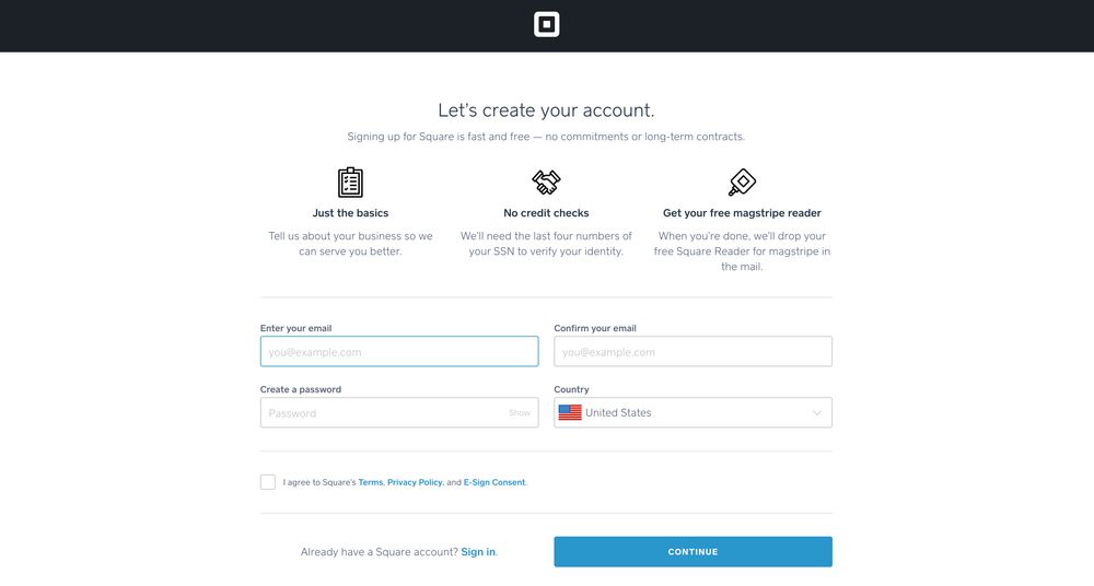
When you’ve piqued the user’s interest, ensure they have a seamless onboarding process. Create a quick registration form with only the necessary details. Squareup is a company that offers online tools to boost all levels of businesses. Creating an account with them is easy as well. You only have to enter your email, confirm your email, create a password, and select your country.
6. Social proof
One factor visitors would look for in a startup website is credibility. But new businesses might struggle with this. If you have company milestones, awards, or customer testimonials, use those to your advantage. Show social proof on your homepage, so you’re amping up brand trustworthiness.
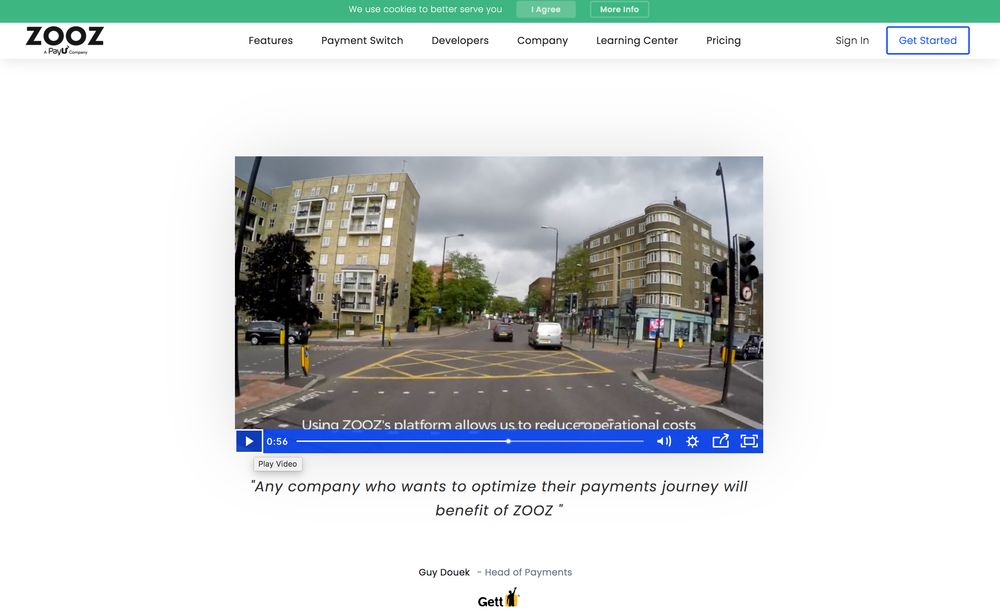
Zooz is an online payment processing platform that is relatively new to the industry. The company features a video of a customer who is very happy with their service. This strategy will make you stand out in a cut-throat fintech industry.
7. Clear benefits
While it’s recommended to showcase your product’s or service’s features, users would want to know the benefits too. Showcasing product benefits is more relevant since they address the customers’ pain points. And this is why startups should clearly explain the benefits of using their products or services.
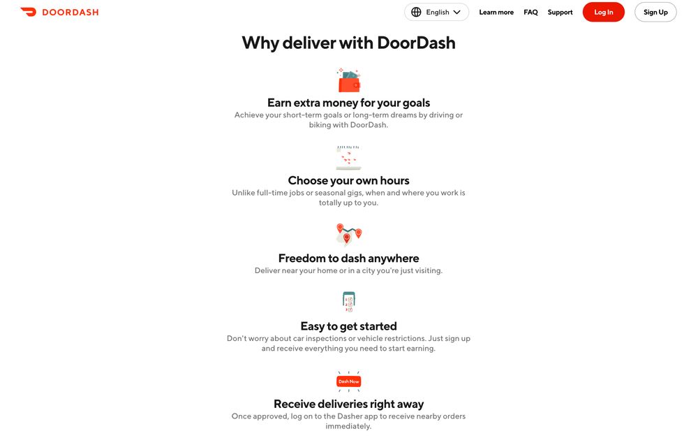
DoorDash is a food delivery service launched in 2013. Apart from their site’s clean structure and excellent images, they also present the benefits in a digestible manner. A prominent heading “Why deliver with DoorDash” sits on top of the icons and concise copy.
8. Clean user interface
As with any website design process, you want to keep your user interface simple. Plus, you must be clear on what you bring to the table. Combine clarity and a clean interface to prevent users from getting sidetracked. You want to subliminally lead users to some parts of your website that can rake in conversions.
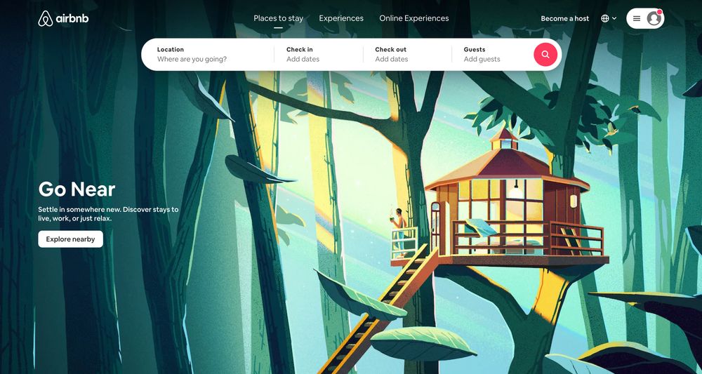
For instance, Airbnb’s user interface is straightforward and compelling. It has a captivating hero image, search fields on top, a call-to-action button, and limited menu options. It’s easy for customers to type in their inquiries and book if they see a price that fits their budget.
9. Quick demo
Unless you’re selling food, t-shirts, or other products that are ready to use and wear, a quick demo is recommended for complex products or services. Startups that are offering out-of-the-ordinary products or arcane services must include a quick demo on their web page. Make your demo easy to understand for all levels of users.
Here’s an example from GiftRocket, a platform for sending online gift cards and certificates. Apart from their consistent branding and cool color palette, their demo is commendable. You’ll see the evident CTA button, “Demo.” Once you click on it, it leads you to screenshots of how a recipient will receive a birthday e-gift certificate.
10. Interactive features
The upper hand of established companies over neophytes is they have a regular clientele. Having more clout in business means leniency in startup website advertising. To maximize every website visit, integrate interactive features to engage users.
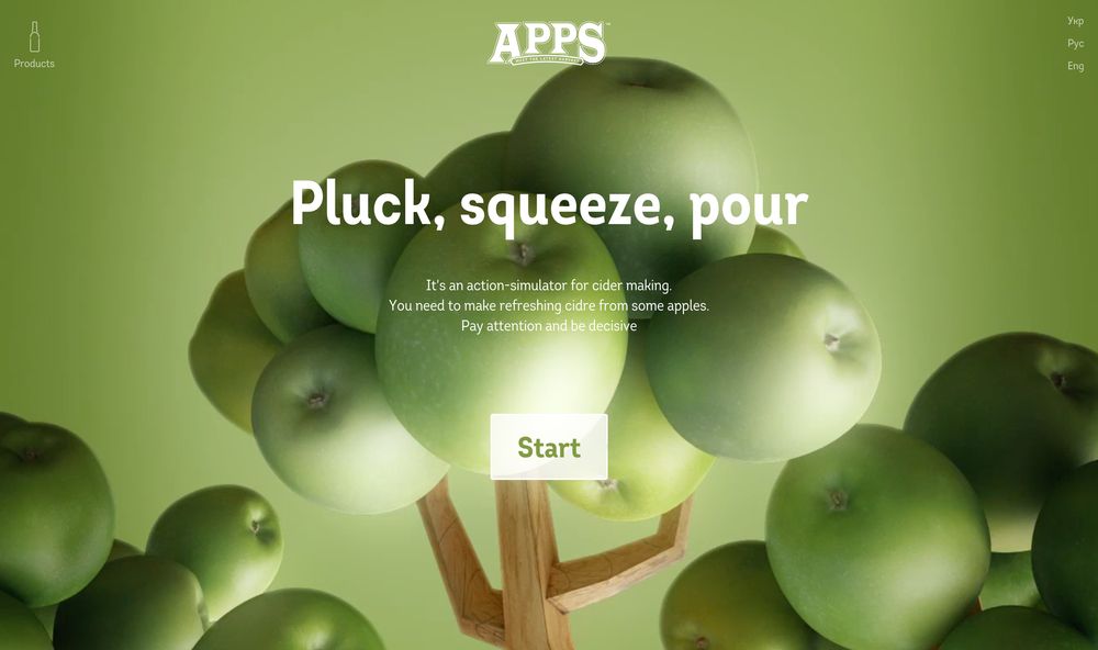
APPS is a liquor company with its flagship product, apple cider. Once you land on their homepage, you can press the Start button to see how they ferment their apple cider. At every stage, you get to press a button to move on to the next step. It’s simple and fun and creates a unique user experience.
11. Fun animations
Another way not to bore your visitors with dull startup web design is to incorporate fun animations. You can combine playful illustrations and fun animations to make your startup website more compelling. This will make your visitors stay on your site longer and potentially increase your Time-on-Page metric.
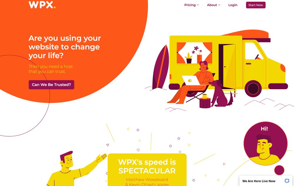
WPX is a WordPress hosting site with great and bright color schemes, stellar illustrations, and fun animations. Everything on their website is eye candy, and the bright colors tempt you to explore their site more.
12. User-friendly navigation
We’ve come to the last and most important startup website design element that is a must — user-friendly navigation. A confusing website that’s hard to navigate will turn users off and make them leave your site. This will increase your bounce rate, impacting your organic traffic negatively.
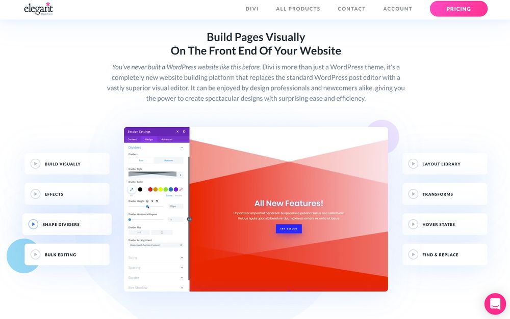
Creating a user-friendly website will add to a great user experience. Here is an example from Elegant Themes, a company that offers WordPress themes. Their website is easy to navigate, with four menu options on the header. When you scroll down, you’ll see an interesting explainer video of what they offer.
When you scroll to the bottom, you can select any of these features, and it’ll show you a tutorial on how to use each feature. The company boasts easy-to-design websites on the front end, which they showcase in their tutorials.
Where to Get Custom Graphics for Your Startup Website Design
The only way your startup can gain traction is by using compelling custom graphics on branding assets and ads. This is where Penji steps in. Penji is an on-demand graphic design service that is suitable for startups and small businesses. These are the benefits when signing up with Penji:
- Subscription-based structure, pay only when you’re using the service
- Affordable, flat monthly rates
- Unlimited designs (Request as many logos, business cards, merch designs, branding designs, etc.)
- No additional fee for illustrations, get unlimited illustrations too!
- Unlimited web and app designs
- Fast 24-hour turnaround
- Custom and easy-to-use design platform, where you can add up to 10 team members
- Dedicated account manager
- Brand asset and project organization
- 30-day money-back guarantee
How to Request Custom Graphics on Penji’s Platform: 3 Steps
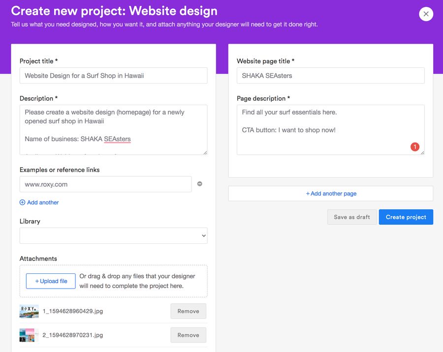
1. Create a new project on the dashboard and fill in the Description form with all the details of the business and web design you prefer.
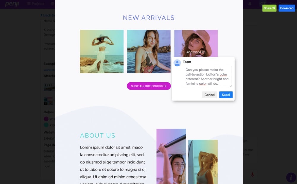
2. Wait for 24 to 48 hours for the first draft. You can ask for revisions by clicking on the area you want to change and typing in your feedback.
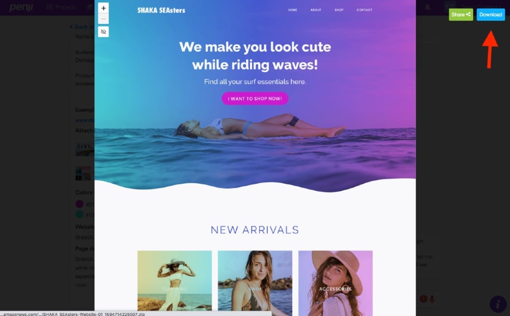
3. Download the final design if you’re 100 percent happy.
Overall, Penji’s seamless onboarding, business model, and design process make it easy for startups to stay on track. If you want a hassle-free design process that prioritizes quality, then Penji is your best bet. Best of all, you can try Penji’s services for 30 days risk-free. Sign up now and submit your first startup website design request.
About the author

Table of Contents
- 1. Clear value proposition
- 2. Clear calls to action
- 3. Powerful heading
- 4. Quality and compelling images
- 5. Quick registration form
- 6. Social proof
- 7. Clear benefits
- 8. Clean user interface
- 9. Quick demo
- 10. Interactive features
- 11. Fun animations
- 12. User-friendly navigation
- Where to Get Custom Graphics for Your Startup Website Design
- How to Request Custom Graphics on Penji’s Platform: 3 Steps


