

Choosing the right color palette for your social media accounts is essential for creating a cohesive brand identity. Colors evoke certain emotions and behaviors, so it’s important to choose a palette that reflects your brand’s values and goals. Before you begin choosing colors, it’s important to understand the basics of how colors interact with each other and how they can be used to create an impact on your audience. This article will outline the basics of choosing a social media color palette, as well as some tips on how to make sure you choose the right one for your business.
Color is a crucial element in brand recognition. Your social media color palette should describe who you are as a business, it should be harmonious and provoke emotion, and it should be used consistently.
However, when it comes to branding your business on social media, there are other considerations:
- Some colors perform better than others on social media. To get the most out of your content, you should select colors that people will find engaging.
- Your content will be surrounded by the platform’s own brand colors, so you’ll need to be sure that the colors work together.
In this post, we’ll cover how to create a social media color palette by explaining the importance of color psychology for business success on Instagram, Facebook, Pinterest and Twitter, and we’ll show which color combinations are most effective on each platform.
What Is Color Psychology?
Color psychology is the study of how color affects the way we interpret the world around us. Colors are thought to influence our emotions as well as our purchasing decisions. Combining the perfect mix of colors could mean the difference between attracting short-term customers and lifelong ones.
Businesses that have a clear understanding of color psychology can choose specific colors to provoke an intentional emotional response that aligns with their brand.
Consumers subconsciously make judgments about products and services within the first two minutes, and color plays a strong role in those assessments. So, it’s important to catch a customer’s eye with a pleasing color palette for your business.
Why Is Color Psychology Important for Businesses on Social Media?
Image Credit: Thirdman from Pexels
Businesses publish content on social media to make their followers feel a particular emotion or take a specific action. Color plays a strong role in this.
There are a few factors to keep in mind when selecting your social media color palette:
- The meanings of different colors
- The principles of color theory
- How to choose colors in the context of social media
Related Post: Threads vs Twitter: The Key Differences that Set Them Apart
The Meanings of Different Colors
Red
Red is one of the most emotion-provoking colors on the spectrum. It’s a primary color, meaning no other colors can come together to create a perfect red. Associated with love, passion, energy, danger and strength, red increases respiration rate, raises blood pressure and enhances metabolism.
Green
A color that represents health and freshness, green has been connected to brands that encourage growth and vitality. It’s both invigorating and relaxing and represents connection to ourselves and to nature. Green has been shown to slow metabolism and produce a calming effect.
Blue
Blue is associated with serenity and calmness. It represents a sense of inner reflection and tranquility, and it’s been shown to lower the human heart rate as well as metabolism. Blue represents sincerity, flexibility and integrity.
Brown
This color is associated with stability and earthiness. Most people feel safe in a brown environment because the color represents trustworthiness. While light brown is often associated with honesty and reliability, dark brown is considered mature and predictable.
Orange
Orange is the result of red combined with yellow. Yellow signifies cheerfulness and optimism while red represents intense feelings of love and power. Orange is in the middle of those extremes, combining the energy of red and the happiness of yellow. It’s associated with enthusiasm, creativity and stimulation.
Yellow
The brightest color on the spectrum, yellow represents creative projects and fresh ideas. It releases mental blocks, heightens energy levels and encourages people to seek new perspectives. Yellow is associated with morning, when humans tend to be most alert.
Pink
Pink is a color that varies depending on the context. It represents tenderness, vulnerability and youth, and it’s also associated with kindness and nurturing. Pink is a calming, non-threatening color that’s linked to innocence, hope and optimism.
Purple
A mix of blue and red, purple sits exactly halfway between the two on the color wheel. It’s associated with the energy and power of red and the relaxation and stability of blue. Purple conveys luxury, nobility, wisdom, dignity and mystery.
White
White is the color of purity, new beginnings, elegance and serenity. It’s an effective color for those who want to declutter their minds and spaces, and it’s associated with goodness, light, cleanliness and order.
Black
Black is a highly versatile color that can be viewed as mysterious and elegant or melancholy. It’s associated with authority, death and the unknown, and it’s considered to be a formal, elegant, prestigious color. It’s also a color that symbolizes grief.
The Principles of Color Theory
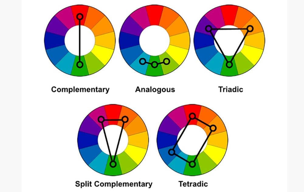
Image Credit: DesignGuru via Medium
Every color used in a design should work well together to create a harmonious visual. When choosing your social media color palette, a color wheel can help you understand the relationships between different colors and how they interact with each other. To create a well-balanced design, there are five options, according to color theory:
- Monochromatic colors, which emphasizes the meaning of one particular brand color.
- Complementary colors, which lie on the opposite sides of the color wheel.
- Split-complementary colors, which lie one space in either direction from the opposite color.
- Analogous colors, which sit next to each other on the color wheel.
- Triadic colors, which are three colors that are evenly spaced around the color wheel and usually result in a vibrant look.
- Tetradic colors, which combines four colors: two sets of complementary pairs (red and orange or blue and green, for example) with one color chosen as the dominant color, resulting in a bold look.
Red, yellow and blue are primary colors, meaning they can’t be created through mixing colors. But blending primary colors allows you to create other colors.
Color theory also encompasses a color’s darkness or lightness. A color’s hue can be adjusted by adding white, which will result in lighter pastel colors, or black to darken and dull color. When gray is added to a primary, secondary or tertiary color, it creates a tone. If a color is toned down, its intensity is lowered.
How to Choose the Best Social Media Color Palette for Your Brand

Image Credit: Lisa Fotios from Pexels
When selecting colors for your social media visuals, you should take these considerations into account:
- The color palette of the social media platform.
- The colors that have proven to generate the most engagement for each social media platform.
On top of that, you should also pay attention to the characteristics of your target audience. Research suggests that men and women have different color preferences and react best to different color combinations:
Women: Colors with white added, resulting in softer colors like pink, green and light blue.
Men: Colors with black added, resulting in bolder colors like navy blue or maroon.
Best Instagram Color Palette
Given that Instagram is so visual, it’s important to get the colors right. Research shows the following:
- Images that have blue as the dominant color perform better on Instagram than those that are mainly red or orange.
- Bright images on Instagram outperform dark images.
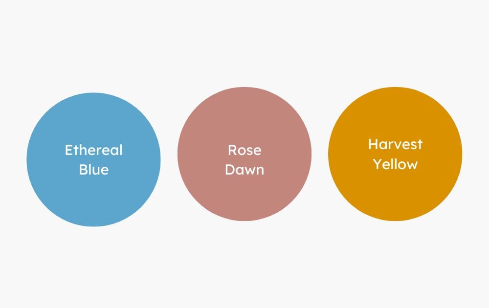
Another study identified the three colors that drive the most engagement on Instagram:
- Ethereal Blue, a teal shade of blue
- Rose Dawn, a dusty pink
- Harvest Gold, a sandy yellow
Best Facebook Color Palette
Studies show that bright, energetic colors can increase the amount of Facebook engagement, such as likes and shares. Choose warmer colors like shades of orange and red, golden yellow and violet so that your posts don’t blend in with Facebook’s dominant colors, which are blue and white.
In fact, you should avoid using too much blue in your Facebook designs. If blue is part of your branding, you can still use it, but ensure it’s paired with warm colors.
Best Pinterest Color Palette
Pinterest’s main colors are shades of red, pink, black, white and gray, but that doesn’t mean you should avoid these colors. Unlike Facebook, pins that match Pinterest’s native colors of red and pink actually get the most engagement.
Additional research findings show:
- Pins that are predominantly red, purple or pink lead to sharing on the platform.
- Green, yellow, blue or black pins are shared the least.
- Very light or very dark images don’t get repinned as often.
Best Twitter Color Palette
You only have 280 characters to get your point across on Twitter, so your copy needs to be straightforward. If you use the right colors and imagery for your profile, you can boost your engagement significantly.
A study showed that the following colors are used most frequently in Twitter profiles:
- Yellow: 26%
- Black: 22%
- Blue: 15%
- White: 11%
- Green: 9%
- Purple: 7%
- Orange: 6%
- Red: 4%
Streamline Your Design Process with Penji
If you’ve ever wished all your social media graphics could be created for you, Penji is the answer to your prayers.
We offer a simple graphic design service that gets you unlimited designs every month. With Penji, you can quickly and easily request custom designs for your business or personal projects. The platform offers a variety of features that let you organize your projects, share with team members, and request revisions from our designers. With Penji’s intuitive interface, you can save time and money while creating stunning visuals – You make the requests, we do the work. Never wonder where your designs are coming from again! Learn more..


