Some small businesses believe they don’t need a website because they’re too small to own one. However, it’s essential that small businesses have a website. Even just owning a domain and using a good template may help. If you have the resources, outsource your small business website design to experts. After all, time management is important. This way, you could focus on your tasks and increase your productivity.
Tap Penji to work on your designs. Being an unlimited design service, Penji can produce all the collaterals you need during your subscription. Request visuals such as social media posts, illustrations, website designs, and more! In the meantime, know how to drive traffic to your website by applying the tips below. Plus, get an exclusive sneak peek on how to request a website design on the Penji platform.
Let Your Product Become the Hero
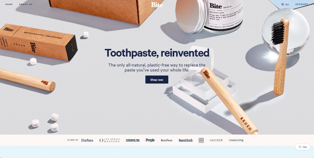
Hero images can help convert your visitors into customers. You should have a hero image that will capture your audience’s attention. It’s also a big part of small business website design. Examples of hero images you could use:
- Products
- People
- Illustrations
In this instance, look at the Bite Toothpaste Bits homepage. Immediately, your attention goes to the brushes and the small bits. It’s also a plus for Bite Toothpaste Bits because they used high- quality images to show off their products. That way, it’s more enticing for customers and might enable them to click on the “Shop Now” Call to Action (CTA) button.
Use a Split-Screen Approach
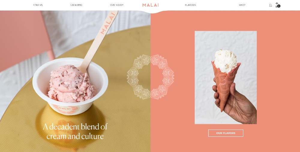
If you want to stand out from your competitors, you might need to take a different approach to your small business website design. One of the website trends that many websites use is a split-screen layout. It demonstrates that you want to shine a spotlight on different things. Maybe, you want to save up on space as well. Either way, it’s not a bad idea to execute this on your website.
Look at how Malai designed their website with a split screen. Once you load the homepage, you’ll see they introduce visitors to their ice cream. On the other hand, they’re also leading the visitor to check out their flavors in-store as well.
Choose Appropriate Fonts
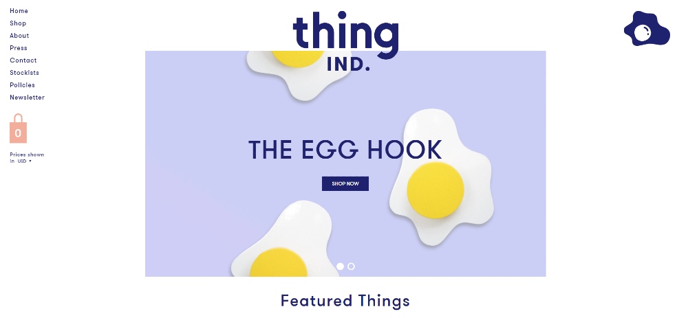
Part of a small business website design is to choose fonts that match your branding and personal preferences. You want to have a font that would catch the attention of your target audience. It can be a challenging task, especially you have serif and sans serif fonts to think about, then sizing, and then colors.
However, don’t sweat the small stuff like fonts. Just go with what you think is right for the website.
If you need to, though, you can use a combination of sans serif and serif for the important copy on your website. Perhaps use the serif for headers while sans serif for the body.
Take inspiration as to how Thing Industries use the fonts consistently on each page. They use a sans serif font on each page of their website. It’s appropriate for the whole website, and they even change up the colors or sizes depending on what the text requires.
The designers at Penji know how to use typography effectively in each design. Discover the visuals our team has produced for clients.
Keep it Clean
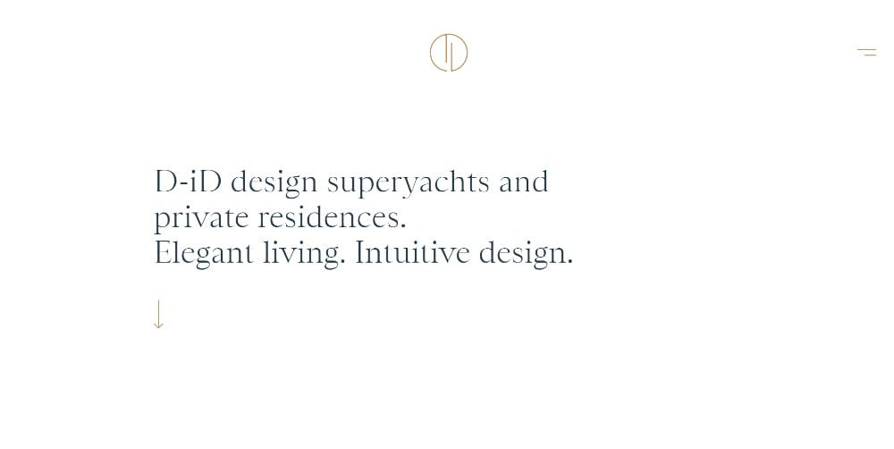
Less is more, so they say. Sometimes in designing a website, you want to keep it neat. Maybe that’s part of your business ideals, or perhaps you don’t want too much fuss on a website. You can also go for a minimalist website so your page loads faster.
Get inspired by the D-iD website. The website greets you with a copy of what they do in a nutshell. Then you’re guided by a navigational cue, so that you can see an example of their projects. As you scroll further down the homepage, you can learn more about them. They execute white space well.
At the bottom of the page, you can contact them through different channels.
Apply Asymmetry
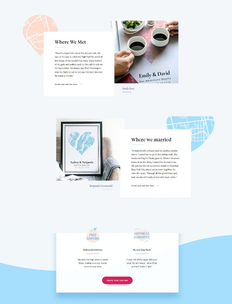
A growing trend in website design is applying asymmetry. Asymmetry will help shift focus to the different locations on the website. The idea of asymmetry will allow your visitor to navigate to different pages.
Perhaps it’s a coincidence, or it was deliberate, but the hero image on The Happy Prints website doesn’t have symmetry too. You’ll see more examples of how they implemented asymmetry with photos and shapes. If you also notice that one photo and some graphics adjust as you go up and down the site. It’s a cool feature on the site.
Stay on Brand

In creating your website design, you should remember one important aspect: branding. It’s crucial because you want people to remember your company. Your website is vital to ensure that your customers recognize your brand immediately. Plus, you need to show off your pride for your brand.
If you want to get an idea of how branding works, even in the subtlest ways, check out this example from Palo Alto. Their website is consistent with their color branding on the site. You’ll notice green and blue elements on several pages, even using gradients. Plus, based on their logo, you’ll see sharp edges on some icons or components, which is a nice touch.
Have a Landing Page
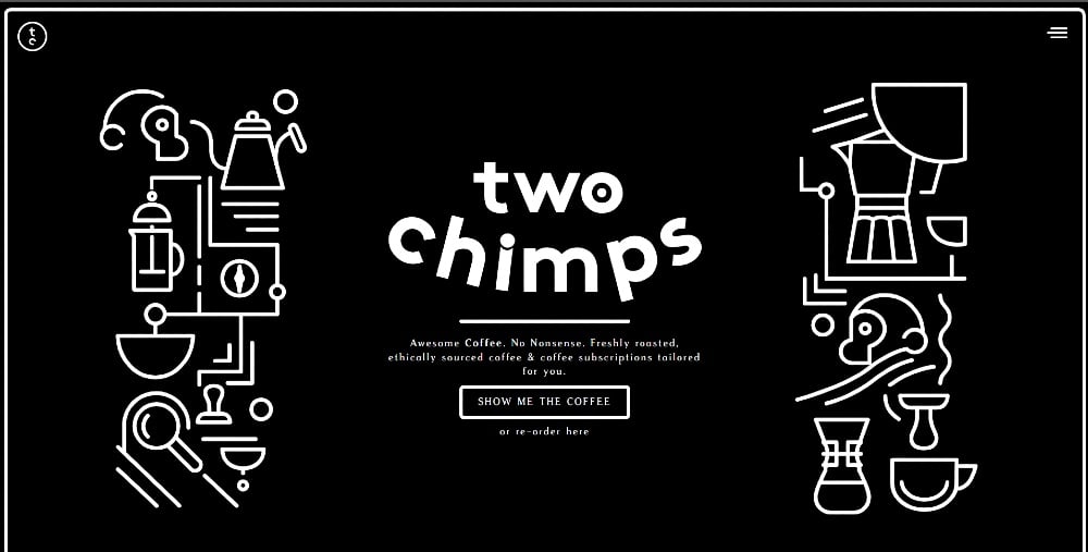
If you want to increase sales, adding a landing page will do just the trick. It’s a well-known practice on any website that’s selling anything. It makes it easier for you to convert visitors as customers because a landing page can give you an edge against your competitors.
Here’s Two Chimps Coffee’s take on a landing page. Some would usually have the usual rectangle with a CTA on the site, leaving us to take a sneak peek of the content below. Meanwhile, for Two Chimps Coffee, the landing page takes centerstage. You see an illustration of two chimps and coffee-related items. Your eyes would immediately dart to the CTA button as well because the outline is thick, and it catches your attention.
Need a landing page design for your small business? Request one by subscribing to Penji. Get a preview on how the Penji platform works.
Make it Easy to Navigate
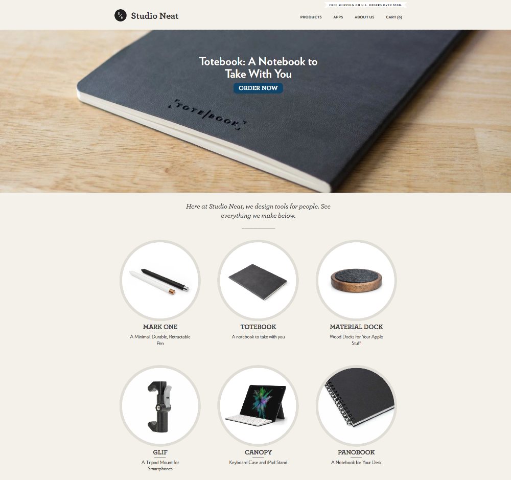
Navigation is key in website design. Even if it’s related to responsiveness and user experience, website design still plays a role in navigation.
You need to have the menu on top or the side. A clickable logo that leads them back to your homepage. Then remember to add the links to other pages as well. Plus, the footer is also essential. Experts would say that navigation should be intuitive.
Of course, the design comes in because you need to make sure you follow a layout that will guide your visitor to do things while they’re on the website. Examples include buying your item, checking out an item, or contacting you when they need help.
Look at how Studio Neat arranged their layout so you can navigate their website in a breeze. You’ll see the header or landing page first. Then below the fold, you’ll see their handmade products. When you click on any of the items, you’re led to the product page. If you want the product, you can easily click buy, or if you’re going to surf some more, you can go back to their homepage.
Put Social Proof
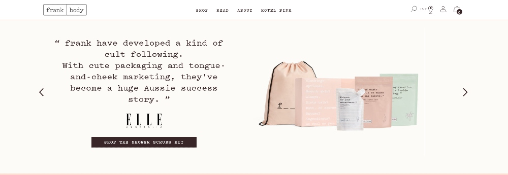
Social proof can improve your sales because you’re getting recognition from known customers or big names in the industry or the media. If people see that many like your product, they could try it. Examples of social proof are:
- Reviews by big companies or from the media
- Testimonials from customers
- Social media posts by customers
Many would put social proof below the fold, while some would add logos of those that mentioned the brand just below the header or landing page. Either way, adding social proof is a necessity for your small business website.
Take a look at this example from Frank Body. The social proof they added on the site is the mentions about their products in the media. It’s a simple carousel design that adds a short copy from the review in the media, a logo of the publication, and a featured product.
Optimize for Mobile
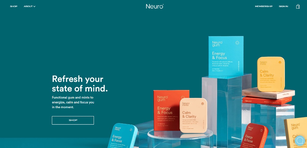
Since most of us who have an internet connection use smartphones. After all, Statista finds there were 3.2 billion users in 2019. And the numbers will continue to rise in the coming years.
More people are glued to their screens. In turn, you should have a website that’s optimized on mobile. You might lose visitors or leads if you neglect to do this.
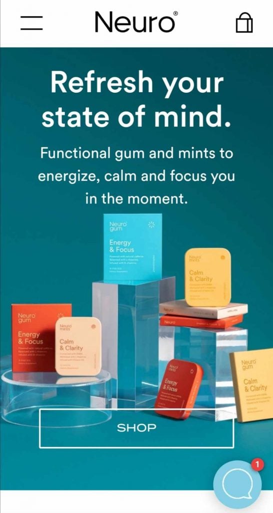
Here’s an example from Neuro. Their mobile website is the same as it is on the desktop version. Both mobile and desktop versions are responsive so a point goes to them. You don’t have to zoom in on the photos either since they’re fitted well on a screen as well.
Contrasting Colors for Call-To-Action Buttons
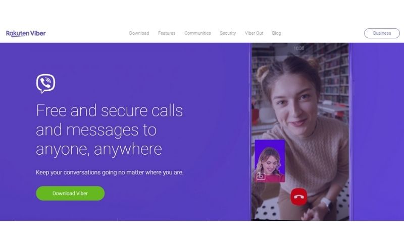
If you want people to click on your call-to-action buttons, make sure that you use contrasting colors. Take for example what Viber did. The green button encourages visitors to download the app and stands out from the rest of the page. You can take that approach as well if you want to emphasize other elements on your website.
Improve the Layout of Your Blog Posts
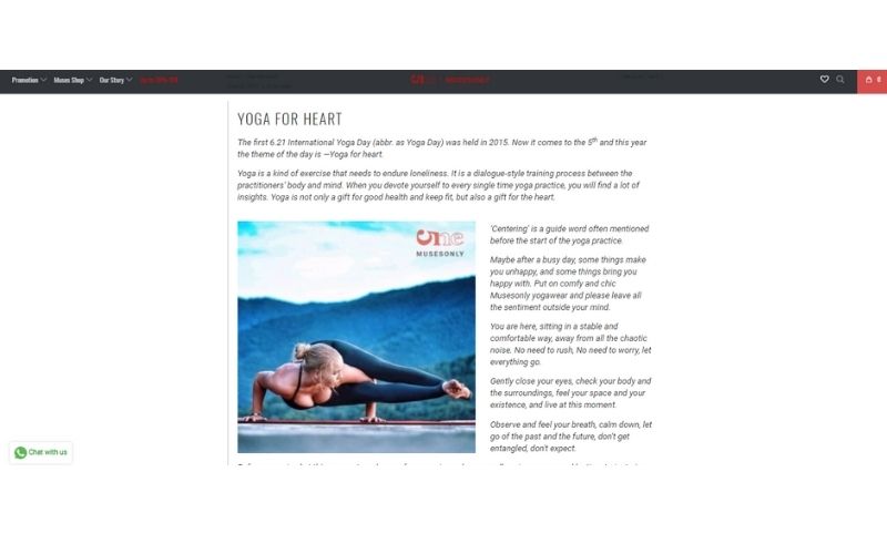
People today love to learn a lot! Use that to your advantage and create content for your market. And what better way than to publish articles on your website. With this, you are also improving your website’s SEO. But remember, posting content without thinking of its aesthetic value can also cause a backlash.
Look at this blog post from Musesonly. Instead of just using an all-text article, they used interesting photos related to their topic. Thus, less boring.
If you are selling products, you can even subtly include your offerings in your blog post images.
Ensure Privacy and Security
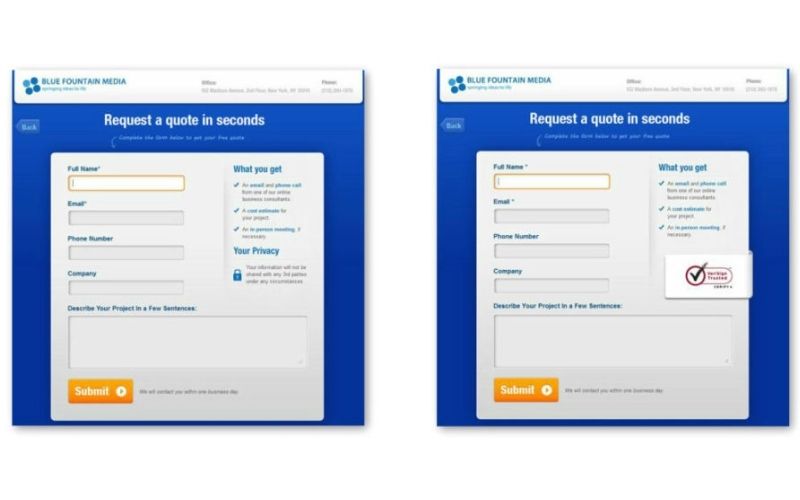
An additional touch that can boost your website and sales are trust badges. This is proven by Blue Fountain Media where they placed a VeriSign trust badge near their contact form. This is more effective than just having a personalized message that your site is safe and secure.
When people see that your website can be trusted, they will be more confident to transact with you.
Use Animations
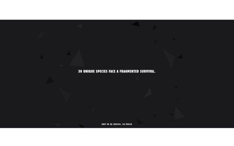
In some cases, you can also use micro-animations for your website. This breaks an otherwise entirely static design. It’s what Species-in-Pieces did. It’s their way of spreading their advocacy to the audience.
This is certainly an effective technique for similar niches. Or, if you are still a startup and people are not familiar with your services, you can tell a story on your website using micro-animations.
Keep Forms Simple
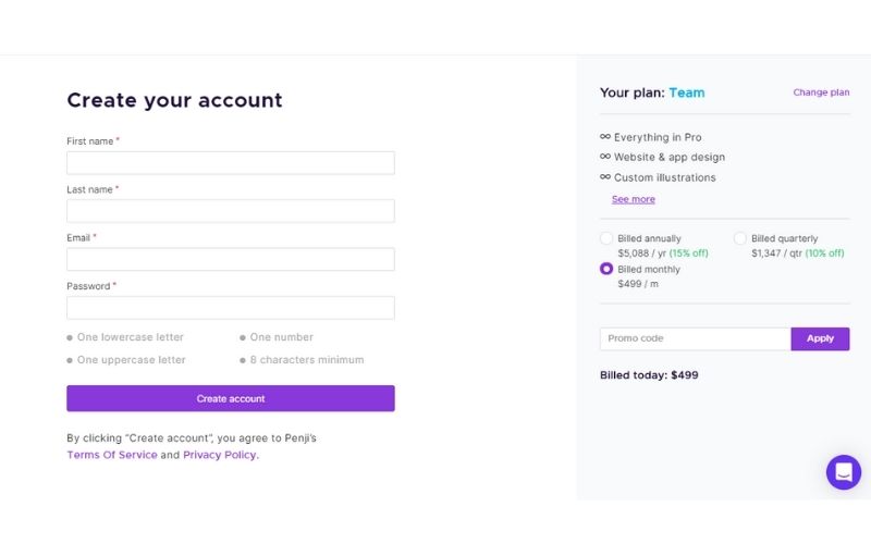
More often than not, websites are an excellent place to get leads. But if your contact forms are too complicated, people will unlikely to complete it. And that’s a lost opportunity for your business.
Let’s use our website as an example. We make sure that creating an account will only take you a few minutes. It doesn’t require a lot of information, but only the necessary details for the transaction.
Increase Website Visits by Requesting a Website Design from Penji
The moment you sign-up for Penji, you get access to the platform. You can create your first project as easy as 1, 2, 3. To illustrate, here’s the three-step process of requesting a website design on the platform.
1: Create a Design
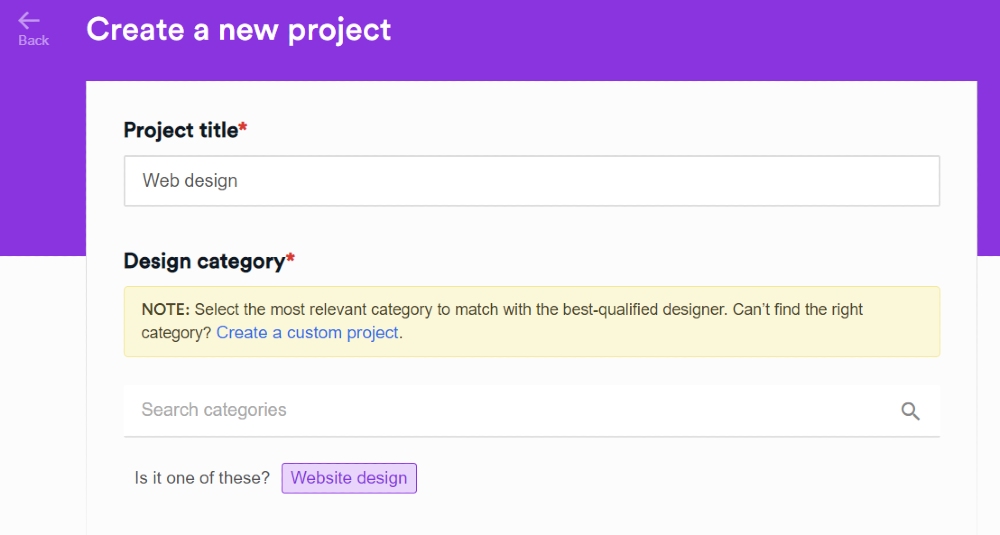
On the dashboard, you’ll see the New Project button. Click on it, and you’ll fill in a form with all the details of your design project. First off, you need to provide a Project title and a Design category. Please choose Website Design.
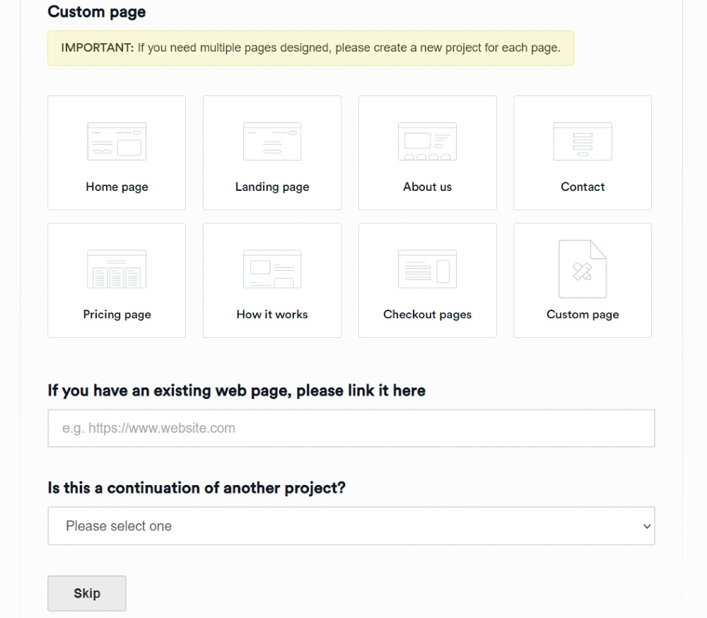
From there, you’ll choose the page you need a design for. Let’s say you want a home page, click on it, and you’ll be prompted to fill in details of your design.
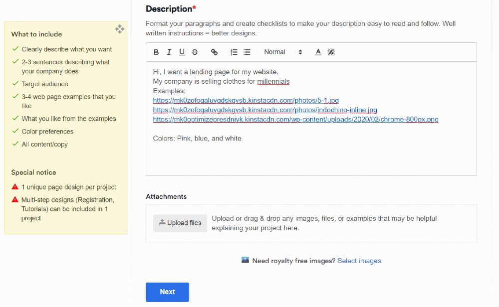
Make sure you write the specifics of your design on the Description field. You can always refer to the guideline box if you might have missed some details.
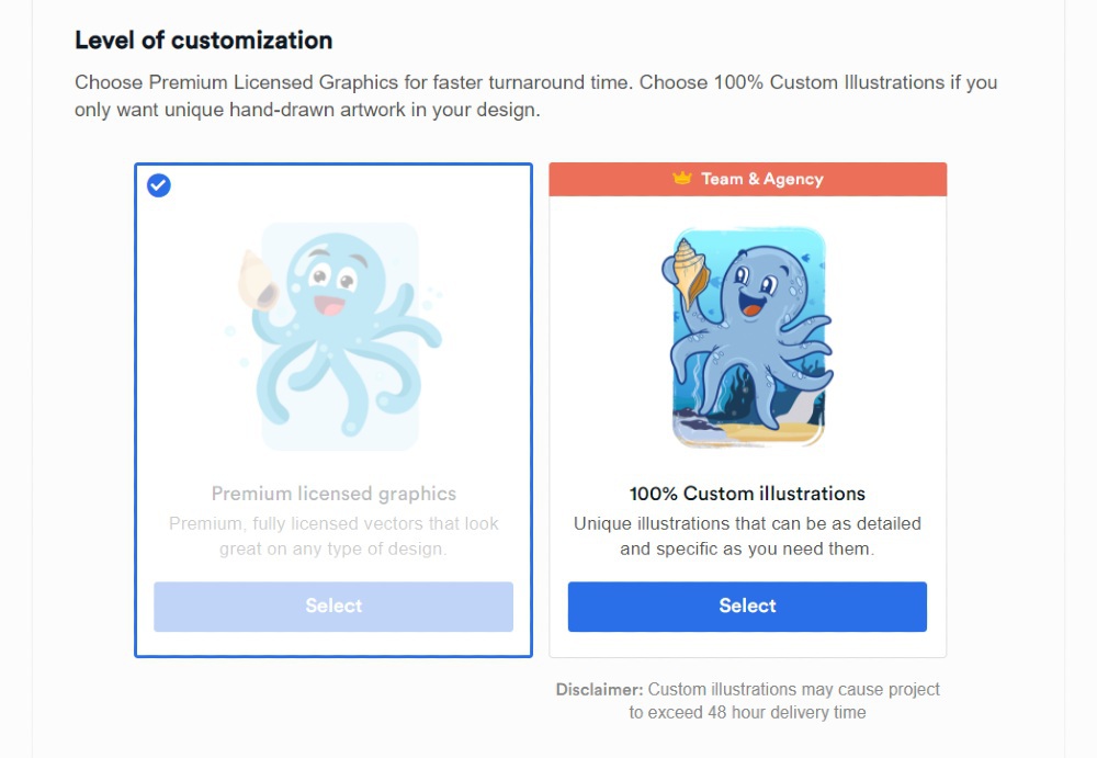
After this, click Next, select the Level of Customization, File Deliverables, and Associated Brand.
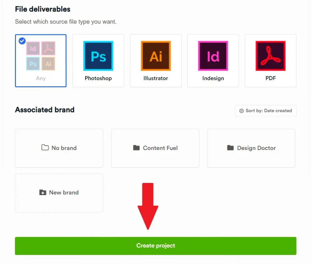
Once done, click Create Project, and you’re all good!
After this, you’ll have your first project in the queue, and a designer will be assigned to your project. Expect to receive the first draft within 24 to 48 hours.
2: Review the Web Page Design
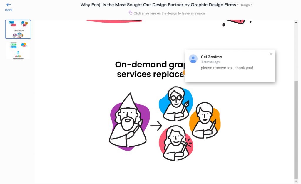
At this stage, you need to assess if the first draft meets your expectations or needs more work. In case it needs revision, you can use the built-in point-and-click feature. This will allow you to add notes on the design without leaving the Penji platform.
Not only that, but you have unlimited revisions too. Not all graphic design services offer this feature. And we want you to get the best designs without paying extra for revisions.
3: Download the Design
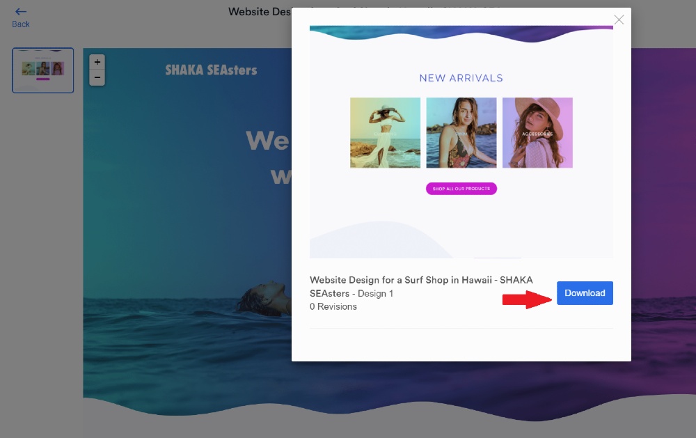
If the web page looks great, and it no longer needs enhancements, you can download the design already. Click the blue Download button, and the files will be saved to your computer.
Penji’s Sample Website Designs
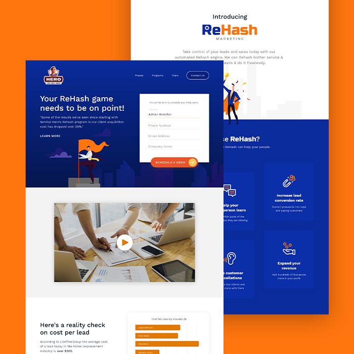
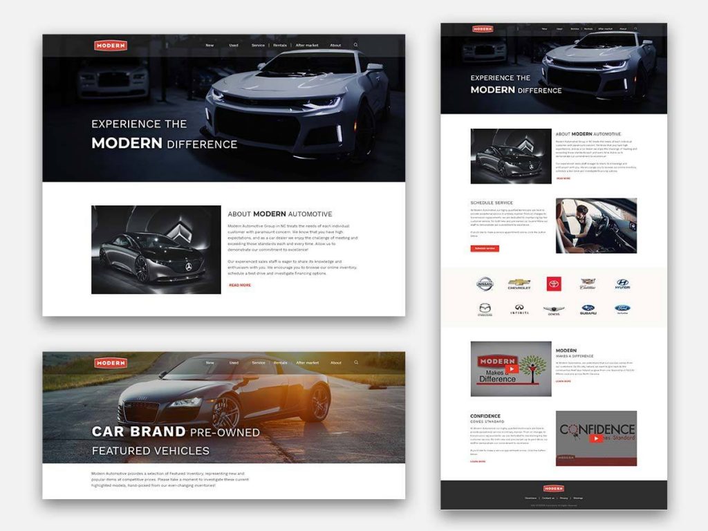
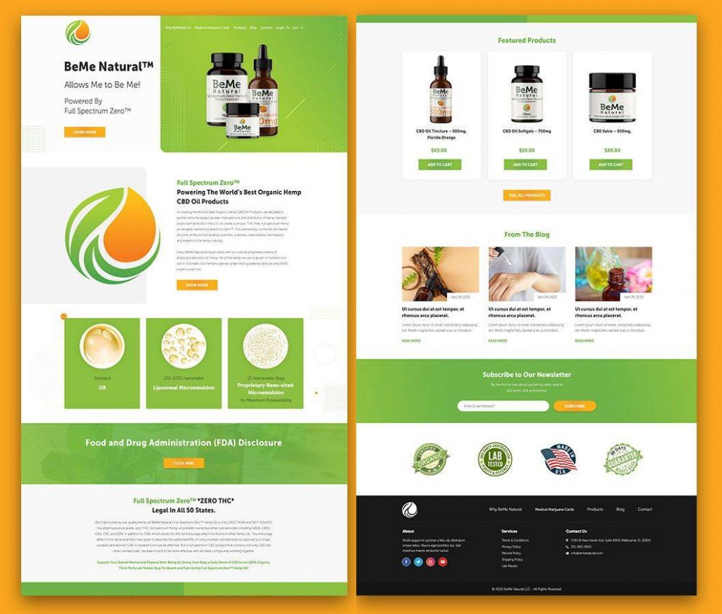
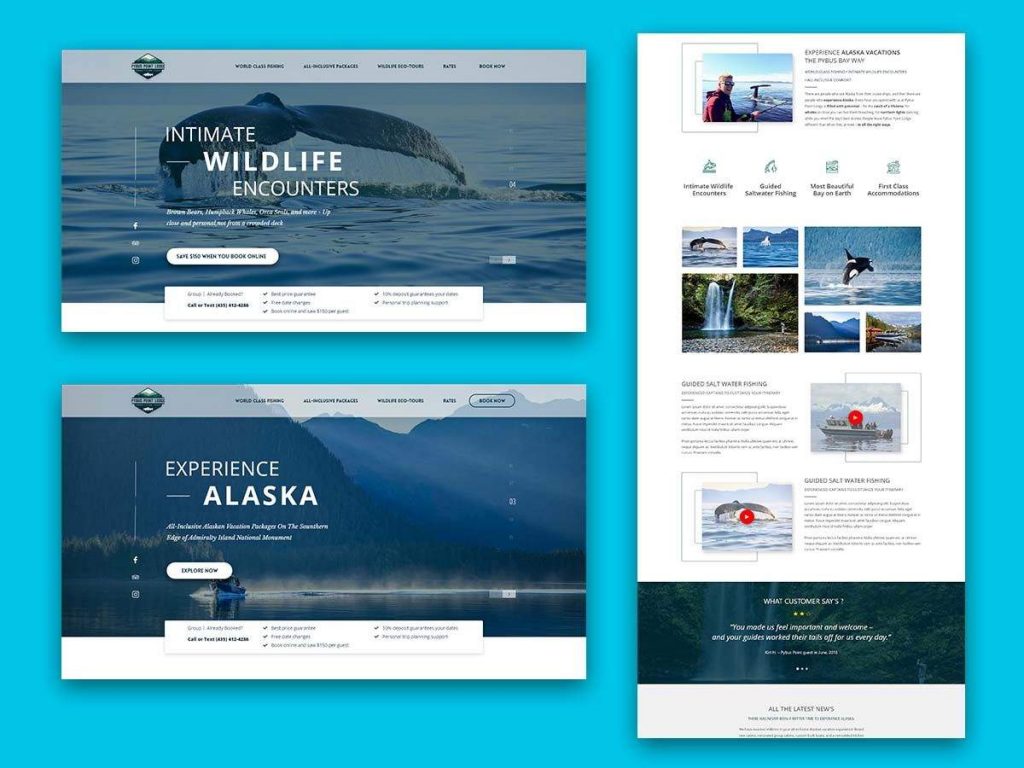
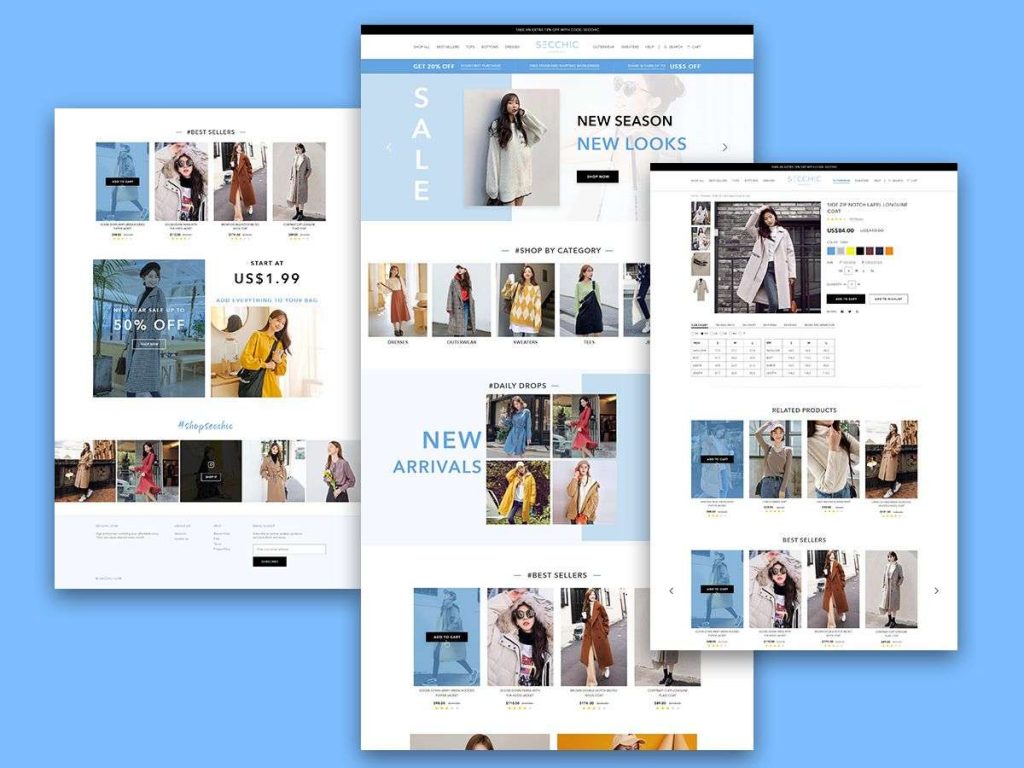
As you provide your personal preferences, our designers will also take into consideration the best industry-practices. That way, your website is not just beautiful on the surface, it actually works and could convert visitors. Here are some of our amazing works:
Final Thoughts
Make your small business known on the internet. That way, more visitors flock to your website and your physical store (if you have one). You might be losing leads if you don’t own a domain.
If you have a website, remember that website design matters. Website design is a huge factor in sales. You don’t want visitors to leave your website. Remember these ten website design tips because they can make your customers click on the CTA buttons.
Increase add to cart rates or get more leads by getting an awesome website design from Penji. For only $499/mo on the Team plan, you get exclusive access to all design types. Plus, don’t worry about paying extra for illustrations or website or app design. It’s an all-inclusive and affordable plan. Subscribe today and try the platform 100% risk-free.
About the author

Katrina Pascual
Katrina is a content writer specializing in graphic design, marketing, social media, and technology. In her spare time, she writes monthly personal blogs to practice her craft.
Table of Contents
- Let Your Product Become the Hero
- Use a Split-Screen Approach
- Choose Appropriate Fonts
- Keep it Clean
- Apply Asymmetry
- Stay on Brand
- Have a Landing Page
- Make it Easy to Navigate
- Put Social Proof
- Optimize for Mobile
- Contrasting Colors for Call-To-Action Buttons
- Improve the Layout of Your Blog Posts
- Ensure Privacy and Security
- Use Animations
- Keep Forms Simple
- Increase Website Visits by Requesting a Website Design from Penji
- Penji’s Sample Website Designs
- Final Thoughts


