


Looking at various record label logos, from the iconic “tongue and lips” of the Rolling Stones to the bold lettering of Def Jam Recordings, you’ll find that music isn’t just about the beats and lyrics. It’s also about the visual identity that forms a huge part of the music industry. Below are the top record label logos that exemplify great design and even greater music:
1. Def Jam Recordings

First on this list is Def Jam Recordings which has one of the most recognizable logos in the music industry. The bold lettering in white amidst a black background makes it instantly identifiable. The slightly larger “D” and “J” letters add a sense of balance and symmetry to the design.
This record label logo’s use of bold letters conveys strength and power. This perfectly fits a label that has played a significant role in developing hip-hop and other genres. Together with the illustration of a turntable stylus, its simplicity, and boldness make it easy to remember.
Amazing record label logos to bust the charts
Unique record label logos in 1-2 days


2. Atlantic Records
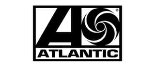
A classic example of a well-designed record label logo, the Atlantic Records logo was designed and used from 1966 to 2005. It was revived in 2015 and is still in use today. The design features a bold letter “A” with a circle beside it that resembles a camera shutter. Furthermore, the use of the letter “A” in the design is a nod to the label’s name, while the circle represents the recording process and the capturing of sound.
While the multicolored version of the logo may be eye-catching, it is the black-and-white version that is more recognizable and iconic.
3. Warner Music Group

Using the brand name in the logo is also an effective way to establish a label’s identity and promote brand recognition. This is what Warner Music Group has done in its logo. It features three rounded lines representing the letter “W” in the brand name. Also, the use of curves and soft edges in the design gives it a sense of fluidity and movement, reflecting the music industry’s dynamic nature.
The logo is primarily dark blue, giving it a professional, sophisticated, instantly recognizable look.
4. Motown Records

A record label logo that’s simple and striking, the Motown Records logo is one of the most recognizable in the industry. It is an excellent example of how a simple and elegant design can be highly effective in creating a solid and memorable brand identity. In addition, the stylized letter “M” in black has a sleek and modern look. It is timeless and conveys the label’s focus on creating music that is both sophisticated and accessible.
The Motown logo has become an iconic symbol of the label’s legacy and helped establish it as one of the most influential record labels in history.
5. Sub Pop Records
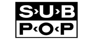
Featuring two rectangles stacked on each other, the Sub Pop logo has become synonymous with the label’s brand identity. It has helped the brand to establish itself as a leading player in the world of alternative music. What sets this logo apart from others is the small arrows between the letters pointing left and right, giving the design a sense of motion and energy.
The simple yet eye-catching logo perfectly captures the spirit of Sub Pop’s music, known for being raw, energetic, and unapologetic.
6. Columbia Records
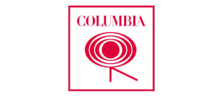
Having a distinctive logo design, Columbia Records has one of the most iconic designs in the industry. It features a stylus above the grooves of a record. This was meant to represent the label’s commitment to producing high-quality music. However, the logo has become more commonly known as the “Walking Eye” due to its distinctive design.
The Walking Eye nickname has even become a registered trademark of the company, showing the lasting impact of this unique logo. Despite misinterpreting its meaning, it remains a compelling and memorable symbol of the label’s brand identity.
7. Island Records

Perfectly capturing the label’s vibe is Island Records’ logo design. It has a stylized palm tree sitting atop the label name, evoking feelings of relaxation and escape. The simple font adds a touch of confidence and energy, which complements the relaxed and easy-going vibe of the palm tree. The white circle at the back places enough emphasis on the icon and brand name.
The design creates a unique and memorable logo that perfectly represents Island Records’ commitment to innovative and groundbreaking music.
8. Verve Records

A timeless and elegant design, the Verve Records logo perfectly reflects the label’s commitment to producing high-quality jazz music. It features the label name in white on a black background, creating a bold and striking contrast. The use of stylized typography adds a touch of sophistication and subtle artistic flair to the design.
This is a great example of how less can be more when it comes to logo design. Its simplicity allows the label name to take center stage. Plus, the circle around it adds a subtle visual interest that captures the essence of jazz music.
9. Epitaph Records
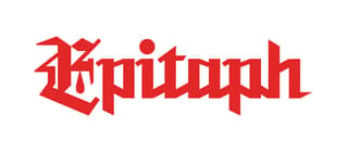
Featuring a simplified Old English font in red, the Epitaph Records logo has a raw and edgy feel synonymous with punk rock music. The use of this typography is a nod to the label’s roots in the punk rock scene and adds a touch of rebelliousness to the design. The use of red in the logo adds a sense of energy and urgency to the design, reflecting the label’s commitment to producing passionate and socially conscious music.
This record label logo design perfectly represents the brand’s punk rock spirit and has become a recognizable symbol of its identity in the music industry.
10. Blue Note Records
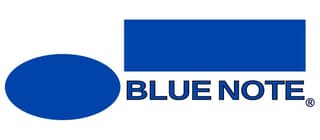
Another jazz record label that uses a timeless design, the Blue Note Records logo is proof that simple can also be impactful. It features a blue oval and rectangle set against a white background, creating a simple and elegant design. This perfectly captures the label’s commitment to producing high-quality jazz music. The use of blue in the design gives the logo a sense of calm and sophistication, while the white background adds a touch of purity and simplicity.
Its clean and minimalistic design allows the label name to take center stage, making it instantly recognizable to jazz fans worldwide.
Final Thoughts
Record label logos are essential to a brand’s identity in the music industry. A great logo can effectively capture a label’s identity and values while also making it instantly recognizable to fans around the world.
If you need a great logo for your record label or any other graphic design needs, try Penji. Penji offers unlimited graphic design services at an affordable price, making it easy to get high-quality designs for your brand. With a team of talented designers and a user-friendly platform, Penji makes it easy to create custom designs that perfectly capture your brand’s identity and values.
Click here to get started with your design!


