
Out of the 100s of posters you see every day, one poster design always stands out. Whether it makes you smile or provokes the heck out of you, a good poster captures your attention. Don’t know what we’re talking about? Here are some disturbing poster advertisements that depict some of society’s elephants in the room.
WARNING: The ads featured on this list contain allusions to sex and violence that may be disturbing for some readers. We’ll give you a heads-up before each one, but if you’re squeamish, you may want to check out some of our other blogs instead.
What is a poster advertisement?
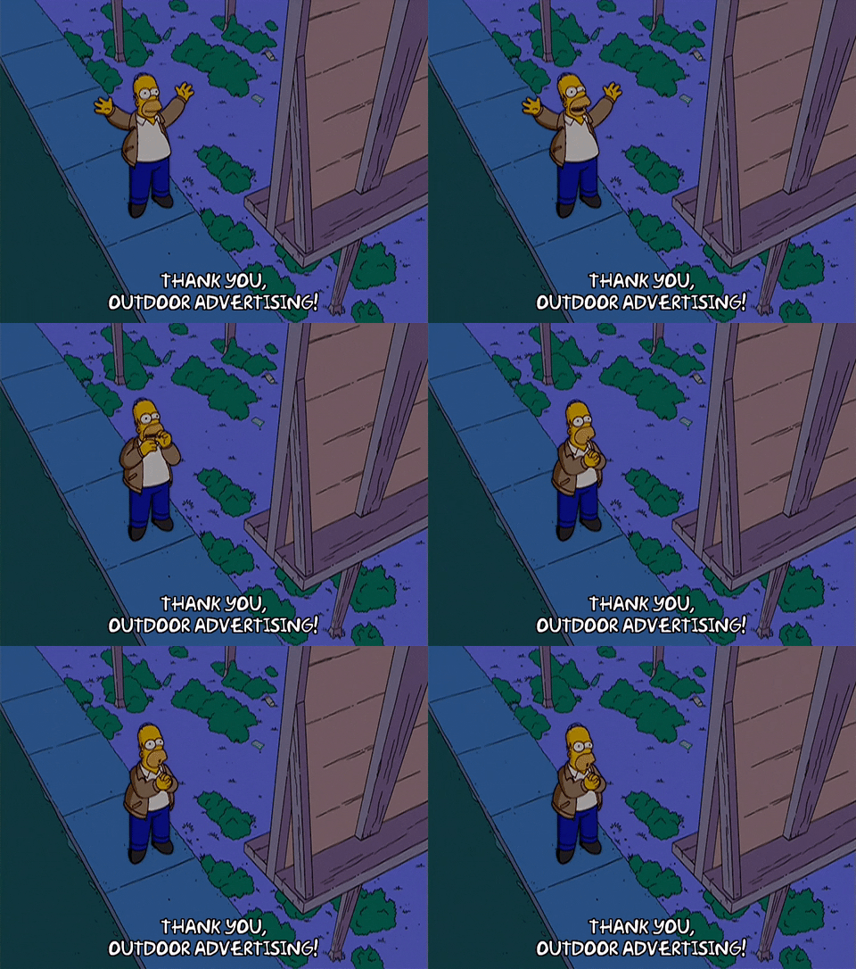
Posters are a type of outdoor ad that most of us are familiar with. While most of us think of the shape and style of a movie poster, any printed ad for an event, service, or product can be called a poster advertisement.
Do disturbing poster advertisements work?
You can judge for yourself whether these ads do the trick, but ads that shock viewers are generally a source of controversy. If they’re distasteful, they can lead to massive backlash. But sometimes, they hit just the right spot to stick in audiences’ heads and spark a conversation.
[in_content_ads gallery=”logos” logo=”on” title=”Need graphic design help?” subtitle=”Try Penji’s Unlimited Graphic Design and get all your branding, digital, print, and UXUI designs done in one place.” btntext=”Learn More” btnlink=”https://penji.co”]
1. PETA’s Poaching Campaign
Content warning: Animal death.
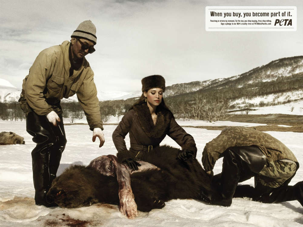
When it comes to advocacies that center on animal protection, PETA instantly pops up. They’re an organization that speaks for the voiceless, and their ads also showcase how passionate they are of their cause. This particular PETA poster design is for a campaign against bear poaching in Singapore.
The gruesome picture shows a bear with its skin and fur scraped off, showing some dead flesh. Then over him sits a woman wearing a classy fur coat, with eyes fixed on the bear’s fur. Two poachers are seemingly happy about their kill and the sale about to transpire. Finally, the point of the message is to remind consumers that buying fur coats makes them one of the culprits of animal poaching.
2. Shirley Manson for PETA Poster Advertisement
Content warning: Animal death, blood.
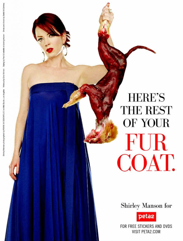
If lead vocalists of prominent rock bands like Garbage come together for animal protection, we all know how vital the message is. Shirley Manson admitted she was never really an “anti-fur” person per se. However, she claimed that as she got older, she became more mindful of the consumerist culture we have.
The picture is so disturbingly striking that anyone would’ve had a change of heart in their fashion sense. Shirley holds a skinned fox with the caption, “Here’s the rest of your fur coat.”
3. Michael Stich Foundation’s AIDS Campaign
Content warning: Sexual imagery, partial nudity, guns.

HIV and AIDS continue to become a social stigma that everyone is afraid of, despite the recklessness in their decisions when it comes to having different partners.
This poster design for Michael Stich Foundation received mixed reactions from its audience. It’s a picture of two people about to engage in a coital activity. But the most striking part was the gun resembling a man’s penis and the woman taking it head-on. The message is plain and straightforward: A condom can save your life!
4. French Government’s AIDS Campaign
Content warning: AIDS, death.
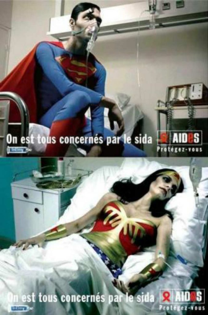
Here’s one from the French government and AIDES.ORG that resulted in a controversy. It’s a picture of sickly, famous superheroes, Wonderwoman and Superman, lying on a hospital bed.
A message across the poster says, “Aids makes us equal.” It signifies it doesn’t matter how tough you are. If you don’t use protection, you run the risk of getting AIDS.
The poster design stirred controversy and resulted in campaign organizers canceling the ad.
5. Volvo’s Airbag Campaign

This is one of the meaningful yet head-turning poster advertisements from a luxurious car manufacturer, Volvo. At first glance, you’d instantly wonder why a pedestrian has an airbag on his face while crossing the street.
But then as you look closer and read the fine print, you’ll realize how the brand is innovating airbags. Volvo’s brilliant idea on the world’s first external airbags will surely get those sales through the roof.
This poster has been well-embraced by its audience, even praising the brand for its genuine take on road safety.
6. YO BK Hot Yoga Poster Advertisements
Content warning: Depiction of melting skin.

YO BK is a yoga studio in New York, and their drive for an active lifestyle is resonated in this poster advertisement. The graphic designer instinctively knew how to represent the sweat and the extra pounds creatively.
Here, a woman does a Natarajasana or Dancer pose. She appears to be covered in paint, which seems to trickle to the floor. The entire message conveys how hot yoga can make you lose those extra pounds.
7. Crossfit Liege’s Self-Love Poster Advertisement
Content warning: Partial nudity.

Crossfit Liege is a lifestyle and fitness gym located in Belgium. In an effort to encourage everyone to feel and look good inside and out, Crossfit Liege created this poster to spread its message.
What strikes this poster as disturbing is the outstretched hands that come from opposite directions. Whether the image is trying to reflect strength or flexibility from regular exercise, it certainly cuts the mustard.
8. De Facto’s Tobacco Campaign
Content warning: Smoking, allusion to choking.

The tobacco industry is one of the most progressive sectors the world over. It relies on the sheer law of supply and demand. And where there’s more demand for tobacco, tobacco companies also cater to that demand.
In fact, a low supply of cigarettes will result in higher prices due to the high demand. De Facto is the brainchild of Quebec students and athletes who want to spread awareness on the tobacco industry’s practices.
Poster advertisements like this will probably not do much to persuade people to stop smoking. However, a disturbing image of a girl seemingly choked by an oversized cigarette will truly make them think twice.
9. Let’s Do It Romania’s Ati-Litter Campaign
Content warning: Smoking.
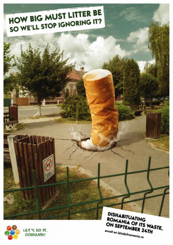
When it comes to environmental preservation in Romania, Let’s Do It Romania spearheads the advocacy. Since 2010, the organization has involved over a million volunteers and cleaned more than 25,000 tons of trash.
This disturbing poster design of an oversized cigarette butt put out in the middle of the street implies how people nonchalantly throw their litter anywhere. The question, “How big must litter be so we’ll stop ignoring it?” is also thought-provoking.
The message tells us how the increasing garbage problem impacts the environment globally. But sadly, people are turning a blind eye because they think it’s a “small” issue.
10. Mr Leggs’ Poster Advertisement
Content warning: Misogyny.
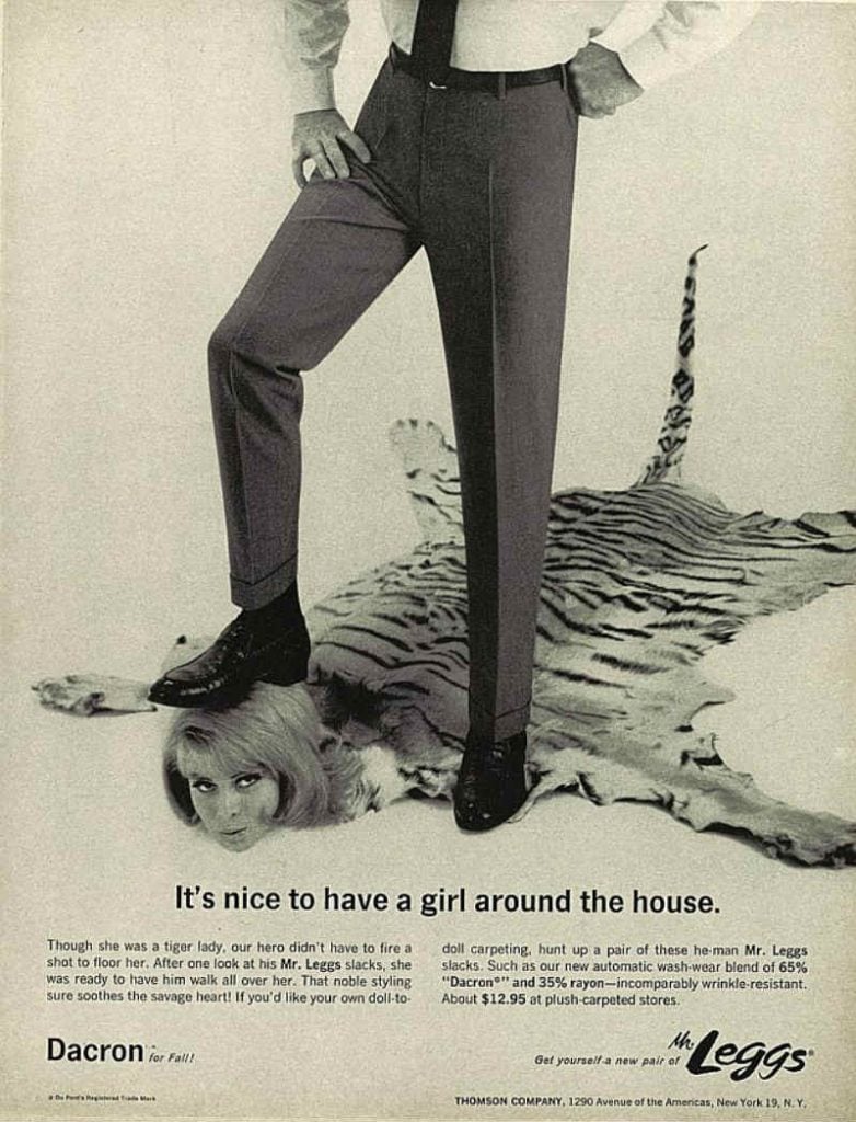
Here’s one of the most shocking vintage promotional posters that’ll make your jaw drop. It’s a campaign for Mr Leggs pants.
A man, wearing the pants, props his foot down on the woman’s head, who is lying on the floor. The tiger coat indicates the woman is the “prey,” while the man is the “hunter.”
Then as you read through the text, it highlights how wearing Mr Leggs pants didn’t even require the hunter to “fire a shot to floor her.” The woman instantly bowed down to the man after seeing him in those pants.
This poster ad has grown infamous for its objectification of women. It was considered shocking and controversial when it was released. However, this ad might drive egoistic men who want to validate their machismo.
11. QSOL

This sexist ad for QSOL never saw the light of day after it was launched in 2000. QSOL is an IT consulting company founded in the 1990s and focuses on technology. Its services dwell on data networks, industrial real-time computer systems, and complex integration issues within these systems. While most of these IT companies are male-dominant, the company poked fun at women using titillating copy. It demonstrates a misogynistic tone that drew flak after being published in Linux Journal. Since then, the magazine company promised not to run ads like this.
12. Dove

Dove is one of the most inclusive brands worldwide, emphasizing women, race, and equality. Most of its ads motivate women to become better versions of themselves—except for this one. For this body wash product, Dove showed racism by implying that white skin is better. In this print ad, three women with different skin colors from left to right show that the body wash improves your skin color. The only controversial issue here is that Dove implies that white skin is the improved color.
How to create a poster ad design
A poster ad still does the job of luring in more leads. The trick is to ensure your poster ad design is well-thought-out. Follow these steps and include all these elements when creating a compelling poster design.
1. Create a catchy title
Your title is what will hook your readers. That said, ensure your poster title is catchy and brief. The title shouldn’t be more than two lines of text. Also, making your title legible is crucial so your poster doesn’t go unnoticed. Try using a 48-point font size or larger.
2. Make text easily scannable
Another vital aspect of poster design is scannable text. Keep your copy concise and include only what readers need to know initially. The rest of the information can be found on your website or other marketing channels. Ensure your copy doesn’t exceed a thousand words, or it will be too long for readers. Organize paragraphs into sections and include labels to make them easily digestible.
3. Include quality graphics
Graphics are one of the most crucial elements in your poster advertisement design. The graphics tie the whole design together. Images, photos, icons, symbols, or illustrations also demonstrate visually what written words can’t. Another tip is to use high-quality, high-resolution images that look good on posters. So when readers view your poster from afar, the graphics are comprehensible even from five feet away.
4. Integrate white space
White space or negative space is the empty space on your poster that allows the eyes to rest. White space is necessary to give your poster a “breathing room.” It helps to prevent overwhelming readers with too much information or text. A rule of thumb is always including about 30 percent white space on your poster ad.
5. Think about flow and layout
These two are essential in keeping readers hooked to your poster. Creating a well-organized layout ensures that the most critical information is at the top and the least essential details are at the bottom. Flow also refers to how readers’ eyes transition from one text or element to another. Ensure your copy, graphics, and colors don’t confuse readers. Instead, make the next section relevant to the previous section.
6. Add relevant colors
Colors evoke specific emotions in people. Choose colors relevant to your brand identity or the overall message of your poster. For instance, if you’re promoting the prevention of drug abuse, bright and happy colors like yellow or orange wouldn’t fit. Likewise, if you’re selling toys to kids, using black or darker colors isn’t a good idea.
Here’s how to DIY your poster design on Canva:
Conclusion
These poster designs should be enough to make your blood boil. But the designers precisely invoked specific emotions they initially targeted with these poster examples. So kudos to them!
What’s the best way to get poster advertisements for my brand?
Do you need help with poster advertisements that stick in your prospects’ minds? Subscribe to Penji and get these benefits:
- Unlimited designs and revisions
- Affordable rates
- Fast turnaround (24 to 48 hours)
- Bespoke design platform
- Dedicated account manager
- 120+ design services
- Brand folders for organization
Sign up for a demo to see Penji in action!
About the author
Table of Contents
- What is a poster advertisement?
- 1. PETA’s Poaching Campaign
- 2. Shirley Manson for PETA Poster Advertisement
- 3. Michael Stich Foundation’s AIDS Campaign
- 4. French Government’s AIDS Campaign
- 5. Volvo’s Airbag Campaign
- 6. YO BK Hot Yoga Poster Advertisements
- 7. Crossfit Liege’s Self-Love Poster Advertisement
- 8. De Facto’s Tobacco Campaign
- 9. Let’s Do It Romania’s Ati-Litter Campaign
- 10. Mr Leggs’ Poster Advertisement
- 11. QSOL
- 12. Dove
- How to create a poster ad design
- 1. Create a catchy title
- 2. Make text easily scannable
- 3. Include quality graphics
- 4. Integrate white space
- 5. Think about flow and layout
- 6. Add relevant colors
- Conclusion


