

Advertising visuals have evolved so much in recent years. From simple typographical ads to overly vivid visuals, advertising is never stagnant or one-way. One thing has remained the same, though: people are still drawn to consumerism. One way to take this lightly is by using vivid colors, playful icons, and popular celebrities to attract customers. This is why pop art advertising has been widely adopted in marketing. Penji Unlimited Graphic Design can be your go-to service for creating unique visuals for your pop art advertising.
Key takeaways:
- What is Pop Art Advertising?
- How Advertising Influenced Pop Art
- Why Do Marketers Use Pop Art Advertising?
- What are the Characteristics of Pop Art Marketing?
- Pop Art Advertising Best Practices
What is Pop Art Advertising?
Pop art is a unique visual style that emerged in the 1950s, with the first influences coming from the United Kingdom and the United States. It integrates mundane objects and instills humor, color, and familiarity to keep it visually interesting.
Pop art advertising uses vibrant colors to showcase the main star of the imagery. Infused with humor and irony, pop art visuals express culture using the artist’s style. While we primarily see pop art in comics and magazines, more pop art advertising visuals are making their way into billboards, flyers, websites, and online ads.
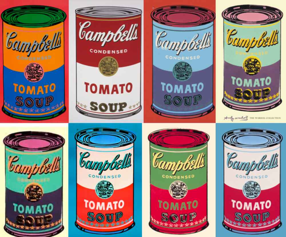
We see pop art in branding visuals, such as logos, packaging labels, and even homepage hero images. One of the first few influences of pop art marketing is Andy Warhol’s Campbell’s Soup Cans.
How Advertising Influenced Pop Art
Since pop art is gravely influenced by popular culture, it makes sense how advertising can be infused into this playful marketing concept. Consumers are enthralled with famous people, celebrities, and anything trending, making pop art a powerful strategy that understands consumerism.
It has expanded into various cultures in different aspects, such as in fashion, music, magazines, television, and newspapers. One of the first pop art pieces that influenced marketers was Richard Hamilton’s “Just What Is It That Makes Today’s Homes So Different, So Appealing?” in 1956.
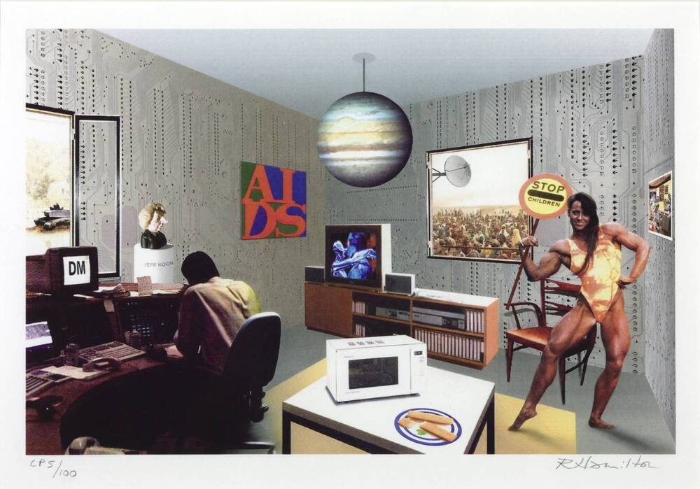
He took cutouts from popular magazines and displayed them in a new composition to convey a different context. However, the cutouts still communicated the same original meaning from popular magazines. This project was part of the This is Tomorrow group exhibition, featured in the catalog, and turned into a poster. To date, Hamilton’s work has become a British pop art icon.
Do you need unque visuals to pormote your product?
Work with Penji's team of experts for your pop art advertising needs.


Why Do Marketers Use Pop Art Advertising?
The marketing and business landscape is a fast-paced industry. People are bombarded with hundreds of online advertisements daily, and marketers aim to make their ads stand out. One evident reason marketers use pop art advertising is its versatility and powerful messaging.
It’s an attractive, unique, unconventional expression, different from ordinary ads people see. Pop art displays designs that work and connect with people through humor and reality. It picks up on popular culture that engages and stimulates consumers.
Another reason why pop art advertising is famous in marketing is how it makes mundane packaging and branding assets stand out. By using quirky compositions, dots, unconventional shapes, patterns, and lines, it evokes feelings of excitement and nostalgia.
Moreover, this type of art only uses minimal text, while the visuals speak their message. This is imagery at its finest, bringing versatility and diverse artistic styles that capture the audience’s attention.
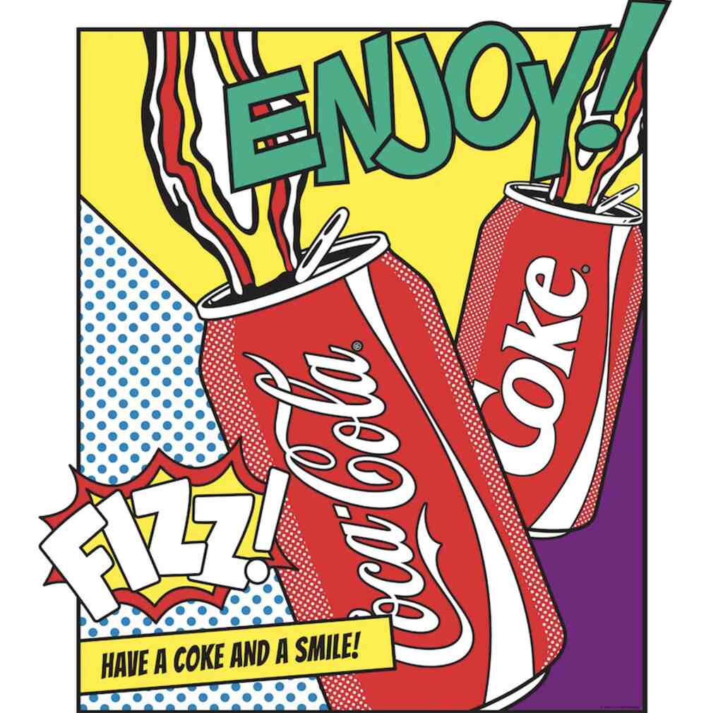
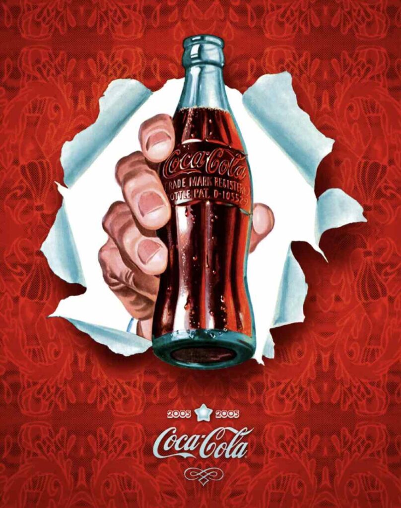
Coca-Cola is one of the first brands that use pop art to promote its products. The example above uses vivid colors, Ben-Day dots, and a brief copy.
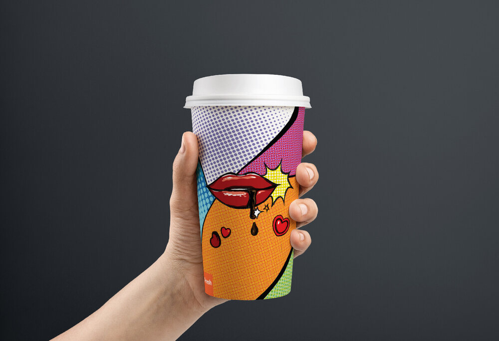
Here, another Coca-Cola pop art advertisement design uses simple composition, minimal color palettes, and retro flair.
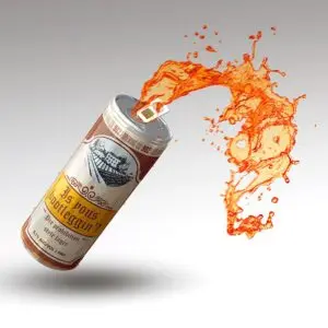
Here’s another example of coffee packaging that uses a compelling pop art style.
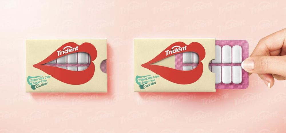
This Trident sugar-free gum brand features interactive packaging that displays a mouth. The transparent plastic shows the square white gums, which resemble teeth perfectly.
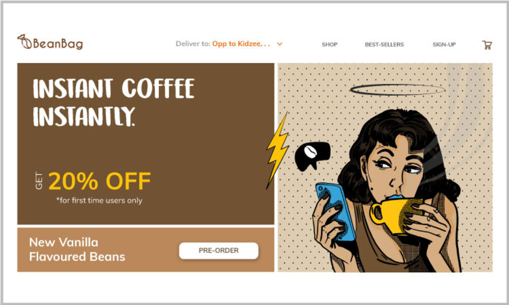
You can also transform your website into a beautiful work of art, connecting with your audience. Here’s a coffee brand’s landing page, with a simple illustration of a woman on Ben-Day dots holding a coffee mug.
What are the Characteristics of Pop Art Marketing?
Here’s what you need to include in your pop art marketing visuals:
- Recognizable visuals. Pop art draws inspiration from popular people and trends.
- Vivid colors. Bright colors make pop art stand out. Prominent reds, blues, and yellows are seen in many famous old and new designs.
- Collage. Collages also work in this type of art expression. Asymmetrical collages in vibrant colors and different patterns are commonplace.
- Satire, irony, and humor. Artists usually take recognizable objects from their original context and feature them in a new composition. They poke fun at current events and people and keep everything lighthearted.
Pop Art Advertising Best Practices
So how can marketers succeed in pop art promotional content? Here are some tips for using pop art advertising.
1. Focus on materialism and consumerism
Pop art picks up on consumerism, so it’s popular in marketing. The focus on consumerism and materialism is one of the central themes of this art style.
2. Use fame and celebrities
Since this art concept banks on recognizability, marketers leverage this by infusing fame and celebrities in their visuals. Think Hollywood, movie, magazine, and television stars.
3. Highlight ordinary objects
One way to make your products stand out on a grocery store shelf is through beautiful packaging. Focus on ordinary objects and transform them into unique creations, and product packaging is an excellent place to start.
4. Repetition
Most pop art images feature repeated images. Whether you use collages, overlays, or duplicates, repetition is crucial in pop art.
5. Enlarge and combine images
The use of satire is common in pop art. Artists combine images from their original context with dissimilar images conveying different meanings.
6. Use vibrant colors
Some pop artworks came out post-war, conveying affluence and optimism. Try combining primary colors, like blue, red, or yellow, with neons for a more vivid effect.
7. Lines and patterns
Pop art compositions consist of clean and sharp lines and various patterns. When put into one arrangement, the outcome is a non-distracting hodgepodge of beautiful shapes that pops.
Final Thoughts
Pop art advertising is a powerful strategy business owners and marketers can use to promote their products and services. There are plenty of techniques and expertise that go into pop art. If you want to embrace this type of advertising, work with only experts in this field.
Are you ready to create your pop art masterpiece? Sign up for Penji’s unlimited graphic design service today and let our team of experts handle it for you. Watch the demo video now for more information.
About the author

Table of Contents
- What is Pop Art Advertising?
- How Advertising Influenced Pop Art
- Why Do Marketers Use Pop Art Advertising?
- What are the Characteristics of Pop Art Marketing?
- Pop Art Advertising Best Practices
- 1. Focus on materialism and consumerism
- 2. Use fame and celebrities
- 3. Highlight ordinary objects
- 4. Repetition
- 5. Enlarge and combine images
- 6. Use vibrant colors
- 7. Lines and patterns
- Final Thoughts


