
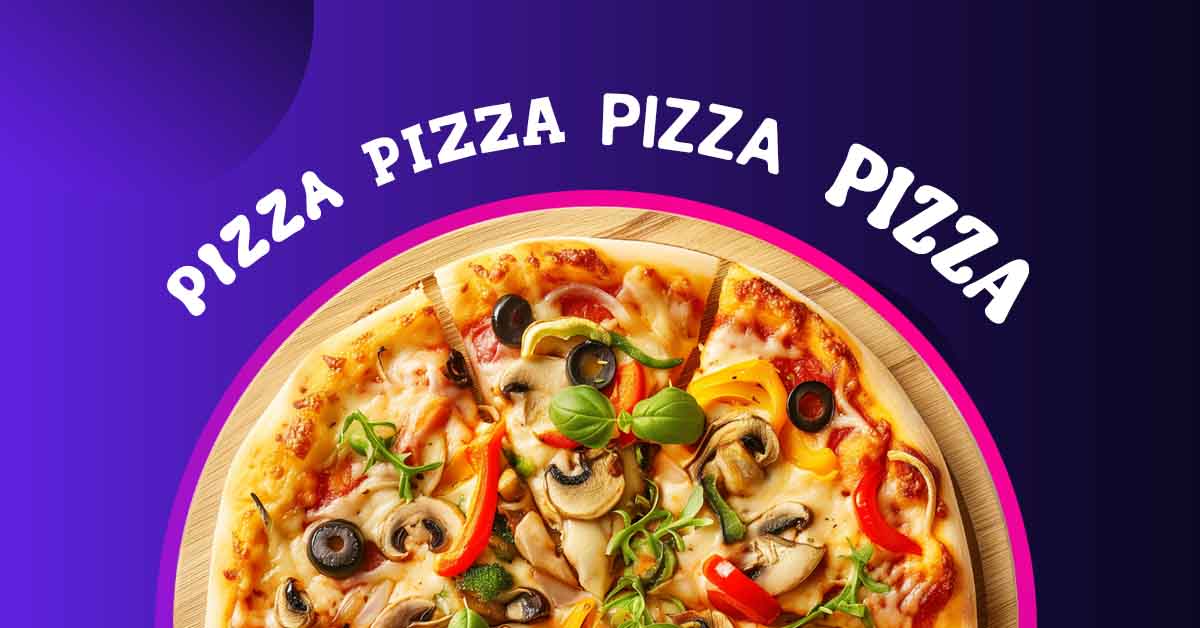
Can we all agree that pizza is a universal food? It’s not surprising that there are thousands of restaurants serving their own recipes. But that means the industry competition gets tougher by the minute. One way to gain more patrons is to have a compelling logo with an equally interesting pizza font. When done right, expect new customers wanting to get their own slice of pizza from your restaurant.
What we have here are some of the best pizza places around the world carrying amazing logos. Take a look, and perhaps, it’s about time to give yours a facelift.
FG Camilla Inspired by Lilla Napoli
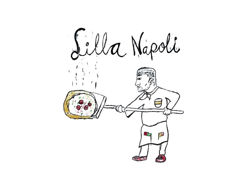
Lilla Napoli is a pizza place located in Sweden. And boy, we all wish to be there right this very moment. As you can see from the pizza font they used, it’s playful and raw. It’s even borderline childish, which gives it more appeal.
When you look at it, you can imagine yourself casually sitting in their restaurant, trying to enjoy every bite of your pizza paired with wine. While the food is exquisite, you won’t feel intimidated like what you’d usually feel in fancy restaurants. Seeing the entire logo, you know you will only have a great time.
Aldogizio Bold Inspired by figidini
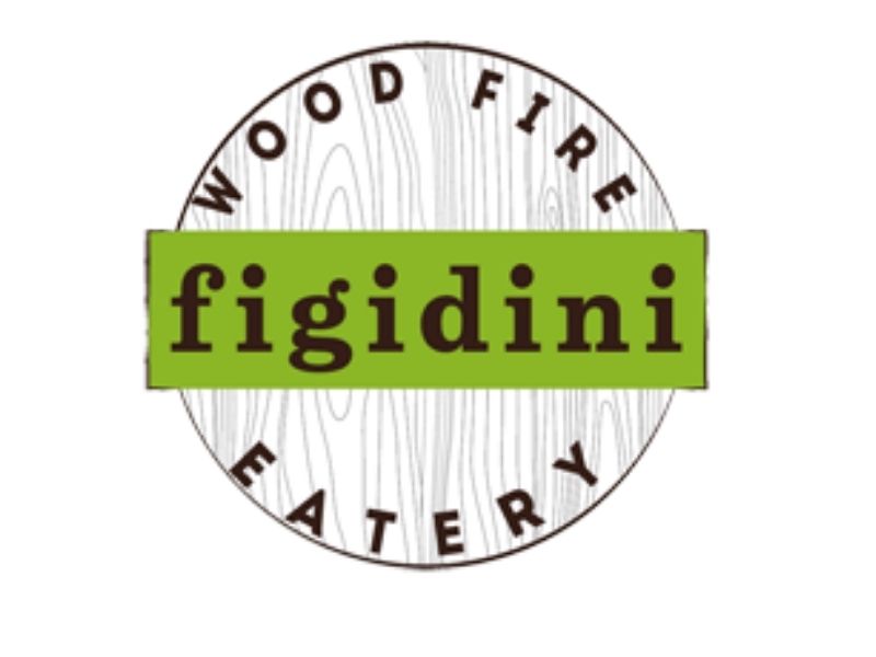
Next, we have the logo from figidini. What we love about their main pizza font is that it has that cartoonish yet classic feel. And since they used lower case for the restaurant’s name, it became more relaxed.
If you must know, figidini uses only one source to cook their menu. And that’s their highly traditional wood fire. Using a font that resembles traditional letterings seen from old newspapers and publications was a clever idea. They were able to successfully mix the old and the new.
Gunplay Three D Inspired by Imilla Alzada
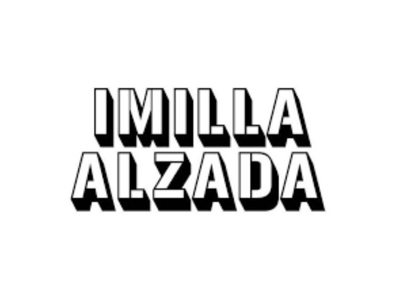
A smart technique that the designer used for Imilla Alzada was to add shadows to the font. Without that single element, the text will be dull. It makes the brand stronger, and it’s easier to scale.
The font itself is straightforward, which would work best if you want your products to be the main attraction of your restaurant. You wouldn’t want people to talk about your logo, but instead, you want them to highlight your offerings. Nevertheless, because it’s bold and clear, it does the job just fine.
Behtab Bold Inspired by Motorino
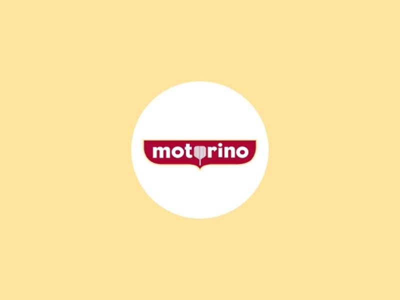
If you want a simple font for your pizza restaurant yet wish to leave an impact, then you can follow Motorino’s lead. The text itself is plain. But they used a peel to replace one of the Os. This means that you can add twists to your texts and be creative.
What’s good about the technique is that at first glance, you know that you are about to enter a pizza place even without the actual food on the logo.
Côté Bold Outline Inspired by Gazzo
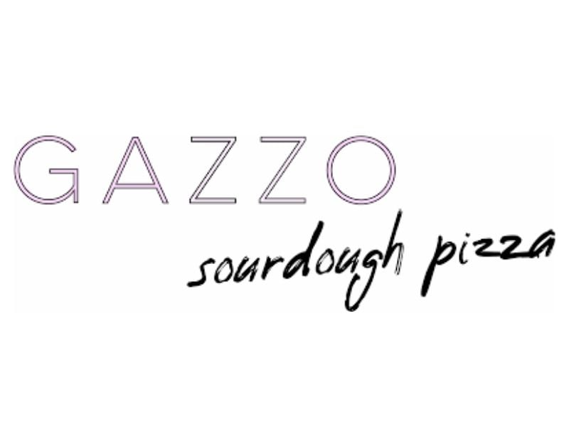
This is one of our favorites on the list. Just look at how ‘prim and proper’ the font used for Gazzo. It was then followed by scribbling. It’s like two opposing worlds merged into one. It’s so effective, you don’t even need to splash colors on it.
If you look at their menu, you can already tell that you will get the best of both worlds. And that’s exactly what you can see from their fonts too.
Republik Sans 01 Inspired by Gino’s Brick Oven Pizza
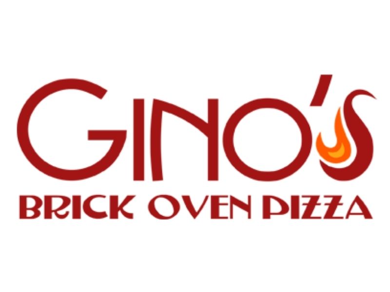
The strong point of using this style is that you can see the name of the restaurant from several feet away. It’s clear, sleek, and it’s hot! Adding a subtle design gives it flavor too.
Using multiple pizza fonts is perfect for emphasizing both the name and their main offering. Even if you are not familiar with the restaurant, you can be sure to get an authentic brick oven pizza.
American Captain Inspired by Paesano
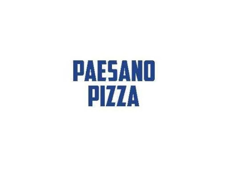
Looking at the font used for Paesano, it resembles a more futuristic appeal. But don’t be fooled as they have one of the best traditional Napoletana pizza.
The good thing about the style is that it has a universal appeal. And that makes sense because this pizza place serves a diverse range of customers. If you wish to cater to a group of friends wanting to have a quick bite, or a family celebrating a milestone, this has got to be the place. Their pizza font screams, ‘It’s for everybody.’
Febiolla Regular Inspired by Pepe In Grani
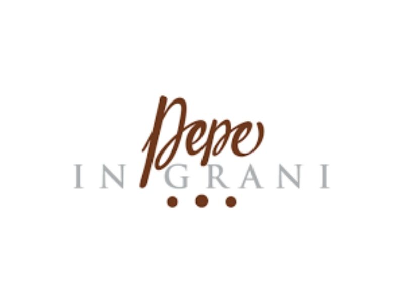
Something is captivating with fonts that resemble real handwriting. And this is what you can see from Pepe In Grani. It has that personal touch, and you feel that every food prepared for you was made out of passion.
Think about how you would feel if you received a handwritten letter as opposed to an email. The message becomes more special, doesn’t it? The same goes for this logo using a beautiful style for its texts.
Grobek Heavy Inspired by Proof
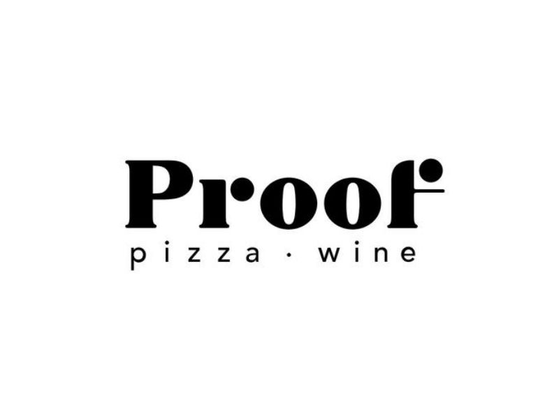
The pizza font used by Proof proves that a style can indeed position your brand. If you visit their restaurant, it’s stylish and sophisticated but not to the point that you would want to wear a tux. That’s what you also feel when you take a closer look at their choice of font.
Over the years, we’ve seen many businesses using a minimal approach. And that’s fine because it can also send a strong message when executed properly.
Delichia Inspired by Pizzeria Montana

The font they used reminds us of robots or a boy’s playground. Without much of a surprise, that’s what you can expect from their store. It has playful colors and fun furniture. It’s a good decision that they didn’t go all out with their logo by adding colors and other design elements. They kept it simple, which balances an eccentric restaurant.
Choosing the Right Pizza Font
Is there a perfect pizza font to use?
The answer depends on your business. Ideally, the font should be anchored on your restaurant’s theme, mission, vision, and even the market. For example, if you positioned your pizza restaurant as luxurious and high-end, using a more refined style could work.
However, if you offer a casual dining experience, you can use playful fonts, and you can be a bit experimental as well. If you will notice in a few samples above, other designers used multiple pizza fonts. Some are even contradicting. But that’s the beauty of it as it makes the entire logo even more interesting. And with that alone, it becomes a work of art.
Take note that in all cases, your pizza font should be readable. Before you approve the design, imagine yourself meters away from the storefront. Do you think you can still read your restaurant’s name? If not, then you better tell your designer to change it.
Conclusion
Using the right pizza font can change the overall look and feel of your logo. Some designers convey the message using icons and illustrations. But only the best ones can do the same with fonts.
Speaking of the best, you should try the services of the Penji team. Our pool of experts has created logos not just for pizza restaurants but also for other niches. This means they have extensive experience that could help you build a logo that works. Sign up now and enjoy unlimited graphic design requests for a fixed fee every month. Now that’s quite a slice!
About the author

Barbara Anne Isla
BA Isla is a Content Writer and also an Events Host. She left the corporate world to do what she loves and to spend more time with her amazing kids. She hopes to bring valuable change to society with her words.
Table of Contents
- FG Camilla Inspired by Lilla Napoli
- Aldogizio Bold Inspired by figidini
- Gunplay Three D Inspired by Imilla Alzada
- Behtab Bold Inspired by Motorino
- Côté Bold Outline Inspired by Gazzo
- Republik Sans 01 Inspired by Gino’s Brick Oven Pizza
- American Captain Inspired by Paesano
- Febiolla Regular Inspired by Pepe In Grani
- Grobek Heavy Inspired by Proof
- Delichia Inspired by Pizzeria Montana
- Choosing the Right Pizza Font
- Conclusion


