

Logo design and photography have more in common than we previously thought. They are both visual materials that serve as excellent branding assets.
Just as in any industry, a logo for photography is a crucial element of a business’s identity because of the following reasons:
- Your logo is often the first thing customers see, whether on a website, social media, packaging, or advertisements.
- A well-designed logo immediately communicates professionalism, credibility, and the essence of your brand.
- A distinctive logo helps customers remember your business and recognize it in a crowded marketplace
- A logo is a visual representation of your brand’s personality, values, and mission.
- The colors, fonts, and design elements convey emotions and messages that help shape how customers perceive your brand.
- Your logo helps differentiate your business from others in your industry.
If you’re in the photography business and are looking to design your photography logo, here are Penji’s best examples you can get ideas from. You’re welcome!
1. Incorporate Playfulness
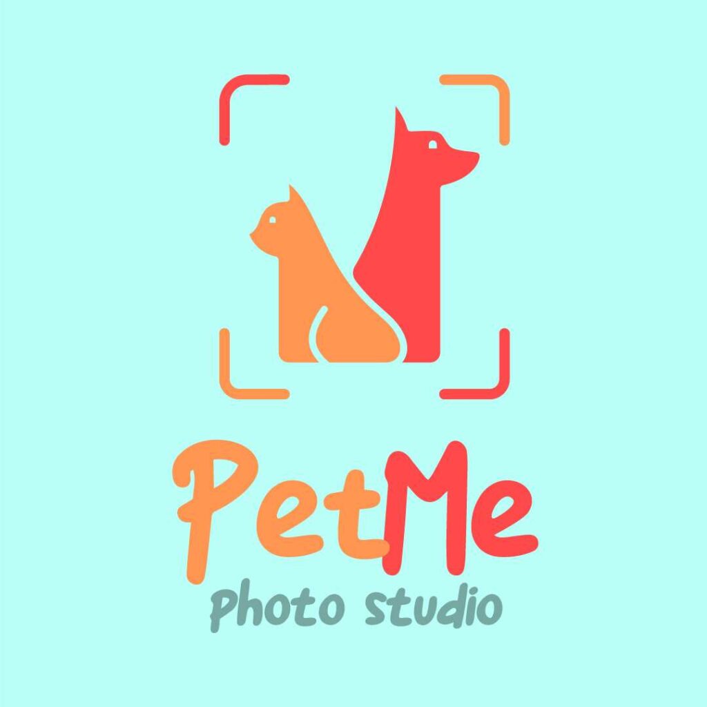
Playfulness in design is not just for kids; it can be a great way to let your brand stand out and create a memorable experience for the customer. Brands incorporating playfulness into their design have seen increased customer engagement and can attract more people, leading to increased sales and revenue.
A playful logo design has a sense of lightheartedness to it. This type of design often uses bright colors, graphics, and shapes to create a lively appearance. The best playful logo designs, such as this pet photography logo, are appropriate for the target audience and check all the right boxes for fun and brand relevance.
Photography logos to make your brand stand out
Create unique logos in 1-2 days


2. Add a Splash of Color
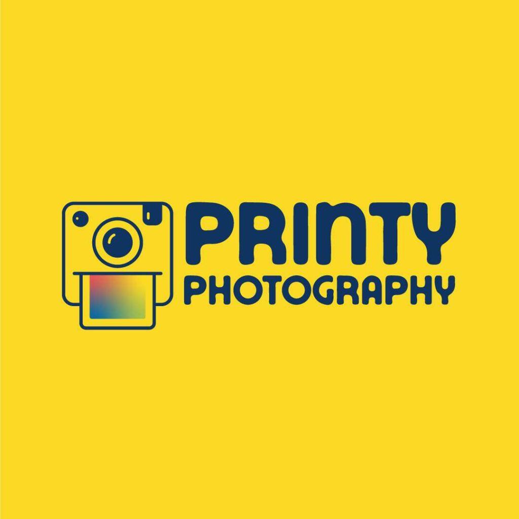
If you want your logo to have impact, adding a splash of color to an otherwise plain design could be the answer. It’s a different technique than those that use a variety of colors throughout the procedure. When you add a splash of color, you choose a specific element to highlight and make it stand out.
For instance, this example added a splash of color to a simple cube logo design to emphasize the strength of their brand – photo printing.
3. Get Low-key but Classy

If you are designing your photography logo, ensure it doesn’t look too complicated or overly detailed. You can opt for a design that will stand out from the rest through the low-key but well-thought-out use of elements.
When you design with deeper layers of meaning, you can engage your audience while giving a classy and more complex tone. Like in this infinity logo design for a photography studio, they implemented many subtle but effective design choices to create an elegant piece that speaks volumes about the brand.
4. Hide Elements in Plain Sight

What do you see when you first look at this photography logo? Did you see an eye or a bird? Did you also notice how the brows resemble a plane or a pointed arrow pointing upward? Now that’s what you call a masterful design!
A logo is the image of your business, and it should be designed in such a way that it will pique the interest of your intended audience. One method is to entice them with a hidden element within your design which will prompt customers to have a second look at your logo and effectively remember your brand.
5. Stick with Monochromatic
A monochromatic logo is a logo design with one color. It’s simple, clean, and timeless. It’s also a great way to go if you’re not yet sure of your brand identity. You can later add other brand colors to your logo, but for now, focus on the one color you decide on.
The primary reason for going monochromatic is that it is easier to design and maintain. In addition, when you use a single color, you can create a logo with fewer complexities making it easier to keep your branding consistent, just like in this design example. This style makes for an logo for photography, as seen on the example.
6. Go 3D

3D logos are becoming increasingly popular with their distinctive multidimensional look and feel. Companies use 3D effects to stand out from the crowd of 2D designs, especially when viewed on a screen or on social media. They also have a better chance of sticking in people’s minds.
A study on how 3D images promote products on the internet discusses that “vibrant images in 3D with high detailing have a persuasive effect on the shopper”. It’s because 3D designs have an added depth that makes them more memorable for the viewer. Just look at how impactful this 3D photography logo is. As you look at it, it further pulls you in.
7. Celebrate Minimalism
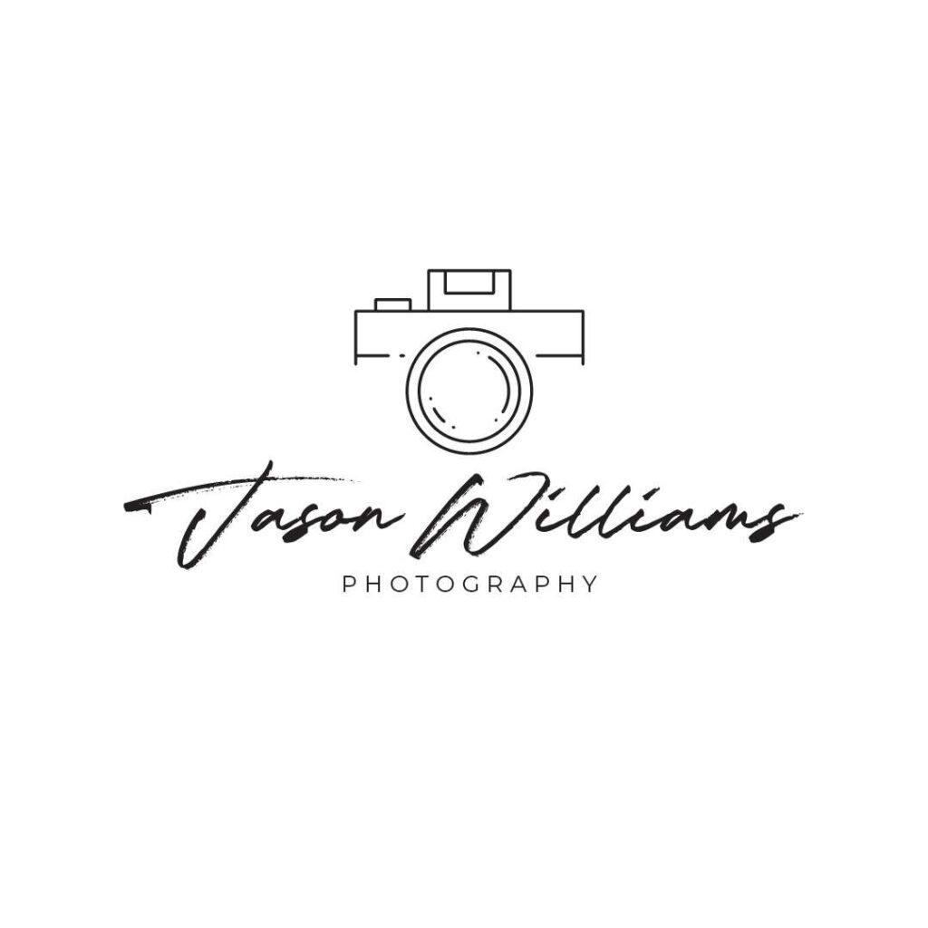
Photography logos with a minimalistic design are effective in the way that they represent simplicity and clarity, which are two critical components of successful branding.
Logos are essential for a brand, and it’s what people notice first and the symbol of a company’s identity. That said, a logo for photography should not have any unnecessary details or elements that distract the viewer from understanding its meaning. The logo design should be clear and visually appealing to viewers so they can remember it easily.
8. Take Inspiration from Your Brand Name
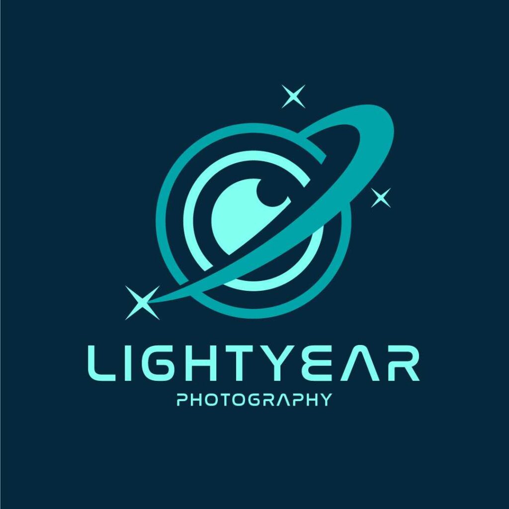
You can find the best source of inspiration for your logo design in the brand or company name itself. Music logo and tech logo designs, for instance, often take cues from the brand name itself as their industries are so distinct in their services.
For example, look at this photography logo, which is based on the company name and has an intergalactic space theme. Using different shades of blue also supports the outer space feel while establishing a sense of trust in a business, based on the Psychology of Colors in Marketing and Branding.
9. Aim for Balance & Symmetry
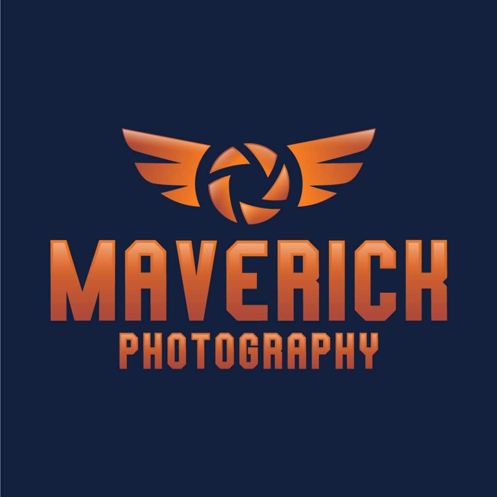
Balance is an essential aspect of design, with colors and shapes being two significant factors that affect it.
Just like one of these photography logos: You can use colors to create balance by offsetting one color with another, while you can use shapes to create symmetry in a design. Designers should always keep in mind the balance of a logo. A logo with a good balance is more pleasing to the eye are unforgettable.
10. Scalability is Crucial

One of the biggest concerns for a logo design is scalability. Scalability is a crucial factor in logo design. The reason is that the logo needs to scale across many media and retain its quality. It also needs to fit in various sizes, such as a business card, billboard, and even an email signature.
A scalable logo can be resized while maintaining its quality. So, before you add many elements or colors, think about how it will look when printed in black and white and used on a smaller platform. Keeping all the changes in mind, are all the details still recognizable?
Elements of Photography Logos
How do you create a compelling and memorable photography logo? Here are a few elements to keep in mind.
Color Psychology
Colors play a pivotal role in logo design, especially in the field of photography, where visual aesthetics are key.
Image Credit: Elizabeth Iris
That said, the choice of color in a photography logo can significantly influence how potential clients perceive the brand, and it can also establish an emotional connection with the audience.
- Red. Often associated with passion, energy, and excitement, red can be used to create a sense of urgency or to draw attention. For photography brands specializing in dynamic and high-energy photography, like sports or event photography, red can be an excellent choice.
- Blue. This color is synonymous with trust, dependability, and professionalism. Photography businesses that want to project an image of reliability, such as corporate or family photographers, may find blue a suitable choice.
- Green. Representing growth, freshness, and creativity, green is ideal for nature and outdoor photographers. It resonates well with audiences looking for organic and natural imagery.
- Yellow. Evoking feelings of happiness, optimism, and creativity, yellow can be used to attract a youthful and energetic clientele. It’s perfect for brands that are all about fun, such as party photographers.
- Black and White. These classic colors symbolize sophistication and elegance. Black and white are often used by photographers who specialize in monochrome photography or those aiming for a timeless, classic brand image.
Symbolism and Imagery
Symbols and imagery are the essence of a photography logo, as they can convey a brand’s story and specialty at a glance.
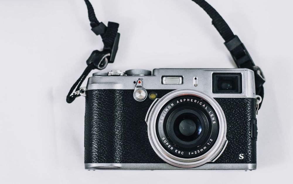
Image Credit: Marx Ilagan from Pexels
Here are usual symbolism and imagery used in photography logos:
- Camera Icons. The most obvious choice for a photography logo, camera icons can range from vintage camera illustrations to modern, abstract representations. The style of the camera icon should align with the brand’s identity – a sleek, modern icon for a high-tech photography studio, or a retro camera for a photographer specializing in vintage-style shoots.
- Shutter Symbols. Often used to represent the act of capturing a moment, shutter icons can be stylized in various ways to convey different brand messages. A fast-moving shutter could indicate a focus on dynamic, action photography, while a more classic shutter design might be used for traditional portrait photography.
- Light and Shadows. Playing with light and shadow in a logo can be a subtle nod to the art of photography itself. This can be particularly effective for photographers who specialize in playing with light, such as studio or artistic photographers.
Typography
The choice of font in a photography logo is crucial as it sets the tone for the brand and complements the visual elements.
Image Credit: Skylar Kang from Pexels
Here are a few choices to consider:
- Serif Fonts. These fonts are often associated with tradition and respectability. They work well for photography businesses that want to convey a sense of elegance and timelessness, such as wedding or fine art photographers.
- Sans-Serif Fonts. Offering a clean and modern look, sans-serif fonts are versatile and can be used for a variety of photography styles. They are particularly suited to contemporary photographers who want to project a sleek, modern brand image.
- Script Fonts. These fonts can add a personal, artistic touch to a logo. They are ideal for photographers who want to convey creativity and individuality, such as portrait or bespoke event photographers.
- Custom Typography. Sometimes, the best option is a custom font that is unique to the brand. This can be particularly effective for photographers whose work is highly distinctive or who have a strong personal brand.
Frequently Asked Questions (FAQs)
How can I make my own photography logo?
Look at other photography logos, especially those in your niche, for inspiration. Then, decide on the key elements of your logo, such as color, typography, and imagery. Once you have a clear idea, use graphic design software or online logo makers to create a more polished version of your logo. If you find the process overwhelming or want to ensure professional quality, reach out to Penji for unlimited graphic design services at flat rates.
How can I make my own logo from a picture?
Choose a picture that represents your brand well – it could be anything from a photograph you’ve taken to a unique graphic element. Logos need to be clear and recognizable even when scaled down, so use a photo editing software to simplify the image. You can then play with the color palette, text style, and layout.
The Bottom Line
A strong photography logo can do more than represent your business; it can capture your brand identity and make your customers feel like they know you on a new level.
Want a photography logo that expresses your brand identity in a snap? Penji can! We offer unlimited designs at a flat monthly cost, and our expert designers will ensure you’ve got the perfect logo for your brand.
Sign up now and get a 30-day money-back guarantee. Plus, here’s an offer for you – enter voucher code LOGODESIGN15 at checkout to enjoy 15% off on your first month.
About the author

Carla Deña
Carla is a journalist and content writer who produces stories for both digital and legacy media. She is passionate about creativity, innovation, and helping small businesses explore solutions that drive growth and social impact.
Table of Contents
- 1. Incorporate Playfulness
- 2. Add a Splash of Color
- 3. Get Low-key but Classy
- 4. Hide Elements in Plain Sight
- 5. Stick with Monochromatic
- 6. Go 3D
- 7. Celebrate Minimalism
- 8. Take Inspiration from Your Brand Name
- 9. Aim for Balance & Symmetry
- 10. Scalability is Crucial
- Elements of Photography Logos
- Color Psychology
- Symbolism and Imagery
- Typography
- Frequently Asked Questions (FAQs)
- How can I make my own photography logo?
- How can I make my own logo from a picture?
- The Bottom Line


