In a world dominated by digital marketing, are magazine ads still worth your time? The answer might surprise you.
While the internet has taken over many aspects of advertising, print media—especially magazines—offers a unique opportunity to create lasting impressions in a way that digital ads can’t always replicate.
Despite the digital shift, did you know that newspaper and magazine publishing has a compound annual growth rate of 2.9% and is expected to grow to a market size of $231.66 billion in 2028?
With such a huge market, it’s no surprise why many brands invest in the best print ads.
In this article, we’ll discuss what goes into advertising art that puts the brand at the forefront. After that, you’ll learn about how you can get professional magazine ad designs on demand by signing up for Penji.
What Goes on a Magazine Ad?
According to the Houston Chronicle, a page in a local magazine can cost a few hundred bucks. On the other hand, magazine ads in popular national publications can set you back a staggering $500,000.
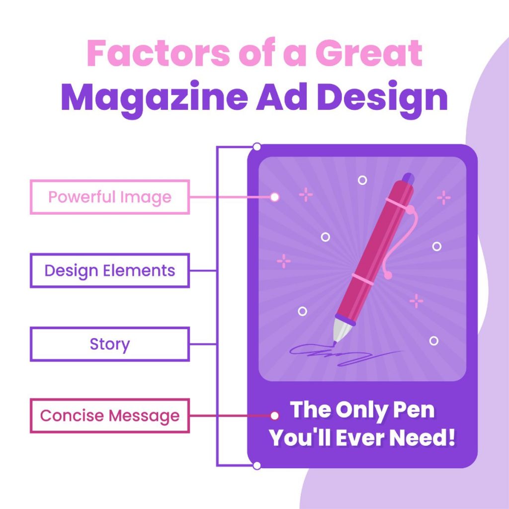
Here are some factors to keep in mind when brainstorming design ideas for the best print ads:
- Concise Message. Both visuals and text should be short and sweet. Your ad should capture readers’ interest at a glance; assume that they don’t have much time to read through a long copy.
- Powerful Images. Likewise, the image should be interesting enough to make the audience stop flipping the pages and focus on your ad. It should hook them the moment they lay eyes on it.
- Design Elements. A witty copy and an attention-grabbing image won’t work if they aren’t related to the story of your brand. Every marketing asset is a building block you use to lay the foundation for your brand’s image.
- Story. The graphic must display a good grasp of design aesthetics. Lines, colors, typography, and all other elements should work together to form a solid and cohesive visual message.
Ensuring these factors are covered can help your magazine ads appeal to your audience and improve brand recognition.
The 15 Best Examples of Magazine Ads
There’s no magic formula for a magazine ad design template that works every time. However, looking at top graphic design ad examples can surely inspire you to create the best visual for your brand. Here are thee best print ads to motivate you as you brainstorm your own.
1. Revolution Cooking
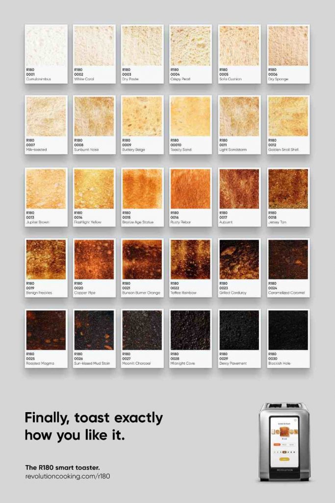
This magazine ad design for a smart toaster brand is surely eye-catching. What looks like a board of color swatches at first glance turns out to be various levels of toast-doneness.
2. Save the Children Indonesia

Initially, this image seems to be harmless – a kid enjoying a popsicle. However, the threat lurking underneath the frozen treat creates to a striking message.
3. Nissan
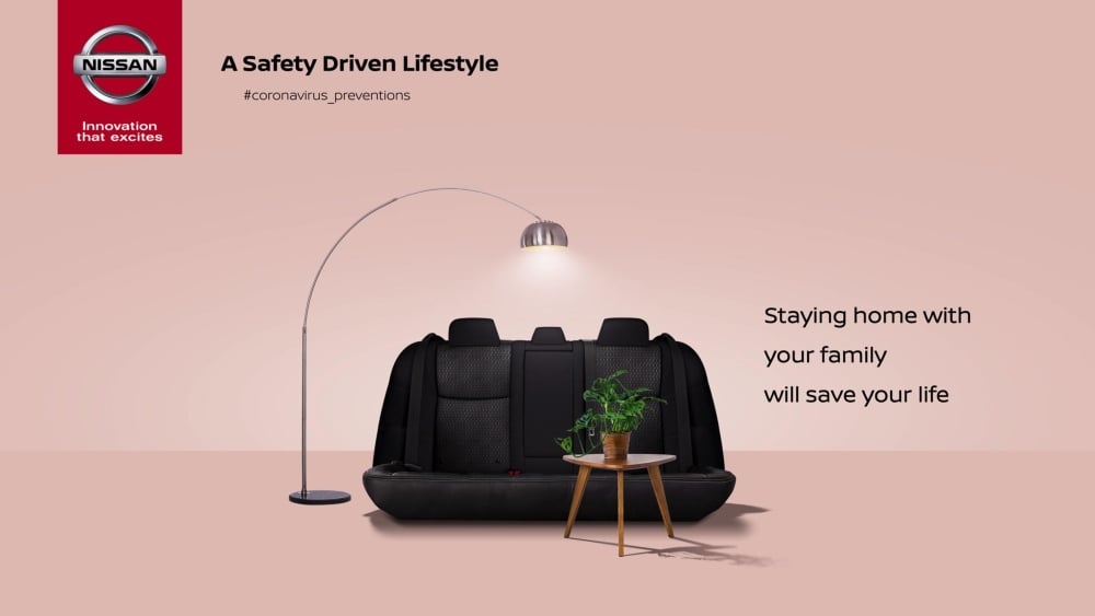
One trait of award-winning magazine advertising is their subtle wit. This print advertising, for example, encourages people to stay at home amid the COVID pandemic. It’s not necessarily an ad for Nissan, but it uses the brand’s image cleverly to convey its message.
4. McDonald’s
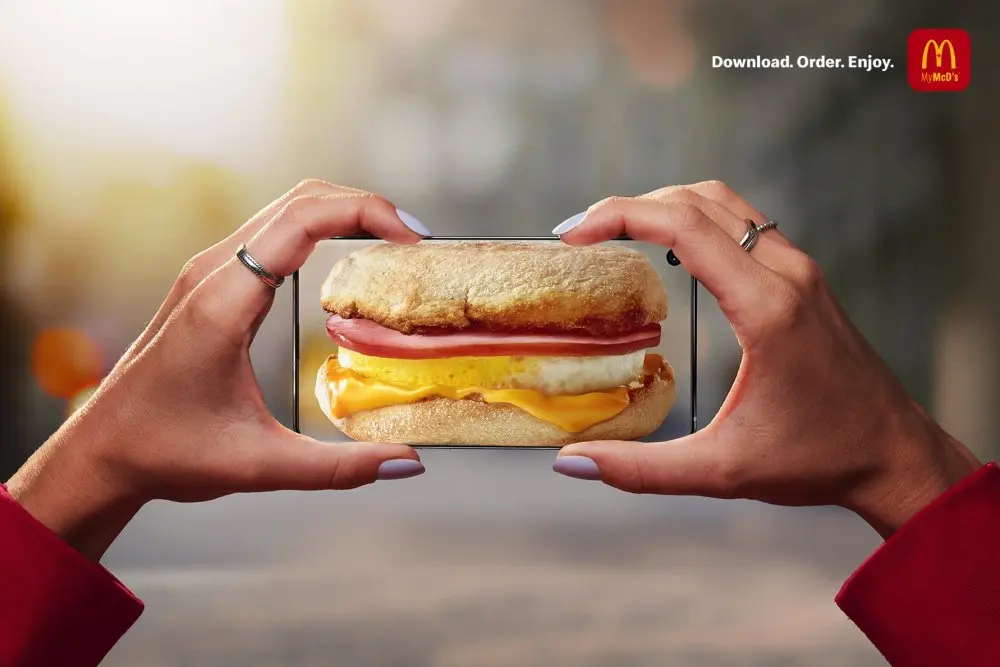
If you’re looking for ways to make your magazine ads amusing, McDonald’s offers a great example. The hands look like they’re holding a breakfast sandwich at first glance, which turns out to be an image on a smartphone.
5. Bonn
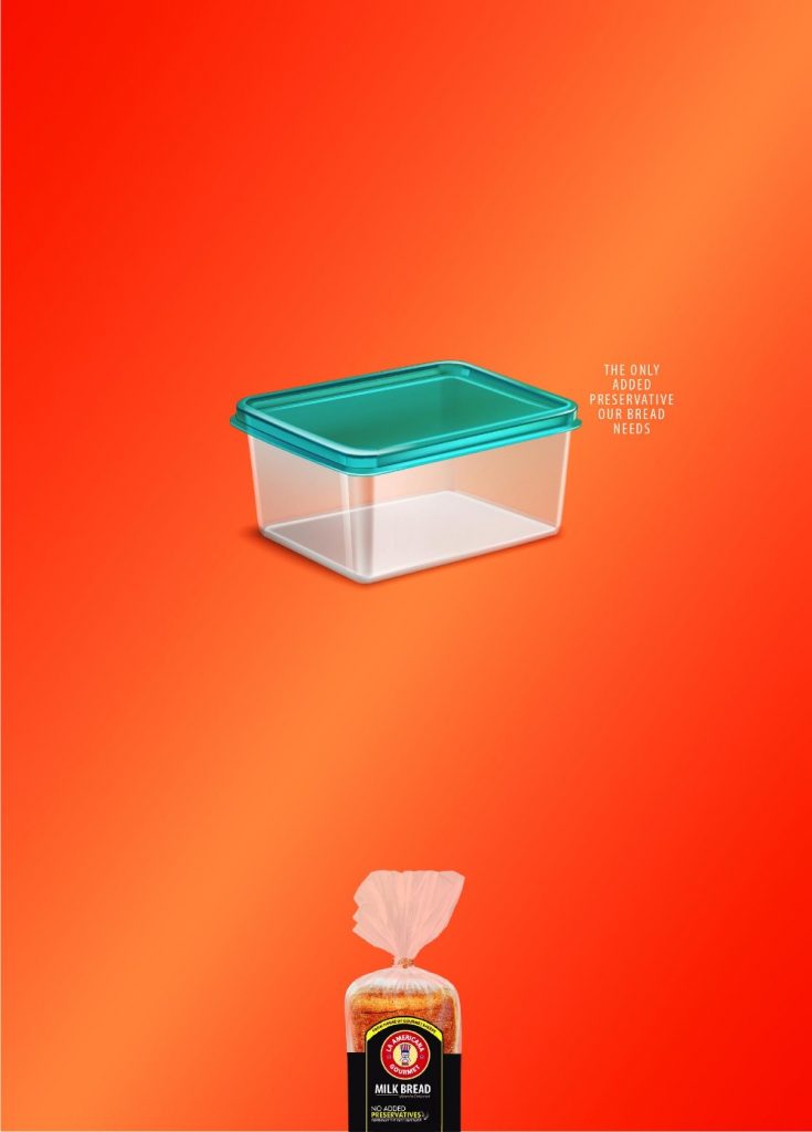
This magazine ad design proves that a minimalist graphic design can be just as compelling if done correctly.
6. Keloptic

This optical firm created a series of magazine advertisements for their print campaign. Iconic expressionist paintings, like this self-portrait by Van Gogh, are turned into hyperrealistic images with the help of eyeglasses.
7. WeightWatchers
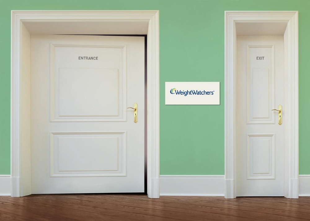
This campaign for WeightWatchers used humor to appeal to its audience and get its message across at a glance. While some would consider the ad distasteful, it directly reaches WeightWatchers’ target audience: people concerned about their weight.
8. Pedigree
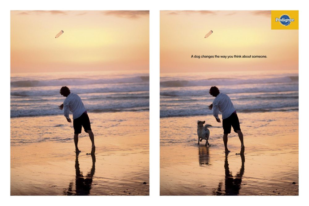
The ad aptly shows how a graphic designer’s skills in photo editing can lead to a powerful visual and one of the best print ads that are simple yet impactful.
9. Top Fit

This image evokes a crime scene to humorous effect, encouraging guilty eaters to “clear their conscience” at the gym.
10. Nivea
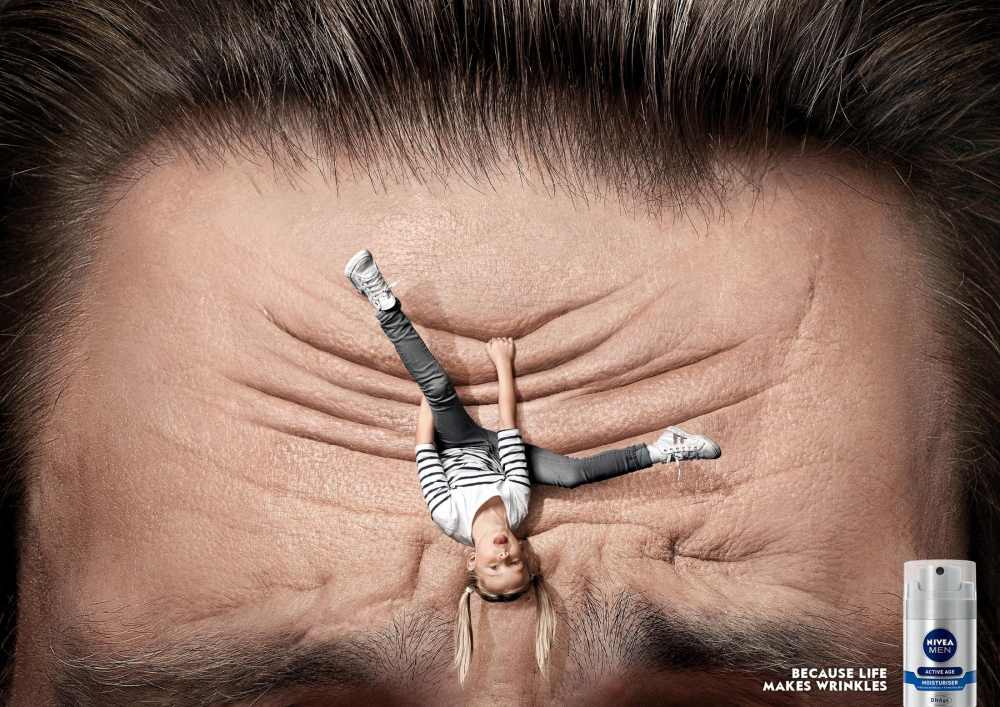
This magazine ad for Nivea connects to its middle-aged male target audience with clever visuals. Fathers know the stress that can come from raising kids, and this design conveys that with gentle, loving humor.
11. Alkolinjen
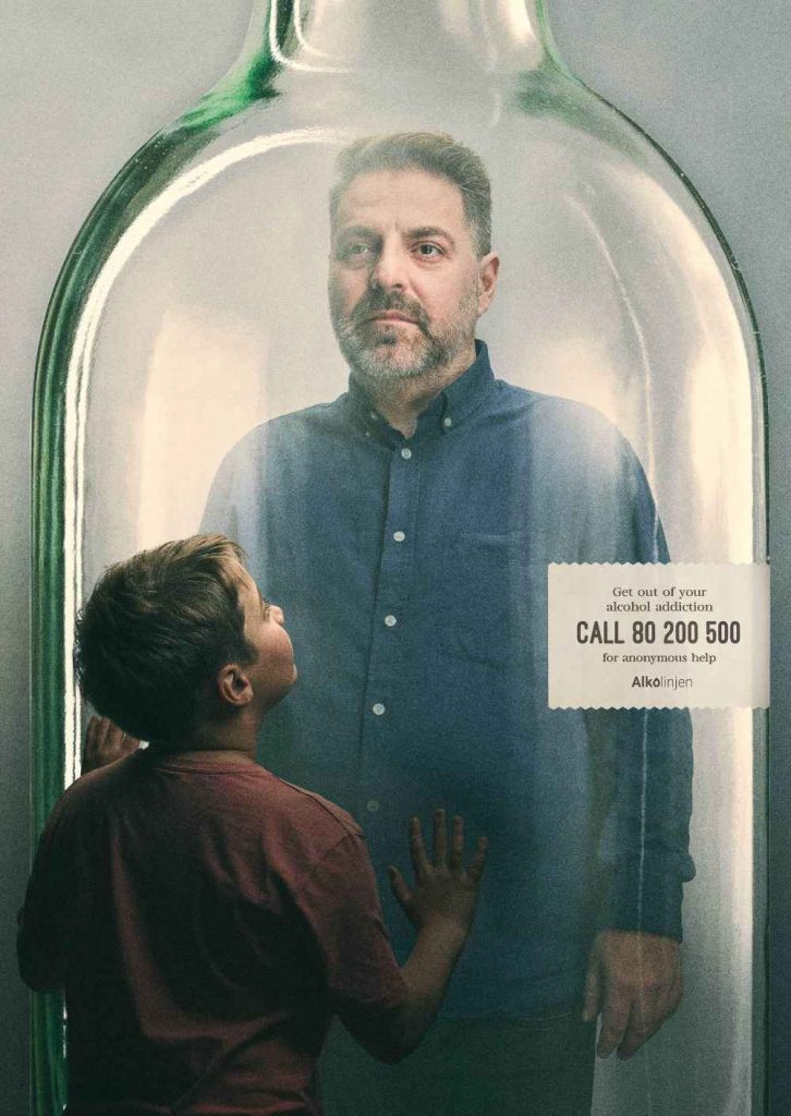
One of the best print ads that raise awareness, this image shoing a man trapped inside a bottle, was created for a Danish org that helps people battle alcoholism.
12. Volkswagen
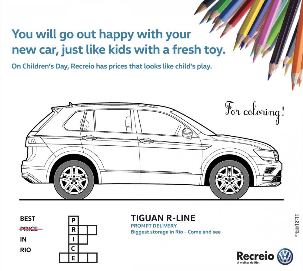
Holidays are a perfect time to put a little extra love in your magazine ads. This Brazilian Volkswagen advertisement offers a free coloring and activity page in celebration of Children’s Day.
13. Febreze
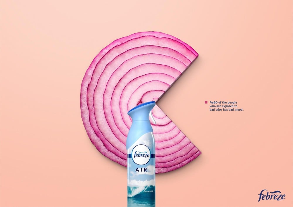
Good magazine ads do two things at once, but this Febreze advert manages three. First, the onion represents a bad odor. Second, the negative triangular space mimics the spray from the Febreze bottle. And last but not least, the overall image looks like a pie chart that represents the given statistic.
14. Lowcucar
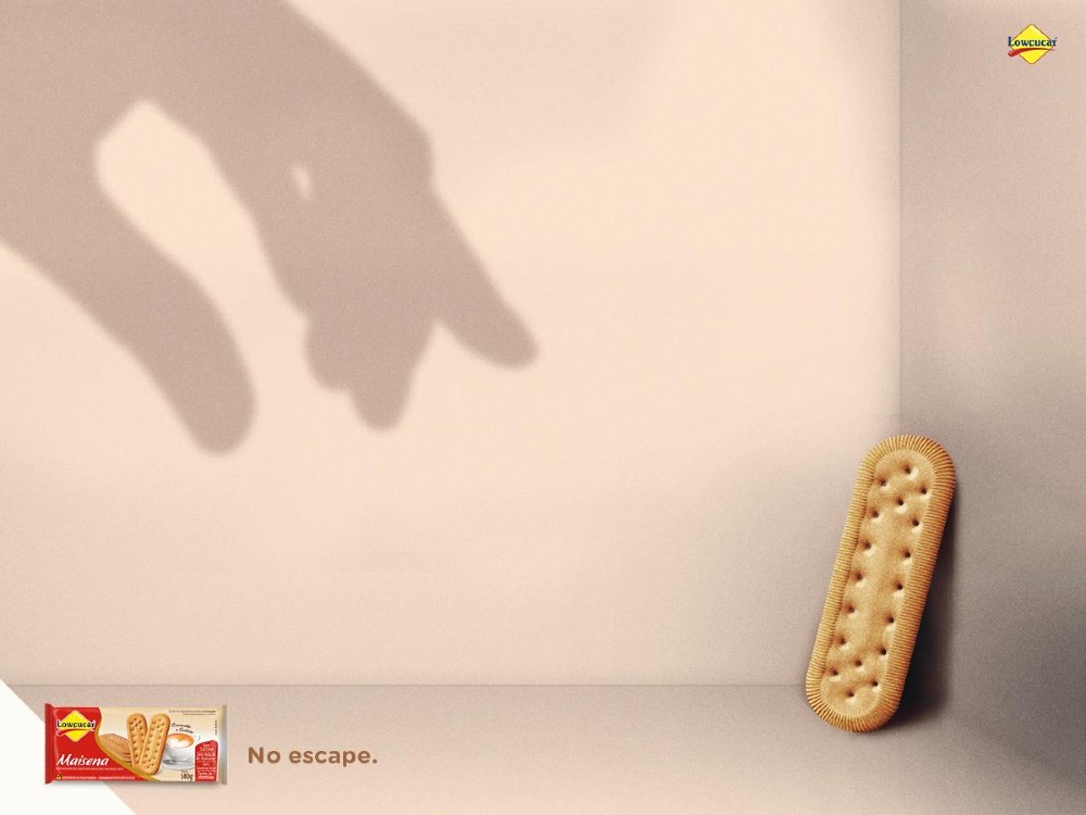
This ad for a biscuit brand playfully hints at a monster closing in on its prey.
15. Audi
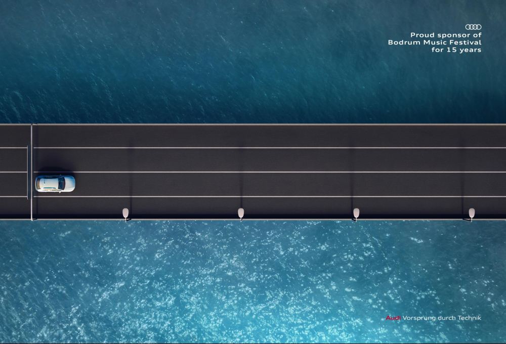
This print ad for Audi, being a sponsor of a music festival, paints two pictures in one: a road trip and a guitar fretboard.
16. Del Monte

The “Always Healthy” ad campaign by Fresh Del Monte is a testament to the brand’s goal to offer fresh and healthy products. The ad design likely showcases vibrant images of fresh fruits or produce, emphasizing their natural goodness.
This magazine advertising strategy is aimed at a target audience that values health and wellness. That said, the ad placement in health or lifestyle sections would further enhance its reach
17. A Renaissance of Hope

Drawing from the Renaissance era’s art and culture, the ad campaign aims to raise awareness about breast cancer. The print advertising strategy design is meticulously crafted to resonate with a target audience looking for inspiration and positivity.
The ad placement in art or culture magazines would be ideal, ensuring maximum circulation and reach. The campaign aims to increase brand awareness and showcase the ROI of associating with such a powerful message.
18. Boroume
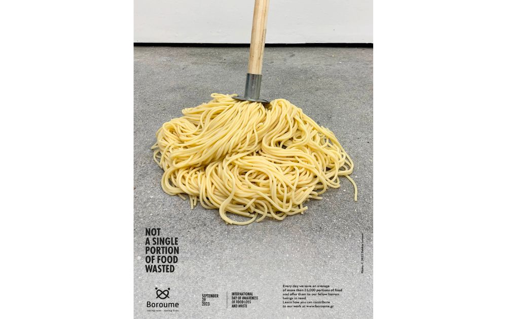
Also included in our best print ads is this magazine advertising campaign featuring a discarded serving of spaghetti transformed into a floor mop. As seen on the image, it offers a striking visual metaphor, focusing the efforts of Boroume, a non-profit organization.
They rescue food from thoughtlessly being thrown away, ensuring it reaches those in need. It was crucially timed on the International Day of Awareness of Food Loss and Waste 2023.
19. CYCLE Kids
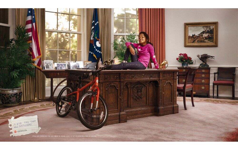
This campaign, masterminded by Ogilvy Health for CYCLE Kids, focuses on a journey that begins with learning to ride a bike. The print ad’s compelling design features young cyclists, their images seamlessly blending with depictions of their dream professions.
This ad campaign, targeting a youthful demographic, underscores the ROI of dedicating time to mastering cycling. With strategic ad placement in children-centric and family-oriented magazines, it’s poised to achieve expansive circulation, amplifying brand awareness for CYCLE Kids.
How do I create magazine ads that stand out?
As mentioned earlier, print ads in major magazines can be expensive. Still, there’s a reason companies are always willing to pay for them.
So, how do you craft a magazine ad that resonates with readers?
- Understand the requirements. First, know that ads vary in size depending on publications, so it’s important to understand the specifications. That said, it would help if you got the proportions right. Otherwise, your advertisement could look distorted when resized.
- Capture attention. Before choosing an image, colors, and words for your ad, you must think about how you want your readers to react. While you want them to know about your products or services, you won’t be able to include everything. So, you should create artwork and a headline to impress your readers.
- Check your layout. Many design software, including AI graphic design tools, are available nowadays. However, most designers start with a pencil and paper. You don’t need to measure everything, but having a sketch lets you visualize how your advertisement would appear on a magazine page.
- Make every image and word work. Every image in your magazine ad should evoke emotions, tell a story, and reflect your brand. Craft the words concisely and impactfully. Every element should work together, forming a harmonious balance that captivates your audience.
But empires aren’t built on magazine ads alone. For one, you’ll have to make sure that your print advertisements are professionally designed. In addition, they also have to match the look and feel of your whole brand across all platforms.
With these things in mind, it’s safe to say that the easiest way to get high-quality designs from world-class graphic designers is with an unlimited design service like Penji.
With Penji, you can sign up today and see designs tomorrow. Our team of experts will create magazine ads, posters, logos, and everything else under the graphic design umbrella for a simple monthly rate.
Interested in Penji? Watch the demo video to see how it works.
About the author

Carla Deña
Carla is a journalist and content writer who produces stories for both digital and legacy media. She is passionate about creativity, innovation, and helping small businesses explore solutions that drive growth and social impact.
Table of Contents
- What Goes on a Magazine Ad?
- The 15 Best Examples of Magazine Ads
- 1. Revolution Cooking
- 2. Save the Children Indonesia
- 3. Nissan
- 4. McDonald’s
- 5. Bonn
- 6. Keloptic
- 7. WeightWatchers
- 8. Pedigree
- 9. Top Fit
- 10. Nivea
- 11. Alkolinjen
- 12. Volkswagen
- 13. Febreze
- 14. Lowcucar
- 15. Audi
- 16. Del Monte
- 17. A Renaissance of Hope
- 18. Boroume
- 19. CYCLE Kids
- How do I create magazine ads that stand out?

