Every successful entrepreneur and marketer will tell you that logos can make or break your business. An effective logo can tell customers instantly what your brand is about and how you can impact their lives positively. However, designing one can be a laborious and time-consuming task. With the advent of Artificial Intelligence or AI, creating logos has become faster and easier.
The importance of logo AI designs cannot be overstated – and that’s why we’re here to help you choose the best one for your business. Here are ten AI companies and the design ideas we can get from their logo designs.
1. Drop a Hint
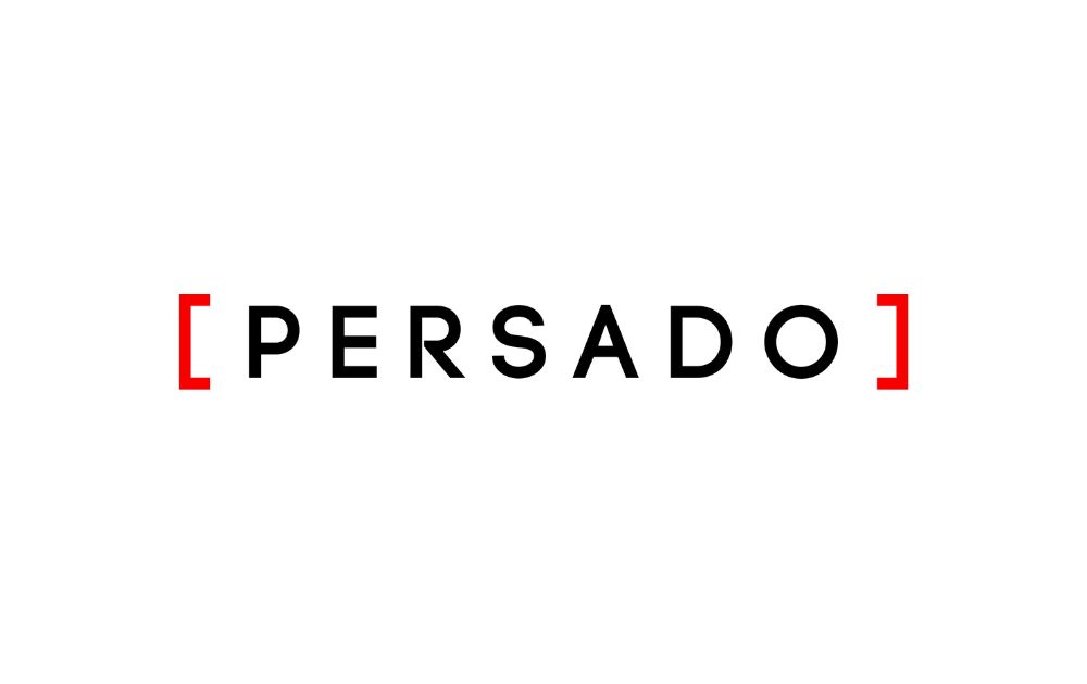
The best logos convey the most with their simple design, even those made with an AI logo generator. Persado’s AI logo is a master class in designing for your audience. Brackets are an integral part of many programming languages. And despite their unassuming characteristic, the bracket’s role in the tech is one that anyone in the field will understand. Using it in your company’s brand is an excellent signal of what your business is about.
2. Make them Look Twice
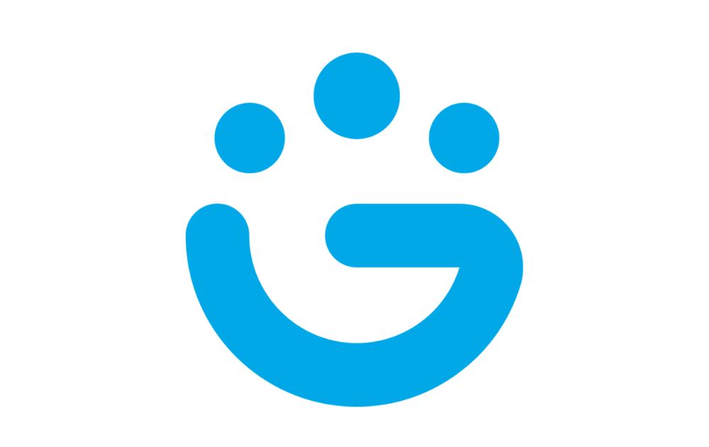
On the other hand, another way to hide a sneaky message in your logo is to make elements that can be interpreted in various ways. Grouped is an excellent example of a logo AI that has a hidden meaning. At first glance, their logo appears as an enclosed fist. But look closer, and you’ll see that the shapes spell out the letter G. The three dots, a common symbol used in chat forums, also hint that the platform is a social messaging app.
3. Layer Elements
A popular trend among AI company logos is layering graphic elements over each other. In fact, most AI logo designs, even those made in logo creator platforms, use geometrical elements with a color gradient. In this case, Predibase uses a diamond cut and unusual color combinations to help make their logo design distinct and memorable. Predibase, in particular, uses this technique masterfully. Furthermore, red and white are uncommon colors to use for AI companies.
4. Use Continuous Lettering
Meanwhile, unique letter marks make AIBrain a standout in logo graphic designs. Carefully thought-out logo designs like this don’t come easily to logo AI generators. This kind of creativity is rooted in human-centered design, not from run-of-the-mill AI logo generator platforms. The designers used one line in the logo to depict the letters i and b. This, in turn, makes for a flowy and slightly cursive logo. Another exciting feature of the company is that it uses the colors red and black, color palettes not typically used by tech companies.
5. Bridge the Gap
Abridge’s logo is a clever play on typography, merging clean-cut lines with a mix of serif and sans-serif styles. This duality isn’t just aesthetic—it symbolizes the company’s mission to bridge communication gaps, likely in the realm of AI-driven speech technology. The subtle transition between fonts reflects a seamless connection, much like how Abridge aims to simplify conversations.
6. Create a Repetitive Pattern
There are not a lot of AI companies that use tapestry-type logos like Insilico Medicine. Because of this, their AI logo design stands out from the rest. The company pairs a verdant green ‘microchip’ with white links and other details to create a recurring pattern. While minimalistic designs take center stage, Insilico’s logo AI design takes a different route. And though it’s an unconventional design, it’s a refreshing take in a sea of minimalist logos.
7. Play with Lines
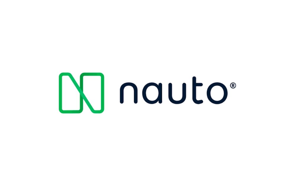
Tired of boring, old typefaces? You can still play around with the same concept and create something great. Just look at Nauto, which features a unique spin on an infinity logo. They turn a simple rectangle shape and manipulate lines into the space to spell out the letter N. Look closer, and you’ll see that the company used different shades of green to draw the lines. It’s not a groundbreaking design, but its composition is playful, creative, and incredibly memorable.
8. Keep it Connected
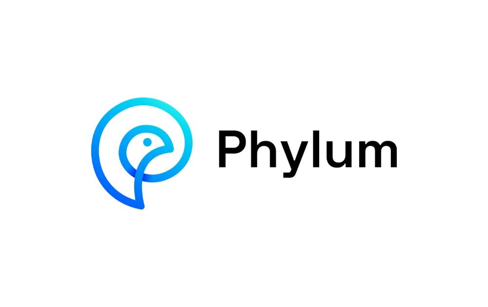
Most companies would think that using sharp and edgy designs can catch attention. But there’s nothing wrong with Phylum’s logo, which starts at a single point. Illustrations like this are a powerful way to signal the company’s values. And since Phylum is a company that focuses on supply chains and transportation, it makes sense that their logo is shaped like a bird. After all, it is an animal known for its capacity for travel and flight, an important feature when your business goes beyond borders.
9. Cut Corners, Creatively
On the other hand, Ceros also has interesting and flowy design decisions. Their general brand identity is centered around thick rounded circles. And, because the letters in Ceros all have rounded shapes, their logo AI also zeroes in on that feature. Even on their website, you’ll notice no sharp and protruding angles and only circular or oblong-shaped blobs. It proves that sometimes cutting corners out of your designs is okay.
10. Blend Nature with Technology
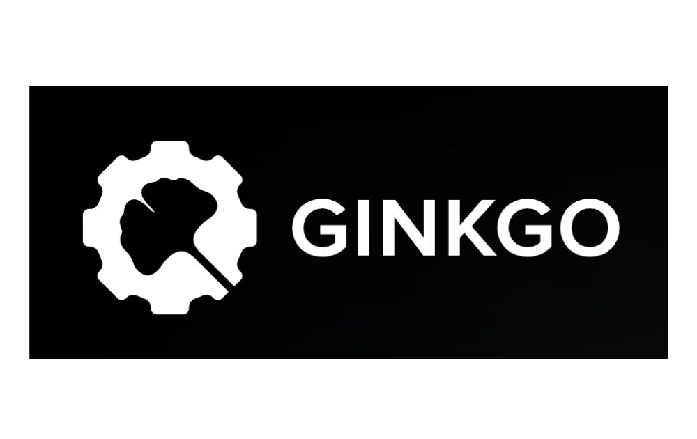
Ginkgo Bioworks’s logo AI seamlessly combines organic and mechanical elements—a ginkgo leaf inside a gear-like shape. This design beautifully represents the company’s focus on biotechnology, where nature and innovation intersect. The choice of a ginkgo leaf isn’t random either; the ginkgo tree is a symbol of resilience and longevity, perfectly aligning with a brand that explores synthetic biology.
The Bottom Line
Logos are emblematic of a company’s identity and how it is viewed by others. It goes without saying that a poorly designed logo AI is difficult to remember and, in some cases, might even associate a negative connotation with your brand.
So, if you need a professional logo that expresses your brand identity, get Penji on board to help! We have unlimited designs at a flat monthly cost, so you’ll get more value for your every buck.
Best of all, we’ve got the top 2 percent of designers, so you’ll be in good hands. Sign up now and get a 30-day money-back guarantee. Plus, here’s an offer for you – enter voucher code LOGODESIGN15 at checkout to enjoy 15 percent off on your first month.
About the author

Carla Deña
Carla is a journalist and content writer who produces stories for both digital and legacy media. She is passionate about creativity, innovation, and helping small businesses explore solutions that drive growth and social impact.

