Logos should be crafted according to the brand’s personality. This way, it speaks to the brand’s target audience. And Penji has done the heavy lifting of curating the best letter A logos for any business. Feast on these 29 best letter A logo designs to fit any industry. But before we get to that, let’s dissect what makes a good letter A logo design.
What Makes a Good Letter A Logo Design

Just because it’s the first letter in the alphabet doesn’t mean you give your letter A logo special attention. EVERY company logo must be well-thought-out and created by professionals to ensure it conveys your branding and message. So what makes a good letter A logo? Here are five components:
Simplicity
If you’re banking on letter logos, consider simplicity as the primary factor. Complicated logos could confuse your target audience. Keep it simple with comprehensible design elements that are also in line with your brand personality.
Relevance
Your letter A logo must exude relevance in terms of design elements that emanate your brand personality. It doesn’t matter if you choose the boldest colors and quirkiest fonts, as long as they’re relevant to your brand. Remember to use these same elements in all of your channels to imply brand consistency, which increases top-of-mind awareness.
Versatility
Versatility or scalability is all about making your letter A logos look good, whether reduced in size or enlarged. Moreover, your logo must aesthetically fit with any branding and marketing asset you have. Consider form and function when creating your letter a logo.
Uniqueness
A unique logo will make your brand a cut above the rest. Of course, this should be alongside other factors such as product quality, customer service excellence, and target audience connection. It’s crucial to work with professional logo designers who know what elements to integrate to make your logo stand out. Check out what the Penji team has curated in the next section.
Memorability
This last logo design component should be tied with simplicity and uniqueness. Your logo must instigate recall from your target audience. This means your prospects should be able to remember your logo via the most unique design elements. Again, this can only be achieved if you onboard a trained and creative eye for unique and cool logos.
The BEST Letter A Logos from Penji
We’ve curated the most unique letter a logo designs we’ve done for our clients. Use these examples as inspiration for yours.
1. Accelerate

As you land your eyes on this logo, you’ll instantly remember the lighting symbol associated with the brand name “Accelerate.” You can see the relevance in both design components, which indicate growth and movement. The lightning symbol also occupies the space that forms the letter “A” in the middle.
2. Access Sports Bristol

Another unique letter A logo that uses creativity and abstract imagery to capture the target audience. Access Sports’s target audience is active people in sports and a healthy lifestyle. And this shows through the letter A symbol that depicts a person seemingly stretching or bending forward, forming the body of the letter, coupled with a circle that illustrates the head.
3. Ace the Floridian
The Ace logo has a machismo appeal, which is suitable for tech and modern brands that cater to predominantly male audiences. The font is a well-chosen pair for the letter A symbol that screams authority and masculinity.
4. Activation Energy Holdings

Activation Energy Holdings dawns a letter A logo that shows movement. This movement is depicted by the arrows integrated into the middle of the letter A. The gold color splashed in the letter’s space is an excellent contrast to make the red letter A pop. The grey embellishment in the letter is another element that brings the red letter forward.
5. Ai Aingels

One of the unique letter A logo designs on this list, Ai Aingels exudes an elegant appeal with authority from the color choices. The various blue hues complement the design, and the small grey letter “i.” Both letters “A” and “i” are combined into one icon, with two strokes of what seems like “wings.” Overall, this design gives forth cohesion.
6. Albert Sheats
At first glance, the logo might seem crammed into a tiny space. However, the big letter A encompasses all design elements, which ties the logo into one connected unit. The fire symbol is also a way to break the monotony of the design by being the most evident component of the logo.
7. Angular Fitness

This logo is well-suited for gyms and brands that sell fitness products. The design is sporty with lively teal and blue-green colors and hues. It also showcases a unique angle, which signifies the brand name.
8. AP
I can see this logo on streetwear shirt brands or t-shirt printing businesses. Although the praying hands may say otherwise, this overall design is rebellious. The yellow letter A symbol between the praying hands keeps the design balanced, especially with the other vibrant colors as the hands’ shadows.
9. Art and Design

The Art and Design logo is an uncomplicated design that shows how simplicity can capture your audience’s attention. The pink letters “A” and “D” provide a good contrast against the blue text. There is no artsy-fartsy appeal to it, just pure classic and straightforward design suited for brands that want to establish command in their niche.
10. Artist Plus

The text “Artist Plus” may look like these two words have their own identity. However, the design style merges both words through the connecting letter “t” from the word Artist and the “l” from the word Plus. The red arrow also brings artistry into the letter A logo.
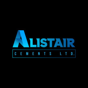
11. Alistair Cements Ltd.

The exceptional hues of blue are what captivate viewers in this logo design. Alistair stands proud with its sophistication and authority that the logo increases the brand’s credibility. The box surrounding the words Cements Ltd. is an excellent way to separate both texts.
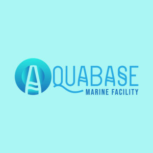
12. Aquabase Marine Facility

The color palettes represent a water-related business such as Aquabase Marine Facility. The teal and blue colors symbolize the ocean, fit for this industry. The font style is also unique, giving this logo a creative twist. You can see that the letter A logo encompassed by a circle is an excellent icon to represent this company.
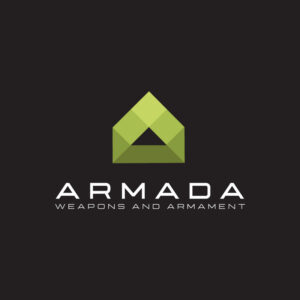
13. Armada Weapons and Armament
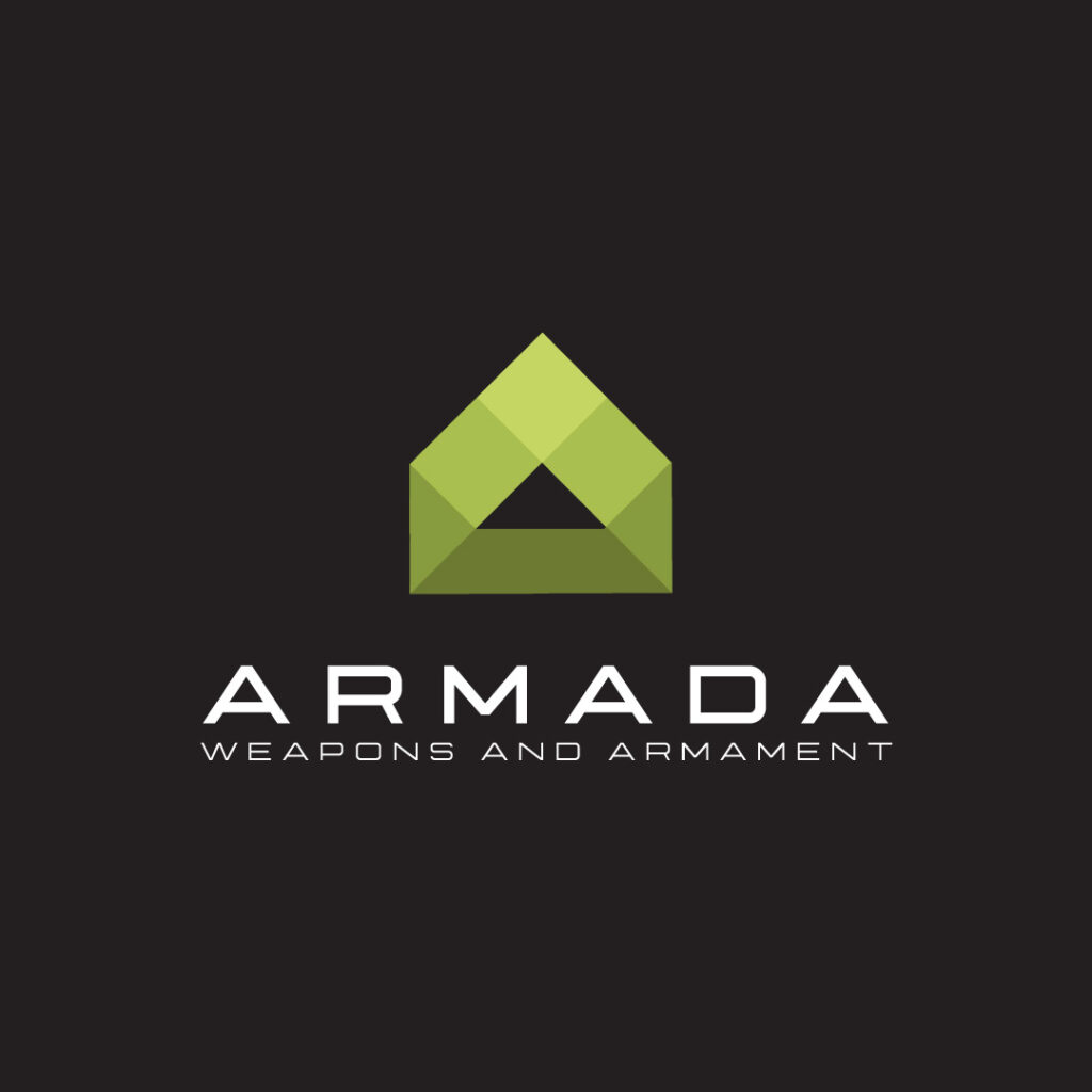
Armada Weapons and Armament is a supplier of military weapons and equipment. The overall logo design exudes a vigorous and robust appeal that elevates its branding. For a brand that sells weapons, the abstract letter A logo is simple yet gives a powerful suggestion about the brand.
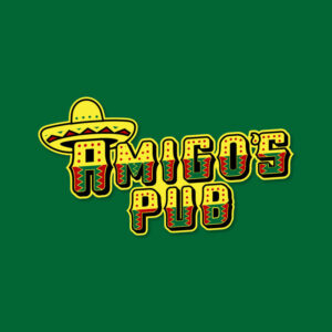
14. Amigo’s Pub
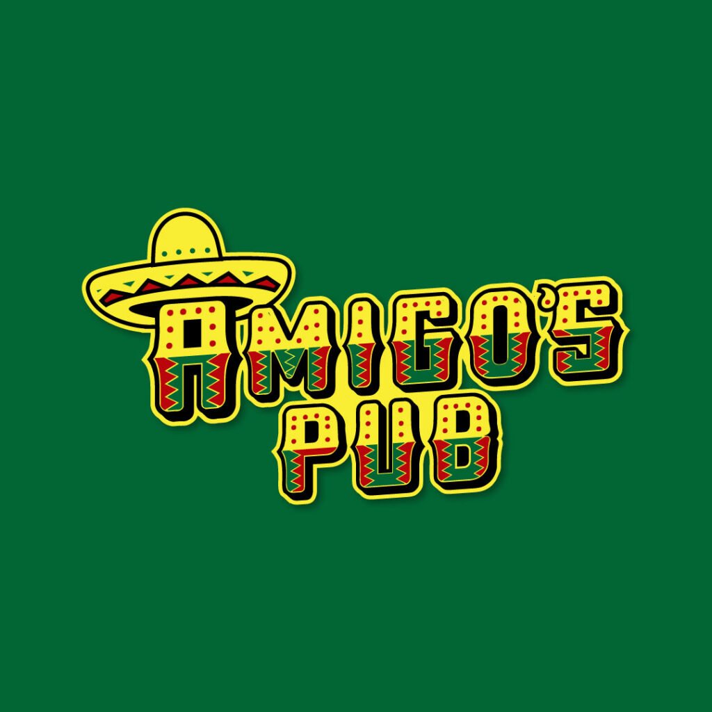
A Mexican bar and restaurant wouldn’t be complete without the colors red, green, and yellow. These colors represent Mexican pride, and Amigo’s Pub showcases this through the vibrant and playful logo design. The typeface is suitable for a Mexican pub, and the sombrero ties the design together.
15. Amazing Pieces Pawnshop

Amazing Pieces Pawnshop is one of the most unique and well-thought-out logos on this list. You can see the excellent structure from top to bottom. First, you’re presented with the brand name with the icon of a puzzle on the left side. Then the word “Pawnshop” is sprawled across in a curve underneath the brand name. The texts are then placed inside yellow lines that make each element shine.
16. Anchors Away Seafood Restaurant
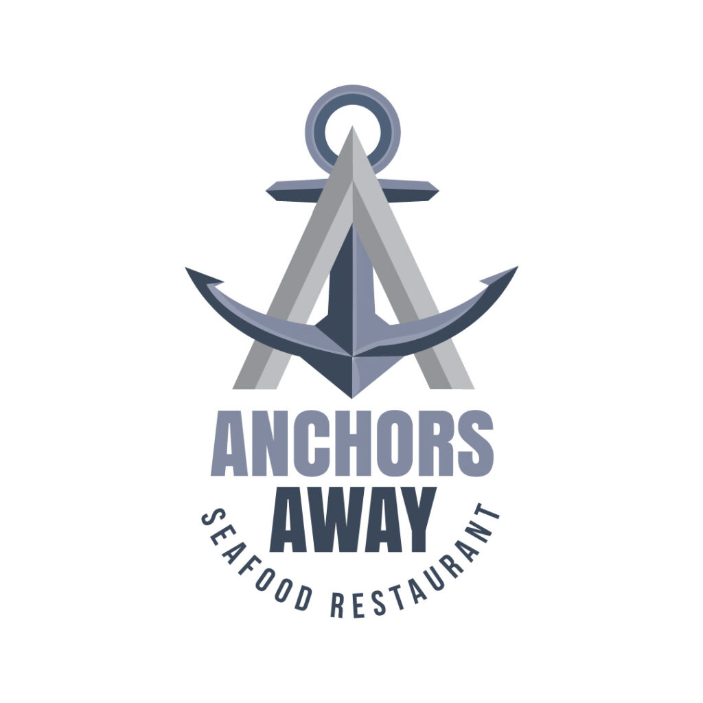
The hierarchy in this logo design is worth commending. The anchor attracts the eyes first and leads them down to the brand name. The accompanying text at the bottom also keeps the design harmonious and balances the varying components of this food logo.
17. Allure Perfumery
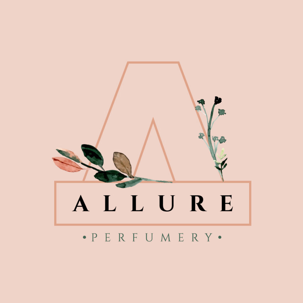
Allure Perfumery’s logo screams nothing but a feminine and gentle atmosphere. For a perfume brand that caters to the female demographic, the flowers and leaves are apt to showcase its brand identity. The big letter A logo that doubles as the background also stands tall and keeps the other design elements busy.
18. Acer Psychiatrics Clinic
At first glance, you’ll instantly notice the brain icon that surrounds the letter A logo on the left side. The symbol is suitable for Acer Psychiatrics Clinic, which deals with clients’ mental health. The brand name on the right side also accompanies the symbol and creates symmetry in this logo design.
19. Auckland Interstate Bank

For a company that deals with money matters, a credible and trustworthy logo makes or breaks its success. Auckland Interstate Bank features the letter A icon with a symbol of a building in the middle. The sans serif font style is another way to imply a modern financial institution that people can trust.
20. Antonio’s Premium Lager
Nothing beats a good logo design than featuring your offer front and center. Antonio’s Premium Lager showcases a mug of dripping beer along with the brand name. The letter A also sits in the middle of the mug, which can stand alone as a pictorial logo.
21. Alaskan Dog Kennels

Alaskan Dog Kennels keeps its logo simple yet impactful. The image of a canine seemingly howling depicts how these animals work in cold Alaska. The big letter A symbol that the dog comes out of is evident, keeping the eyes hooked. Moreover, the serif font features a more traditional branding, apt for the brand.
22. Airheads Balloons
Airheads Balloons offers hot-air balloon rides, and they’ve made this clear by showcasing an abstract hot-air balloon in the logo. Selecting grey as the brand’s primary color is also an excellent way to keep the design subtle yet powerful.
23. All American Aviary

This logo design looks like a movie poster for a superhero flick. However, the wings displayed on both sides of the letter A symbol represents an aviary company. The letter A, which seemingly looks like it’s flying, is the captivating design element on this logo. But the other texts are also as equally fascinating.
24. Angel’s Album Photography
Angel’s Album Photography screams nothing but class and sophistication. The company offers lifestyle shots perfect for luxurious brands and personal projects. The abstract symbol of the letter A with an elegant wing is worth commending.
25. Antioch Diagnostic Clinic

The beautiful curves and combination of various blue color palettes make this logo design captivating. The structure between the letter A, and the two texts separated by the curve, is commendable. Overall, this logo design is simple yet creates a lasting impression.
26. Apollo Tech Solutions
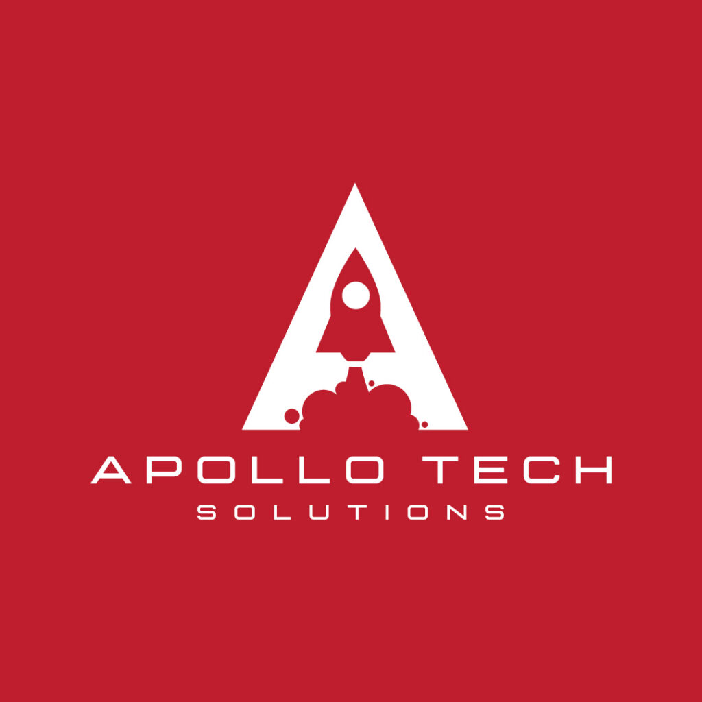
If the word Apollo reminds you of the movie Apollo 13, this logo does a bang-up job of keeping the design familiar. The font choice for the brand name is simple and light-faced. However, the play on negative space is what makes this design eye-catching.
27. Ambrose Medicinal Plants
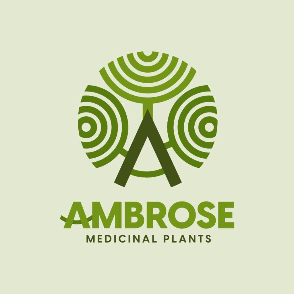
Green is an apt color to represent your brand if you’re selling medicinal plants. Ambrose’s icon looks psychedelic, interestingly. This logo design has all the elements of an excellent logo, such as simplicity, memorability, uniqueness, relevance, and scalability.
28. Aussie Guys Podcast

Instilling a history and storytelling in your logo design is vital to let viewers know about your brand. This Aussie Guys Podcast does just that by showcasing the kangaroo on the logo. Color combinations are also an intelligent way to offer contrast and keep the logo design interesting.
29. Anteater Pest Control

This logo reveals what this company offers, pests and control. It features a rat that doubles as the curve in the letter A. Plus, the exquisite script and simple sans-serif fonts are excellent combinations that make an impact.
Conclusion
Creating letter A logo designs should be easy when working with professional logo designers. We at Penji, ensure that you get the best letter A logo that’s simple, memorable, versatile, relevant, and timeless. Plus, we promise a quick turnaround and prioritize high-quality output that you’ll love. Try our design service for 15 days risk-free, or get your 15 percent discount by signing up here.
About the author
Table of Contents
- What Makes a Good Letter A Logo Design
- Simplicity
- Relevance
- Versatility
- Uniqueness
- Memorability
- The BEST Letter A Logos from Penji
- 1. Accelerate
- 2. Access Sports Bristol
- 3. Ace the Floridian
- 4. Activation Energy Holdings
- 5. Ai Aingels
- 6. Albert Sheats
- 7. Angular Fitness
- 8. AP
- 9. Art and Design
- 10. Artist Plus
- 11. Alistair Cements Ltd.
- 12. Aquabase Marine Facility
- 13. Armada Weapons and Armament
- 14. Amigo’s Pub
- 15. Amazing Pieces Pawnshop
- 16. Anchors Away Seafood Restaurant
- 17. Allure Perfumery
- 18. Acer Psychiatrics Clinic
- 19. Auckland Interstate Bank
- 20. Antonio’s Premium Lager
- 21. Alaskan Dog Kennels
- 22. Airheads Balloons
- 23. All American Aviary
- 24. Angel’s Album Photography
- 25. Antioch Diagnostic Clinic
- 26. Apollo Tech Solutions
- 27. Ambrose Medicinal Plants
- 28. Aussie Guys Podcast
- 29. Anteater Pest Control
- Conclusion


