According to Zippia, there are over 600,000 landscaping businesses in the U.S. Even if that’s the case, that shouldn’t discourage you from starting one. Aside from offering stellar services, one way to stand out is through a beautiful landscaping logo. If you’re on the hunt for one, here are ten logo inspirations created by our very own designers.
Plus, if you want one done in 1 to 2 days, Penji can create those for you. And if you want to see what Penji can do, get one here!
1. Green Guys Landscaping
Expect to see a lot of greens, browns, and other natural colors in this list of landscaping logos. First up is this one designed for Green Guys Landscaping. Since its brand name has the word green in it, it’s only natural to use this color.
To make the logo design stand out, the designer added a few images of leaves at the top right. The design uses a simple but bold typeface that makes it easily readable even from afar.
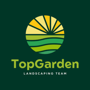
2. Top Garden Landscaping Team

This circle logo design created for the Top Garden Landscaping Team is beautifully made. It uses various shades of green and some yellows that add to its charming appeal. It gives an atmosphere of freshness, vivacity, and vigor that suits the brand well.
When designing logos, it’s crucial that you only use the most vital details. This is to avoid making the logo look cluttered.
3. Amazon Landscaping Team
The logo designer for Amazon Landscaping Team used the letter A to make it look like a grove of trees. It gives off elegant and friendly vibes with its choice of colors that are warm and earthy. This is proof that the usual green isn’t the only way to show your business nature.
The simple yet stylish font for the brand name adds sophistication to the overall design. The secondary line uses a font style that’s very straightforward.
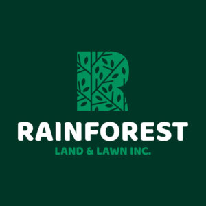
4. Rainforest Land and Lawn Inc.
Similar to the Amazon Landscaping Team logo is this one designed for Rainforest Land and Lawn Inc. It used the initial letter of the brand name and turned it into a forest of trees. The contemporary look gives the brand a trendy and innovative image.
The white font used perfectly makes the brand name pop off the page. With the dark green background, this is an excellent way to place emphasis on your brand name.
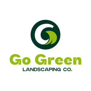
5. Go Green Landscaping Co.
Another landscaping logo that uses the color green, Go Green Landscaping Co.’s logo also uses its initial letter as its main component. It uses a leaf with a color that’s the same as the brand name. The dark green circle in the background emphasizes the logo symbol so well.
This landscaping logo uses a simple and personalized font. This makes it unique that online logo makers won’t be able to give you.
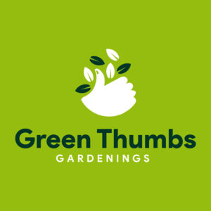
6. Green Thumbs Gardenings
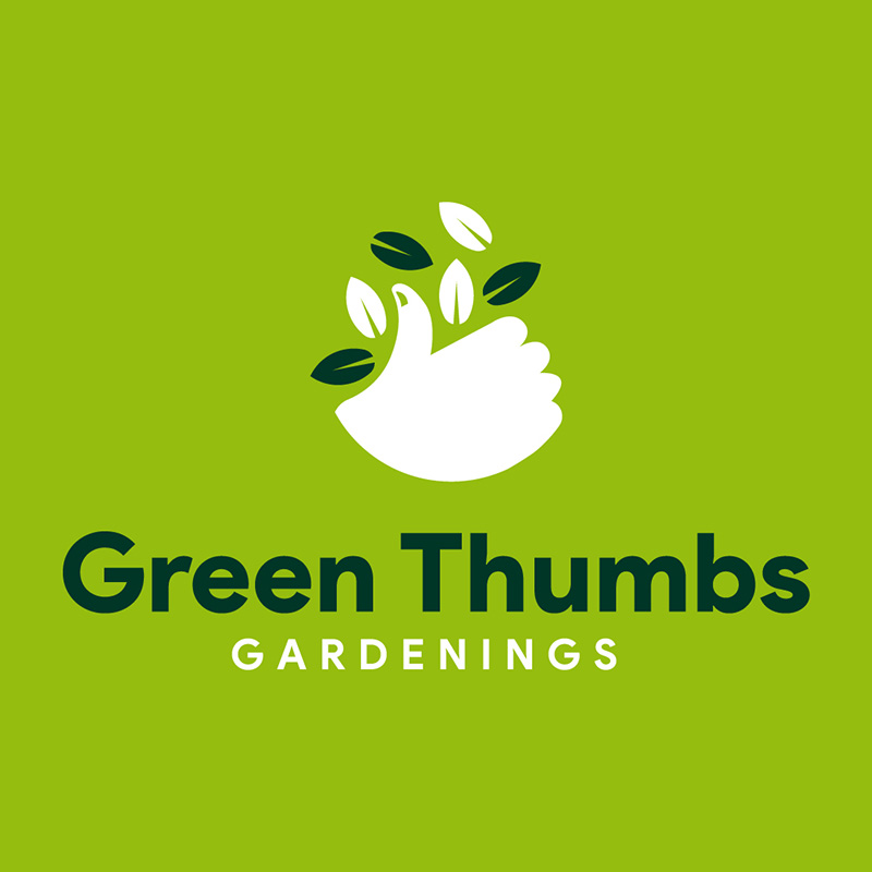
Landscaping logos need to be easy to recognize and recall. The Green Thumbs Gardenings logo managed to do just that. It has a thumbs-up icon with leaves surrounding it. This logo has that cute and quirky personality that’s easy to remember.
Logos use only a tiny space, so make sure that yours tell your story efficiently. It may be challenging to execute, the reason many business owners go to the pros for a logo design instead of getting it through templates.
7. Nature’s Design Inc.

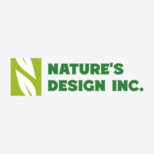
Relevance is an essential factor in logo design. It has to convey your company image and brand identity. To do this, make sure that your colors, icons, and fonts are relevant to your business. In the case of Nature’s Design Inc., the designer chose to use green and leaves for the design.
Using sans-serif typefaces is the norm in logos, but that doesn’t mean you can use other types. This logo uses a serif font but only in the least decorative form. This will ensure that the brand name can be seen quickly and clearly.
8. The Valley Garden Care

Right off the bat, you’ll see the dedication of The Valley Garden Care to its craft just by looking at its logo. It features a hand holding a piece of land with trees and birds flying about. It clearly shows care and concern for its customers.
The green and brown signify the earth, while the addition of the orange adds warmth. This logo uses a simple typeface that is easy to read despite its serifs.
9. The Foliage Group & Co.

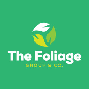
A trio of leaves that look similar to hands, this logo designed for The Foliage Group & Co. is simple and classy. A hand symbol is usually interpreted as the embodiment of protection, help, care, and authority, among many others. This is excellent storytelling, logo design style.
This is also an excellent example of a scalable logo. Flexibility is crucial as a logo will be placed in a multitude of materials such as flyers, business cards, and other advertising collaterals. It should retain its beauty wherever you place it.
10. Bloom Landscaping Services
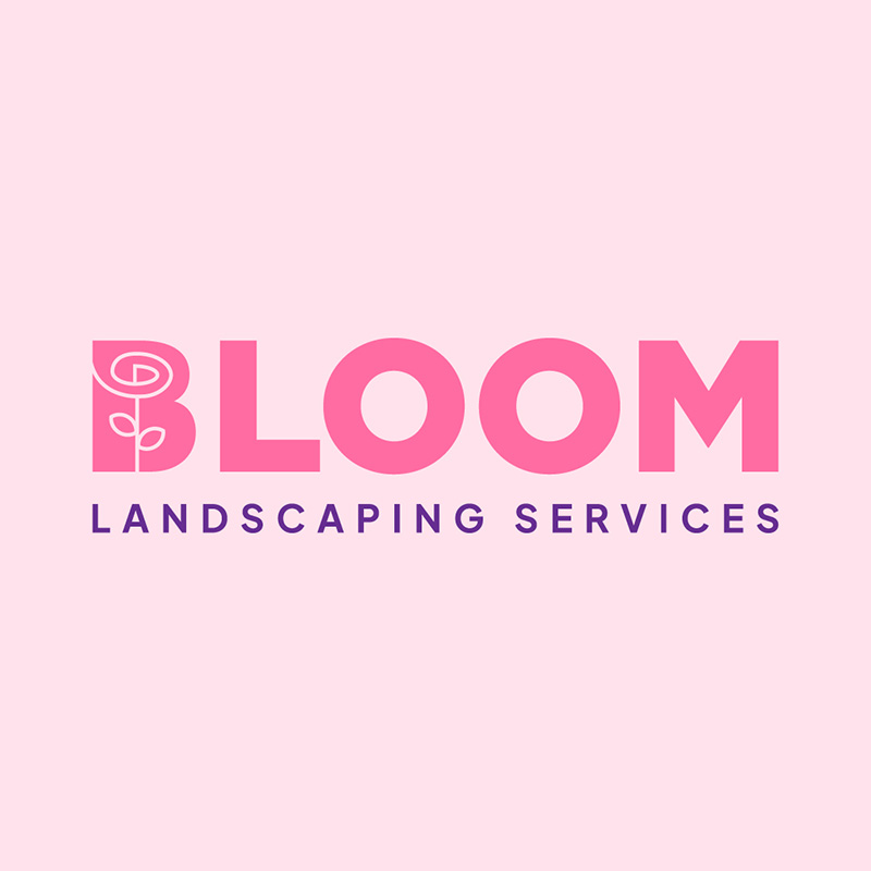
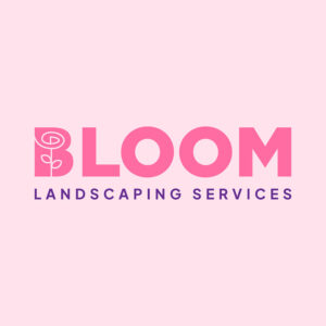
For landscaping logos to stand the test of time, they should also be timeless. If you can, avoid a logo design that follows trends as they tend to lose their beauty a few years after. This logo created for Bloom Landscaping Services is a great example of a timeless design.
From the typeface to the color and icon, this logo is sure to look great ten years after it is designed. A redesign is not something you should avoid, but a timeless logo can set memorability better than a new one.
Helpful Hints When Designing a Landscaping Logo
Throughout the article, we already mentioned tips on designing an excellent landscaping logo. To make the best logo for your lawn care or landscaping business, remember these:
- Relevance
- Timelessness
- Simplicity
- Versatility
Final Thoughts
While you’re working on making beautiful landscapes, let Penji help you with a stunning logo. You can start requesting your brand assets immediately once you subscribe. But if you need only one logo, not to worry; Penji can do that for you too. Here’s where you can get one!
About the author

Celeste Zosimo
Celeste is a former traditional animator and now an SEO content writer specializing in graphic design and marketing topics. When she's not writing or ranking her articles, she's being bossed around by her cat and two dogs.
Table of Contents
- 1. Green Guys Landscaping
- 2. Top Garden Landscaping Team
- 3. Amazon Landscaping Team
- 4. Rainforest Land and Lawn Inc.
- 5. Go Green Landscaping Co.
- 6. Green Thumbs Gardenings
- 7. Nature’s Design Inc.
- 8. The Valley Garden Care
- 9. The Foliage Group & Co.
- 10. Bloom Landscaping Services
- Helpful Hints When Designing a Landscaping Logo
- Final Thoughts


