
Insurance companies need credible and trustworthy company logos that embody their mission and vision. The design elements in an insurance logo must exude security, stability, and trust. Minimal designs with modern logo components like geometric shapes and sans serif typography are a way to stand out in this industry. Squares are also an excellent way to exude security and reliability. If these characteristics sound like your brand, let Penji help you with your company logo. Let Penji help you in whipping up the most impactful insurance logos. Check out these insurance logo designs by Penji’s professional designers.
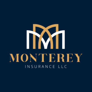
1. Monterey Insurance LLC
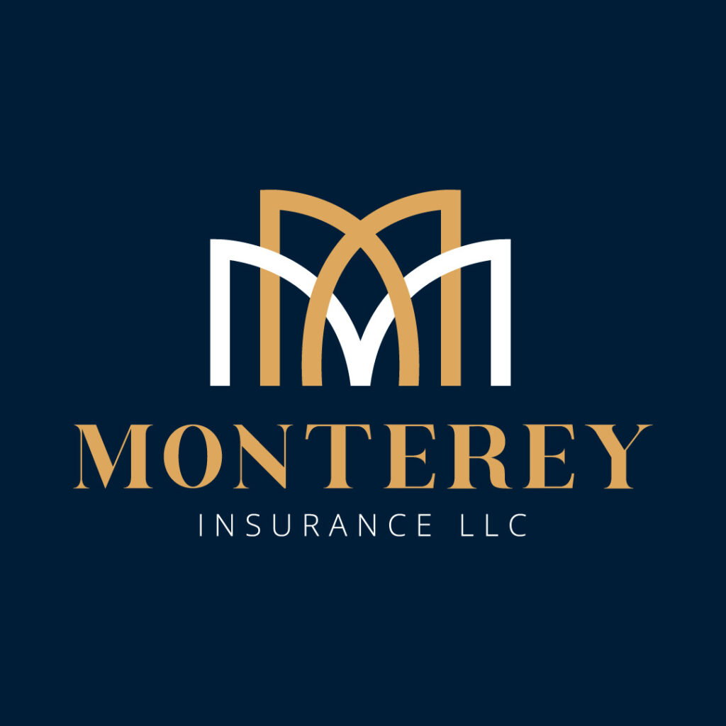
Monterey Insurance LLC’s logo features overlapping letter Ms that look like buildings. The font is an apt choice for an insurance company that exudes reliability and confidence. Yellow in color psychology evokes feelings of enthusiasm, happiness, and confidence, emotions you want your clients to feel when choosing an insurance company. Due to the prevalence of insurance companies, clients may feel overwhelmed with marketing pitches. You want your prospects to feel at ease and comfortable when they interact with your brand.
Insurance logos perfect for your business
Show off your brand’s personality with a professional insurance logo created by expert designers
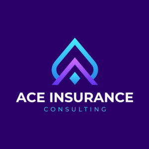


2. Ace Insurance Consulting

This logo embodies nothing but class and sophistication. Ace Insurance Consulting’s logo dwells on simplicity, and it works! The design dons an Ace icon, with an integrated letter A at the bottom, acting as its base. This design is an excellent reminder of how simple logos look clean yet impactful. The purple color also gives forth factors that revolve around quality and individuality, perfect for an insurance company.
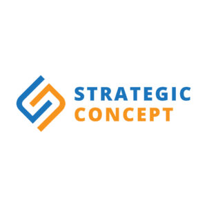
3. Strategic Concept

Here’s another one of those simple insurance logos that fill the bill. The abstract letters stand out as the most evident design, which can also be a standalone letter mark logo. It features the initials of the insurance company Strategic Concept. The letter S makes up the entire design, and either the blue or orange curves make up the letter C. Overall, this is a clever logo that balances optimism and trust.
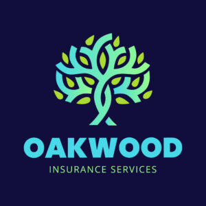
4. Oakwood Insurance Services

Oakwood Insurance Services’ logo radiates positivity and creativity. It displays an illustration of an oakwood tree with beautiful light green leaves that pop and steal the eyes first. The overlapping branches of the tree don soothing colors that are appealing to the eyes. Additionally, the bold and light-faced font combination is a perfect match that makes this logo suitable for all online and print materials.
5. Legacy Insurance Brokerage
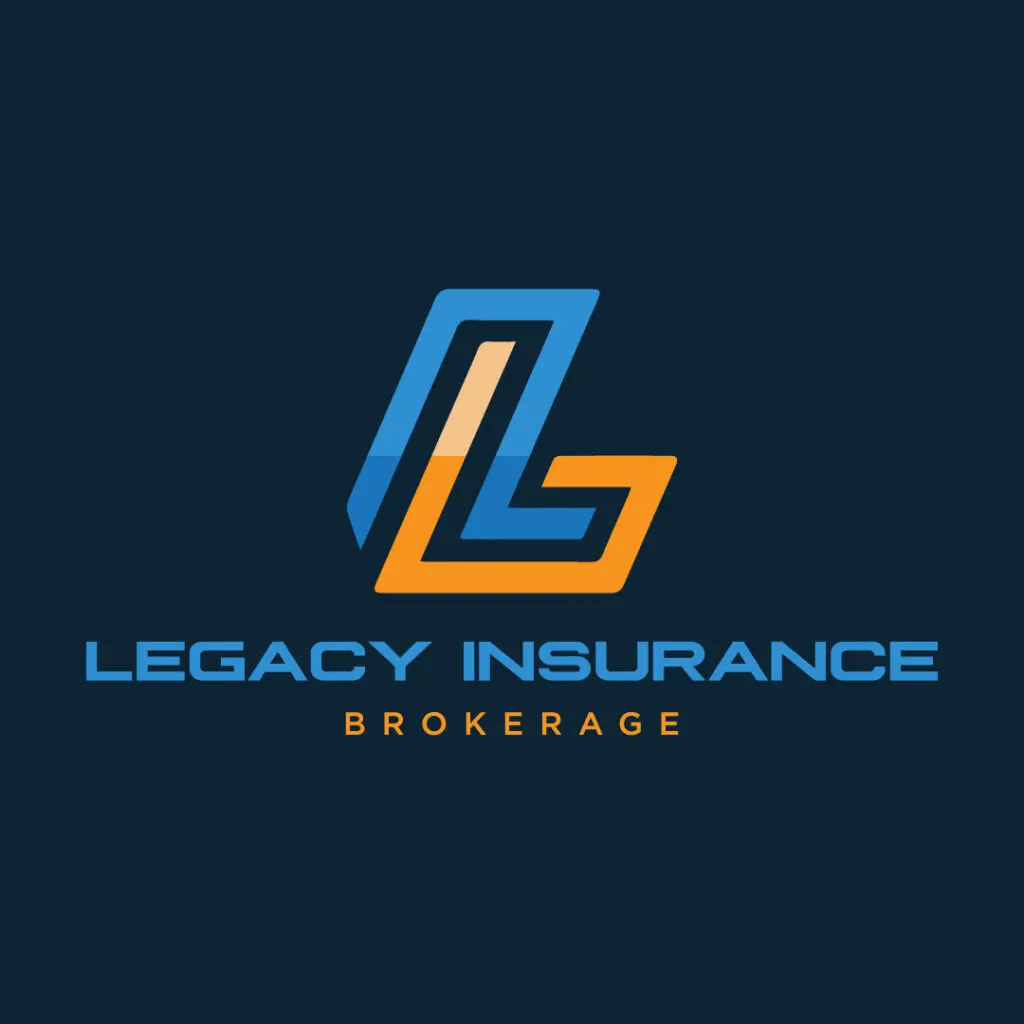
The letter mark logo symbol is commendable in this logo design. Legacy Insurance Brokerage’s logo features combined letters L and I. At first glance, you’ll notice the letter L with its vertical line in blue and horizontal line in orange. However, the designers gave this design an intelligent twist by wrapping the letter I around the letter L’s vertical line. The entire design looks neat and understandable.
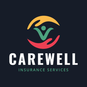
6. Carewell Insurance Services
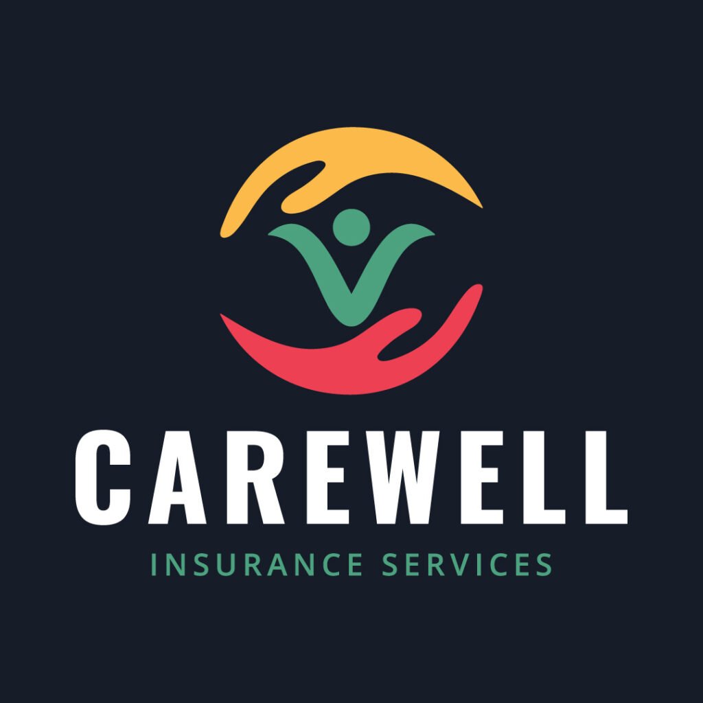
This is one of the most innovative and well-thought-out logos on this list. Carewell Insurance Services’ logo considers relevance and consistency in its branding asset. The red, green, and yellow colors are diverse and playful, which creates a lighthearted appeal. This logo features a circular logo design that shows two hands, one at the top and the other at the bottom. An abstract image of a person is also displayed in the middle of both hands. The overall composition is relevant to the brand name, meaning this insurance company cares for its clients.
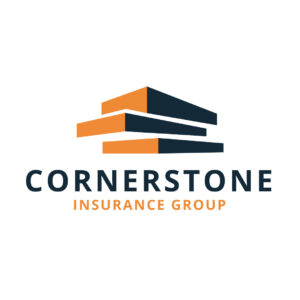
7. Cornerstone Insurance Group

If you look at Cornerstone Insurance Group’s logo, you’ll see blocks piled up on each other. These orange and black blocks resemble abstract building, which represents the insurance company. Buildings also signify dominance, experience, and hospitality, which are apt for people who cater to the needs of others. The overall logo design might look simple. However, it can scale, especially on any branding and marketing collateral. Plus, no other distracting design elements also take the eyes away from the image and text.
8. Paramount Insurance Co.
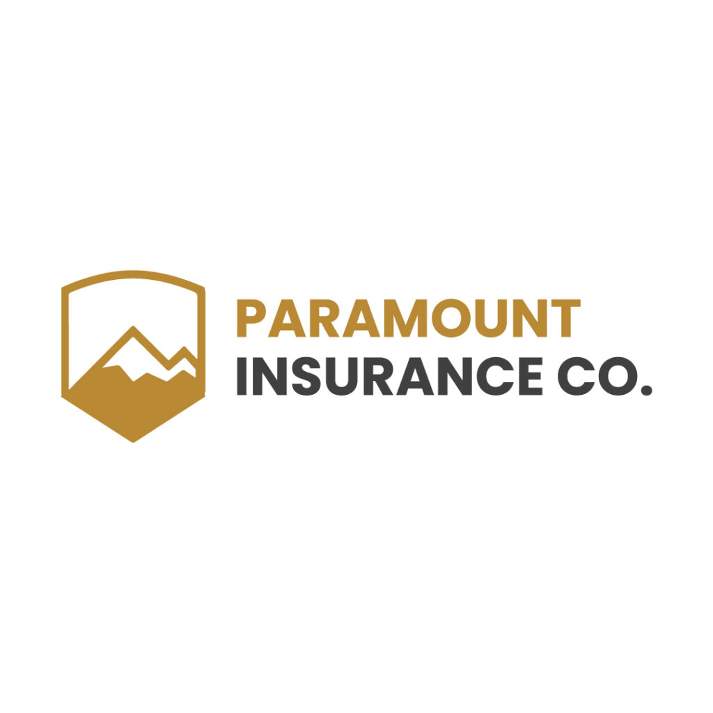
Paramount Insurance Co.’s logo features a pentagon logo icon with an image of a mountain inside. The pentagon symbolizes security and strength, two factors clients look for in an insurance company. The neutral color also keeps this logo design subtle and simple. However, no matter how straightforward this insurance logo is, the design still has the potential to create top-of-mind awareness.
9. Converge Health Insurance
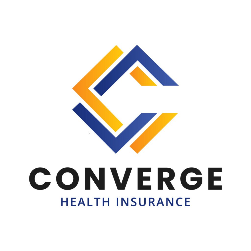
The Converge Health Insurance logo chooses a square icon to represent its company. As you know, squares signify order, stability, trust, and equality. For a health insurance company like Converge Health Insurance, you want to instill these elements within your target audience. This way, they will choose your brand over your competitors. The abstract square in this logo also doubles as the letter C, which represents the brand name.
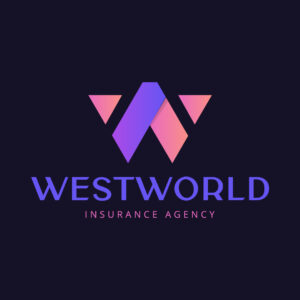
10. Westworld Insurance Agency
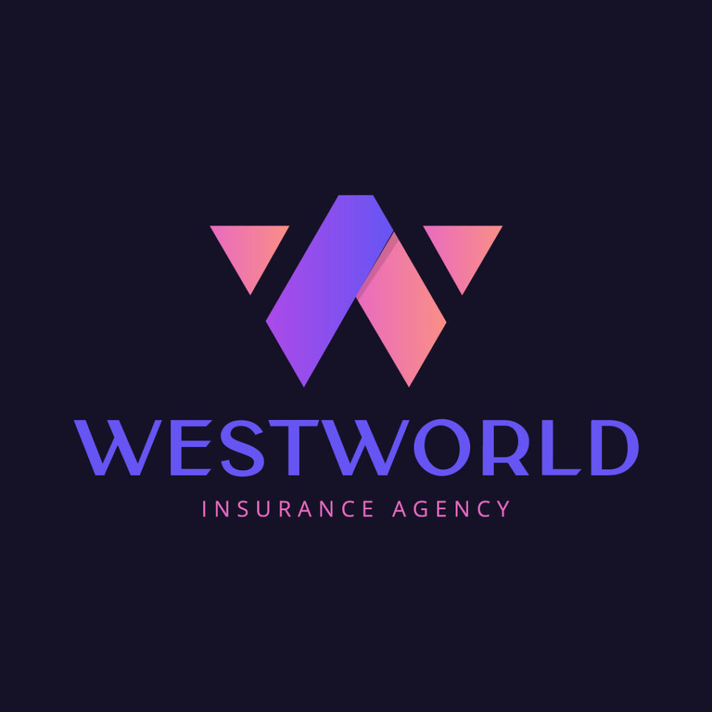
The soft colors in Westworld Insurance Agency’s logo keep this design casual yet sophisticated. The unique and stylized font for the letter W icon stands out. But the font combination for the brand name is also another eye-catching design component in this design.
11. Accentsure

The Accentsure Insurance Services logo symbolizes trust, protection, and assurance. The focal point of the design is a sophisticated serif-font letter “A,” standing tall and proud, evoking reliability and professionalism. Nestled within the contours of the letter, a sturdy shield emerges, representing the robust protection offered by Accentsure. At the heart of this emblem of security, a checkmark takes center stage, symbolizing reliability and the affirmation of safeguarding clients’ needs. The combination of classic serif typography and the timeless shield motif communicates a sense of heritage and steadfastness. Accentsure’s logo is a visual promise, encapsulating their commitment to providing insurance services that stand the test of time and offer a reassuring checkmark of reliability in safeguarding what matters most.
12. MikeMoore
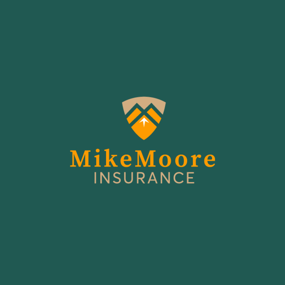
The MikeMoore Insurance logo is a powerful emblem of protection and resilience. A shield adorned with majestic mountainous contours dominates the design, symbolizing the steadfast security and strength that MikeMoore Insurance provides. The serene green, vibrant yellow, and light brown hues evoke a sense of reliability, growth, and stability. At the heart of the shield, an arrow points confidently upward, embodying progress and assurance. The authoritative typography of “MikeMoore” beneath the shield further reinforces the brand’s commitment to trustworthy insurance services. This logo is not merely a symbol; it’s a visual narrative of safeguarding against life’s uncertainties, scaling new heights, and providing a solid foundation for clients. MikeMoore Insurance’s emblem is an inspiring representation of protection, growth, and the unwavering commitment to navigate the insurance landscape with resilience and assurance.
13. Wealth Insurance
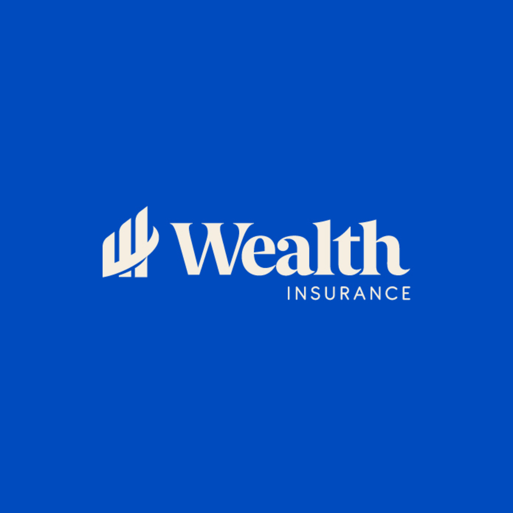
The Wealth Insurance logo is a visual embodiment of prosperity and financial security. The thick and bold serif typography exudes strength and stability, reflecting the robust foundation of Wealth Insurance services. At the heart of the design, a symbol takes shape, resembling an upward-pointing chart. This visual representation signifies continuous growth, echoing the commitment of Wealth Insurance to safeguard and enhance the financial well-being of its clients. The chart’s ascent embodies the journey towards wealth accumulation and long-term prosperity. With its authoritative presence, the classic serif font conveys reliability and trustworthiness. Wealth Insurance’s logo is not just an emblem; it’s a testament to their dedication to securing and nurturing their clients’ financial growth, ensuring a path to enduring wealth and prosperity.
14. AssureSafe
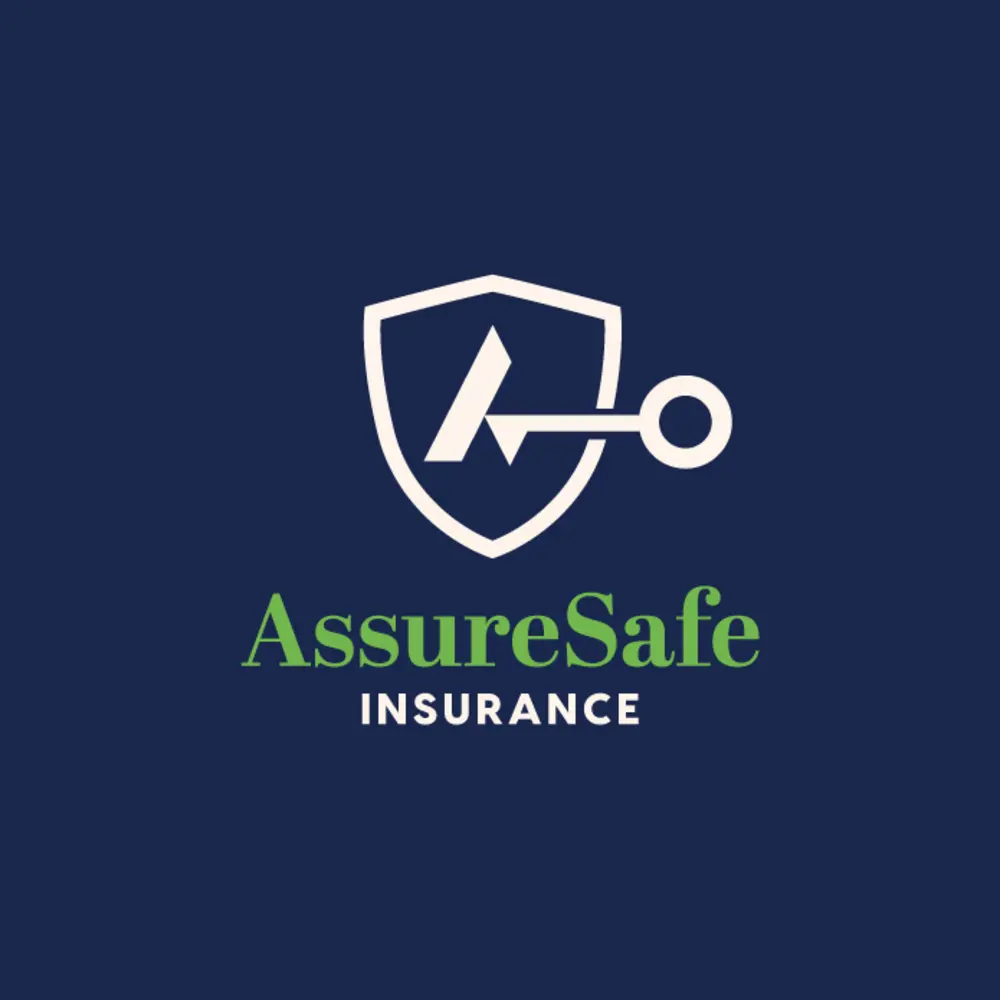
The AssureSafe Insurance logo is a powerful symbol of protection and security. A simple yet sturdy shield takes center stage, embodying the assurance and resilience offered by the insurance services. A key is elegantly poised within the shield, delicately opening a lock to a door or vault. This visual metaphor speaks volumes about AssureSafe’s commitment to unlocking safety and safeguarding the interests of its clients. The symbolism of a secure lock conveys a sense of trust and reliability, while the key signifies access to a secure future. The minimalist and timeless design ensures clarity, emphasizing AssureSafe’s focus on simplicity, trustworthiness, and the assurance of a protected path ahead. AssureSafe Insurance’s logo is a testament to its mission – unlocking peace of mind and securing a resilient future for those it serves.
15. Securenet
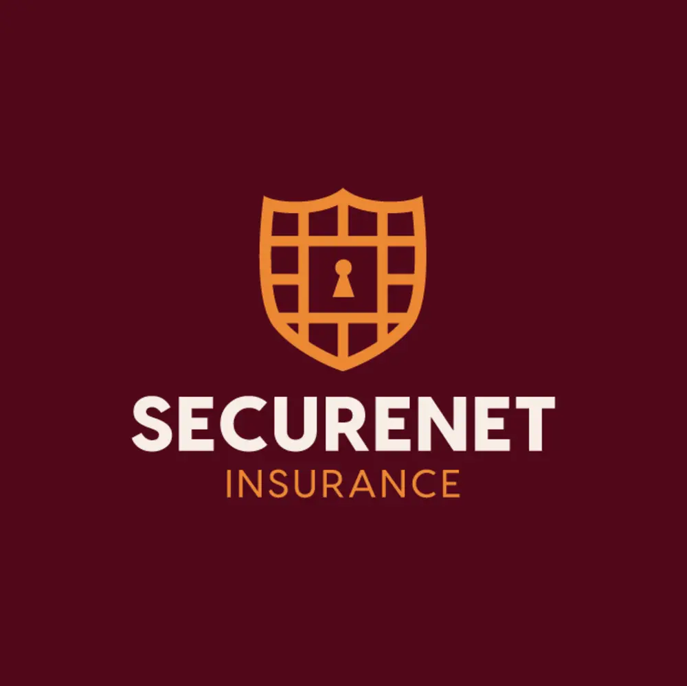
The SecureNet Insurance logo is a modern testament to protection and trust. A grid-like shield takes prominence, symbolizing the structured security the insurance services provide. At the heart of this robust emblem is a keyhole, evoking the essence of safeguarding and access to secure futures. The contemporary and authoritative sans-serif typography of “SecureNet” reinforces the brand’s commitment to modernity and reliability. The grid pattern signifies the intricacies and layers of protection woven into every aspect of SecureNet’s insurance offerings. This emblem is not just a visual identity. It represents a fortified network of security, ensuring that clients are shielded against uncertainties. SecureNet Insurance’s logo reflects a perfect amalgamation of modernity, trust, and the assurance of a secure pathway forward.
Get Unlimited Graphic Design (+ Logos!)
Insurance logos must be professional and high-quality. Additionally, an insurance logo must stay relevant and memorable, for the sake of brand salience. Although DIYing your company logo will save you money, it’s not a sustainable route in the long run. Entrusting logo design to experts who know color psychology, marketing trends, and logo design principles is the key to a timeless logo.
If you don’t know where to get an impressive insurance logo, work with Penji’s professional graphic designers. We ensure fast, efficient, and affordable logo design for any company. Our bespoke design platform lets you experience a hassle-free design process while making communication and collaboration a breeze! Sign up now to get a limited discount on your first month and use the promo code GETPENJI25 to get 25 percent off!
Do you need one logo only? Don’t fret. Penji also offers one-off designs at affordable rates.
About the author

Table of Contents
- 1. Monterey Insurance LLC
- 2. Ace Insurance Consulting
- 3. Strategic Concept
- 4. Oakwood Insurance Services
- 5. Legacy Insurance Brokerage
- 6. Carewell Insurance Services
- 7. Cornerstone Insurance Group
- 8. Paramount Insurance Co.
- 9. Converge Health Insurance
- 10. Westworld Insurance Agency
- 11. Accentsure
- 12. MikeMoore
- 13. Wealth Insurance
- 14. AssureSafe
- 15. Securenet
- Get Unlimited Graphic Design (+ Logos!)


