
When you think of ice cream, what’s the first thing you think of? One might say a sweet treat; some would say summer. Others might go for the cone. The cone imagery is typical in MOST ice cream logo ideas. On most do-it-yourself logo design services, you’ll see templates of ice cream logos with cones. Sure, it’s easy to get a logo that way. But wouldn’t you like a logo unique and tailor-made to your business? And if you say yes, read more about what you need in a logo and some examples of the best ice cream logos.
5 Branding Elements of an Ice Cream Logo
You will find elements like icons, illustrations, fonts, and colors when it comes to any logo. But for ice cream logos particularly, you’ll see ice cream cones and big bright cursive or serif fonts. Although you might want these elements on your logo, you need to distinguish yours from the competition. But in what way can you do that? Here are branding elements to remember for your ice cream logo.
Simplicity
When it comes to logos, you don’t want to jam many elements there. That’s the same with ice cream, right? You don’t want to put too much in there, or it wouldn’t taste great. That’s why you should stick with a simple logo. With this, you might have to think of different logo designs before landing on the best one. And if this overwhelms you, here are some questions to help you narrow down a simple logo design:
- What logo type do you envision (wordmark, pictorial, abstract, monogram, letter mark, or combination)?
- What colors should be in your logo?
- Which is the best font to use (should you choose wordmark, letter mark, or monogram)?
- Do you want to add a significant figure or mascot to your logo?
- Is there something you’d like to add to your logo from your history?
Let your brand voice be heard with a unique logo
Hire a logo designer today and get your logo in 1 to 2 days
Uniqueness
From the hundreds of ice cream logo ideas available on the internet, how do you make your logo unique from the others? Let’s look at the Baskin Robbins example. You’ll notice 31 at a closer look. That’s because they carry 31 flavors in their stores. Think about what makes your brand or company unique. You can integrate it into your logo too. But if you still need more logo ideas, you can scroll down for some.
Timeless
You want a logo that, no matter how many years have passed, it still looks appropriate. Sure, you would like a classic logo, but would that fit your business? A cursive font would help your logo look timeless in most ice cream logos. The same goes for using a bolded sans serif font, which is a common theme in most examples below. You don’t have to rely on fonts. You can use a mascot or illustration that would serve as your logo. It will help achieve the timeless look too.
Versatile
You’ll notice that some companies would publish or print different styles of their logo, but it doesn’t mean they have different logo designs per collateral. It means there might be a horizontal one, a vertical one, a wordmark, or a pictorial only. It depends where it will be published, posted, or printed. Your logo should also have this, especially since you need to have one for your packaging.
For packaging design or other collaterals, you might need different colors too. For example, your ice cream pints would have different colors. Make sure that you prepare a logo with different colors, too, so it’s visible and will match the package colors.
Relevant
You want to do away with the ice cream and the cone for the logo. But you also want to make sure you have a logo that’s not only relevant to your company name but for your branding too. When it comes to relevancy, you can use colors or imagery to make it relevant. The Blue Bunny logo comes to mind here, seeing as their logo is literally blue with bunny ears. But relevancy is more than that. You want to make sure that it’s relevant to the industry too. And you’ll see more examples of that below.
15 Ice Cream Logo Ideas
1. My Mochi
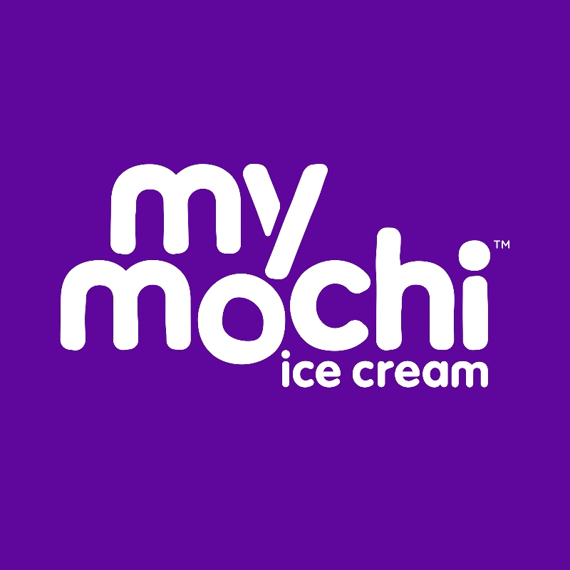
The My Mochi logo is reminiscent of soft mochi treats, but theirs has ice cream. It’s a great way to showcase a logo and a product all at once. Even the o on the logo appears as a mochi, enhancing their branding further.
2. Rain or Shine
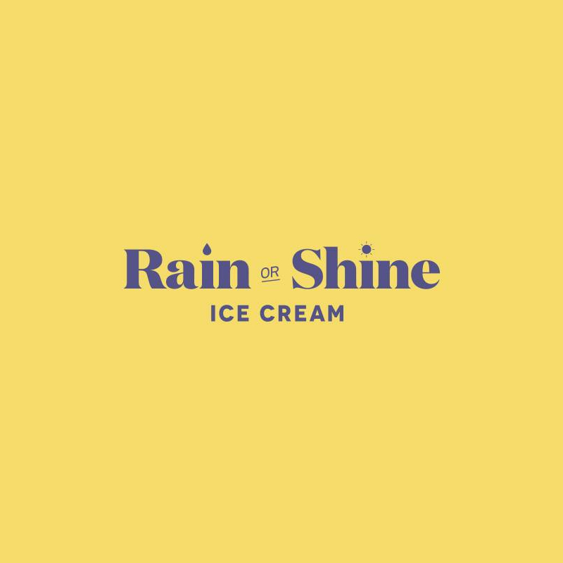
Ice cream is best enjoyed on hot days, but Rain or Shine Ice Cream wants us to know that their ice cream can be enjoyed anytime. The raindrop and the small sun (serving as the tittle for shine) are a nice touch on the logo to give it imagery. It could show that their ice cream can be there with you no matter the weather.
3. Paul’s Homemade Ice Cream
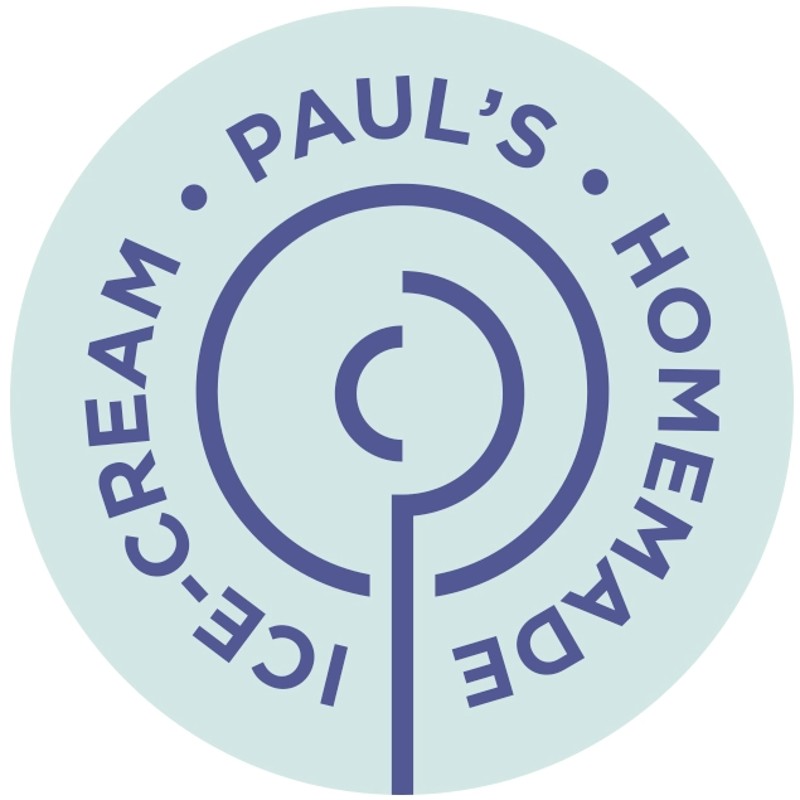
Want to know why this logo made it on this list? Here’s the scoop on Paul’s Homemade Ice Cream logo. The logo appears not only as just one thing but can be interpreted as three different images. One, the logo appears as a spoon scooping ice cream from a pint. Two, it looks like an ice cream scoop. And three, it appears like a P, representing Paul. Now that’s a cool ice cream logo idea.
4. Jeni’s
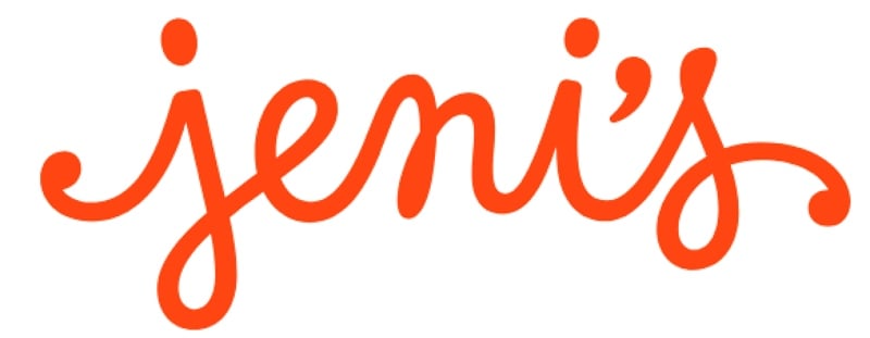
When one thinks of ice cream, we think of it as a sweet treat enjoyed by many, especially during the summer. And Jeni’s looks to do just that. The simple orange, cursive font radiates energy and fun.
5. Helados La Neta
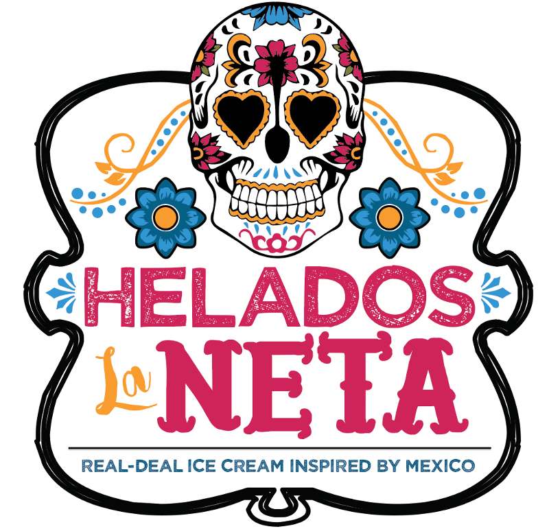
Here’s the first of two businesses that have a cultural background. Helados La Neta uses fonts that have a Mexican feel to them. Although they use three different fonts in their logo, everything comes together, similar to the team being culturally diverse.
6. Noona’s Ice Cream

Say annyeong-hice-sayo with Noona’s Ice Cream. The logo has a mascot of an East Asian female figure (most likely Korean, since the word noona is from Korea) with a cherry as their bun. It appears the mascot logo is wearing a hanbok (traditional Korean clothing) but wrapped around in a cone. It’s one of the coolest ice cream logo ideas because it honors one’s heritage. Fun fact, Noona is the Korean word for an older sister or woman (said by men).
7. Frutero
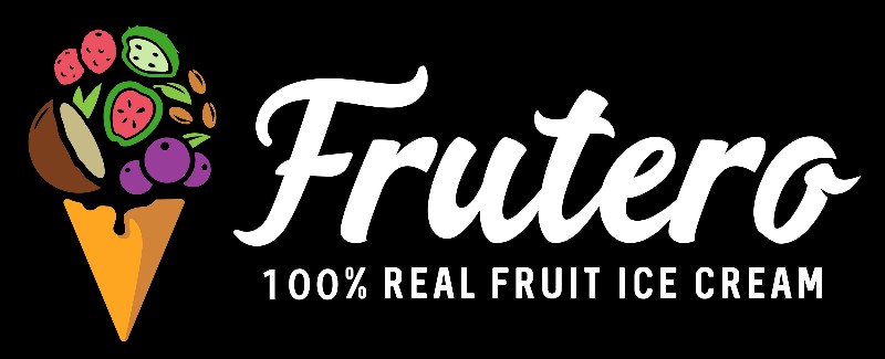
Ice cream cones serve as one of the most recognizable icons of any ice cream logo. Although Frutero’s has one, they made theirs unique by adding tropical fruits to their logo, symbolizing the ice cream flavors they sell.
8. Peekaboo
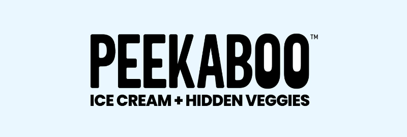
Peekaboo ice-e you! The logo for Peekaboo has a bold look. But what gives Peekaboo its signature look is the eyes on the logo if you look closely. It could represent that they hid veggies inside their ice cream. It’s one sneaky way to help kids eat their veggies while enjoying a sweet treat.
9. Brave Robot
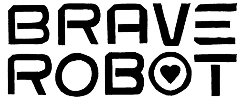
You will rarely see futuristic fonts in ice cream logos since ice cream logo ideas would have a hint of nostalgia or fun. But the Brave Robot logo dares to be different. As a forward-thinking ice cream company, they created dairy-free and sustainable ice cream. With this logo, they may present an image that they’re the ice cream company of the future, and their ice cream would be the go-to for the eco-conscious consumers. Plus, despite their possibly analytical and forward-thinking approach, the heart shows us their care for the environment and consumers.
10. Sebastian’s Ice Cream
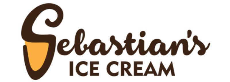
Here’s another ice cream logo that shows an ice cream cone. Sebastian’s logo uses a combination logo, a monogram and pictorial. The S (monogram) is used as an outline for the cone (pictorial) and the swirl for the ice cream.
11. Bluebell Dairy
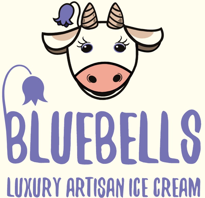
Cows are popular figures in ice cream logos. The Bluebell Dairy’s logo has a cow front and center. Aside from that, there are also bluebells, the flower on the side of the cow and the B of their logo.
12. Mayday
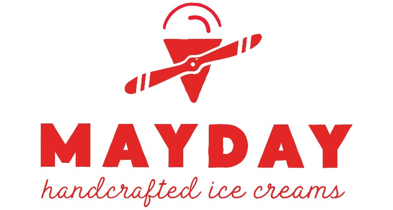
Mayday, mayday sound the alarm! Here’s one ice cream brand for everyone. For you to understand their logo design, you need to read about their history, and it pays respect to the pilots who wanted ice cream during World War II. This is one way to reimagine the cone in your logo. With the added propeller, it looks like a fighter plane, and the ice cream scoop is the rounded window of the cockpit.
13. Proof
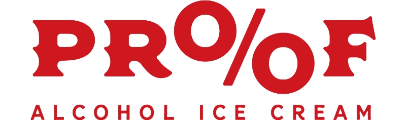
The proof is in the… ice cream? Proof mixes alcohol in their cold, creamy treats. And their logo shows it. The percentage represents the alcohol (which you see in most alcoholic beverages).
14. Paradis
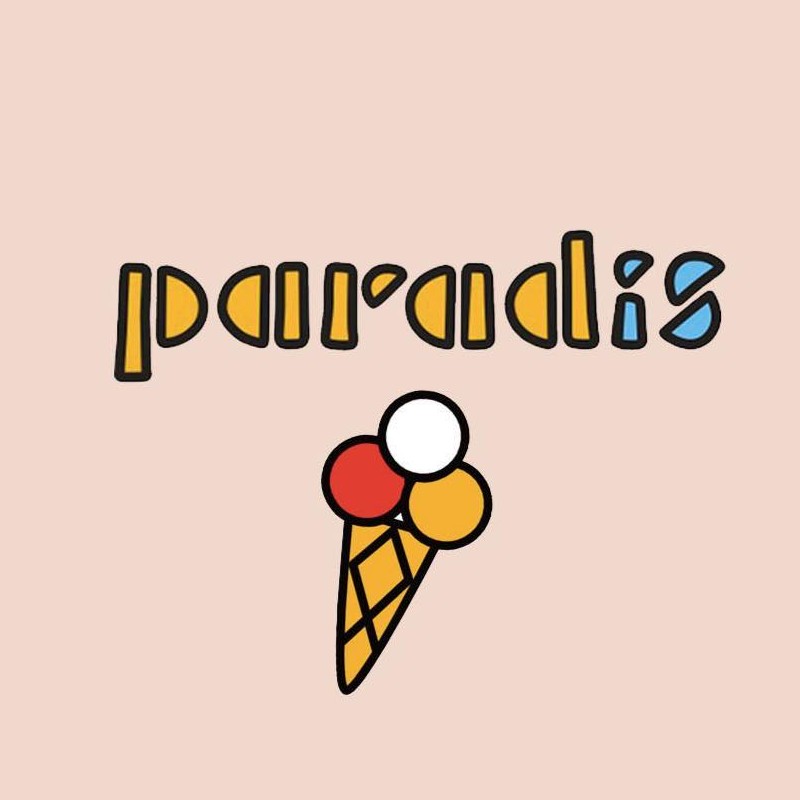
As mentioned previously, most fonts used in ice cream logos are cursive or sans serif. But this one from Paradis is unique. They use a whimsical and playful font. As for the colors, they stuck only to the primary colors, showing us that they’re a bright and cheerful brand.
15. Fat Cat Creamery
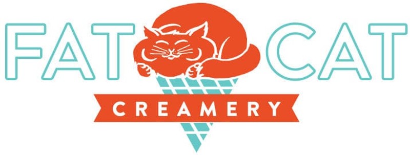
When it comes to ice cream, cats would be one of the last things you’ll associate it with. But Fat Cat Creamery will change your mind. According to Field of Study, they designed the logo with neon signs in mind. Of course, they also included the fat cat on the logo atop the cone, taking the shape of an ice cream.
Work with Penji Designers for Your Ice Cream Logo
DIY seems like the fastest and most convenient option to get a logo. But any business owner knows that it takes time to concoct the perfect logo for your company. And professional designers are the ones you can go to and hire for your well-designed ice cream logo. But where and how can you find a designer for your company?
Well, you’re already in the right place. With Penji, there’s no need to hire anyone since the top 2% of designers are already here. They’re vetted, and we can guarantee that you’ll work with professionals for every project you’ll request. Plus, if you need your logo pronto, it’ll be ready in one or two days. Are you ready to get a sweet and cool logo for your business? Click here to choose a plan that fits your budget and start a new project ASAP.
About the author

Katrina Pascual
Katrina is a content writer specializing in graphic design, marketing, social media, and technology. In her spare time, she writes monthly personal blogs to practice her craft.
Table of Contents
- 5 Branding Elements of an Ice Cream Logo
- Simplicity
- Uniqueness
- Timeless
- Versatile
- Relevant
- 15 Ice Cream Logo Ideas
- 1. My Mochi
- 2. Rain or Shine
- 3. Paul’s Homemade Ice Cream
- 4. Jeni’s
- 5. Helados La Neta
- 6. Noona’s Ice Cream
- 7. Frutero
- 8. Peekaboo
- 9. Brave Robot
- 10. Sebastian’s Ice Cream
- 11. Bluebell Dairy
- 12. Mayday
- 13. Proof
- 14. Paradis
- 15. Fat Cat Creamery
- Work with Penji Designers for Your Ice Cream Logo


