TL;DR: A strong email banner grabs attention in two seconds and gives readers one clear reason to click. This guide covers the layout rules, copy tips, and design principles that make email banners convert, with examples and tools to help you build better ones.
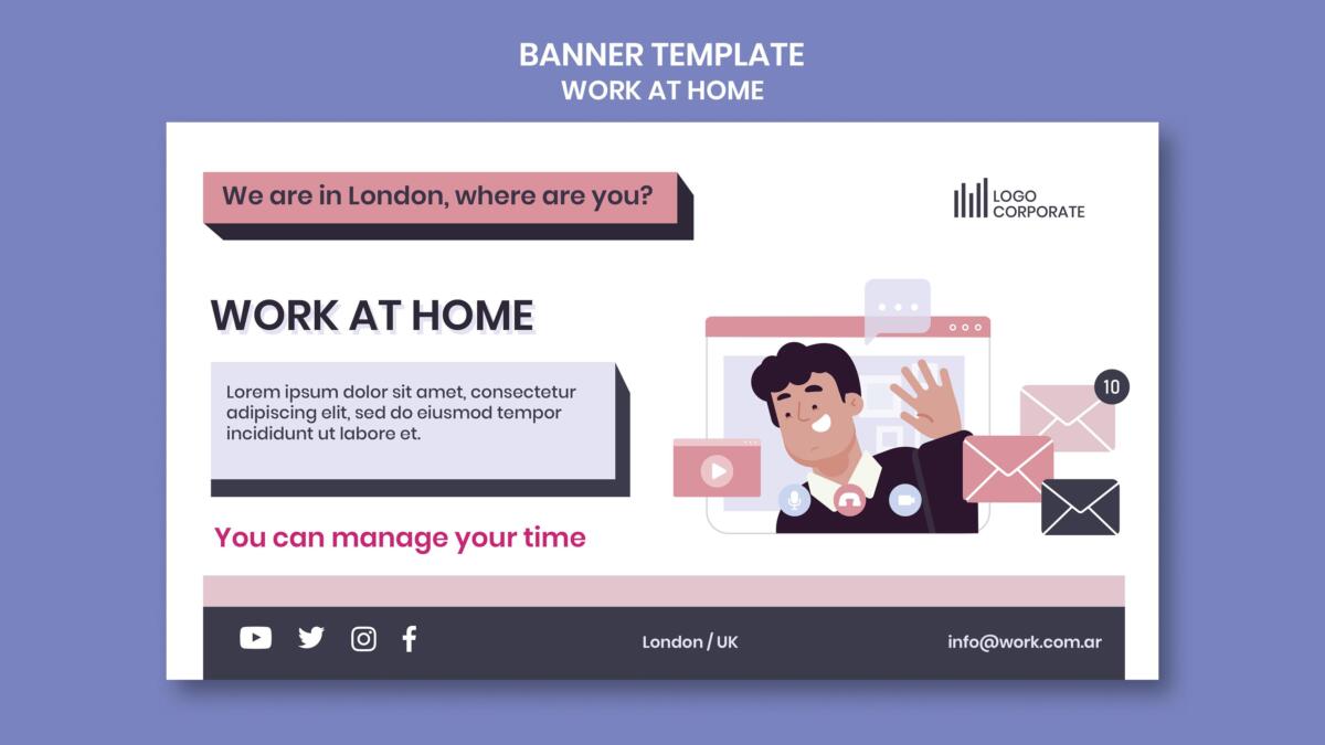
A high-converting email banner combines a clear headline, one strong image, a single CTA, and brand-consistent colors. Standard width is 600px, with height between 200px and 300px.
Keep text minimal, make the CTA button high-contrast, and always test for mobile before sending. The goal is to communicate the offer and direct the reader’s next step at a glance.
Your subscriber opens your email and spends about two seconds deciding if it’s worth their time. The banner is what they see first.
If it’s cluttered, generic, or says nothing useful, they’re gone.
Good email template design changes that.
This guide breaks down what makes an email banner work, what kills conversions, and how to build one that actually earns the click.
1. Why Your Email Banner Is More Important Than You Think
Most marketers spend hours on email copy and about ten minutes on the visual. That’s backwards. The banner is the first thing a reader sees, and in email, first impressions do the deciding.
A well-designed banner communicates your brand, previews the offer, and sets up the click. A weak one does the opposite. It confuses, overwhelms, or gets skipped entirely. Graphic design services built around email know the banner is where the conversion either starts or dies.
2. The Five Elements Every Banner Needs
There’s no single formula, but high-converting banners share the same core traits. If any of these are missing, the banner is working against you.
| Element | What It Does |
| Strong headline | States the offer or hook in under 10 words |
| One focal image | Draws the eye without competing with the CTA |
| Single CTA button | Makes the next step obvious |
| Brand colors and fonts | Builds trust and recognition |
| Correct dimensions | Renders cleanly on desktop and mobile |
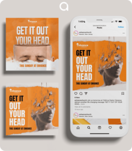
Strip away anything that doesn’t serve one of those five. If it’s decorative and nothing else, it’s probably hurting you. Penji’s email graphics examples show how these elements come together across different industries.
3. Size, Layout, and the Mobile Problem
Email banners run 600px wide for desktop. Height varies, but 200px to 300px is the standard sweet spot. Go taller and you’re eating the screen before the reader sees your message. Go shorter and the design feels squeezed.
Mobile is where most emails are opened now. Your banner needs to scale down without losing its punch. That means large text, high-contrast visuals, and a CTA button big enough to tap with a thumb.
Custom email templates built for mobile-first rendering handle this automatically. If you’re starting from scratch, always test both desktop and mobile preview before sending.
Professional design services by the world's top 2% designers
Unlimited graphic design at a flat monthly rate


4. Writing Copy That Belongs in a Banner
The banner is not the place for a paragraph. You have a headline, maybe a subline, and a button. That’s it.
The headline should name the offer or create urgency fast. “50% Off Ends Tonight” works. “Welcome to Our Newsletter” does not. CTA button copy matters more than most people realize. “Get My Discount” consistently outperforms “Shop Now.”
First-person phrasing wins. Keep the tone consistent with your brand so the visual and the copy feel like they came from the same place.
5. How Color and Typography Drive the Click
Color isn’t decoration. It’s direction. A high-contrast CTA button that pops against the background gets more clicks than one that blends in.
Most successful email banners use two to three colors: one for the background, one for the headline, one for the CTA.
Typography should be legible at a glance. No script fonts in headlines. Nothing under 16px for any text the reader needs to act on. If someone has to squint, they won’t.
Penji’s great email design resource walks through how to combine these elements into something that performs.
6. What a Professional Email Design Service Gets Right
A lot of businesses build email banners in drag-and-drop tools. The results are often functional but flat. They don’t feel like a brand. They feel like a template everyone else is also using.
An email design service that knows your brand gets a few things consistently right: visual language that carries across campaigns, proper specs for every email client, and designs built to convert rather than just look decent.
The difference shows up in performance. Polished, intentional emails get more trust and more clicks.
Design as a service through a subscription model means your designers already know your brand. They build off established assets, which makes every new campaign faster and more consistent. See how that works at Penji’s email design services page, or take a look at what makes email design stand out when it’s done well.
7. A Quick Pre-Send Banner Checklist
Before any email goes out, run through this:
| Check | Done? |
| Headline communicates the offer clearly | ☐ |
| CTA button is high-contrast and specific | ☐ |
| Image is compressed and loads fast | ☐ |
| Alt text is written for every image | ☐ |
| Banner tested on mobile preview | ☐ |
| Image-to-text ratio is balanced | ☐ |
| Colors match brand guidelines | ☐ |
That last point matters for deliverability too. Emails that are all image and no live text can trigger spam filters. Good email template design keeps images and text balanced so your send actually lands in the inbox.
Conclusion
Getting email banners right comes down to intention. Every element should have a job: the image draws the eye, the headline names the offer, the button shows the next step. When those three things work together, clicks follow.
The brands that treat every email as a visual campaign consistently outperform the ones that treat it as an afterthought.
If you want every send to look this intentional without the production overhead, that’s exactly what Penji is built for.
See what Penji’s design team can do for your email campaigns. Browse plans and get started today.
Frequently Asked Questions
The standard width is 600px, which renders cleanly across most email clients. For height, 200px to 300px covers most use cases without overwhelming the screen.
The most important step is testing your banner in both desktop and mobile preview before the send goes out. What looks great on a laptop can fall apart on a phone if the layout wasn’t built for scaling.
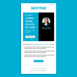
Pick an image that supports the offer rather than competing with it. Product shots work well for promotional emails. Lifestyle images work better for brand-building campaigns.
Whatever you choose, make sure it doesn’t clutter the headline or push the CTA out of the visual hierarchy. One focal point per banner is the rule. For inspiration, Penji’s best email design examples show how image choice shifts based on campaign goal.
Email clients like Gmail, Outlook, and Apple Mail each render HTML and images differently. Outlook in particular is notorious for ignoring certain CSS rules.
The safest approach is to use inline styles, avoid background images in critical areas, and always include alt text so the message comes through even when images are blocked. Working with a professional email design service means these rendering issues get handled before your campaign goes live.
It can. Emails with a heavy image-to-text imbalance are more likely to get flagged. A banner that’s entirely image with no live text is a deliverability risk, especially in B2B inboxes.
Balancing your banner with some live text, proper alt text on images, and a healthy text body below the fold helps keep your sends out of the junk folder.
About the author

Flore
Flore’s passionate about turning ideas into clear, useful content that connects with people and performs on search. From blog posts and landing pages to full content plans, her work is grounded in purpose and always aligned with a bigger picture.
Table of Contents
- 1. Why Your Email Banner Is More Important Than You Think
- 2. The Five Elements Every Banner Needs
- 3. Size, Layout, and the Mobile Problem
- 4. Writing Copy That Belongs in a Banner
- 5. How Color and Typography Drive the Click
- 6. What a Professional Email Design Service Gets Right
- 7. A Quick Pre-Send Banner Checklist
- Conclusion
- Frequently Asked Questions