If a company operates in the healthcare or medical sector, incorporating a hospital in its logo can help establish a clear connection with its core business. The hospital symbol must convey the company’s values, mission, desired brand perception, and overall messaging. If you’re looking for logo design inspiration, here are 10 hospital logos created by professional graphic designers.
Looking for help with your hospital logo? Let Penji design a quality and unique logo for you for only $75!
1. Seattle Grace Logo

The vibrant colors of the Seattle Grace’s cross icon keep the overall design lighthearted. The color combination isn’t jarring to the eyes, which is an excellent eye-catching symbol for those looking for reliable healthcare service. Although the varying colors keep it distinct, the letter S in the middle of the cross ties everything together. Overall, this logo design is simple yet impactful to the right audience.
2. Springfield General Hospital Logo
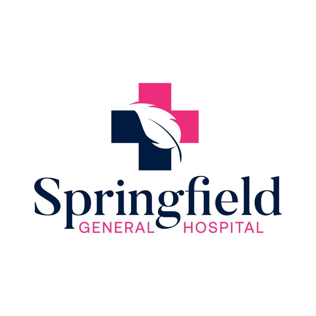
This is a beautiful and elegant logo from Springfield General Hospital. It features a simple cross combining pink and dark blue colors. But the play on negative space is what makes this hospital logo a unique one. A feather slightly slanted to the left is the white space that separates both colors creatively. The serif font also gives this logo design a traditional touch. Moreover, the mix of both pink and dark blue colors in the text keeps the design consistent.
3. Portola Hill Medical Center Logo

Portola Hill Medical Center is situated on, you guessed it, a hill in the suburbs. It’s the only medical institution within a few-mile radius. That said, the logo is created to tell clients their geographical location. When creating your logos, it’s good to add your company’s history or story. People will have an affinity for brands that they can relate to. And this Portola Hill Medical Center logo shows that through the illustration of a hill and sun within the cross icon.
4. Vettel Medical Clinic Logo
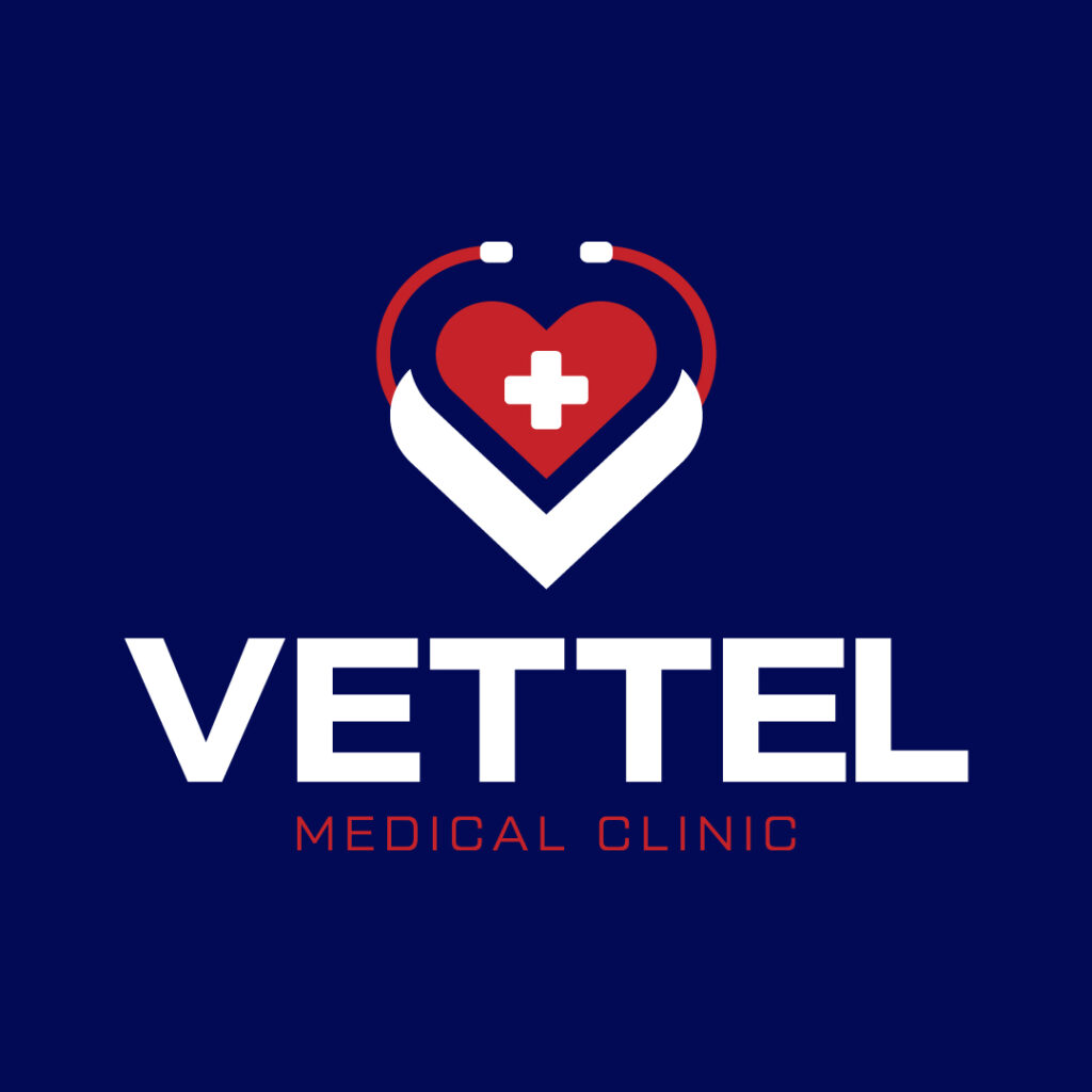
One of the elements of logo design is simplicity. Keeping the design elements less is the key to making your logo understandable. And Vettel Medical Clinic’s logo is one that you must emulate. The entire design composition is commendable as the various components meld nicely. You have the cross inside the heart that is displayed in the middle of a stethoscope encompassing the entire design. You’ll also notice the collar that looks like a scrub suit, which stays relevant to what a hospital offers.
5. Capitol Doctors Hospital Logo

Here’s another example of a simple hospital logo. It’s a wordmark or letter mark logo that dons only the initials of the hospital name. The text is a one-word line combining “Capital” and “Doctors,” in different colors. The letter mark logo also combines both subtly by creating a letter C and D bound to each other. These initial letters are also in the same colors as the hospital name.
6. Hill Medical Hospital Logo

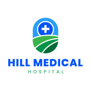
This is a perfect example of a hospital logo located in a remote area on a hillside. The illustration of an abstract hill complemented by a cross symbol captures your attention instantly as the green color pops. The entire design is compact as it’s encapsulated in a capsule-shaped drawing. Moreover, the bold blue font is still the most evident design element in the whole composition, making this logo suitable for any online or print materials.
7. Paradise Valley Clinic Logo
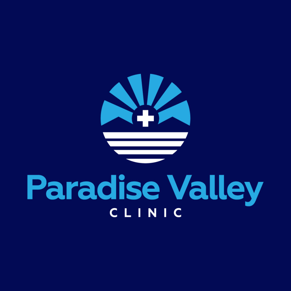
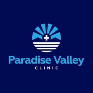
Ask any professional designers worth their salt, and they’ll tell you logos should be the brand’s first line of advertising. That said, creating a logo means involving design components that include storytelling. Paradise Valley Clinic’s logo has every subtle detail about this hospital, which ups their storytelling factor. You get the sun’s rays on the horizon and the valleys at the bottom. Then it features a cross symbol in between the valleys. Finally, the white horizontal lines at the bottom half of the circle provide contrast against the dominating blue colors.
8. Wilson Medical Center Logo
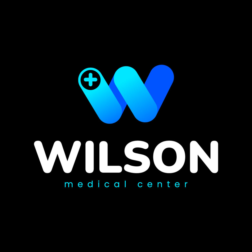
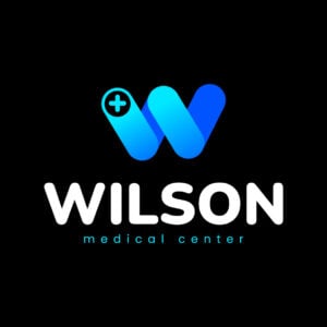
Wilson Medical Center takes on a different approach to its logo. The company relies on a letter mark, which features the letter W and a small cross on the left side of the letter. The beautiful blue hues and gradients provide a unique twist to the letter W. Additionally, the letter mark design can also be a stand-alone logo, which is perfect for any branding and marketing material. It’s memorable and has the potential to create top-of-mind awareness. Also, the typography is commendable as a light-faced font complements the bold white text. Overall, this logo looks modern and sleek.
9. St. John The Baptiste Medical Center Logo

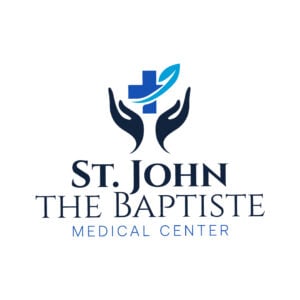
For a hospital named after a saint, this logo is an apt design that shows just that. It displays praying hands that seemingly hold the cross. The designer also features an accent in teal, which is a good contrast against the blue cross and black praying hands. The three-font combination, featuring sans serif and serif fonts, also provides an impressive typographical design.
10. Central Los Santos Medical Center Logo
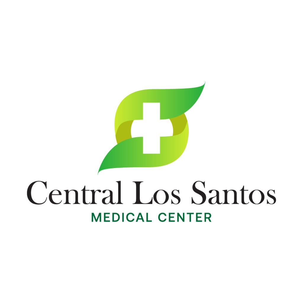
The Central Los Santos Medical Center logo is a unique design that makes an impact. You want your company logo to create a lasting impression that clients will remember. And this is an example of a timeless logo because of the appealing shape with a negative space that looks like a cross.
Create a Hospital Logo & More Designs with Penji
Making your company logo professional is crucial if you’re in the healthcare niche. This is because people entrust you with their lives, and seeing a crappy logo lowers your credibility as a business. That said, it’s vital to work with professional graphic designers.
Penji hires the top two percent of the best graphic designers in the world, ensuring you’ll have a high-quality outcome. You’ll also have access to a bespoke design platform, where you can add up to 10 team members to collaborate on projects. With their subscription-based model, you can get unlimited design requests for a flat fee and have them delivered within 24-48 hours. Not only does this save time, but it also saves money on design costs.
If you’re looking for a quality, efficient, affordable logo and graphic design, subscribe to Penji today. Get this limited 15 percent off your first month!
Penji also offers one-off designs at discounted prices! Visit our website if you want a professional hospital logo for only $75!
About the author
Table of Contents
- 1. Seattle Grace Logo
- 2. Springfield General Hospital Logo
- 3. Portola Hill Medical Center Logo
- 4. Vettel Medical Clinic Logo
- 5. Capitol Doctors Hospital Logo
- 6. Hill Medical Hospital Logo
- 7. Paradise Valley Clinic Logo
- 8. Wilson Medical Center Logo
- 9. St. John The Baptiste Medical Center Logo
- 10. Central Los Santos Medical Center Logo
- Create a Hospital Logo & More Designs with Penji

