Often viewed as being conservative and traditional, the finance industry can be one of the most difficult to design for. Crafting a finance company logo requires careful thought and planning, a considerable amount of research, and high levels of skills and experience.
When looking for professional finance logo designs, Penji is the all-in-one solution that will provide you with compelling logos. Entrust Penji with your logo design and more! Since it’s a subscription-based design service, request as much as you want at a flat rate. Plus, we offer the most affordable plans for any business. No other graphic design service offers our budget-friendly prices. Sign up for a subscription now and try it free for 15 days!
Here are 25 finance logo designs that are effective in getting their messages across.
1. Bank of America
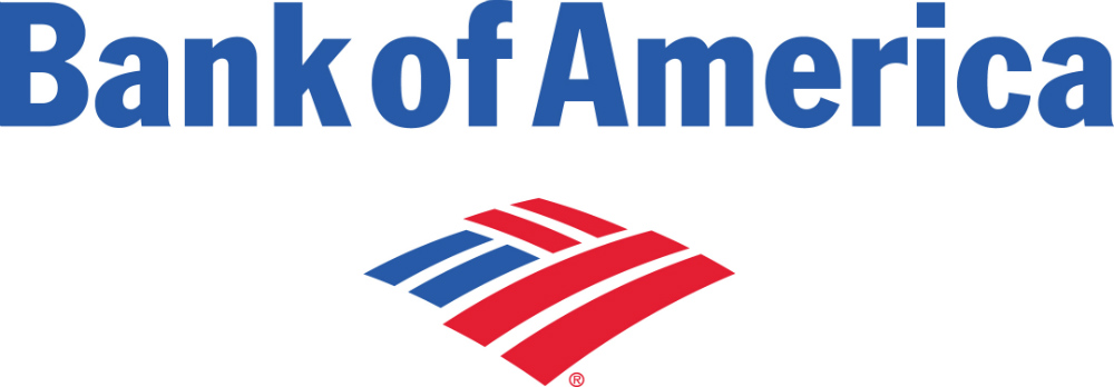
Bank of America carries the name of the country it comes from, so it’s only natural that its logo would include patriotism. The logo is a stylized version of the flag and uses red, white, and blue as its colors. It uses its logo to establish itself as a bank to represent the United States.
2. Merrill Lynch

Merrill Lynch uses a bull for its logo to help showcase its dominance. As a company dealing with investments and insurance, they want to showcase its strength and aggressiveness in the industry.
3. Everspire
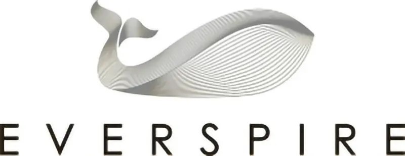
In Native American traditions, the whale is a powerful symbol of awareness and wisdom, something that Everspire’s logo has achieved beautifully with its use of a whale icon. An investment company, their logo inspires confidence and stability that is suited for their business.
4. Prudential

Another investment company, Prudential, uses a steep mountain face as its logo, reinforcing its claim that they are as solid as a rock. And their years in the industry and the millions who have done business with them prove that they are right.
5. Captain Cash
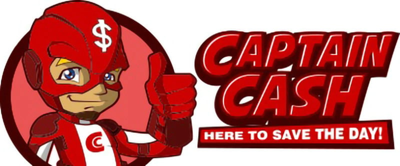
Captain Cash is an online cash loan company in Canada and what makes its finance logo stand out is the fact that it used fun and laughter in it. By using an optimistic-appearing human in its logo, Captain Cash comes off as a personable brand. Their goal is to remove the intimidating feeling of taking out a loan.
[in_content_ads gallery="logos" logo="off" title="Get a logo as timeless as your brand" subtitle="Logos should be as unique as your business. Hook your audience with a 100% custom logo design." btntext="I need this!" btnlink="https://penji.co/pricing/?affiliate=J2O5AB8RAR3386837"]6. Avant Capital Partners
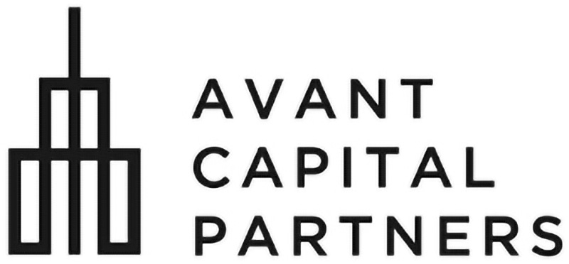
The Avant Capital Partners logo uses geometric shapes that give the impression of modernity in a streamlined manner that looks crisp and clean. Most financial institutions nowadays have services online, and this image of a building reflects the time when the company started.
7. Deutsche Bank
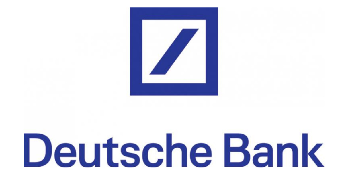
Deutsche Bank’s logo is simplicity at its best. With only a square and a slash inside it, it’s one of the cleanest logos on this list. The idea in its design was to create a logo that can be used globally regardless of script and language. Its minimalism has made the company recognized as one of the leading financial institutions in the world.
8. Barclays

Barclay uses an eagle in its logo to associate itself with everything the bird represents. It conveys power and flying higher than its competition. They are one of the most respected companies in the industry. It is also strategically shaped like a shield to illustrate protection, strength, and security.
9. Mastercard
Thanks to the association, MasterCard dropped its name from its logo because the branding is so recognized worldwide. This may be due to a shift in their business model. This finance logo is one of the most memorable and well-known in the industry. MasterCard’s logo sticks to its roots while also looking to the future. It follows some finance business trends, sticking with simplicity.
10. Liberty Mutual
Synonymous with freedom and patriotism, the Statue of Liberty has almost always been associated with Liberty Mutual. As one of the biggest insurance companies in the US, their logo is a very effective way of sending their message of trust and confidence in doing business with them.
11. Truist Bank

Formerly known as SunTrust Bank, Truist Bank’s logo is a stylized blue letter “T” that appears to be formed by intersecting lines, with the word “Truist” in lowercase letters written underneath. The design is intended to symbolize the coming together of the two banks and the intersection of their respective strengths to create a new, unified entity.
12. KeyBank
The key in KeyBank’s logo is simply a literal interpretation of the company’s name. Their motto is ‘Achieve anything,’ and it can be hard to come up with a catchy motto that matches your financial ideas. This is the key element to being successful in dealing with the finance market.
13. J.P. Morgan Chase & Co.
The largest bank in the US, J.P. Morgan Chase & Co. uses typography as its logo, and it works very well in letting everyone know that they are straightforward, reliable, and transparent. Besides this logo, Chase itself uses a similar logo, using four of the same shape to create uniformity.
14. Standard Chartered Bank
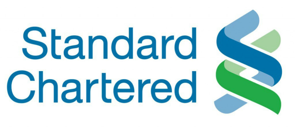
Two intertwined bands of blue and green compose Standard Chartered Bank’s logo, which denotes the trust and partnership that they aim to provide their clients. The blue band represents the S, while the green represents the C.
15. Credit Suisse

The Switzerland-based company Credit Suisse uses two superimposed geometric shapes reminiscent of a ship’s sail to effectively illustrate its forward-moving objectives. The design is clean and clear and gives the impression of advancement in technology, yet commemorates its long history of service.
16. Charles Schwab
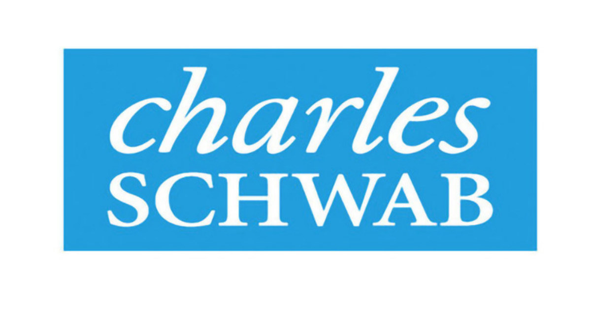
Text-only logos have become very popular in the last few years. Charles Schwab has typically used a text-only logo before it became widely popular. In this context, they come off as both serious and lighthearted. The font isn’t overwhelming, and the bright blue is a friendly color.
17. The Bank of New York Mellon
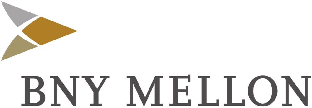
The Bank of New York Mellon shortens its name in its logo. It’s a great way to showcase your name in a way consumers will remember. They use an arrow, going well with their core values. By splitting the arrow and color-coding it, it comes off more as both a representation of their values and professionalism. The colors are neutral and sophisticated as well.
18. Wells Fargo

Wells Fargo updated its classic name logo and added an image of a stagecoach that clearly shows its long history of service to the finance industry. The new finance logo is part of a plan to reinvent itself and give the company’s fresh face, and it’s working quite well.
19. ING
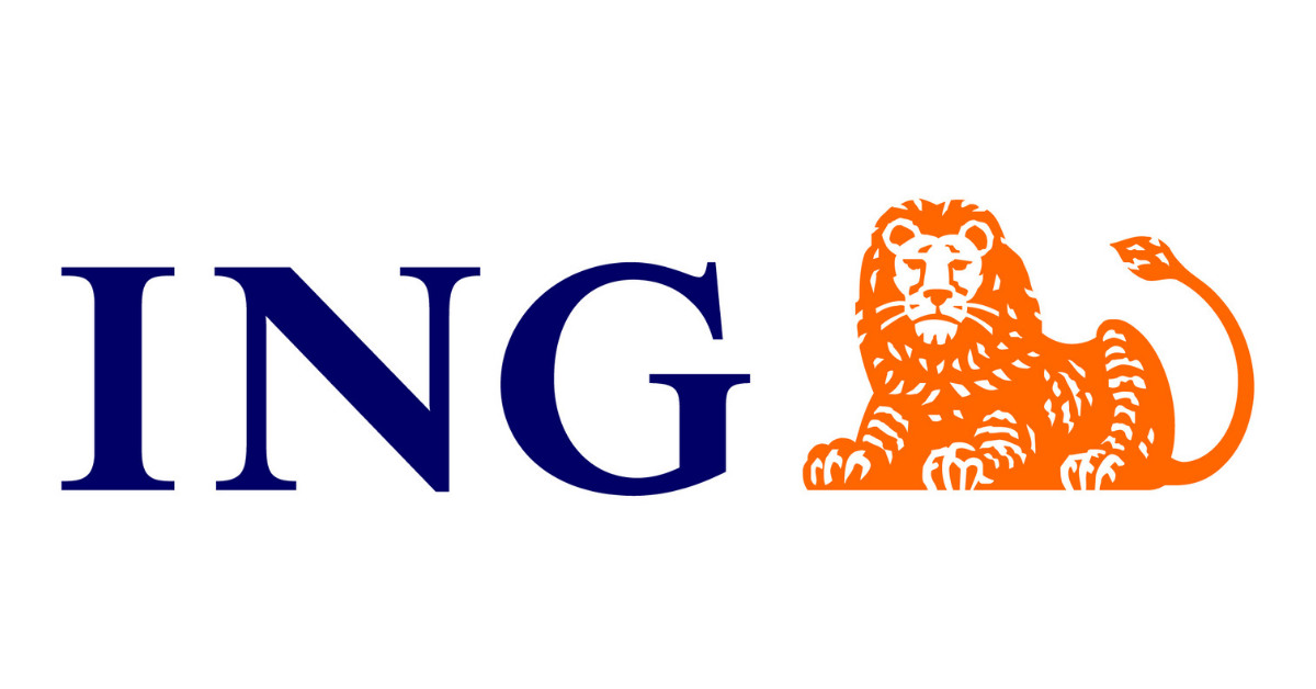
Logos often use lion imagery to signify strength, courage, and force. ING projects its image through its logo with a lion icon to show that they are built on solid ground. The company hails from the Netherlands and the lion is the country’s national symbol.
20. Raiffeisen Bank

You want a strong company logo. Raiffeisen Bank gets straight to the point, using tools in their direct logo. The gable cross is a great way to show strength in your company, and it doesn’t take away the purpose of the bank.
21. Apple Pay
Apple recently entered the finance market with Apple Pay. Just like other online-only credit cards, the company decided to try this approach. When it comes to its logo, it does a fantastic job of showcasing its part of the Apple brand but serves a wider purpose than just technology. But just adding Pay to the end, tells you its intention as a finance logo.
22. PayPal
PayPal‘s logo hasn’t changed drastically over the years, but you don’t need a logo to undergo major changes. For PayPal, they enjoy its colors and style with the P. They’ve adopted the modern trend of simplifying their existing branding, which in this case works effectively. It’s narrowed down to three colors, and together it screams PayPal.
23. Ally
Ally is an online-only bank, latching onto the modernism that many new fintech industry businesses use. As a result, they only use one color, with their name as their logo. Its clean, almost feminine vibe is one that can appeal to any consumer looking for banking like this company.
24. Chime
Chime‘s name matches its fun logo. Just like other newer finance companies, they use only their name as their finance logo. Instead of just using a regular font, they use a font with a fun swirl in the m to showcase their relaxed nature. They used a custom logo design to ensure their logo was more than just the word chime.
25. Simple
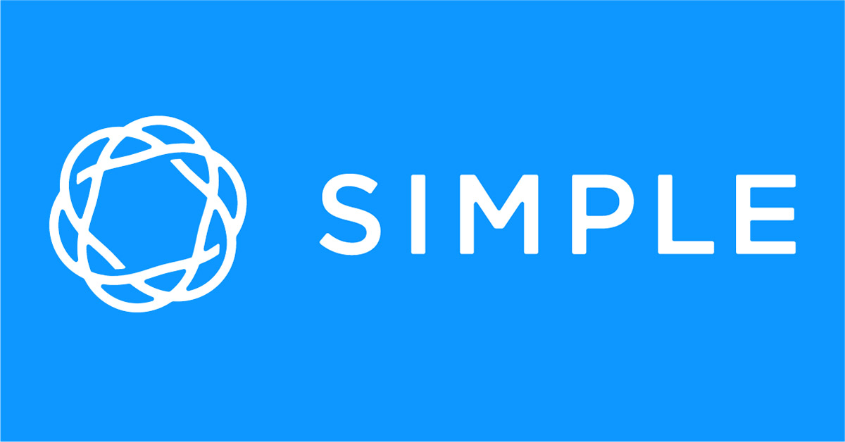
Although closed in May 2021, Simple still made it to this list of the best finance logos. Its design matched its name that offered a straightforward way of banking when it was in operation.
Related Article: Why FinTech Companies Are Changing The World
Three-Step Process to Requesting Designs on Penji
By using Penji, you can request branding and other materials on any Penji plan. Learn the steps on how to receive the designs on the platform.
Step 1: Create
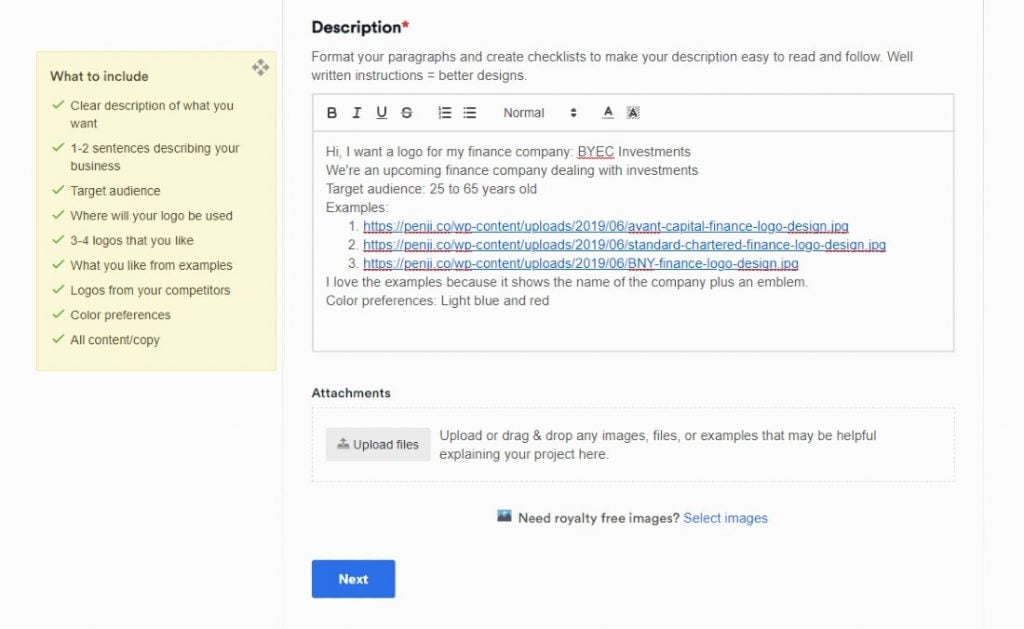
It’s easy to create a project on the Penji platform. Once you subscribe to any plan, go to your dashboard then select New Project.
From there, provide the details of your design. Name your project in the Project title field. Then, select a category from the list of Design categories. If you can’t find the type of design you need, click Create a Custom Project. After selecting or providing design dimensions, add your design brief to the Description.
I advise you to follow the What to Include guidelines. This way, your designer knows the specifics of your design. Plus, they can work on it right away. Providing all the necessary design details also means you will receive them within 24 to 48 hours.
Step 2: Review

Once you submit the design, we assign your project to a designer suitable to fulfill your project. After this, they’ll clarify your design brief, work on it, and submit the first draft within 24 to 48 hours.
When you receive the first draft, you could download it or review it further.
On any Penji plan, you have unlimited revisions. This way, you could get a design that you’ll love. Plus, unlimited revisions are integrated into your Penji plan. We don’t charge you extra for revisions AT ALL.
Make sure to use the revision feature, so your designer knows how to enhance the design. This reduces delays and unclear instructions on revising the design.
Step 3: Download
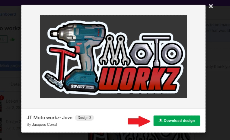
If you love the design that you receive, download it in a snap. You won’t have to access it anywhere else. After all, the Penji platform is the all-in-one solution for your design needs.
Plus, we store your files on the cloud, too. This way, if you need those designs, you can access them anytime, anywhere, and download them again.
Save Costs by Subscribing to Penji
You won’t just need a logo for your finance company. You might need promotional materials, merchandise, and the like. That’s why you should use Penji to get those visuals. You won’t have to find a graphic designer for each project. We’ve got you covered at Penji. We hire the best graphic designers in the industry, and we ensure you experience the best when you’re subscribed to Penji.
Get started on your plan today.
About the author

Celeste Zosimo
Celeste is a former traditional animator and now an SEO content writer specializing in graphic design and marketing topics. When she's not writing or ranking her articles, she's being bossed around by her cat and two dogs.
Table of Contents
- 1. Bank of America
- 2. Merrill Lynch
- 3. Everspire
- 4. Prudential
- 5. Captain Cash
- 6. Avant Capital Partners
- 7. Deutsche Bank
- 8. Barclays
- 9. Mastercard
- 10. Liberty Mutual
- 11. Truist Bank
- 12. KeyBank
- 13. J.P. Morgan Chase & Co.
- 14. Standard Chartered Bank
- 15. Credit Suisse
- 16. Charles Schwab
- 17. The Bank of New York Mellon
- 18. Wells Fargo
- 19. ING
- 20. Raiffeisen Bank
- 21. Apple Pay
- 22. PayPal
- 23. Ally
- 24. Chime
- 25. Simple
- Three-Step Process to Requesting Designs on Penji
- Save Costs by Subscribing to Penji

