
Your Facebook business page is one of the quickest ways to reach and connect with your target audience. But do you ever wonder how brands get users to scroll their pages and end up following them? This is all thanks to Facebook page customization. But how can you customize your Facebook page and make it “yours”? I’ll show you how to customize your Facebook business page design with the essentials, plus examples!
How Do I Customize my Facebook Business Page?

- Profile picture – Most brands use their logo as their profile picture. You can follow their path or use a notable character or product as your profile picture instead to make your profile picture unique.
- Cover image – The Facebook cover image further enhances your branding. Your cover image can be an image of your new product. Or, for service-based businesses, you can tailor it by adding an illustration or promotional content.
- Custom images and visuals – Branding is essential for your Facebook page, and you should observe your branding guidelines for your custom images or visuals.
- Branded videos – Finally, you can post branded videos as part of your overall Facebook business page design. Brands do this by customizing the thumbnail to keep branding consistent.
10 Examples of Facebook Business Pages
1. Oreo
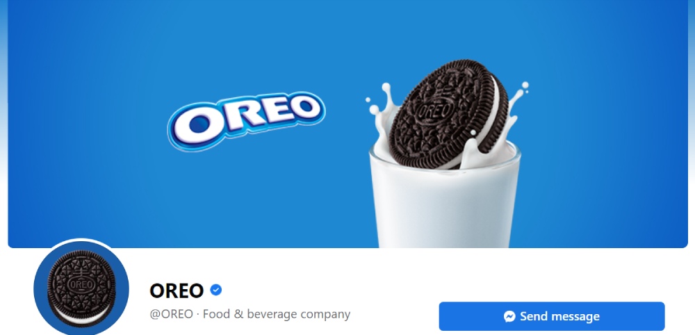
If you want to use an image other than your logo as the profile photo, check out this Facebook business page design from Oreo. They use their delicious round treat as the profile photo. Then, you’ll see the logo on the cover photo instead. Plus, they added the image of the cookie falling on the full glass of milk. It’s the beverage you drink when consuming an Oreo, further enhancing their branding.
2. Hubspot
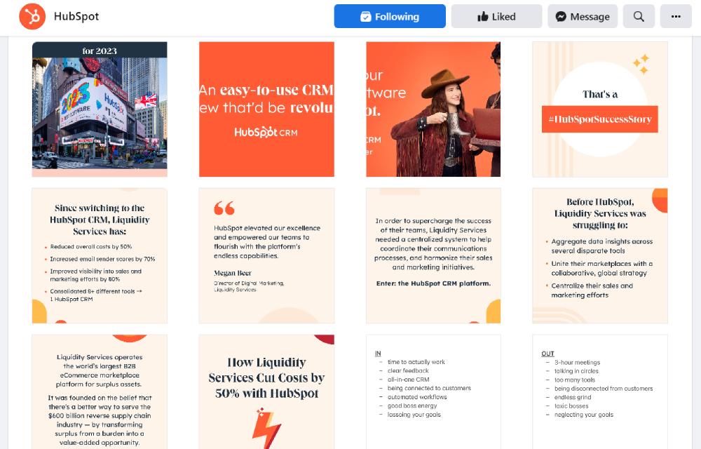
There’s a reason why Hubspot is one of the most recognized brands by marketers. Across various platforms, they sport their signature orange paired with their Hubspot logo or typography. You will see those on their Facebook page, such as their cover image, profile photos, images, and videos.
3. Shein
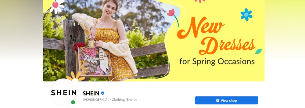
Fast fashion company, Shein, has won the hearts of young audiences. It’s beloved because they sell affordable clothes. Aside from that, the Shein brand features outfits and apparel that many customers love. One notable design feature is their Facebook cover photo. They are promoting new clothes inviting customers to visit their site and purchase it. In addition, they post various images and image edits using a serif font.
4. Arby’s
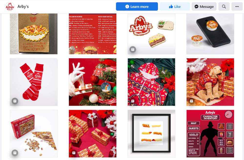
Arby’s is another brand to check out if you want inspiration for Facebook business page design. When you visit their Facebook page for the first time, you’ll be greeted with the sight of curly fries that will make your tummy grumble. Of course, they have the profile photo logo. But what makes Arby’s Facebook page their own is the red motif. Plus, they mix up content with fun image edits, like choosing which burger to eat, delectable photos, and interesting videos!
5. rue21
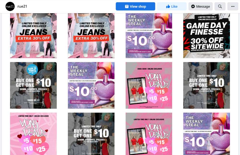
Here’s another clothing brand to look at on Facebook. But instead of posting images of featured products, their Facebook profile is promotional. rue21 connects with customers by treating them to different promos and discounts. Most of their images are edited photos with their products layered or with added typography. The brand shows its unique personality and is not afraid to be straightforward with followers that they are here to promote our products all day long.
6. Sephora
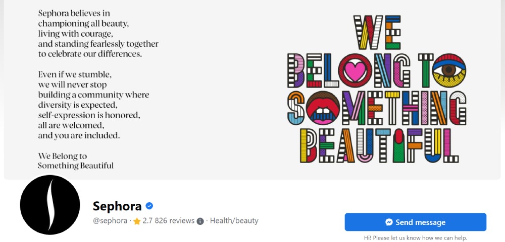
Sephora publishes a variety of posts on its Facebook page. But they ensure to keep their branding on some original posts. A photography style is another way to present your branding. Aside from that, Sephora posts image edits using their font.
Additionally, if you have an advocacy, why not show it to your followers via a Facebook cover photo? It’s a one-of-a-kind idea to try, especially if you want to make an impact. And this one from Sephora gives us an idea of what kind of brand they are and what they stand for with this photo.
7. HP
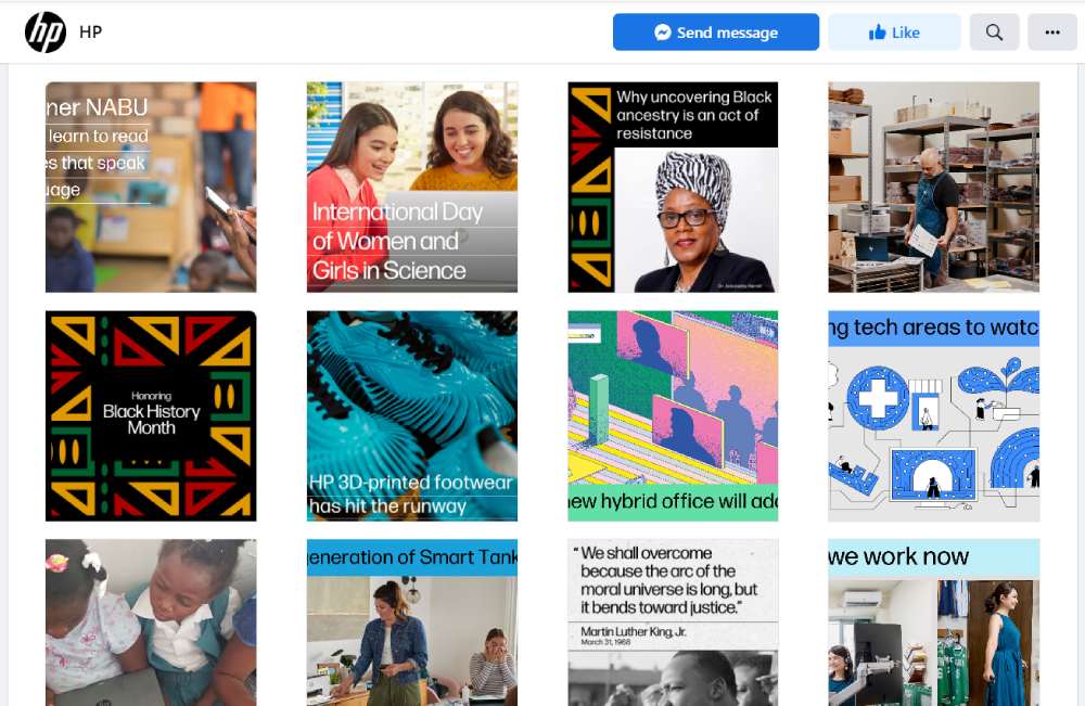
If you want a professional-looking Facebook business page, HP is the best brand to get inspiration from. You’ll notice the typical profile photo logo. At the same time, their Facebook cover photo is of an HP employee. Additionally, they make an effort to post image edits. Plus, they published illustrations from time to time as well. Aside from those, you’ll notice that they stick to one font and use pastel colors to give their Facebook page some color.
8. The Body Shop
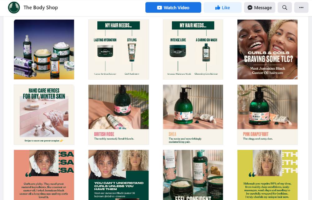
The Body Shop Facebook page also follows a similar trend to other pages here. Modern graphics are becoming more common since Millennials and Gen Zs dominate social media. Other than those, The Body Shop educates the audience and posts interactive content to engage with the audience.
9. Discord
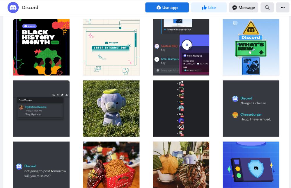
If you want to appeal to a younger demographic, following graphic design trends can help you attract this target audience. Discord uses this tactic on its Facebook business page. You will see modern-looking visuals. Aside from those, you’ll notice they post memes and promote collaborations using image edits.
10. Amazon Books
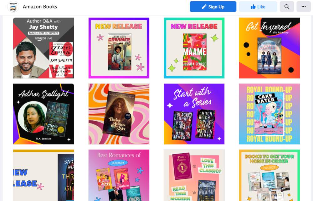
Amazon Books ensures that they promote popular and new books available in their store. They have specific image edits for new releases. Sometimes, they would combine different books to promote a particular theme. Finally, they have visuals for author spotlights too. If you have a variety of images like these, you can check which ones get more engagement when you analyze your posts at a later time.
11. Innocent Drinks
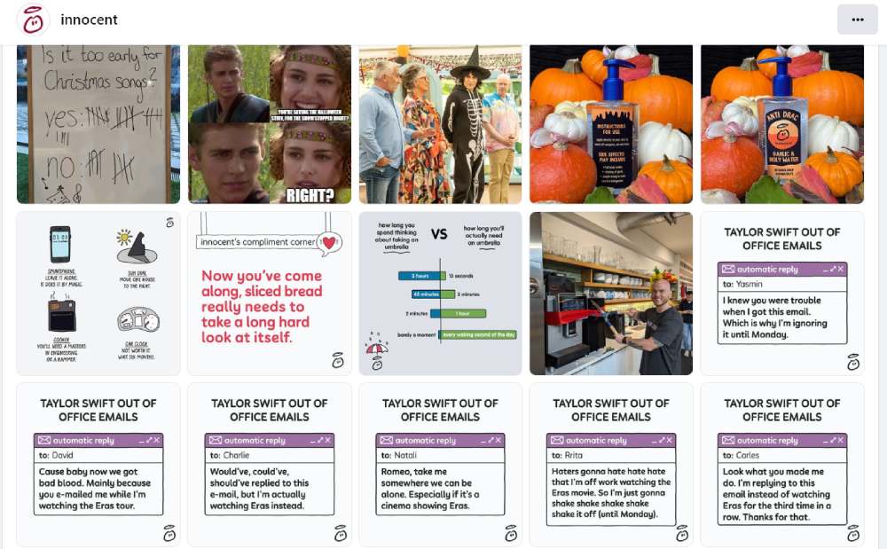
innocent has landed spots on various lists of brands to follow on social media. It’s well-earned not only for their brand personality but also their visual content. You are greeted by a Facebook banner with two of their popular drinks.
Besides that, they also have custom visuals that would get snickers or laughs from pop culture fans. They post memes like the Anakin and Padme one. Plus, they even create original funny visual content like Taylor Swift’s Out of Office Emails. These would surely garner engagement from their followers and target audience.
12. TechCrunch

If you want to stay consistent with visual branding across social media platforms, take a page from TechCrunch.
They use simple graphic edits using weighted sans serif fonts over images or black backgrounds. Plus, they have added their logo to the image on the upper right side.
Additionally, they were strategic with their Facebook banner. You can use the banner section to promote a product or event.
13. Emma Sleep PH
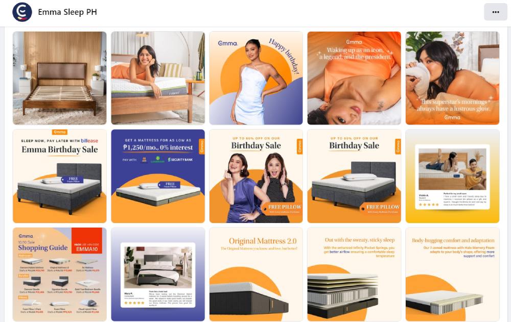
Sleep is associated with calm and relaxation. However, Emma Sleep PH went in the opposite direction with the color scheme.
Orange and purple are the motifs used to promote their comfy mattresses. They pair these colors with serif fonts for a classy look. Moreover, they include a high-quality product image to entice their target audience and customers. Plus, they have a simple photo as their banner image. It shows a happy couple opening their new Emma mattress.
14. Intuit MailChimp
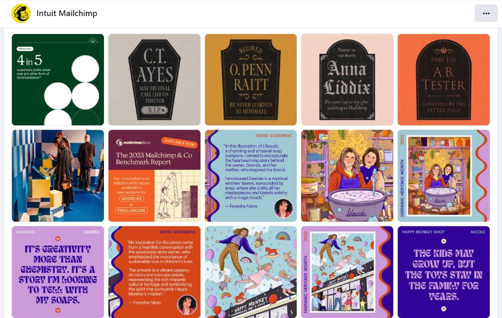
Do you want to look authoritative and professional but still have hints of playfulness?
Check out Intuit MailChimp’s Facebook business page design! What’s great about their Facebook page is the colorful motif that brings the brand alive. The colors are engaging, plus they use illustrations and real humans to create variety. Plus, they are consistent with color schemes, using yellows, oranges, reds, purples, blues, and greens in various graphics.
Moreover, the Facebook banner shows a diverse group of people looking confused or annoyed, except one. The one person smiling in the image is holding a laptop showing MailChimp’s dashboard. This signifies that when someone’s a MailChimp customer, they’re much happier and can connect with their audience.
15. Levi’s PH
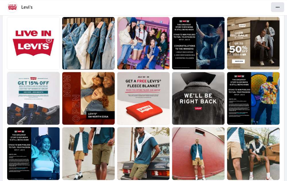
Levi’s PH presents a hip image on its Facebook page. The graphics will appeal to younger audiences due to bigger fonts and brighter colors. Additionally, they use images of young people to show that Levi’s caters to this demographic.
Meanwhile, their banner sticks to its roots by posting images of their classic jeans hung on a metal hook. It shows that their target audience has landed on the right page to follow and connect with the brand.
16. National Geographic
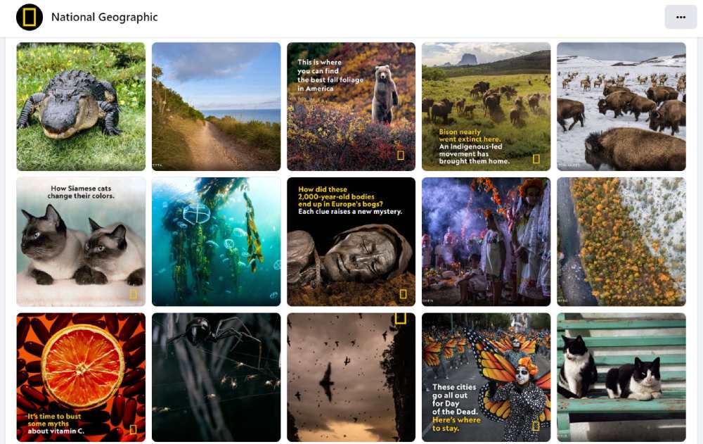
National Geographic (Nat Geo) is another brand that keeps its visual identity consistent across various platforms. Posting on Facebook is no exception.
Their graphics feature a high-quality image of a person or place. Then, they have the Nat Geo logo as part of the logo. Finally, they add an image description with yellow and white block letters to the image to give their followers context. It’s an easy strategy you can execute for all your social media pages.
17. Singapore Airlines
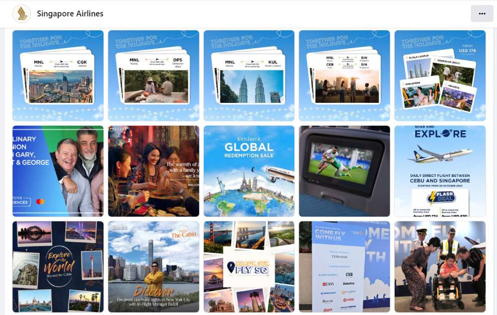
Even a big and well-acclaimed brand like Singapore Airlines also creates custom visuals for their Facebook business page. Most visuals would have custom designs, depending on the post.
For example, if they are featuring flight attendants, they would use a photo edit using the flight attendant’s photo with a quote. They also have custom graphics for promotions and features for various countries.
Finally, their banner or cover picture uses a custom image with a copy. This introduces their target audience to what they can expect from Singapore Airlines.
18. BarkBox
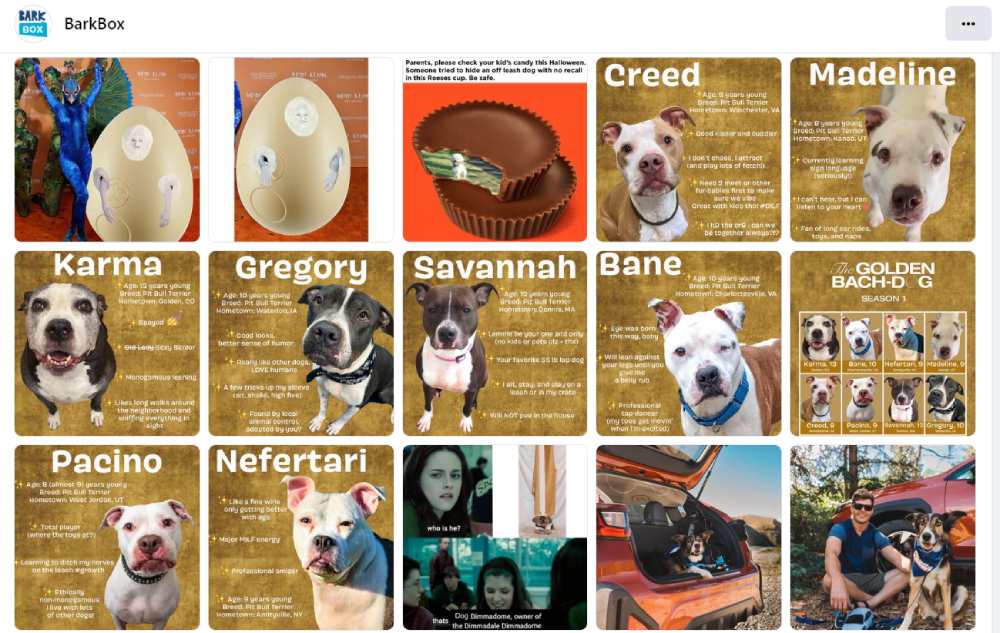
Show off your brand’s fun side like this one from BarkBox. Like other brands on Facebook, they also hop on trends to show that they’re updated and hip. Plus, it helps them connect with audiences updated with pop culture. They use memes for laughs. Additionally, they had a series of “Golden Bach-dogs” profiles, which are a nod to the TV show The Golden Bachelor.
Moreover, they have a custom Facebook banner/cover, which shows what goodies dog owners receive to give to their furry children.
19. Samsung PH
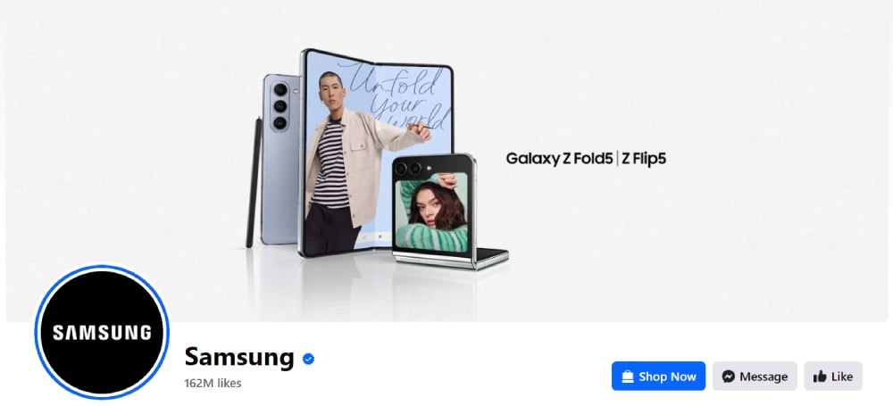
Another brand to look up to is Samsung PH.
Firstly, their cover image features their latest product, the Galaxy Fold. This could entice non-Samsung users to explore more of the product.
Then, their graphic designs are consistent, making them recognizable even without the Samsung logo or products. Most of their graphics include promotions, product features, and people spotlights.
20. Pop-Tarts
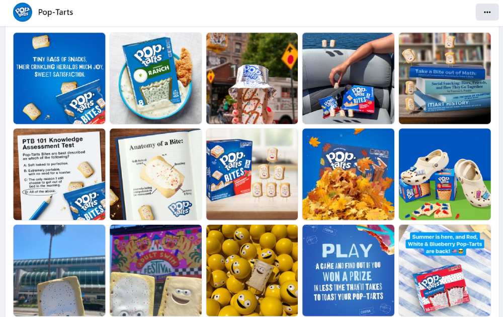
Tickle the senses like Pop-Tarts with their Facebook business page design! Their Facebook cover image has a funny twist to it because it personifies the Pop-Tart as an actual character.
Next, they post various graphics that would make you crave and buy a box of Pop-Tarts from your local grocery. They also post funny and relatable memes. Plus, the brand posts some promotional posts or events!
21. Cheetos
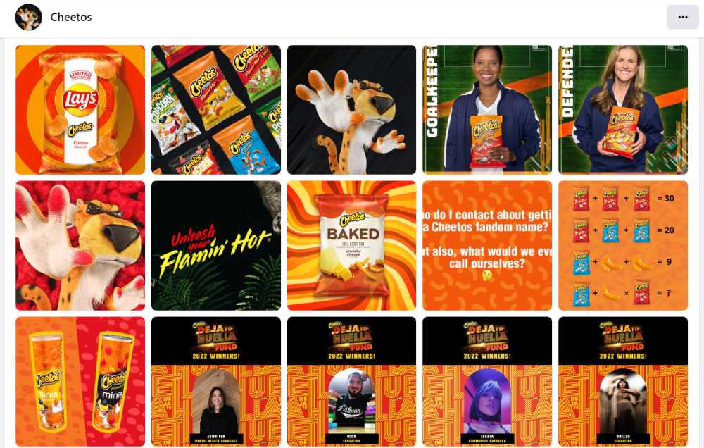
Another snack that made it into our list is Cheetos. What’s great about their Facebook page design is you’ll see different content, but it all represents the brand. The signature Cheetos orange is present in all graphics, making you crave their cheesy chips.
Additionally, they also publish high-quality images of food, using their chips as a main ingredient. Finally, they also feature influencers and their mascot (Chester Cheetah) doing fun or hilarious things.
22. Garnier PH
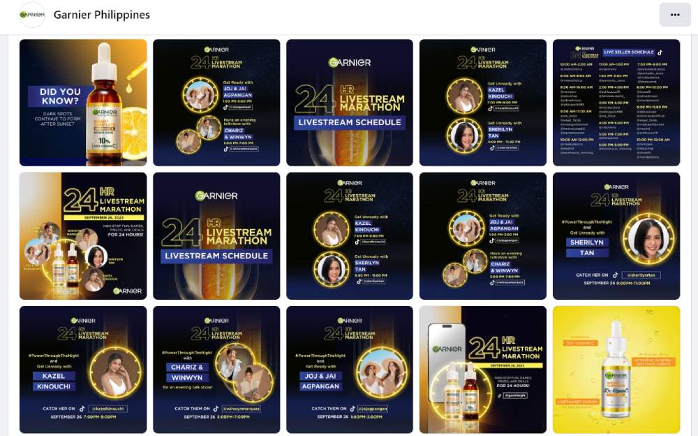
If you have a new product and want to promote it, check out how Garnier did it on their Facebook page! They were promoting their overnight serum product, resulting in the darker graphics. Usually, they have brighter ones, considering the ingredients added to their skincare products. Additionally, they also base colors depending on the product labels, some of which are blue, pink, and yellow.
23. SAP

Our final featured Facebook business page design on this list is SAP. They have similar design styles to TechCrunch. However, unlike TechCrunch, SAP adds more color to its designs. Plus, they post various content like statistics, webinar announcements or replays, and other facts. It makes them an authoritative figure, even in the social media sphere.
Why Penji?
Your Facebook business page needs to be updated regularly so that your followers will know that your business is active. The easiest way to update your page is by posting images and videos. But if you want to level up and post various visuals and images on your page, let Penji help you with image edits and interactive visuals. And you can request those once you start subscribing to Penji!
You don’t have to worry about creating those visuals all by yourself. Penji will help you with content creation and other graphic design-related projects your business will need. And if your business wants to be one of the thousands subscribed to Penji, try Penji for 30 days and see why companies love Penji!
About the author

Katrina Pascual
Katrina is a content writer specializing in graphic design, marketing, social media, and technology. In her spare time, she writes monthly personal blogs to practice her craft.
Table of Contents
- How Do I Customize my Facebook Business Page?
- 10 Examples of Facebook Business Pages
- 1. Oreo
- 2. Hubspot
- 3. Shein
- 4. Arby’s
- 5. rue21
- 6. Sephora
- 7. HP
- 8. The Body Shop
- 9. Discord
- 10. Amazon Books
- 11. Innocent Drinks
- 12. TechCrunch
- 13. Emma Sleep PH
- 14. Intuit MailChimp
- 15. Levi’s PH
- 16. National Geographic
- 17. Singapore Airlines
- 18. BarkBox
- 19. Samsung PH
- 20. Pop-Tarts
- 21. Cheetos
- 22. Garnier PH
- 23. SAP
- Why Penji?


