
Have you ever decided on a product to get based solely on its packaging design? If your answer is yes, you’re not alone. According to a study by multinational market research and consulting firm Ipsos, 72 percent of Americans said creative packaging influences their purchase decisions when selecting a product.
Here at Penji, many of our clients request product packaging design that puts the product in the best light and advances the brand identity forward. They know just how crucial it is to have the perfect packaging design if they want to grow their brand, so they entrust the task to the top 2 percent of graphic designers (yup, that’s us). If you’re brainstorming for your product packaging, you’ve come to the right place! We’re discussing the basics of creative packaging, and we’ll take a look at the best examples that helped brands rake in sales.
What Goes into Creative Packaging Design?
Whether you’re looking for honey creative packaging ideas or creative packaging ideas for clothing, one thing holds true: it should be interesting enough to make consumers choose it instead of other products on the shelf.
Here are a few factors you need to consider when brainstorming for creative packaging.
Packaging Material
It might sound obvious, but the type of product you offer should be the main consideration when designing the box, packet, bottle, or can. It protects the product and keeps it in good condition until it’s ready to be used.
In addition to that, the Ipsos study found that 67 percent of Americans said the materials used in the packaging also make a difference when they’re choosing which products to buy.
That said, choosing the right materials may vary according to product type. For instance, using a cardboard box or a synthetic fiber tote for apparel is more of a branding decision. Either way, the clothes will retain their form and quality; the packaging is an add-on.
If you’re looking for packaging ideas for clothes, check out this beautiful packaging by Bscly, an apparel kit provider:
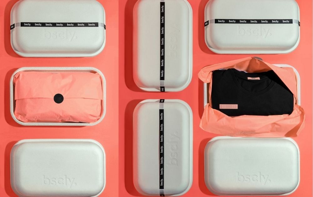
Image Source: Bscly
Because the brand offers stylish and sustainable clothing kits, they incorporated that mission into their mailer boxes. The cute opaque boxes are made of sugarcane, so they’re compostable, biodegradable, and eco-friendly.
Unlike apparel, food products require more consideration. For instance, aluminum cans may be excellent vessels for beers and drinks, but they can be highly reactive to acidic items like vinegar, citrus, and tomatoes.
Baked goods, on the other hand, also require specific packaging requirements depending on ingredients and handling. For example, putting butter cookies straight in craft boxes will result in unappealing dark brown grease maps on the box’s bottom and sides.
Audience
Who is your audience, and what are they thinking when they buy your product? You need to consider these questions when you brainstorm for your design. Let’s take wine, for example.
If you’re targeting wine connoisseurs who make a mini-event out of opening a priced bottle, then a traditional sleek bottle would be a great choice.
Over the past decades, however, the wine niche has developed dozens of sub-niches. Take, for instance, this Boizel Champagne packaging that targets those who adore sipping a glass of rose on a bright summer picnic:
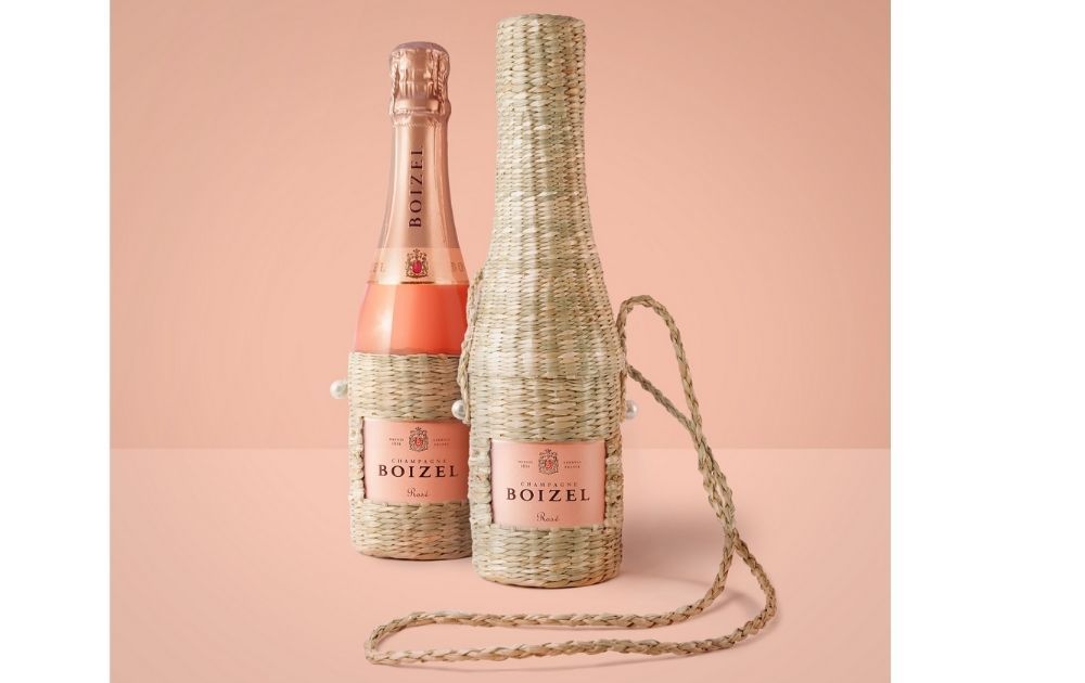
Image Source: Boizel Champagne
But what if you’re trying to reach the market segment that doesn’t necessarily enjoy the outdoors? For the home buddies who would rather bury their nose in a book, this packaging for Bodegas Neleman is just genius:
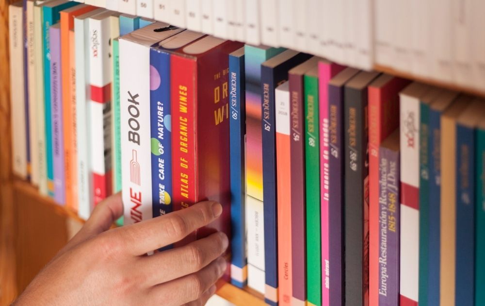
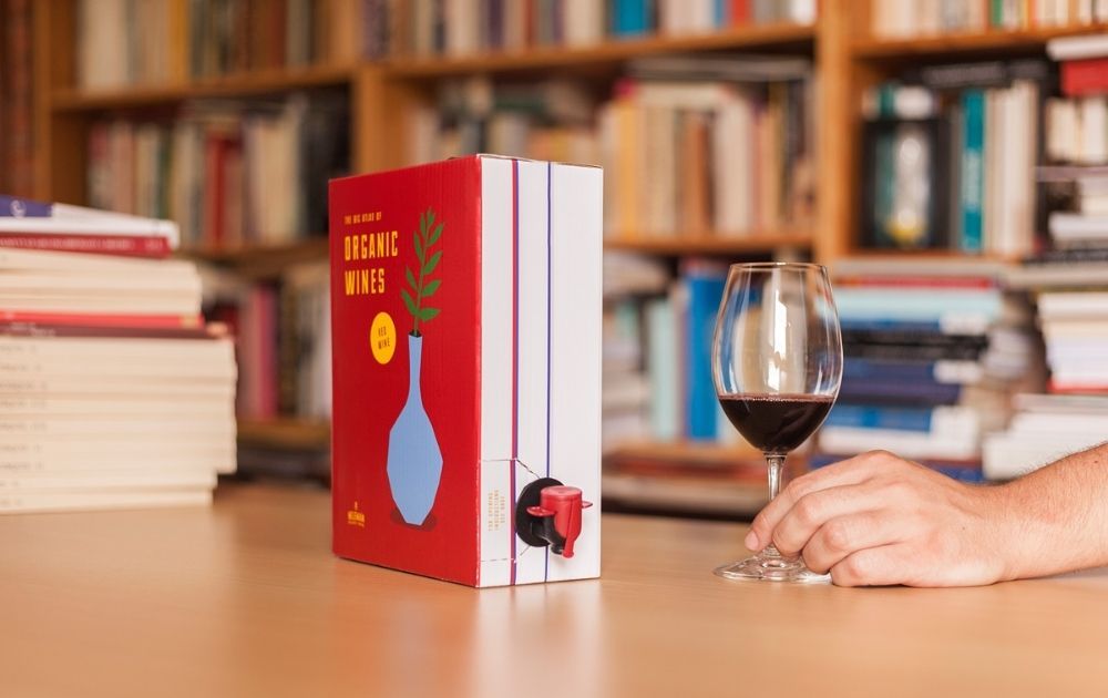
Image Source: Bodegas Neleman
With this on the shelf, no one would mind staying in and cuddling up with a good book (and a carton of wine pretending to be a book).
Related Post: Here’s How Packaging Design Can Increase Your Sales
Industry Practices
When it comes to packaging, you need to know industry practices. It doesn’t necessarily mean that you’ll need to go by the rules. However, there’s a huge difference between breaking the rules and being ignorant about them from the start.
For instance, supplements and other health-related products need to go by specific state-required labels and info. If your products fall under this category, there’s no other work-around. You need to study the rules and comply.
Going by the rules doesn’t mean settling with a boring design. For example, these tubes for Voost, a vitamin brand, is anything but dull:
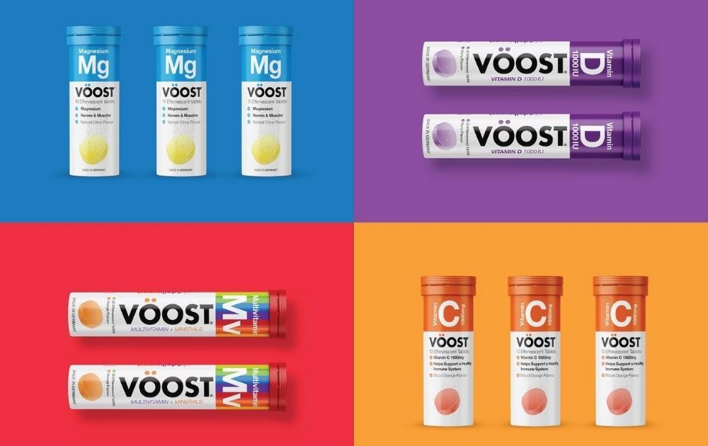
Image Source: Voost
With its vibrant Bauhaus appeal, consumers’ eyes would surely spot it on a shelf full of austere vitamins boxes.
Changes in the Market
Market shifts are also a big factor in design. As seen from the previous example of Bscly, the introduction of wardrobe subscriptions paved the way for apparel mailer box packaging.
Tech and social innovations also play a huge part. There was a time in the 80s when brands turned to plastic packaging. Not only did it preserve the quality of products, but it was also a lot cheaper compared to other materials.
Nowadays, with environmental advocacy at the forefront, more and more brands are trying to avoid single-use packaging. Take a look at this cup for Cadbury instant drink in the United Kingdom:
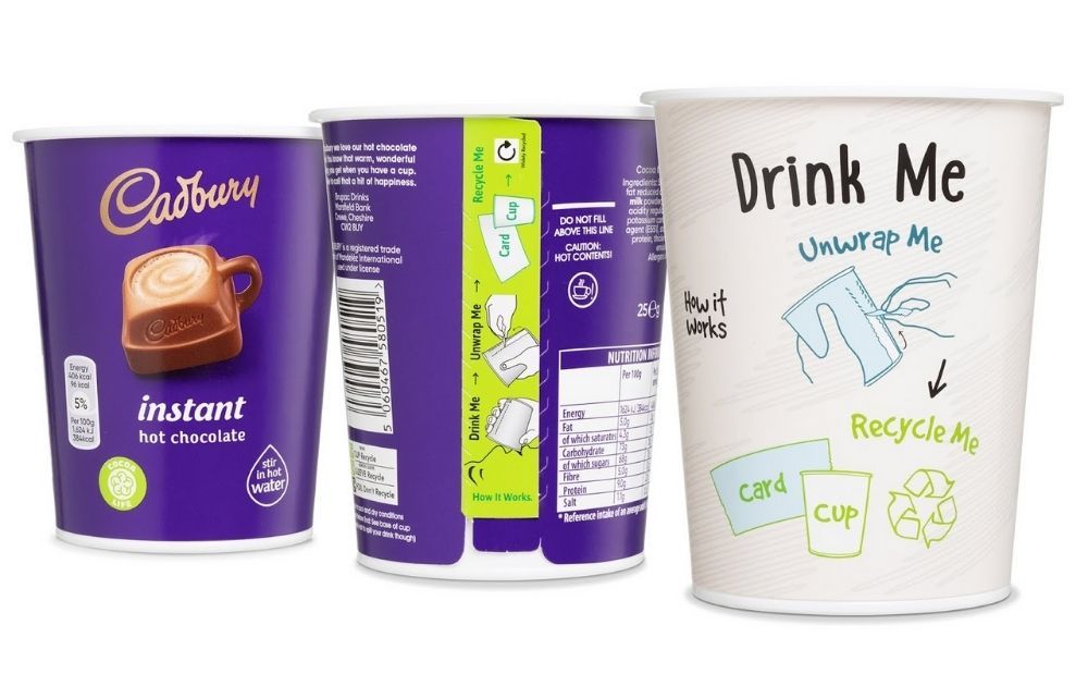
Image Source: Cadbury
After downing the drink, consumers can peel the wrap and recycle the K3® light-weight thermoformed tub cup.
The coronavirus disease (COVID-19) pandemic has also caused shifts in various industries. As a result, community quarantine protocols have changed the way we buy things amid a global health crisis.
And when it comes to creative packaging ideas for shipping, this Gelatino ice cream cone in Colombia comes out as the cream of the crop:
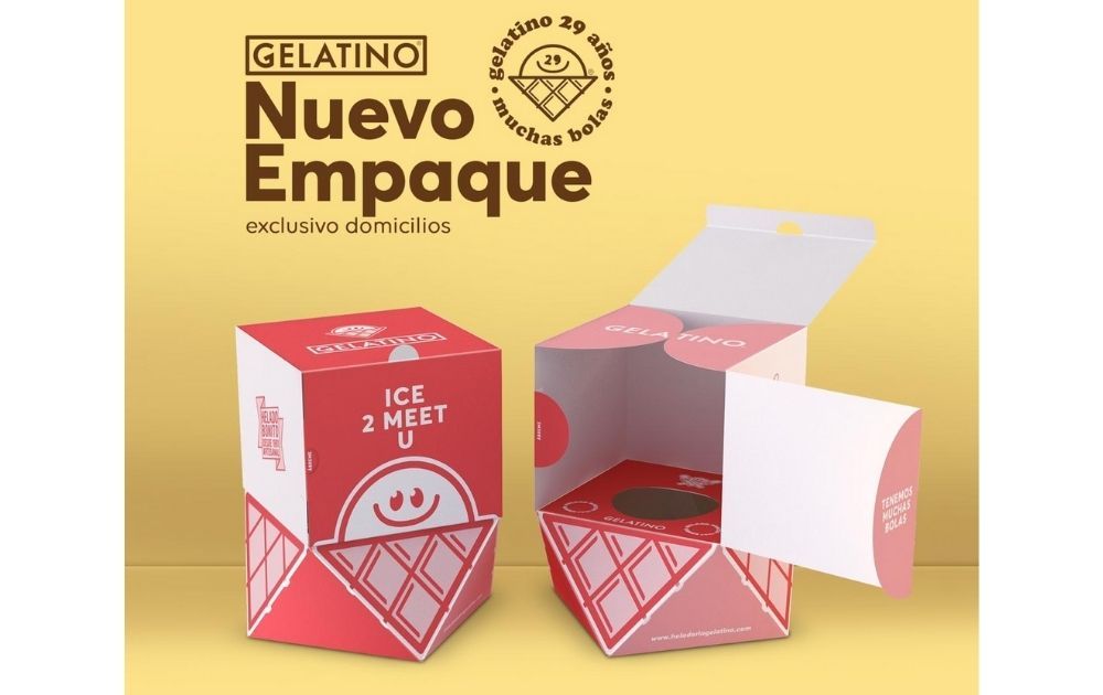
Image Source: Gelatino
Amid the lockdown, the business needed a way to keep their best-selling ice cream cones fresh upon delivery. The solution – this cute box that doubles as a cone stand and an insulator to keep the product frozen for longer.
Related Post: Top Product Packaging Designs That Push The Envelope
Creative Packaging Examples that Raked in Sales
Creative packaging is surely a way to spark interest. But more than that, it should encourage your audience to actually buy your product. Here are some examples of packaging designs that contributed (directly or indirectly) to the brands’ sales rates and popularity.
1. Kombucha by The Culture Co.
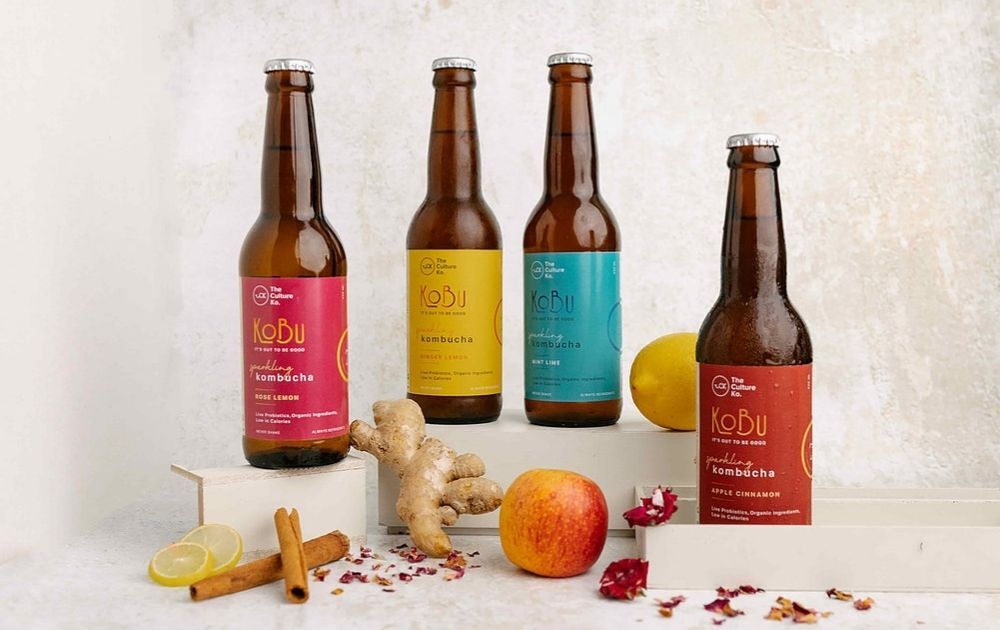
These bottles by Kombucha by The Culture Co. (image grabbed from their website) feature cute color-coded stickers. The colors – hot pink, yellow, teal, and rust – go well with the amber-colored bottles. In addition to that, these stickers stand for different variants, making them beautiful and functional at the same time.
Brand sales: On their website, the brand founder admitted that they’d had a rocky 2019. But after rebranding in 2020, they’ve built up their clientele. They’ve built a small team and manufacturing unit to meet the demand for their product.
2. Bionoble
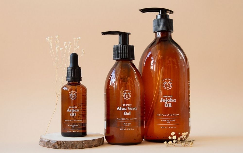
When it comes to design simplicity, Bionoble indeed sets a standard. The self-care products come in amber bottles with black caps or nozzles. The white print stands out from the dark glass and gives the product a unique look that marries modern and old-school. The brand is so proud of their packaging and says their bottles can double as bathroom decoration!
Brand sales: One look at the reviews section of their website, and you’ll see how much clients love the brand. In fact, many of the buyers noted how they loved the fine and eco-friendly packaging.
3. Twinings
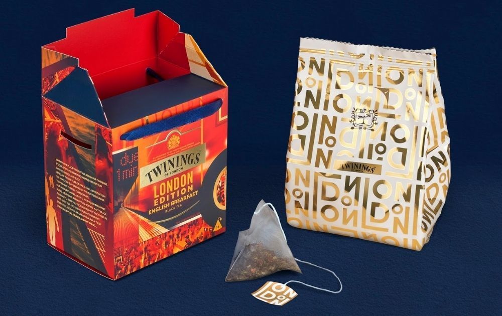
The Twinings is synonymous with English tea. And as a tribute to the city where it all began, they released a London Edition line. The layout and images capture the vibrant hustle and bustle of the city. In addition to that, the box with ribbon handles makes for a great gift to anyone who loves London, tea, or both.
Brand sales: Twinings is one of the leading standard tea brands in Great Britain, next to PG Tips, Yorkshire Gold, and Tetley Tea Bags. In relation to that, Statista data says Twinings’ standard tea is its second-leading product next to herbal and fruit teas.
Related Post: 15 Amazing Tea Packaging Designs From All Over the World
4. Trubel Artisan Truffles
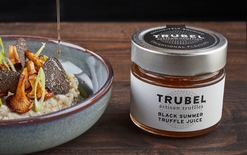
If you’re looking for a simple packaging design inspiration, be sure to bookmark Trubel Artisan Truffles. The white label and simple design make the product look elegant and sophisticated. And for a brand that promises award-winning taste, the minimalist design allows the product to shine bright.
Brand sales: Because of its gourmet branding, you can’t expect this brand to compete with more affordable grocery spices or sauces. It’s crucial to note, however, that the brand is well-received by culinary institutions, including pro chefs.
5. Reese’s Peanut Butter Cups
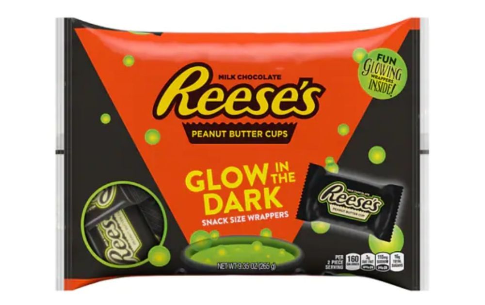
Reese’s Peanut Butter Cups is an example of how good packaging can further strengthen an already thriving brand. Though the product is known for its orange packaging, it’s also interesting to look at its seasonal Halloween bag (photo grabbed from their website). Each pack features a glow-in-the-dark label, perfect for trick-or-treat adventures or horror movie marathons.
Brand sales: The nutty chocolate cup is the best-selling Halloween candy in America, as per a 2019 study conducted by Monmouth University. Of course, we can’t conclude that the popularity is solely based on the product packaging. But a creative Halloween edition approach surely gets consumers interested.
6. Confidas
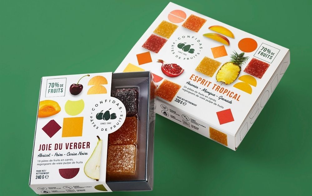
Colorful fruits represent excellent and robust health. And that’s what this packaging for Confides fruit jellies reminds us of. The palette offers eye candy, with images of fresh fruit slices and jellies alike. In addition to that, the white background makes the images look even more lively and vibrant.
Brand sales: The brand has been offering its products to retail, wholesalers, and chocolatiers for almost four decades now. That only goes to show how well the brand is doing in the market.
7. Starbucks by Nepresso
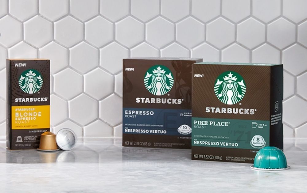
Starbucks by Nepresso (image grabbed from their website) is a line of Starbucks coffee capsules produced for Nepresso machines. The box design looks sleek and modern, with a coffee brown bodice reminiscent of cafe noir. The coffee house’s iconic mermaid logo takes up a good part of the upper part, while a colored strip below indicates the product variant.
Brand sales: Bloomberg reported in 2019 that Nestlé S.A. shares gained to a record, thanks to accelerated sales of its Starbucks coffee capsules. In fact, its stocks rose as much as 2.9 percent. Though we can’t credit this to design alone, marketing efforts that make the product what it is surely helped the brand reach its target.
Related Post: 10 Coffee Packaging Designs That Would Make You Crave for a Cup
Creating a Product Packaging Design that Works
Without a doubt, there’s a symbiosis between creative packaging, brand growth, and sales.
But how exactly can brands come up with the best packaging design that fits their product and market? Here are the basic steps simplified for a quick run-through:
- Know what packaging material works best for your product, industry, and brand identity—research where you can source these materials within your budget.
- Look for a printing service that can print your design onto the material that you choose. Alternatively, you may also choose to print the design yourself if you’re using simple stickers or labels for branding.
- Create packaging design. Now, not all people have the creative chops or the time to do this. But fret not, because pro designers like our artists at Penji are ready to help. Here are few samples of packaging designs we’ve done for our past clients:
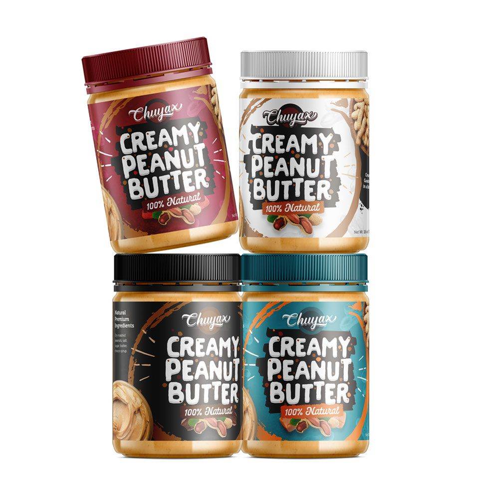
Image Licensed by Penji
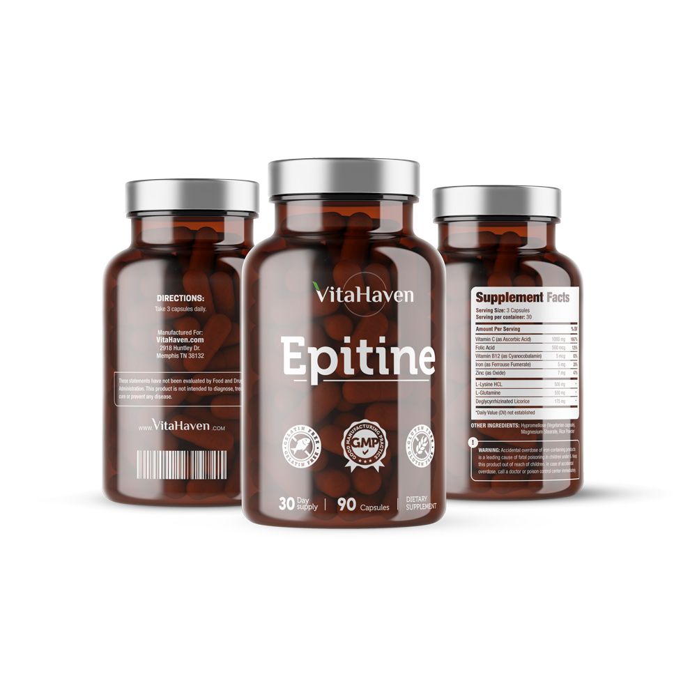
Image Licensed by Penji
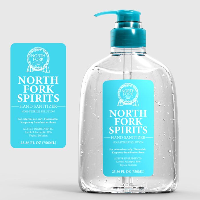
Image Licensed by Penji
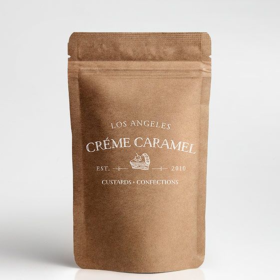
Image Licensed by Penji
The Lowdown
As seen from the examples above, product packaging is an essential part of offering a product that actually sells. Fortunately, you’ll never run out of creative packaging ideas just as long as you have a clear understanding of your brand identity.
And if you need a partner in creating graphics that will make your audience grab our product and proceed to checkout, we at Penji are here to help! We offer unlimited graphic design at a flat monthly rate. So, you can have all the graphic designs you need without spending an arm and a leg. From logo designs to digital illustrations, we’ve got you covered!
As mentioned above, we have the top 2 percent of designers, so you know you’ll be in good hands. Sign up now by clicking this link to enjoy 15% off the first month of any plan. And the best part? You can try any of our packages risk-free for 15 days.
Note: Product packaging images were grabbed from Packaging of the World unless otherwise noted.
About the author

Carla Deña
Carla is a journalist and content writer who produces stories for both digital and legacy media. She is passionate about creativity, innovation, and helping small businesses explore solutions that drive growth and social impact.


