Construction companies are responsible for creating reliable structures and quality work. And many construction businesses are vying for recognition and want to become the industry leader. That said, your company should establish a robust branding identity to demonstrate your capabilities. It starts with a logo. Fortunately, we have ten construction logo ideas for inspiration! Plus, here’s how Penji can develop your brand from the ground up.
1. Chapman Building Solutions
Chapman Building Solutions features a unique construction logo that doesn’t go out of style. It’s perfectly scalable and suits all your marketing and branding assets. The play on negative space is also commendable as the house sits comfortably at the bottom of the letter “C.” Without the other text, the letter “C” may even be a standalone icon representing the brand.
2. Anderson Builders
The bold font captures the audience’s attention in this construction logo. Anderson Builders’ logo is legible even on the most undersized print material. The letter “A” also dons a different color, which is a great way to break the monotony of the color black. Also, the heavy-duty vehicle attached to the letter “A” indicates what the company does.
3. Stonewood Construction
Nothing can get more straightforward than this construction logo from Stonewood Construction. Blue dominates the entire design, giving off strength and reliability, apt for a construction company. You want to evoke these feelings within your target audience because customers rely on you. The house and hammers also add a nice touch to the logo.
4. Churchill Construction Co.

Churchill Construction Co. features an old-fashioned-looking typography logo. The brand chose a serif font, representing a traditional and classic brand. However, the sans serif font at the bottom also complements the text, which gives it a modern touch. The hard hat on top of the letter “C” in yellow is also another way to grab attention.
5. The Community Builders

The logo for The Community Builders exudes warmth and a welcoming vibe. The color yellow evokes a feeling of optimism, which is apt for customers who want to stay optimistic about building their commercial or residential spaces. The man holding a hammer is also an excellent way to symbolize reliable builders.
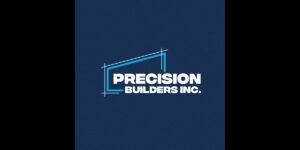
6. Precision Builders Inc.
Logo creation entails careful planning, so it stays relevant. And this is why hiring professionals is recommended instead of using DIY logo makers. Take this logo from Precision Builders Inc., for example. It’s simple yet impactful, with some creative design elements that make it relevant. The commercial space with line measurements is symbolic of the word “precise,” apt for the brand’s name.
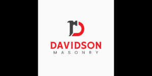
7. Davidson Masonry
The clean and neat structure of Davidson Masonry is one that you must follow. It offers a good hierarchy that leads the eyes from the most important information to the least important detail. For instance, you’ll notice the letter D in the form of a hammer connected to the letter D’s curve. The text “Davidson” then captures your attention before reading the word “Masonry.” Overall, this construction logo design is simple yet well-thought-out.
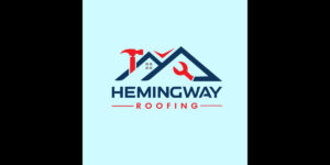
8. Hemingway Roofing
If you remove the brand name, Hemingway Roofing, the icon with the house’s roof, hammer, and wrench can still make the logo memorable. It’s an excellent way to create top-of-mind awareness within your target audience. The contrasting blue and red colors are perfect for grabbing your audience’s attention.
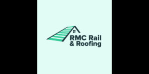
9. RMC Rail Roofing
For a company that provides rail roofing, this construction logo is a suitable design to represent the company. The house’s roof might seem overwhelming at first. However, it doesn’t get in the way of the text, which is the show’s main star. Overall, this logo design looks modern and timeless.
10. Westgate Contractors
Westgate Contractors makes this logo visually attractive by displaying a yellow gate that also doubles as the letter “W.” Simple design elements like this could be the factor that separates you from the rest of the competition.
What Makes a Good Construction Logo
Before you hire a graphic designer who can make your construction logo, keep these five logo design elements in mind.
Simplicity
If you scroll through the logos above, you’ll notice that they’re all straightforward and understandable. That’s because “less is more” in logo design. Keeping it simple prevents confusing the viewers and giving a wrong impression.
Uniqueness
Of course, your logo must be unique to stand out from the competition. Try scouting for existing construction logos and see what trends and design principles the logos have. Incorporate those and make yours even better.
Relevance
Before integrating all logo design principles and trends, it’s crucial to keep relevance in mind. Remember, your logo ties all your marketing and branding collateral. All your branding assets must be relevant to your brand identity and personality because anything out of place will jeopardize memorability.
Memorability
One of the essential factors in logo design is memorability. You must ensure that your prospects will remember your company logo after a couple of exposure. This ensures you’ll be the first brand they’ll think about they’re looking for construction services.
Scalability
This last factor may be left up to professional logo designers because it all boils down to the final image. When creating your logo, designers must ensure that the design is versatile enough to look good and legible on any branding and marketing collateral. The point is to ensure that the logo’s quality is maintained even when resized.
Get Your Construction Logo from Penji
With all your projects and construction work, you probably won’t have time to design graphics for your brand. Luckily, now you’ve seen what Penji can do, why not give us a shot for 30 days risk-free? You can subscribe here! But if you need a logo for now, we have a limited-time offer for a one-off logo design for only $70! Visit our Marketplace to get your new logo.
About the author
Table of Contents
- 1. Chapman Building Solutions
- 2. Anderson Builders
- 3. Stonewood Construction
- 4. Churchill Construction Co.
- 5. The Community Builders
- 6. Precision Builders Inc.
- 7. Davidson Masonry
- 8. Hemingway Roofing
- 9. RMC Rail Roofing
- 10. Westgate Contractors
- What Makes a Good Construction Logo
- Get Your Construction Logo from Penji

