
A great user experience is critical to the success of any website in today’s digital age. The way we design our website can make or break its effectiveness in engaging and retaining visitors. Here are the ten best webpage designs that have set the standard for great user experience.
1. Stripe
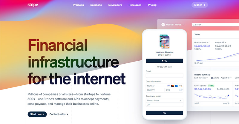
A stand-out for several reasons, Stripe’s webpage design has a clear and concise message that is reinforced through visual cues. It prioritizes functionality and usability with intuitive navigation and powerful tools. The site’s modern and aesthetically pleasing design is consistent throughout, with a simple yet effective color palette and ample whitespace.
Stripe’s website design is an excellent example of balancing functionality, usability, and aesthetics to create an exceptional user experience. With its focus on the core product, prioritizing usability, and implementing a clean and modern design, Stripe has set the standard for great webpage design.
2. Wistia
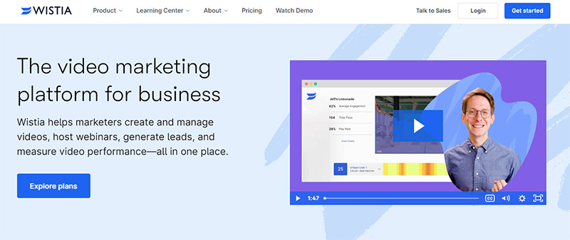
Video marketing website Wistia has a webpage design that’s truly worth noting. It successfully conveys the brand’s focus on video marketing through high-quality visuals and engaging animations. It has an intuitive and user-friendly layout with clear navigation and well-organized content.
The site’s design uses whitespace effectively, creating a sense of focus and clarity that makes it easy for users to find what they’re looking for. The design is aesthetically pleasing, with a consistent color palette, engaging visuals, and polished typography. The site’s modern and professional look helps reinforce the brand’s focus on quality and innovation.
3. Evernote
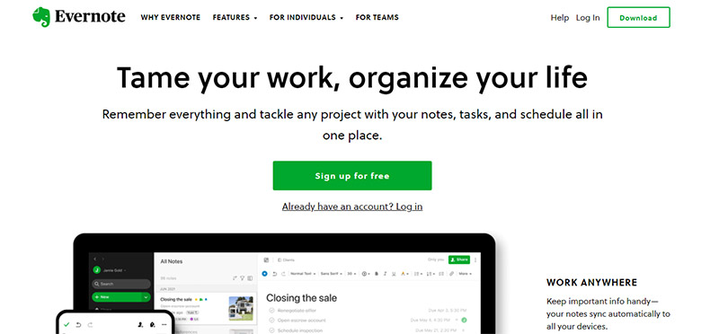
With an intuitive layout, simple color scheme, and clear messaging, Evernote’s webpage design is noteworthy. It uses compelling visuals, like product screenshots and lifestyle imagery, to communicate the product’s value proposition and benefits. The site’s messaging is clear and concise, making it easy for users to understand the product and its features.
Moreover, the site’s mobile responsiveness and consistent design elements create a professional and visually appealing user experience. It is optimized for mobile devices, ensuring users can access the site from any device without sacrificing usability.
4. Basecamp
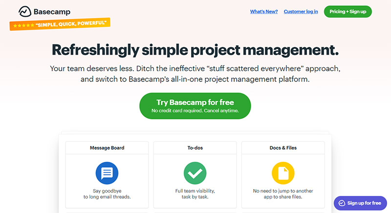
It may seem too basic at first glance, but Basecamp’s webpage design is worth emulating. It has graced many best web design examples lists thanks to its user-friendly interface and streamlined navigation. The site’s clean layout and color scheme create a professional look, while the consistent design elements help establish trust with visitors.
Basecamp’s website design is an excellent example of how to create a user-focused website that prioritizes ease of use and effective communication. The use of customer testimonials and case studies adds credibility and helps build trust with potential customers.
5. Udacity

Online learning platform Udacity’s webpage design is widely recognized for its user-focused approach and clear communication of the company’s goals. The site’s modern and uncluttered design exudes a professional appearance, while the intuitive navigation and well-structured content make it easy for users to find what they need.
The site’s use of visual elements like infographics and videos effectively conveys the benefits and value of Udacity’s online learning programs. If you want to know what user-centric design is, this is the webpage to get inspiration from.
6. Zillow
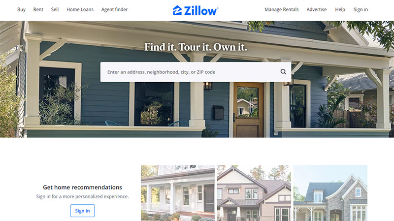
One of the key features of Zillow’s webpage design is its focus on delivering a personalized experience for each user. The site uses advanced algorithms to provide personalized recommendations and search results based on a user’s preferences, search history, and location.
The site’s clean and modern design creates a professional look, while eye-catching visuals and interactive elements add to the overall user experience. The search functionality is highly effective, allowing users to quickly and easily find the information they need on properties for sale or rent.
7. Dropbox Paper
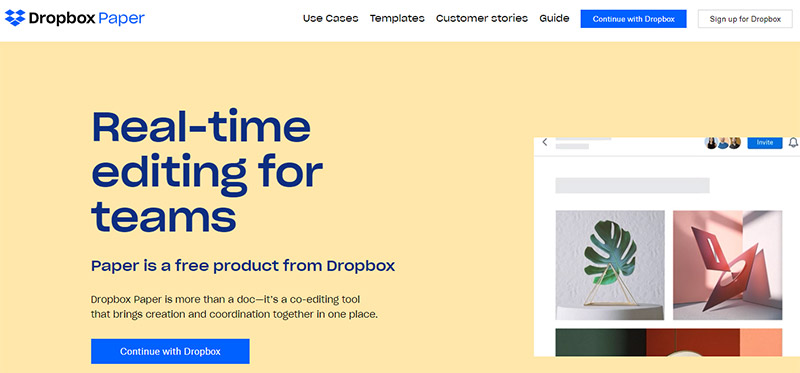
Often praised for its simplicity and minimalism, Dropbox Paper’s webpage design features a clean interface with minimal clutter. It makes it easy for users to focus on their work without distraction by emphasizing the content itself. Its bold typography and clear formatting help make the content easy to read and digest.
The site’s interface facilitates real-time collaboration between multiple users, making it easy to share ideas, feedback, and edits seamlessly and efficiently. It is also optimized for mobile devices, allowing users to work on their projects anywhere, anytime.
8. CTRL SHIFT!

The CTRL+SHIFT website design is an excellent example of how to create a visually engaging and informative website. The site’s sleek and modern design has a bold color palette and custom graphics that grab the user’s attention. It is intuitive, making it easy for users to find the latest episodes, show notes, and other relevant information.
The design makes excellent use of multimedia to engage users and provide additional context and information about the podcast. Its use of social media integration helps build a sense of community and encourages listeners to engage with the podcast beyond just listening to the episodes.
9. Andermatt

If you’re looking for inspiration for your travel destination business, Andermatt is an excellent example. The webpage design features beautiful imagery and custom graphics that effectively showcase Andermatt’s natural beauty and cultural heritage. It strongly emphasizes providing a positive user experience and seamless navigation.
Its intuitive interface lets users quickly locate information on accommodations, local attractions, and activities. Additionally, the site is optimized for mobile devices, ensuring that visitors can access the site from any location and at any time, providing greater flexibility and convenience.
10. Sesame Street
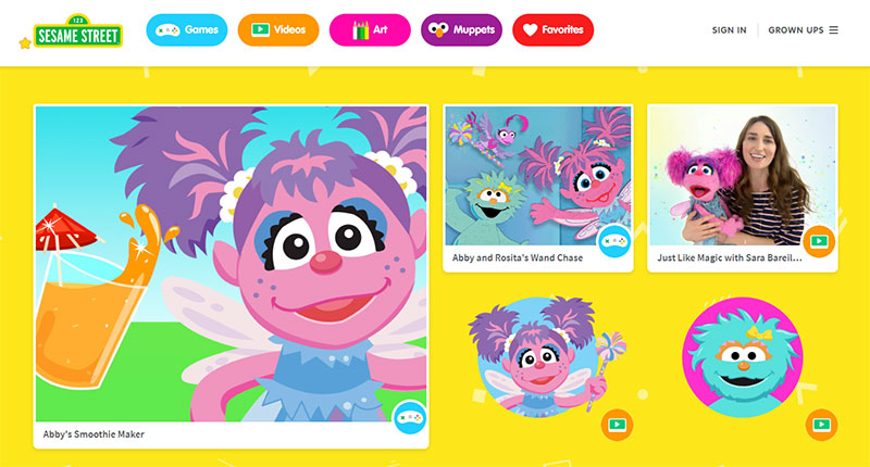
Tailored to provide an interactive and engaging experience for young users, Sesame Street has one of the best webpage designs worth noting. It has a vibrant and playful design that captures the attention of children. The site’s messaging is clear and informative, offering various fun and educational activities to enhance learning and development.
Sesame Street’s website design focuses on accessibility and inclusivity, ensuring that all children can benefit from the site’s resources and activities regardless of their learning abilities. It combines playfulness, accessibility, and multimedia content to create a fun, educational, and inclusive platform for children.
Final Thoughts
These ten websites represent some of the best webpage designs. Each has a unique approach, but all prioritize user experience, functionality, and aesthetics. Learning from these designs allows business owners, web designers, and developers to continue to create innovative designs that meet users’ evolving needs and expectations.
If you need help with your webpage designs and many other design assets, work with Penji. Our unlimited graphic design and revisions assure you that you get only the best. Click on this link to get our designers started.
About the author

Celeste Zosimo
Celeste is a former traditional animator and now an SEO content writer specializing in graphic design and marketing topics. When she's not writing or ranking her articles, she's being bossed around by her cat and two dogs.


