All the best podcast websites have a few key features:
- Branding
- Accessibility
- Listening tools
The list goes on. But the core of all these ideas is excellence in web design.
If you’re creating a podcast, especially for your business, a unique and inspired website design is vital for growing your audience. That’s why we’ve compiled some of our favorite podcast website examples.
What is a podcast website?
Usually, a podcast website is the landing page for a podcast. It allows curious listeners to discover information about a podcast, as well as listen to episodes directly from the site.
You might also use “podcast website” to refer to a podcast hosting platform. These sites allow creators to automate the process of releasing new episodes and growing their audience, often with a subscription-based pricing model.
Examples of podcast platforms include:
- Anchor (free)
- BuzzSprout ($0-24/mo)
- PodBean ($0-79/mo)
- Captivate ($17-90/mo)
- Simplecast ($15-85/mo)
These platforms use RSS feeds to send your new episodes and data directly to streaming services. It’s how you get your podcast on Spotify, Apple, Google, Audible, and all the other “podcatchers.”
15 best podcast websites to inspire you
1) How Did This Get Made?
Designed with: Squarespace
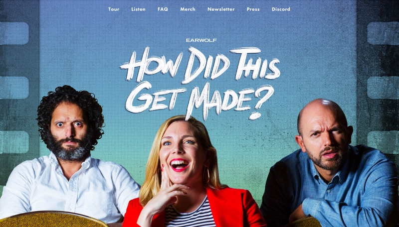
The first impression is the most important one. How Did This Get Made? makes it count with a fullscreen version of their podcast cover art. This comedy talk podcast is part of the Earwolf network, but their dynamic standalone website sets them apart.
2) Earwolf
Designed with: WordPress
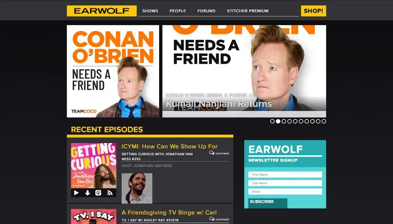
Speaking of Earwolf, their own podcast network website is nothing to sneeze at. While it’s not as flashy as How Did This Get Made?’s own page, its yellow lettering and dark background make it both inviting and unique. Note how the “recent episodes” feed includes information about each show’s hosts.
3) The NewsWorthy
Designed with: Squarespace
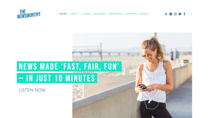
Just by looking at The NewsWorthy’s website, you might not even guess that it’s a podcast. Indeed, The NewsWorthy tries to subvert any preconceived notions of what a podcast does. They offer a quick burst of news, promising to be “fast, fair, fun.” This bright, cheery design sets them apart from your average news podcast.
[in_content_ads gallery=”logos” logo=”on” title=”Need graphic design help?” subtitle=”Try Penji’s Unlimited Graphic Design and get all your branding, digital, print, and UXUI designs done in one place.” btntext=”Learn More” btnlink=”https://penji.co”]
4) Twenty Thousand Hertz
Designed with: Squarespace
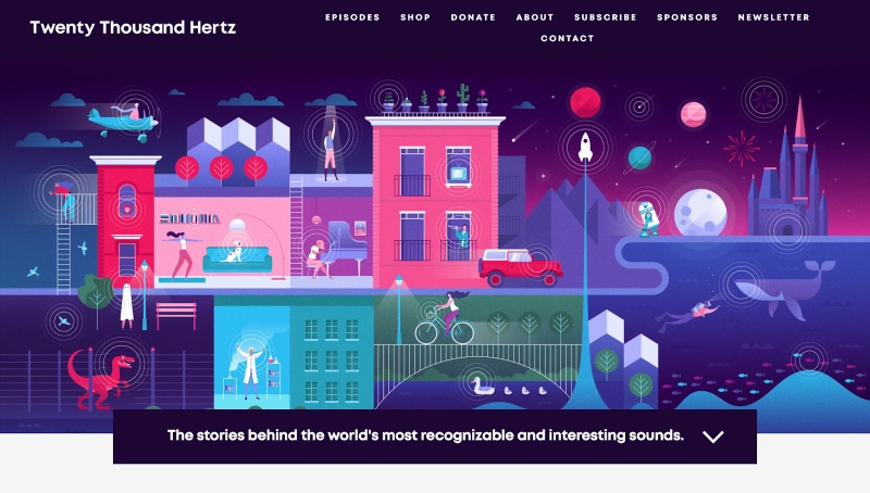
Some websites for podcasts stand out because of their cool layout and features. With Twenty Thousand Hertz, a nonfiction podcast about the history of iconic sounds, it’s the unique illustration designs that set them apart. From the hero banner to the episode thumbnails, everything is packed with maximalist flair.
5) NPR Podcasts
Designed with: (custom)
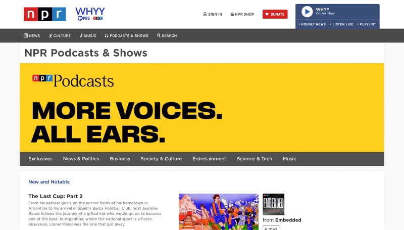
NPR produces some of the most iconic podcasts out there, and their instantly recognizable sound is a key reason why. Just like their audio, their website design is soothing, functional, and completely their own.
6) Song Exploder
Designed with: WordPress
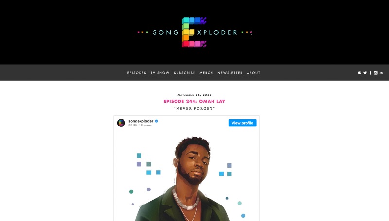
Song Exploder is part of a rare breed of podcasts that became TV shows. With a winning premise (musicians break down the history of their songs), it doesn’t need much to win you over. You can just scroll through the latest episodes and see the diversity of genres they cover.
7) Office Ladies
Designed with: Squarespace
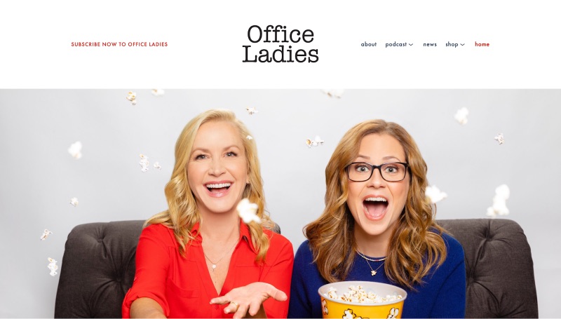
Like How Did This Get Made?, Office Ladies starts with an image of its recognizable hosts. The difference is, it also employs the branding of the iconic TV series it focuses on, The Office. That minimal style carries as you scroll throughout the page, finding episodes, news, and more.
8) Radiolab
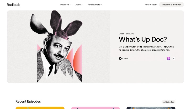
Designed with: (custom)
Once again, thumbnails and web design go hand in hand for this stunning podcast website. The modern, artistic style features sleek rounded squares and artwork that flies off the screen.
9) Podcastica
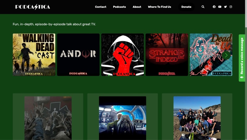
Designed with: Podcastpage.io
Podcastica has a unique pitch for a podcast network. Each podcast recaps a different popular TV show. People know what to expect going in, and their website makes it easy to find the best TV podcast for their interests.
10) Freakonomics
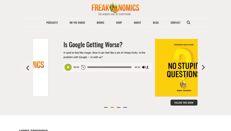
Designed with: WordPress
If you need any evidence that Stephen J. Dubner knows his stuff when it comes to economics, look no further than the Freakonomics brand. It’s still a household name nearly 20 years after the first book’s release, thanks in no small part to the Freakonomics podcast network and its slick branding.
11) Blank Check
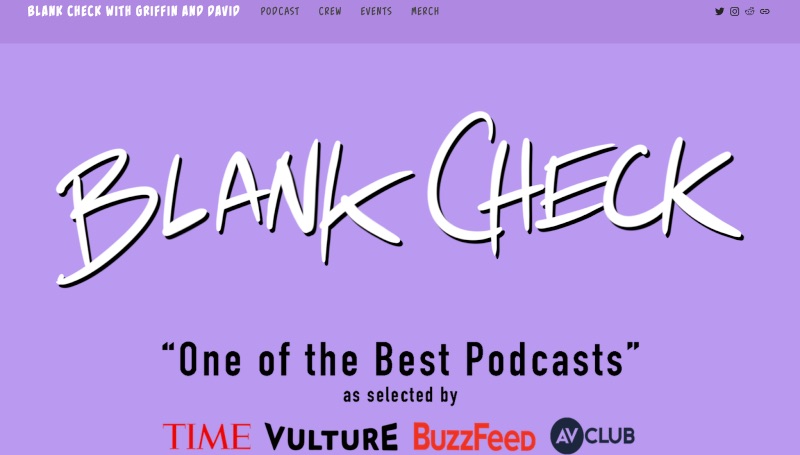
Designed with: Squarespace
Some of the best podcast websites aren’t just for attracting new listeners. While Blank Check proudly displays its accolades as one of the most acclaimed film podcasts, it also hosts events and campaigns for superfans straight from the site.
12) The Sakita Method
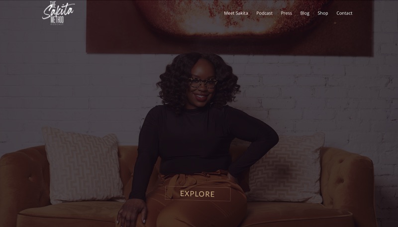
Designed with: WordPress
Entrepreneur Sakita Holley hosts one of the best marketing podcasts out there, and her podcast website is a perfect example of her expertise. Everything from the typography to the layout, and even the name “The Sakita Method,” helps cement her status as a branding guru.
13) The West Wing Weekly
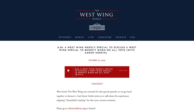
Designed with: Squarespace
This is one of the most clever podcast pages you’ll find. While the show itself is just a talk podcast focused on The West Wing, the website mimics that of the actual White House. This is a restrained bit of fun that showcases the podcast’s gentle sense of humor.
14) My Favorite Murder
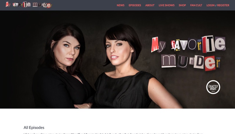
Designed with: (custom)
True crime podcasts have taken the world by storm, and My Favorite Murder is just one of many prominent examples. This one prominently features their magazine cutout logo, as well as access to their fan community, tour dates, and more treasures.
15) Headgum
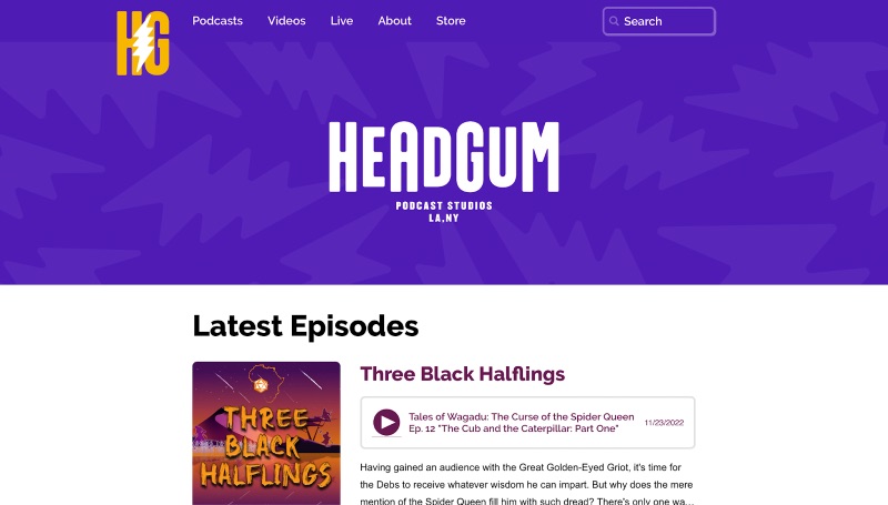
Designed with: (custom)
Founded by CollegeHumor’s Jake and Amir, Headgum is another of the best podcast websites to discover shows from some of your favorite comedic talents. Their colorful homepage offers a scroll of podcasts with new episodes, highlighting the diverse range of talk podcasts they offer.
Design the best podcast website with Penji
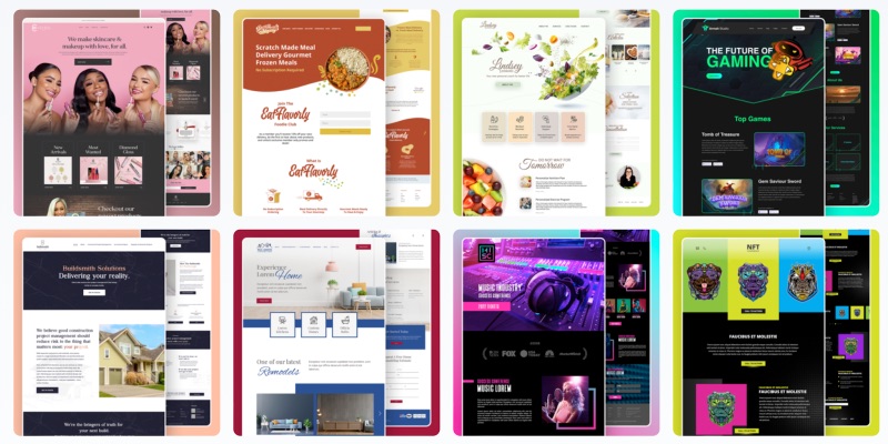
The best podcast websites put brand voice first, but also make it easy to discover the show and incentivizes fans to come back. All of these elements can be tough to juggle, especially with all the other concerns associated with growing your podcast.
Luckily, Penji can help. We offer unlimited graphic design for a simple monthly price, which means you can leave your podcast website design to the professionals and focus on scaling your business. Our skilled designers can also handle illustrations, cover art, social media graphics, presentations, and just about any other graphic design need.
Ready to learn more about Penji’s unlimited graphic design service? Here’s how it works.


