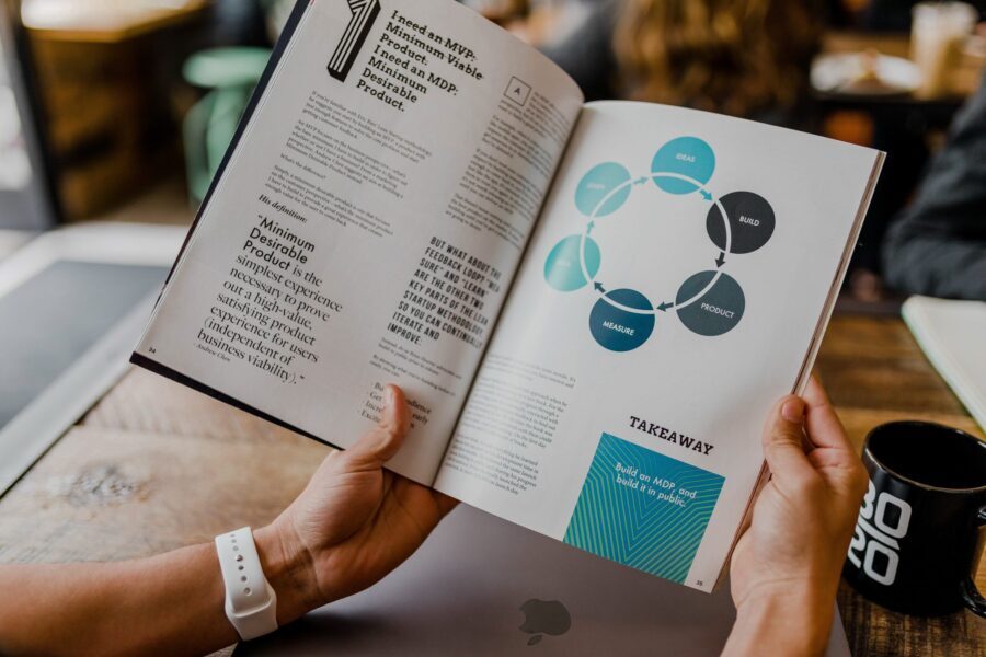
An eBook is often the first impression customers have of your brand. Because they’re affordable and low-risk, customers generally have no issue buying an eBook that will help them solve a problem in their life. Of course the content needs to be great. But you also need a way to demonstrate the book’s value before customers even make the purchase. That’s where design comes in. What’s a good book cover design look like? We’ve collected the best eBook designs from around the web so you can get inspiration for your next release.
1. The Future of Data
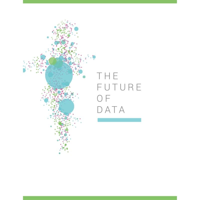
Our first example is a thematic cover for “The Future of Data,” published by Import.io. The cover is an excellent introduction to the eBook’s content. To reinforce the theme, the illustration is a beautiful abstract data visualization art. Likewise, the ample white space makes the design sleek and elegant, making it one of the best eBook designs we’ve come across.
2. The Video Marketing Handbook
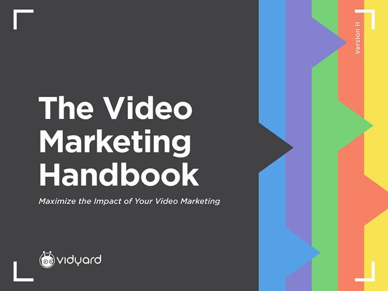
The simple design of Vidyard’s “The Video Marketing Handbook” is perfect for those who want to do away with content overload. Using a fair balance of colors and typography intentionally is a brilliant idea. We also love the file tab-style layout of the eBook cover. It relays the purpose of the handbook, which is to organize the guidelines on video marketing. This is one of the best eBook designs because it’s straightforward and eye-catching.
3. The Ultimate Guide to Effective Data Collection
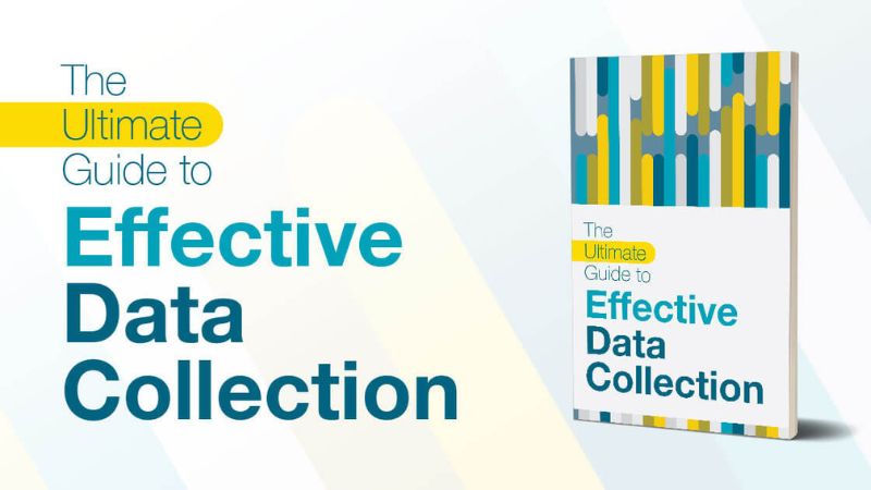
Draw inspiration from this eBook example using just the right amount of color to create an eye-catching cover. This data collection eBook uses lighter color tones that complement each other.
4. The Joy of Data-Driven Storytelling
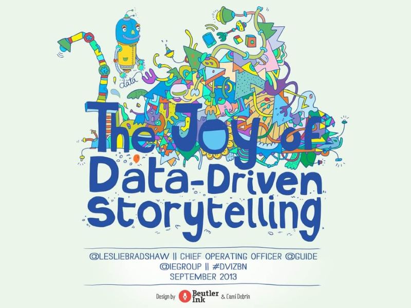
This Leslie Bradshaw eBook features a colorful illustration on its cover. The image tells that the eBook communicates the joy of data, not just the mere numbers. Putting the author’s information on the front cover is a good sign that a credible professional is writing the eBook.
5. Build Smarter with Tech

Most of the best ebook designs don’t have to be particularly fancy. Leaning on basic custom illustrations can still bring content to life effectively. This layout is worth considering for teens, young professionals, and any thematic book designs.
We love seeing brands from all industries up their ebook game by applying outstanding design. Definitely, seeing others’ excellent works can inspire you too.
6. Product Management by Intercom
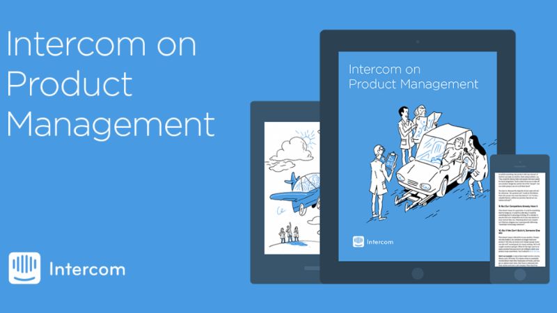
We are repeating this! Not all eBooks need a cover with a bold palette. That is why using a minimal color scheme can also look beautiful. Also, the straightforward typography added to the simplicity of the eBook design.
7. Marketo’s The Definitive Guide to Marketing Metrics and Analytics
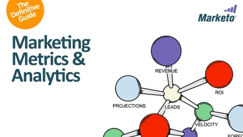
Marketo software company believes marketing is the key to customer acquisition supremacy. Similarly, data visualization will always capture attention. This eBook has a minimalist design. But despite that, it clearly illustrates how a marketing ecosystem is interconnected.
8. The Secret Sauce by LinkedIn
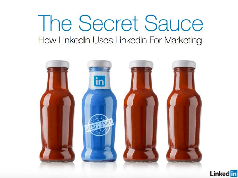
Some people love bold visuals, and this eBook cover hits the mark for many reasons. It is a very witty theme, showing that LinkedIn has a literal secret sauce. The only bottle demonstrates the purpose of the eBook with a label.
To achieve the best eBook design, you must consider clean photography instead of boring covers in the B2B space. This design reflects LinkedIn’s brand identity via its signature bright blue, a visual differentiation. A visually appealing cover is the way to do it when you’re looking to make an impact.
9. Your Field Guide to Foraging Intent Data
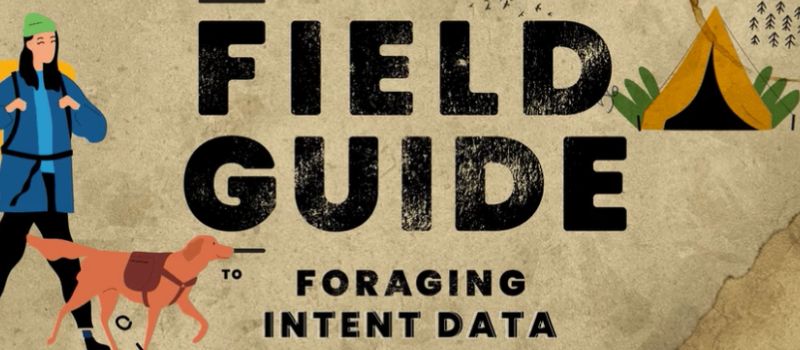
Data gathering is an essential component of your job as a marketer. But, let’s admit it, sometimes you can feel lost in the wilderness. Account-based marketing (ABM) platform Terminus did a fantastic job translating this metaphor into an exciting adventure guide. This interactive ebook is a perfect example of how creativity can drastically enhance a viewer’s experience, from the people and animals to the maps and trails. By giving it a unique twist, learning to gather data feels like an exciting adventure—not a dull chore.
Remember that it is easy to come up with obvious visual metaphors like a lightbulb for an idea. But, it’s good to challenge yourself by coming up with an interesting and relevant visual theme.
10. Rethink the B2B Buyer’s Journey
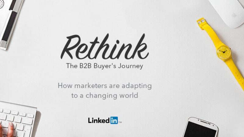
Here’s another design of a LinkedIn eBook. This overhead shot showcases photos of natural objects placed in perfect harmony with each other. These images show a different visual aesthetic, instantly capturing readers’ attention.
Get the Best eBook Designs On-Demand
If you want to be a company showcasing one of the best eBook designs this year, you’re in luck! Our graphic designers have made book covers that educate, entertain, and inspire readers. We’ve made book designs in every industry, from marketing guides to children’s books.
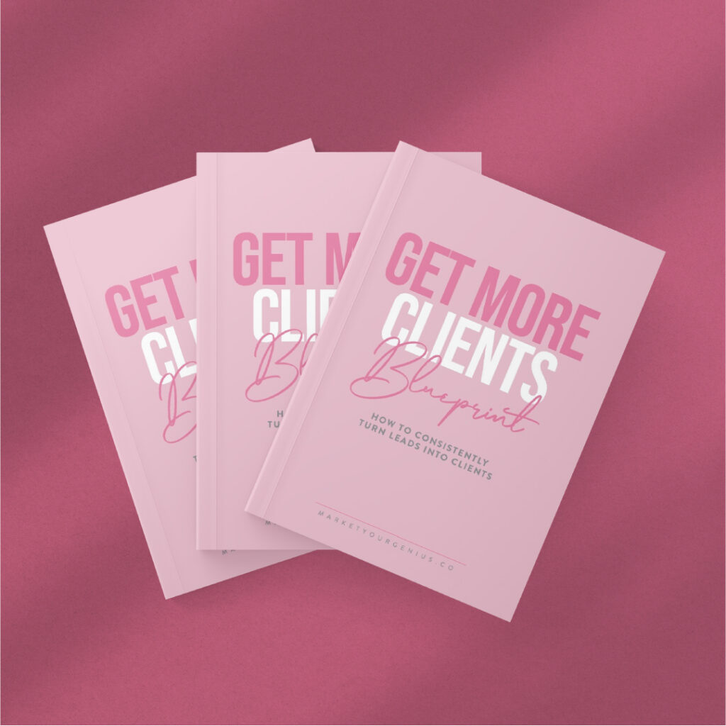
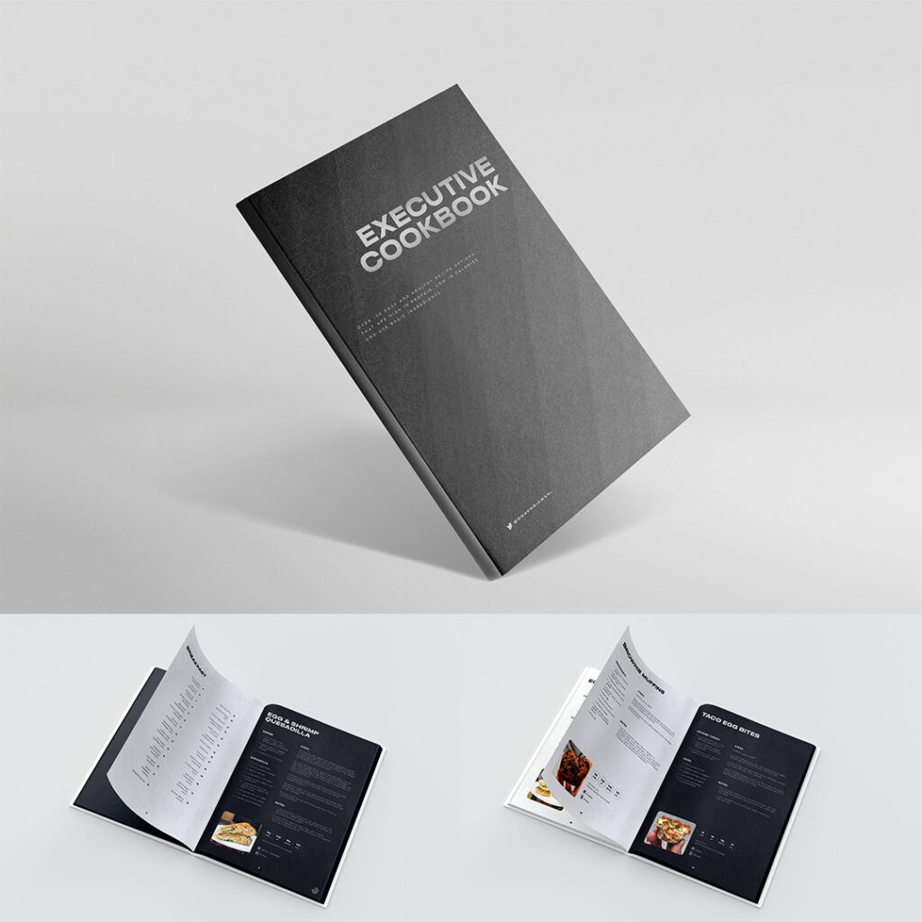
If you want an eBook design that reflects your brand identity, get started with Penji. We make sure to align your requests with your branding style guidelines, and revision requests are always welcome.
Magazine, brochures, and eBook layouts are just a few of our 120+ design services all under one subscription. Ready to test it out? Fill out this form and start submitting graphic design requests today!
About the author

Rowena Zaballa
With a background as a former government employee specializing in urban planning, Rowena transitioned into the world of blogging and SEO content writing. As a passionate storyteller, she uses her expertise to craft engaging and informative content for various audiences.
Table of Contents
- 1. The Future of Data
- 2. The Video Marketing Handbook
- 3. The Ultimate Guide to Effective Data Collection
- 4. The Joy of Data-Driven Storytelling
- 5. Build Smarter with Tech
- 6. Product Management by Intercom
- 7. Marketo’s The Definitive Guide to Marketing Metrics and Analytics
- 8. The Secret Sauce by LinkedIn
- 9. Your Field Guide to Foraging Intent Data
- 10. Rethink the B2B Buyer’s Journey
- Get the Best eBook Designs On-Demand


